Design thinking Playbook Roundtable by Deepa Bachu

desk-931928_1280

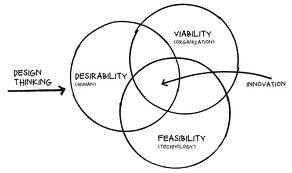
The core idea of a startup is to tap into the previously unexplored markets, identifying unsolved problems and bringing to the market innovation that disrupt the existing eco-system. It’s about understanding complex problems and coming up with innovative, disruptive solutions…a process that requires understanding the consumers’ requirements and behavior patterns to create a well-thought out solution for the customers’ benefit.

While most entrepreneurs spend weeks brainstorming about the idea, they often ignore the key ingredient to innovation : design.

Design /dɪˈzʌɪn/ (noun) – do or plan (something) with a specific purpose in mind.

The Design thinking Playbook Roundtable organized by iSpirit and conducted by Deepa Bachu from Pensaar helped startup founders understand the importance of design thinking and integrate design into their workflow. Here are some key takeaways from the Playbook Roundtable held at the head office of Instamojo in Bangalore:

Design thinking is not just about the graphic elements, UI or tools. It is a creative approach to a problem. It is a problem solving methodology – whether it is blueprints for a building, a beautiful graphic design for a brochure, a sleek UI for a website or a comfortable piece of furniture, design helps to solve any problem, visual or physical.

While it is important to engage a professional, it is crucial that everybody on the team thinks DESIGN. Entrepreneurs should be able to step away from their immediate environment to look around and view their idea from the perception of the consumers, a process that requires creative thinking.

As a good product manager, a startup founder should be able to connect the dots in non-obvious ways to come up with a unique and innovate solution for the consumers. It is crucial for entrepreneurs develop a deep insight of the problem they are seeking to solve and be passionate about it before coming up with a solution. More startups focus more on the solution and forget the initial problem statement. You must never lose sight of your problem, constantly revisiting it while fine-tuning and tweaking the solution.

A product is valuable only as long as the consumer users it. It is thus important for entrepreneurs to understand customer behavior in order to make their product user friendly. Usability studies though interesting, aren’t always reliable. Startup founders thus have to seek out customers and work with them closely to understand what they need, what they think, how they use the product and how they feel about it.

Customer behavior v/s customer intent – it is important to understand the difference between the two. While a user may want to do something in the ideal world (intent), she may not be able to do it in the real world (behavior). As entrepreneurs it is important to differentiate intent from actual behavior. If this is geographically impossible, startup founders should not hesitate to use data analytics to tap into the users’ behavior patterns and modify the product.

Design thinking allows entrepreneurs to look at their idea holistically and come up with the best possible solution for their users. Design after all enables people to create and come up with the unimaginable and unexpected designs.


Promoting Design Thinking in the NCR

design thinking

In the last 2-3 years there have been well designed products coming out of the NCR startup ecosystem. Mettl, Visual Website Optimizer, Paytm, and Oogwave, especially come to mind where Design Thinking has been an integral part of the product development process, and not an after thought by giving it just a cosmetic veneer.

There is a noticeable increase in design sensibility while attending various Meetups and pitching design services to startups. However, there is still a gap in how to make it happen. In other words, how do startups and product managers cover the distance between thinking of design and making it actually happen.

With support from ProductNation, a few design professionals from Design For Use, MakeMyTrip, WoodApple, DSYN, Zomato and U2opia Mobile have formed an informal coalition to help promote the how-tos of design thinking,

Please join us for our launch session this Saturday (May 18th) at the MakeMyTrip office. There will be a talk by Mettl founder, Tonmoy Shinghal, followed up a 3-hour workshop on how to practice Design Thinking in your company by Devika Ganapathy of Anagram Research. Not to mention plenty of networking opportunities during coffee breaks and lunch. Please check out the details and register soon (only 30 participants).

Usability Review of @Bubbles – A new kind of mail service

In a startup, the design is usually an afterthought after the more important challenges of business and technology are solved. Which means by then the design is more like a band aid or a lipstick on the proverbial pig. Probably the main reason why products here still lack that world-class feel, even though they are better in terms of features and performance.

A successful product usually has the right blend of usefulness, ease-of-use and engagement or emotional connect through aesthetics. For example, Facebook might score high on each of the three attribute, while a game like Grand Theft Auto may deliberately keep the ease-of-use difficult. Each of these attributes should be part of the product roadmap at the onset. By how much should you dial up or down each attribute or in other words what is the overall design vision? And who will be responsible to achieve this vision?

We feature the first of several quick audits to get a conversation started around the importance of design when you are a startup. We did a quick review of @Bubbles, a six month old startup trying to re-imagine email by bringing it closer to the art of letter writing from the good old days. It enables tools for your creative expressions, allowing you to scribble your thoughts, stick photos, sketch cartoons, draw diagrams, and attach sticky notes to your email as you would do on a physical letter.

We evaluated it on 4 key user experience parameters.

How well does it COMMUNICATE to users?


To reduce user’s memory load, it is important to use terms & language that connects to their existing mental model. Once you have adopted a mental model or a metaphor, then try to be consistent.

  1. Terms like “Open Letter”, “Direct letters” are not commonly used in context of letter or email writing and hence can lead to different interpretation. It also adds to the learning time for the user.
  2. Similarly, “No Posts” and “100% Spam free inbox” violate the mental model of letter writing. Either use a “letter” or “email” metaphor but use it consistently.

How easy is it to NAVIGATE?

  Ease of use is vital. The user should always be in control and take the intended direction to perform a particular task. To be able to do this, it is essential that the user understands the flow of screens or sequence of actions.

  1. The incoming and the outgoing mails have the same look and feel, which leads to some confusion. The status of the site or where you are at a given point is not well communicated.
  2. Same page for public & personal letters – The sending route should be selected after the letter has been written. There could be multiple paths to doing this too.

How easy is it to INTERACT?

The information structure should make relevant connections between different pieces information and tools (features) to enable user to achieve desired goals.

  1. Editing tools for the letter are scattered all over the page. A fixed layout for the toolbar would make it easy to use. Some drawing tools like – copy, paste, resize, rotate, etc could be integrated at one place to create a seamless experience.
  2. Every selection or user action should be followed by an appropriate feedback. For example, when a user selects a Pen tools, there is no feedback that it has been selected.

Does it create the right EXPERIENCE?

Overall, it is about experience.

  1. Sent mail is a personal letter as well as a promotional letter for Bubbles, so it should be designed so as to attract more customers, who are not currently on Bubbles.
  2. Keyless Login creates a good experience but the learning curve should not be high.

Undoubtedly, Bubbles is a much better designed product than most. There is a design sensibility with some effort and thought behind each screen, icon and color palette. However, it seems that though there was an emphasis on graphic design (engagement or aesthetics), it could still be improved significantly with some thought on interaction design (usability).