Bangalore: 30th Nov 2013 | Design Thinking round table with Eskild Hansen

On a typical Saturday morning in Bangalore, a small group of design practitioners and product folk got together at the Fusion Charts office in Koramangala. They were attending an informal round table discussion on the topic ‘Design driven innovation to help make the world a more beautiful and pleasurable place.’

As part of a design tour being organized by the Danish Government and the Ministry of Foreign Affairs, Eskild Hanson (a prominent Danish designer) was visiting Delhi and Bangalore. Members of iSpirit, Indian designers and design thinkers were invited to meet and engage with him on areas of common interest.

Eskild is a part of the Danish government strategic think tank that is developing and strategizing the ‘Danish Design Society.’
His previous workplaces include CISCO and Coloplast.
At CISCO, Eskild was responsible for establishing their first European Design Center in Copenhagen and during this period helped bring a fresh air to their previously ‘boring and bulky’ Wireless Routers. He won a Red Dot in 2011 for one of his designs.
More about his work at www.eskildhansen.com

Here are a few pictures capturing the event:

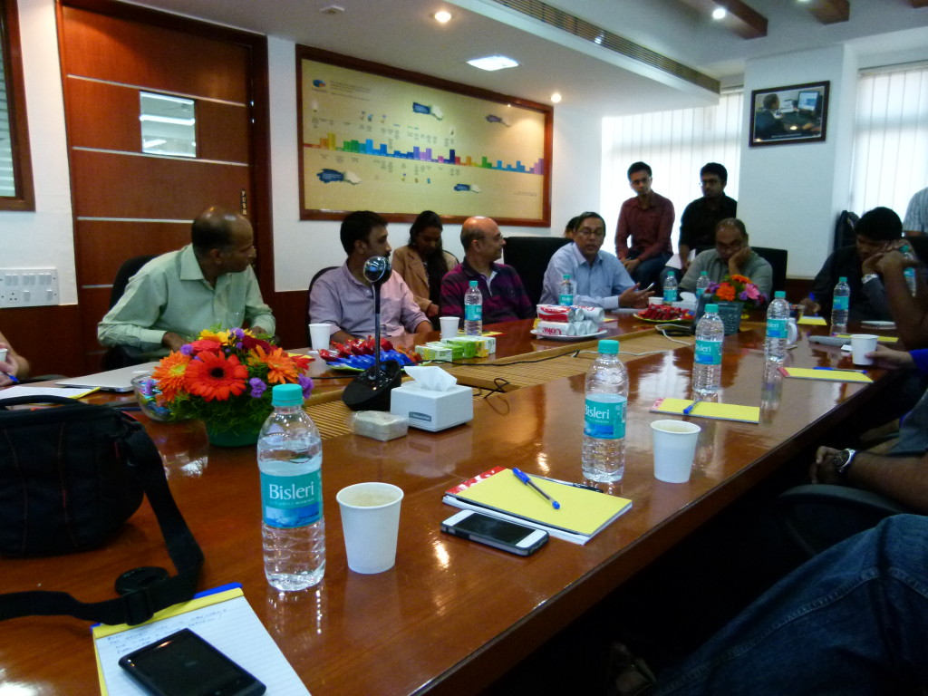
Roundtable Discussion
Participants introduce themselves at the start of the event
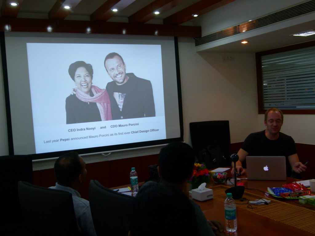
Eskild talking about a trend in executive roles - CCO (Chief Creative Officer) / CDO (Chief Design Officer)
Eskild talks about a trend in executive roles – CCO (Chief Creative Officer) / CDO (Chief Design Officer)
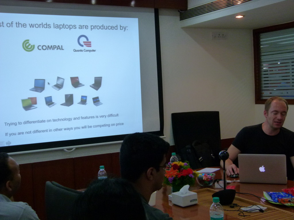
Making a point about the importance of competing on factors apart from price, features and technology. (COMPAL and Quanta Computer - Virtualy unknown but producers of most of the worlds laptops!)
Making a point about the importance of competing on factors apart from price, features and technology. (COMPAL and Quanta Computer – Virtually unknown – but producers of most of the worlds laptops!)
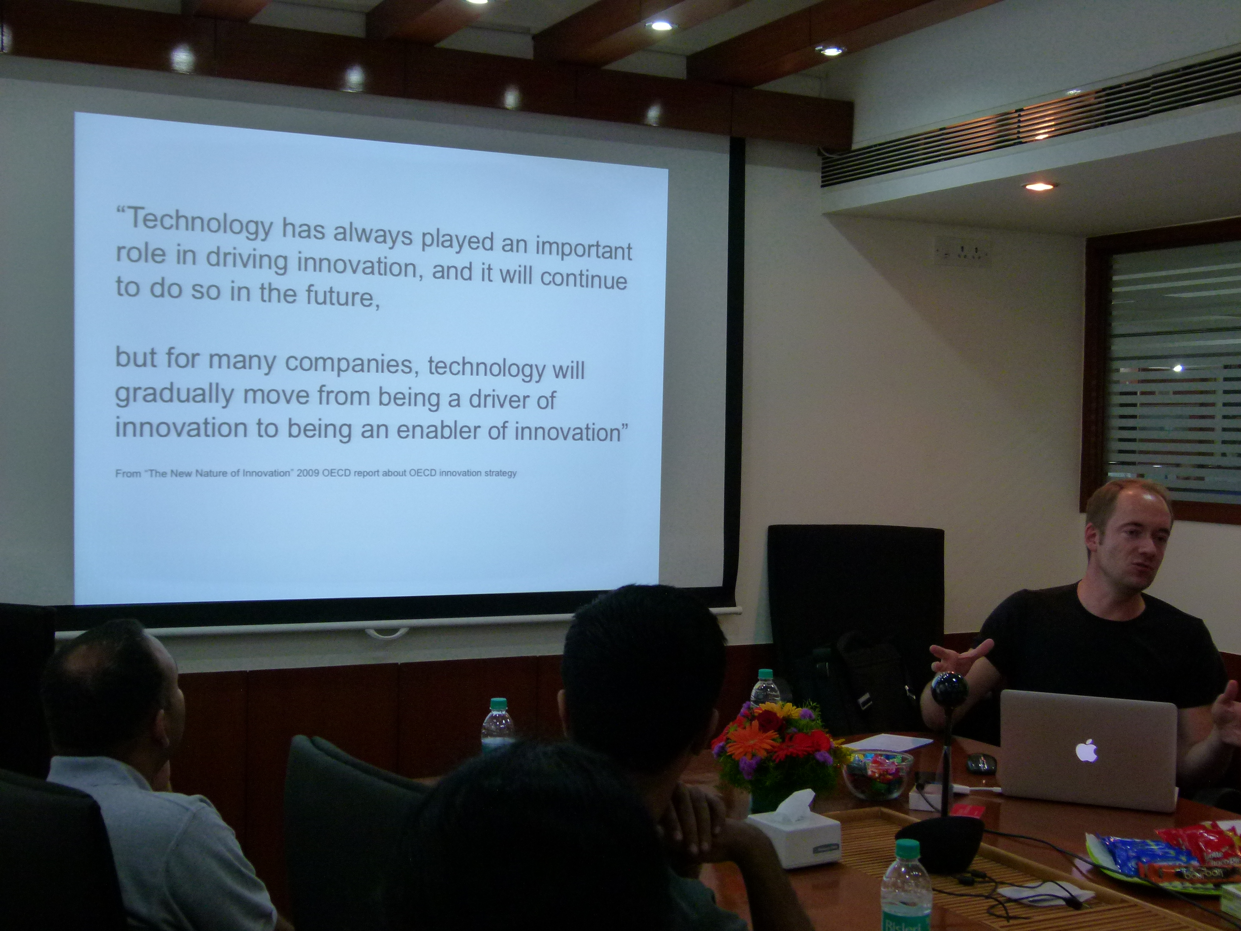
Technology as an 'enabler of innovation' (As opposed to 'technology as a driver')
Technology as an ‘enabler of innovation’ (As opposed to ‘driver of innovation’)
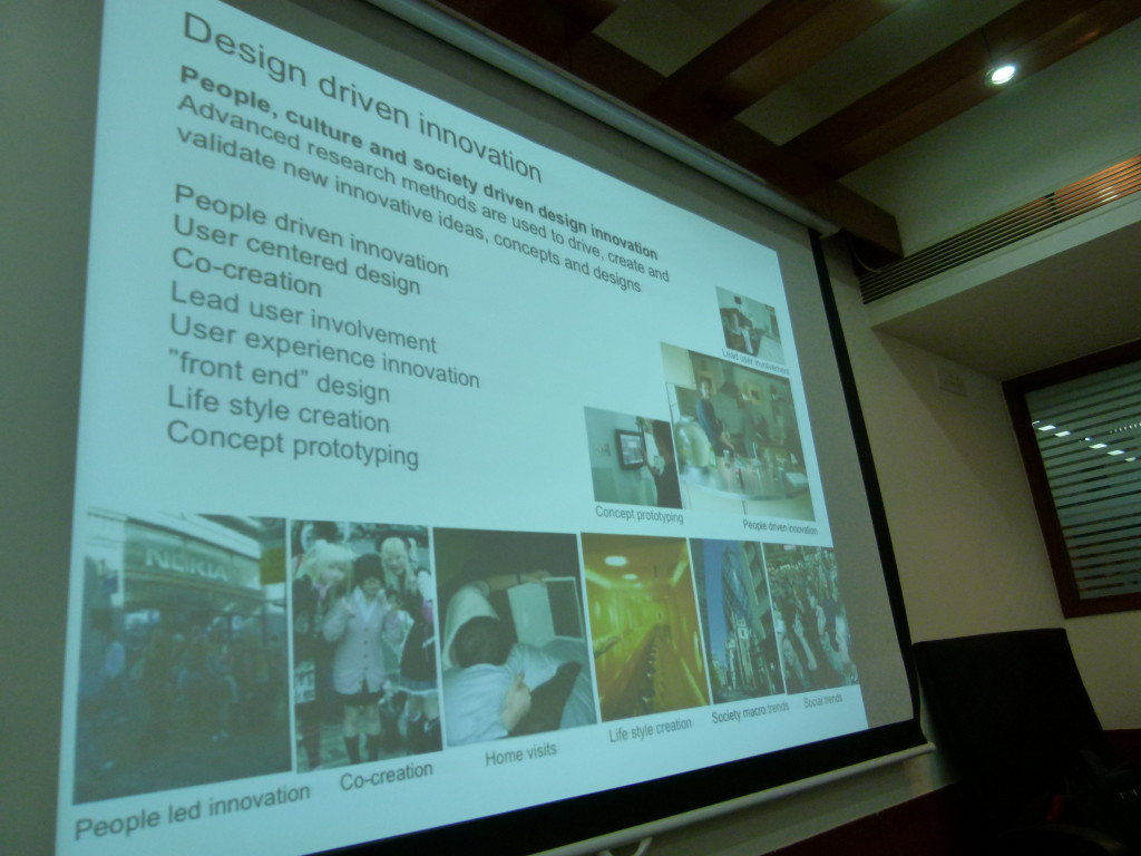
User research - A tool to drive and validate innovation.
User Research – A tool to drive and validate innovation.

The interactive session was a great forum to hear each other’s thoughts on topics related to design and design thinking.
It also gave participants an opportunity to learn more about the Danish Design approach and their innovation related initiatives in India – www.icdk.um.dk.

To know more about the session, check out this sketch note created by Rasagy Sharma, an NID student – https://twitter.com/rasagy/status/407165458303836161/photo/1/large


Quick Research / Usability Methods: Lean Usability Testing

(Post 3 of a series on quick research and usability techniques. Start-up’s can use these techniques fairly easily to connect to and understand their end users better, as well as maintain usability standards on their products.)

Previous posts in this series showcased two discount usability engineering methods – Expert Usability Review‘ and ‘Heuristic Evaluation’. Both these methods are ‘expert based’ – i.e. an interface is reviewed by design or usability experts vs. getting feedback from end users – and are used to identify usability issues on an interface.

Post 3 introduces lean Usability Testing – A ‘guerrilla’ version of traditional Usability Testing.

Before discussing the how’s and why’s of ‘lean’ testing, here are a few basic points to better understand Usability Testing and why it’s important in context to start up’s.

USABILITY TESTING BASICS

Usability Testing (UT) is a research method used to gain insight into product usability.
It is a time bound ‘show and tell’ method where a moderator asks representative users to use and/or talk about the product being evaluated, in context to key task scenarios.
A basic test typically starts with open ended ‘interview style’ questions, followed by a longer scenario based ‘show and tell’ session and ends with a debriefing session.

Usability Testing can be conducted at various points of the product development lifecycle.
Although there are several types of usability tests and techniques that can be used, testing can be broadly classified into ‘Formative’ and ‘Summative’ Testing.

Formative Testing can be conducted at any stage of development. (Initial paper prototype / high fidelity prototype / even post release)
The objective is to aid iterative design. Formative Testing is typically qualitative in nature and the goal is to find specific pain points and highlight areas of improvement.

Summative Testing
is done only with designs that are complete or near completion.
The objective is usually to judge the design against quantitative metrics (like efficiency or productivity) or against competitive products.

Find out more about Usability Testing and how you can plan for and conduct a test, at Usability.gov.

Steve Krug’s demo video is also a good starting point to get started with Usability Testing.

Demo Usability Test


WHY TESTING IS IMPORTANT: THE MALCOVICH BIAS

The Malcovich Bias

The UT method is particularly relevant to start ups, where the environment is characteristically ‘inspired’ and ‘driven’ by a shared product vision.
In order to pull in the best talent and sustain momentum, start-up leaders ‘sell’ their product to themselves, to their investors and to their employees.

While this can energize teams and enhance productivity, it also fuels the ‘Malcovich Bias’.
(‘The assumption that ‘target users’ use things / see things / care about the same things that the ‘product / design team’ does.’)

In a high-pressure, super charged start up environment, it is easy to become ‘product / vision focussed’ rather than focussed on the people who are ultimately going to use the product.

Usability Testing puts start up teams in touch with their end users and their reactions to the product that is being built.

And seeing people struggle with what seemed standard or obvious reinforces the fact that assumptions made about the product or its features may be very different from the way users actually perceive or experience it.

LEAN USABILITY TESTING

That said, traditional Usability Testing can be difficult to incorporate into tight budgets and product timelines. However, several specific elements add to the cost, duration and complexity of testing, and can be substituted with lightweight alternatives that help make ‘Usability Testing’ leaner.

Lean Usability Testing is easier to fit in because it is cheaper and can be done more quickly than traditional testing. And more so in context to Agile Software Development – where a key practice is quick and incremental development.

For example, did you know that testing in a professional facility can add to the cost, but is usually not a ‘must have’?
At a basic level, a test can be conducted very effectively in any room that is quiet and available for use without interruption.

Other (cost effective) alternatives to a professional / formal testing space include:

  1. Remote (Moderated) Usability Testing
    Remote Testing follows the same objectives and a similar process to traditional ‘lab’ usability testing. The obvious difference is that the moderator and the user are in two different locations. (e.g. The moderator in his office / the user in his office or home)
    However, with good screen sharing and screen recording software, usability testing can be conducted easily and effectively with a remote participant. Besides saving costs related to renting or setting up a formal testing space, remote testing reduces the costs of accessing geographically dispersed target users.

    screen sharing software

    Recommended screen sharing software – WebEx, Adobe Connect, Skype, GoToMeeting

    screen recording software

    Tech Smith’s Camtasia Recorder is an easy-to-use tool that can be used to capture remote testing sessions for later reference and analysis.

  2. Guerrilla Testing: This is an impromptu method and therefore should not be tightly scripted or planned. The distinguishing characteristic of this method is its spontaneity.

    The method essentially involves:
    … taking your product to a public space
    … identifying and recruiting people who are interested / fit a broad profile from among a pool of strangers
    … conducting the test right after

    If your product is generic or targeting a wide audience, you can conduct guerrilla testing on the street / in a coffee shop / at a conference;
    For niche or specifically targeted products, a more specific space that is likely to be populated by your target users would work best. (Like outside a college for an educational product, or inside a mall for a product related to shopping.)

    Besides cost and time saving, Remote Testing and Guerrilla Testing are good DIY research options for start-ups who want to get end user feedback.
    They are easier to plan and organize than traditional usability tests. Several of the challenges related to scheduling and set up in traditional testing are no longer applicable here.

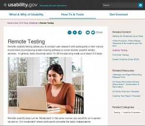
    Remote Testing

    Find out more about how you can set up and conduct a Remote Test at Usability.gov, Quick and Dirty Remote User Testing (A List Apart)More about Guerrilla Testing at – UX Booth

  3. In-Context Testing
    In this case, the researcher pre-recruits participants, and then schedules and conducts tests in the context they would typically use the product – rather than having participants come in to a formal testing venue.Testing in the participants natural context of product usage not only cuts costs associated with a formal facility, but adds richness to the test. Contextual influencers that would otherwise be invisible to the researcher now become added inputs to the research.

Coming up soon – How to be leaner in participant recruiting, selection of testing equipment / software, reporting and more…

Post 4 will discuss multiple additional ways in which start up’s can conduct a Usability Test at leaner costs and timelines.

Are you a design thinker evangelizing or facilitating user research and usability methods within your start-up?
We would love to hear about your experience / answer any questions that you have about the research and usability methods you use.

We invite members of the start-up community to volunteer their screens / functions for use as examples in upcoming posts showcasing additional research techniques.
Email me at devika(at)anagramresearch.com to check whether your screen is eligible for selection. 

Quick Research / Usability Methods: Heuristic Evaluation

(Post 2 of a series on quick research and usability techniques. Start-up’s can use these techniques fairly easily to connect to and understand their end users better, as well as maintain usability standards on their products.)

In my last post, I introduced a discount usability engineering method called the ‘Expert Usability Review’ – A method best suited to start-up’s who have access to skilled and experienced usability / design professionals who can conduct a Usability Review.

Post 2 introduces a related technique called the ‘Heuristic Evaluation’.
Start up’s that don’t have a usability / design team in place, can start focusing on usability and ease of use, using the ‘Heuristic Evaluation’ method – A method with similar goals to the Expert Usability Review, but a relatively easier starting point for novice researchers.

In a Heuristic Evaluation (or Heuristic Review), the reviewers identify issues by looking at an interface in context to a pre-decided set of heuristics. Violations to any of the heuristics indicate non-compliance / potential usability issues.

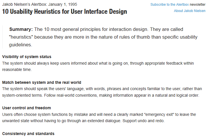
‘Heuristics’ are rules of thumb – Broader than design guidelines, typically available as self-sufficient ‘sets’ (e.g. Nielsen’s 10 Usability Heuristics / Gerhardt-Powals’ cognitive engineering principles) that can be used standalone / along with other sets.

Popular examples:

Visibility of system status: The system should always keep users informed about what is going on, through appropriate feedback within reasonable time. (Jakob Nielsen)

Reduce uncertainty: Display data in a manner that is clear and obvious. (Gerhardt-Powals)

The set of heuristics used act as a guideline – making this method more of a check list based audit rather than requiring reviewers to intuitively identify issues by drawing upon a deep knowledge of usability and UI in general.

(More about the technique and how to conduct Heuristic Evaluations at Usability.gov, Smashing Magazine and the NN Group)

One of the drawbacks of the Heuristic Evaluation method, is that the issues identified are dependent on the list of heuristics used. So if the set of heuristics is too narrow, there is a chance of some issues going unidentified. On the other hand, if the list of heuristics is very large, the review would take a very long time to do.

The most popular set of Heuristics are Jakob Nielson’s 10 Heuristics. However, these are broad guidelines – and may be too abstract for a lay person to interpret and apply.

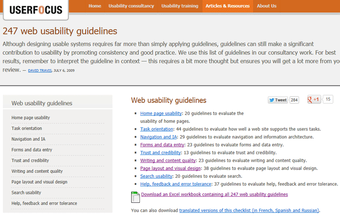
10 Usability HeuristicsThe 275 Web Usability Guidelines from User Focus are more literal and therefore much easier to understand for the lay person. Moreover, these guidelines are available in a neat Excel spread sheet format that includes instructions on how to use them and an auto-calculated numeric rating for guidelines compliance.

275 Web Usability Guidelines


To end, here are a few tips you can keep in mind while attempting to do a Heuristic Evaluation:

Start with a Knowledge Transfer
Before critiquing a product, it is important to understand its context and usage.
The knowledge transfer must enable a good understanding of the product strategy and goals, target audience, known trouble points, constraints and design centres. The KT must include a walkthrough of all features, screens and task flows that are critical to the product.

Define the scope of the review
While this is not necessary for a simple product or a product with a manageable number of screens, in a complex or large product, defining the key task flows and screens to be reviewed is important to keep the review manageable.
With some exceptions, the 80 /20 rule is a good way to do this – Attempt to review 20% of the product features that are used 80% of the time.

Select the set of heuristics that are right for your product
There are plenty of heuristics available online.
Keeping n mind the product you plan to review, it is important to decide whether to use a generic set of heuristics (Like Jacob Nielson’s 10 Heuristics / User Focus guidelines) or whether domain specific / niche heuristics would be more effective. In niche or highly targeted products (products for senior citizens, children, disabled users, mobile phone hardware etc.) generic heuristics may be ineffective for unearthing all issues.

Select a set of heuristics that are right for the reviewer
The reviewers who are going to be using the heuristics, need to be comfortable / familiar with the heuristics in order to interpret and apply them effectively.

Focus on issue identification vs. recommendation
A common tendency among newbie reviewers is to jump right into fixing the problem / wording the issue as a recommendation. It is important to keep the Heuristic Review focused on issue identification, in context to a given set of heuristics. In fact, an issue may / may not be accompanied by a corresponding recommendation – Issues are sometimes too complex to be tackled by a quick written recommendation and need a larger, more focused redesign effort.

Rate issues to help prioritize
Doing this helps focus the post review effort of addressing the issues identified through Heuristic Review.

Are you a design thinker evangelizing or facilitating user research and usability methods within your start-up?
We would love to hear about your experience / answer any questions that you have about the methods that you used.

Post 3 coming up soon, will showcase a Guerrilla Research techniqueRemote Usability Testing. Look out for this post to learn more about the method and to compare the issues found through Usability Testing, against issues identified through the Expert Usability Review.

We invite members of the start-up community to volunteer their screens / functions for use as examples in upcoming posts showcasing additional research techniques. Email me  at devika(at)anagramresearch.com to check whether your screen is eligible for selection.  

Quick Research / Usability Methods: Expert Usability Review

(Post 1 of a series on quick research and usability techniques. Start-up’s can use these techniques fairly easily to connect to and understand their end users better, as well as maintain usability standards on their products.)

ProductNation in collaboration with a few like-minded design professionals, recently put together an informal forum for designers, engineers, product managers & entrepreneurs in the Delhi NCR region. The objective of this forum was to evangelize and encourage a dialog around Design Thinking among the start-up community.

I conducted a short workshop on this topic at the forum’s launch event – a day long interactive meet up – hosted at the MakeMyTrip office in Gurgaon.

During the workshop, I introduced participants to the concept of Design Thinking and touched upon a few design research and usability methods that they could use to support design thinking within their organizations. A brief recap:

Design Thinking is an approach to design rather than a specific technique or method.
A core principle central to supporting design thinking is iteration. A ‘prototype and test’ focused approach fuelled by empathy for the people who will ultimately use the product, is recommended to be followed throughout the product development lifecycle.
There are several user research methods that can help companies connect to and understand their end users better. Guerrilla Research techniques in particular, are especially useful  in context to the start-up environment – Where time is of essence, budget is limited, teams are small, people are typically multitasking and playing multiple roles.
Guerrilla Research includes research techniques that can be done more quickly, with less effort and budget, as compared to formal or traditional user research techniques. Remote  / Informal Usability Testing, Man on the Street Interviews, Micro-surveys, Fake Doors, ‘Design the Box’ and Personal Inventory are a few examples of quick research techniques that can be learnt and implemented fairly well by a newbie researcher / anyone on a start-up team doubling up as a researcher.

In this first post, I want to introduce a discount usability engineering method called the ‘Expert Usability Review.’

Like Guerrilla Research methods, a Usability Review is an effective way to quickly identify usability and ease-of-use issues on a product. However, unlike user research, this method does not involve talking to end users at all.

What it involves is ‘expert evaluators’ reviewing a product, to identify usability and ease of use issues across different UI areas like Navigation and Structure, Layout, Visual Design, Interaction, Error Handling, Content etc. The experts are able to identify issues by drawing on their own experience in the areas of design and usability.

Subjectivity is minimized and issue validity maximized (or attempted to!) by ensuring that issues identified map onto existing and recognized design guidelines / principles / best practices or heuristics.

The issues identified through review, can then be fixed as part of an iterative design process. The kinds of issues that a Usability Review typically identifies are the ‘low hanging fruit’ or obvious usability problems.

Doing a review helps to highlight any aspect of an interface that violates usability and design principles.

The issues that surface through a review are different from the type of issues that come up while using user based methods like Usability Testing. So a review is a good complement to other user research techniques that may also be employed.

(More on typical issues found through Heuristic Evaluation and Usability Testing vs. Expert Reviews)

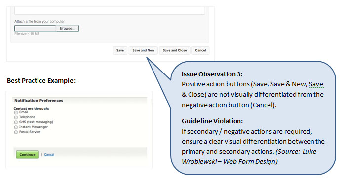
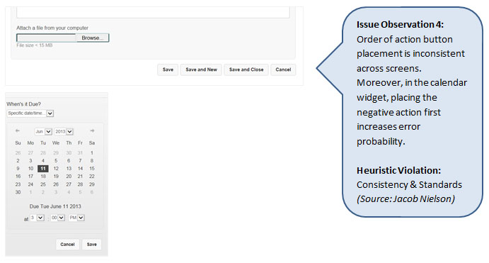
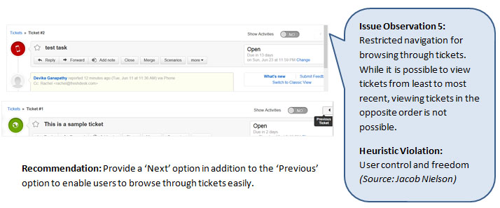
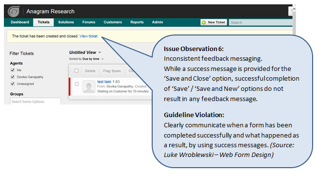
To demonstrate the type of issues typically found through a Usability Review, I evaluated the ‘Submit Ticket’ function on Freshdesk. Freshdesk is an online customer support software, targeted at small and medium sized businesses looking for a cloud based solution.

Here are some of the issues that I found:

Note: This is not an exhaustive review of the ‘Submit Ticket’ page, but a few example issues that help illustrate the type of issues that may be found through a usability review.
The products selected to be used as examples in this series of posts are products that are well designed in general. This highlights the importance of iterative design / the type of issues that can be unearthed even in well-designed products, by using various usability and research techniques.
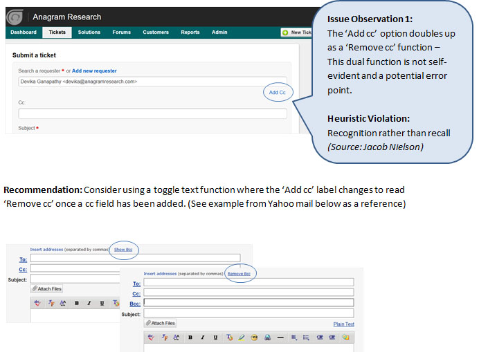
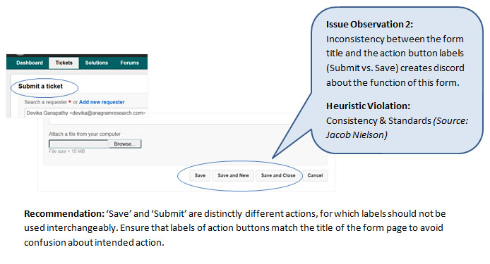
issue observation 1issue observation 2issue observation 3issue observation 4issue observation 5issue observation 6The examples shown above are just a fraction of the issues that a Usability Review could highlight.
The success and effectiveness of this technique is dependent on the experience and skill of the reviewer. A review is typically done by three or four experts in the field of usability and design.

This method is best suited for start-up’s who have access to skilled and experienced usability / design professionals who can conduct a Usability Review.

Post 2 coming up soon, will introduce a related technique called ‘Heuristic Evaluation’.
With similar goals to an Expert Usability Review, a Heuristic Evaluation is a relatively easier starting point for novice researchers – Ideal for start-ups who don’t have a formal design / usability team in place, but want to try their hand at usability evaluation.

Are you a design thinker evangelizing or facilitating user research and usability methods within your start-up?

We would love to hear about your experience / answer any questions that you have about the methods that you used.

We also invite members of the start-up community to volunteer their screens / functions for use as examples in upcoming posts showcasing additional research techniques. Email me  at devika(at)anagramresearch.com to check whether your screen is eligible for selection.