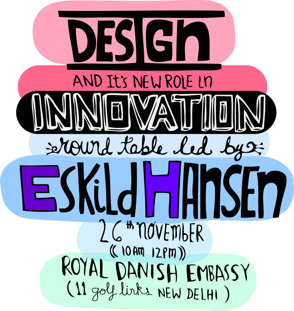
Design and its New Role in Innovation – A Round Table led by Eskild Hansen (Nov 26th, New Delhi)

DesignRoundTable with Eskild Hansen in New Delhi

Eskild Hansen will lead a discussion with prominent design thinker in the NCR on ‘Design and its New Role in Innovation.’

Eskild Hansen is one of the most talented Danish Designers on the Scandinavian landscape. Just turned 40, he has already been in leaderships positions at Cisco and Coloplast among others after having worked with other leading global design firms. At CISCO Eskild was responsible for establishing their first European Design Centre in Copenhagen and during this period helped bring a breathe of fresh air to the previously ‘boring and bulky’ Wireless Routers. He even won a Red dot in 2011 for one of his designs. You can read more about his work at www.eskildhasen.com.

Eskild is also a part of the Danish government strategic think tank that is developing and strategizing the ‘Danish Design Society.’ Invest in Denmark, a part of the Ministry of Foreign Affairs is bringing him to India on their 2nd Design Tour between 25th and 30th of November, 2013 and are offering the members of iSpirit and opportunity to engage with Eskild on common areas of interest. A new development has been the opening of a Danish Innovation Centre in New Delhi and Bangalore (www.icdk.um.dk).

Eskild is also very excited and eager to work with Indian companies for his private design consulting company.

Pixel Jobs – Product review of a job portal by designers for designers

Pixel Jobs Image

Pixel Jobs, designed by the talented folks at Sparklin, is a refreshing look at the boring world of job portals. The problem to solve was simply, “How to get a job post seen by the best creative talent?” An old fashion job-board served as a physical metaphor to yield a clean, simple and inviting job portal cheekily named – Pixel Jobs. It has nifty filters to make searching easy and a straightforward form that allows you post a job in a few minutes.

Pixeljobs Screenshot


On April 3rd, Avinash and I had freewheeling chat with the young founders of Team Sparklin – Gurpreet Bedi and Himanshu Khanna – on the hows and whys behind the product. 

How did it all began? Are you trying to become Cleartrip for the job space?

“Pixel Jobs really started based on internal need of hiring the best designers. Sparklin started a Facebook group last year to reach out to the designers through personal networks and within a short time close to 1200 people had signed up. That clearly indicated a need for a specialized job site for designers. There are already sites for coders, so why not for designers. This is purely a niche product,” on the why.

“There was a concern on excessive moderating to ensure the postings to be creatively-relevant and accurate. I had to overly moderate the Facebook group for the first couple of months. But then everything kind of fell in line. The relevancy and quality of postings sort of improved on their own. Very little moderation was required. That’s when an open job forum became a viable next step. We still moderate but only for completeness.”

So what is the initial marketing strategy?

“We have deliberately taken a slow approach towards marketing this portal. First, we want to ensure that the platform is robust enough to handle large volumes. Second, by only allowing a selected well-known companies in the creative domain to post (for now) will increase the quality and credibility enough to not warrant a serious marketing push,” elaborating on the initial word of mouth approach.

How is the product going to evolve over next few months? Semantic search, LinkedIn connect, company-based hosting, additional views, etc. are some gaps.

“This is only a version 0. We are improving the product on a daily basis. All these features and many more are in the pipeline and you will see a gradual improvement over next few months. For instance we are working on an Android app to launched soon and targeting companies to use Pixel Jobs to host jobs on their sites. They can just use our embed our code with their branding on their site. There is a big need for this. For example, some of our clients already have a job board on their site but prefer to here.”

Even though the initial version is impressive, there are some user experience improvements to consider. For instance, extending the card metaphor by not going to the next page for a more fluid interaction (too many new windows), introducing category tags as alternate searching mechanism (search only for graphic designers), making search more central to the experience, introduce shared vocabulary (minimal difference between UX Designer and UI Designer), personalizing content based on previous searches and making it easy to follow-up on interesting jobs.

“We agree with all these points. Most of these are being worked on currently. For example, in the Android app you can favourite your job and city. Only those jobs will then be shown by default. These will help personalize your experience. Easier to do this on Android for now and eventually we will introduce them on the web as well.”

How do you plan to distinguish the experience between job seekers and posters?

“This will be a very important strategy once we build some traction and gain volume. For now the obvious focus is job seekers which will help drive better companies to the portal.”

Why is there a disconnect between brand Pixel Jobs and the URL (jobs.pixelonomics.com)? This could split the brand between Pixel Jobs and Pixelonomics. Better to build a single brand for consistent messaging.

Without elaborating on this too much, “We will merge these very shortly under a new brand name in the next release. We could also launch series of boards across other verticals as well – mobile developers, etc. under the same brand.”

It will be hard for the creatives to search on cluttered and difficult to use popular job sites from now on. 

Promoting Design Thinking in the NCR

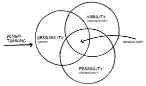
design thinking

In the last 2-3 years there have been well designed products coming out of the NCR startup ecosystem. Mettl, Visual Website Optimizer, Paytm, and Oogwave, especially come to mind where Design Thinking has been an integral part of the product development process, and not an after thought by giving it just a cosmetic veneer.

There is a noticeable increase in design sensibility while attending various Meetups and pitching design services to startups. However, there is still a gap in how to make it happen. In other words, how do startups and product managers cover the distance between thinking of design and making it actually happen.

With support from ProductNation, a few design professionals from Design For Use, MakeMyTrip, WoodApple, DSYN, Zomato and U2opia Mobile have formed an informal coalition to help promote the how-tos of design thinking,

Please join us for our launch session this Saturday (May 18th) at the MakeMyTrip office. There will be a talk by Mettl founder, Tonmoy Shinghal, followed up a 3-hour workshop on how to practice Design Thinking in your company by Devika Ganapathy of Anagram Research. Not to mention plenty of networking opportunities during coffee breaks and lunch. Please check out the details and register soon (only 30 participants).

“Great Designers Steal”

Picasso Cubism

Picasso is purported to have remarked, “good artists borrow, but great artists steal.” He probably did not mean it in a literal sense. He wanted to inspire us from great works of arts and re-interpret or re-imagine them in a different way. Here are some references that have inspired us to become better designers.


Balsamiq Screenshot


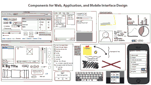
1. Balsamiq: Its simple sketchy interface evokes a sense of nostalgia of our playing with crayons as children. The clients don’t get distracted by little details allowing us to focus on important things such as navigation, content prioritization, quantity of content, and what a screen does. You should definitely use this to visualize and share your vision before writing a single line of code. This is also a great tool to communicate user stories within the agile framework.

PatternTap Screenshot


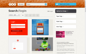
2. Pattern Tap: Its a collection of crowd-sourced design inspirations for all page types and devices. The designs are categorized by facets, so search for “login” to be wowed by how a simple screen can be so beautiful. 

TheNounProject Screenshot


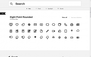
3. The Noun Project: “The mission of The Noun Project is to collect, organize and add to the highly recognizable symbols that form the world’s visual language so they can be shared in a fun and meaningful way.” The symbols are free and delightful. You have see them to believe.

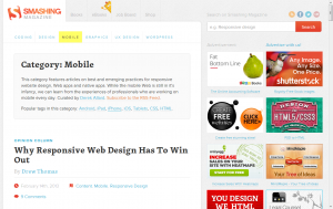
Smashing Magazine Screenshot


4. Smashing Magazine: An online magazine for designers and front end developers, to stay current with the ever evolving tools and techniques. It also has a great compilation of books and ebooks that could be references on your next project.

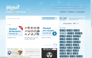
365psd Screenshot


5. 365psd: 365 psd, needless to say, means one high quality psd file a day. A great resource for free UI kits, page templates, and icons to get you started or help get over the creative block. And do sign up for a freebie everyday.

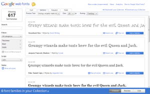
Google Web Fonts Screenshot


6. Google Web Fonts: Are you still married to times, arial, and helvetica? Here are hundreds of open source free fonts to help design great looking yet highly readable sites.  Don’t forget to look at the “pairings” feature. It recommends best complementary font pairs to add that extra zing to the design.

So go forth and steal, and please keep adding to this list.

UX Lessons from Startups

UX

User Experience or UX dictates the connection strength of your product to your user. From a functional connect by how easily the user can accomplish a task, to an emotional connect which is a sum total of experience during and after using the product. It goes way beyond just the aesthetics or how the look (though it is an important part). Its really about how well do you fulfill the user’s expectations and objectives. Sometimes, unexpected delights become even more important to create a loyal base of customers. Therefore, a vision of any new product should include a user experience strategy at the onset. It probably becomes more important for startups, as they just have one or two shots at success.

As a User Experience (UX) design agency, we find it more challenging, yet a lot more fun working with startups. There is a larger canvas for creativity in middle of crazy timelines and ever-changing requirements.

We discuss some useful lessons from startups that have been more strategic, therefore more successful at achieving a stellar UX –

1. Appoint a UX champion – Ideally, a co-founder or a key member of the startup should be articulating and driving the UX. We worked with a startup trying to connect service providers to consumers, where one of the two co-founders succinctly put forth his design vision in the beginning of the engagement. Thereon, he was actively involved in all design reviews and took the final call on any design conflict. He never compromised on the UX during development, even when less preferable alternatives could have led to faster implementation. Sometimes a product manager trusted completely by the founders dons this role. She then becomes the seed of an internal design team.

2. Clear about building an internal team or hiring an agency – It seems the new IP battles are being fought over design. Apple vs Samsung legal tussle is more about design than about technology. So the desired degree of control over UX leads to the dilemma between building an internal team and hiring a specialized design agency. For startups where UX is central to the product, our experience suggests that it is difficult to find good talent within a short time frame, even if there is enough budget. Plus it takes time to build a culture conducive for inspired creativity. An outside agency can help detail out the UX vision, establish a user-centered mindset, and create initial patterns and templates that an internal team can evolve eventually. In essence, a good design partner can serve as the mold for a future internal design team. Sometimes due to security concerns, startups hire designers on short term contract to work onsite. It may work in a production capacity to buffer peak demands on internal teams, but not for creating great design.

3. Define an explicit design process within the larger development methodology – In startups, there is a lot of effort spent on adopting the right development methodology and platform. Design is not thought as a process, rather an input into the chosen development process. A good design process is iterative and involves people from multiple disciplines. Our sense is that if a high level design exists supported by solid user research then adopt a Lean UX approach to fit well within an Agile framework. Alternatively, when starting from a blank slate, allow for completion of high level design (using traditional Waterfall) before enforcing a development process. (More on pros and cons of each in a later post).

4. Attempt to measure the RoI from the UX decisions – Our mantra is to test early and test often. Any and all design decisions should always be supported by some, even incomplete, data. Conduct quick informal or hallway usability tests (measure ease of use) to validate designs early using low-fidelity or even paper prototypes. And then graduate to more formal tests with high-fidelity prototypes. Even post launch, A/B tests are common before releasing any major UI enhancement. Also, with inexpensive tools like Visual Website Optimizer, it is easy to calculate the impact of design decisions. In other words, it is difficult to replicate anything that is not measurable. There are now tools to measure the RoI of UX, a sphere that has been traditionally thought of as art than science. It is always a humbling experience seeing a user stumble on what we thought was good design.

In conclusion, we understand that that every startup or for that matter every company is unique and has different priorities. However, a compelling UX should be an integral part of your strategy.

(As a sidebar, Indian government has made it easy to file design patents within the New Designs Act, 2000. We will present some free UX toolkits and resources in our next blog post.)
Usability Review of @Bubbles – A new kind of mail service

In a startup, the design is usually an afterthought after the more important challenges of business and technology are solved. Which means by then the design is more like a band aid or a lipstick on the proverbial pig. Probably the main reason why products here still lack that world-class feel, even though they are better in terms of features and performance.

A successful product usually has the right blend of usefulness, ease-of-use and engagement or emotional connect through aesthetics. For example, Facebook might score high on each of the three attribute, while a game like Grand Theft Auto may deliberately keep the ease-of-use difficult. Each of these attributes should be part of the product roadmap at the onset. By how much should you dial up or down each attribute or in other words what is the overall design vision? And who will be responsible to achieve this vision?

We feature the first of several quick audits to get a conversation started around the importance of design when you are a startup. We did a quick review of @Bubbles, a six month old startup trying to re-imagine email by bringing it closer to the art of letter writing from the good old days. It enables tools for your creative expressions, allowing you to scribble your thoughts, stick photos, sketch cartoons, draw diagrams, and attach sticky notes to your email as you would do on a physical letter.

We evaluated it on 4 key user experience parameters.

How well does it COMMUNICATE to users?


To reduce user’s memory load, it is important to use terms & language that connects to their existing mental model. Once you have adopted a mental model or a metaphor, then try to be consistent.

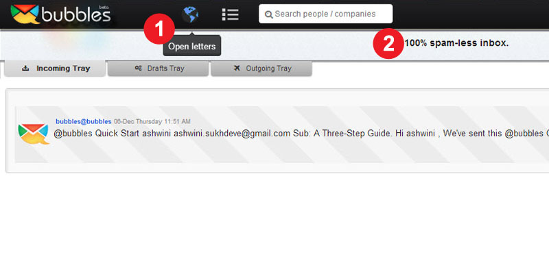
  1. Terms like “Open Letter”, “Direct letters” are not commonly used in context of letter or email writing and hence can lead to different interpretation. It also adds to the learning time for the user.
  2. Similarly, “No Posts” and “100% Spam free inbox” violate the mental model of letter writing. Either use a “letter” or “email” metaphor but use it consistently.

How easy is it to NAVIGATE?

  Ease of use is vital. The user should always be in control and take the intended direction to perform a particular task. To be able to do this, it is essential that the user understands the flow of screens or sequence of actions.

  1. The incoming and the outgoing mails have the same look and feel, which leads to some confusion. The status of the site or where you are at a given point is not well communicated.
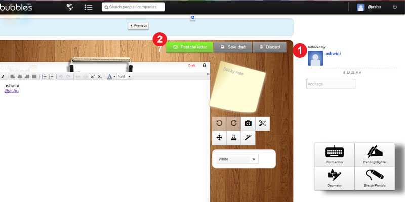
  2. Same page for public & personal letters – The sending route should be selected after the letter has been written. There could be multiple paths to doing this too.

How easy is it to INTERACT?

The information structure should make relevant connections between different pieces information and tools (features) to enable user to achieve desired goals.

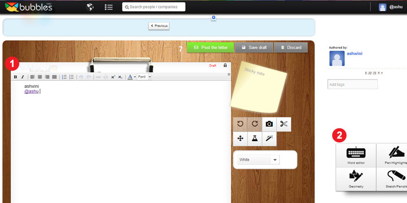
  1. Editing tools for the letter are scattered all over the page. A fixed layout for the toolbar would make it easy to use. Some drawing tools like – copy, paste, resize, rotate, etc could be integrated at one place to create a seamless experience.
  2. Every selection or user action should be followed by an appropriate feedback. For example, when a user selects a Pen tools, there is no feedback that it has been selected.

Does it create the right EXPERIENCE?

Overall, it is about experience.

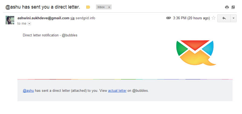
  1. Sent mail is a personal letter as well as a promotional letter for Bubbles, so it should be designed so as to attract more customers, who are not currently on Bubbles.
  2. Keyless Login creates a good experience but the learning curve should not be high.

Undoubtedly, Bubbles is a much better designed product than most. There is a design sensibility with some effort and thought behind each screen, icon and color palette. However, it seems that though there was an emphasis on graphic design (engagement or aesthetics), it could still be improved significantly with some thought on interaction design (usability).