Marketing Expense Tracker for Startups

I moved into a product role recently but for the majority of my startup life, I was in marketing. One of the things I always had lacking in my toolbox was a simple expense tracker. I looked around a lot but the best option was what I was already using and wanted to move on from — Google Sheets.

What’s wrong with a spreadsheet?

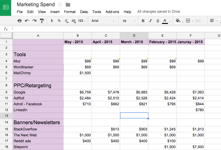
Google Sheets is a great way to record marketing spends compared to complicated expense management modules built inside even more complex solutions. It’s fast, everything is one place, everyone’s familiar with it, and there’s no easier way to collaborate than Google Sheets.
google-sheets-marketing-spend

But every time I shared the sheet with someone else to add spends made by them or their team, I was scared that something will go wrong. They might delete a column, remove a comment, change the amount paid. I normally trust people but this was the only place where I was recording spends. And it’s rather easy to fuck up with a spreadsheet. So, I would make a copy of my marketing spend sheet every couple of weeks or whenever the terror struck me. Over time, I ended up with 40–50 copies of the marketing spend sheet.

Also I often add comments to individual items with details on the campaign, the creative we ran, or simply if the campaign has already been paid for.
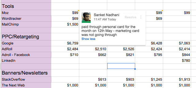
google-sheets-marketing-spend-with-comment

While comments in Google Sheets are awesome to collaborate, once you have a couple of comments, they start to get clumsy. And with 15–20 comments every month, it is easy to miss out on one of the important ones. Oftentimes, I also wanted a reminder to check on the RoI of a particular campaign or to make a payment, which was not possible in Google Sheets.

And of course, I wanted to compare and contrast the total spend against the budget, the spend previous month or the same month last year. Or even sum up and compare sub-heads like Tools, PPC or Events over a quarter or year. One of the core uses of spreadsheets is to help you add and compare numbers and I could have just written simple formulae for that (and I had some of them) but for most practical purposes, the analysis I needed to do was different most of the time. And then there were times when I just wanted the bigger picture — show the total divided under sub-heads, no need for individual expenses. Or show all items under PPC ads, we are spending too much there, so I need to figure out how we can cut down there.

All of these can be done with a spreadsheet, but it’s not the most efficient way. And there’s only so many rows and columns you can see at once in a spreadsheet.

I also talked to some other people in marketing and there were only two ways people were doing this in:

  • A Google Sheet like mine or Excel Sheet that they mailed back and forth in the organization to prevent the fuck ups I was so scared of.
  • Do nothing. And dig through your emails and credit card statement when the time came to put together the numbers..

There needs to be a better way for this.

The Solution

The next step before we get to the actual product definition is listing down the main actions a user could take in our marketing expense tracker. We won’t go into tiny details like inviting collaborators or editing the profile, we’ll just keep it to the actions required to solve the main pain points we just talked about.

User Actions

  • Add an expense
  • Add a reminder to an expense
  • See total spend in the month broken down under sub-heads
  • Compare spend against the budget
  • Compare spend in current month against previous month or same month last year
  • Compare spend under sub-heads across different time periods
  • Edit an expense after it has been added

Screens

The next step I use in the process is to think about the most logical way to group these actions into screens. Here are the screens we are going to have for our expense tracker:

  • Add Expense: The most obvious screen. Here’s where you can add an expense, categorize it and add a reminder.
  • See All Expenses: This is where all expenses for the month will be listed in chronological order. You can see all details about a spend, edit them or delete them from here.
  • Dashboard: This is where you can see total spend for the month compared to budget, and compare spends across months. Also all reminders will be shown here.

Add Expense
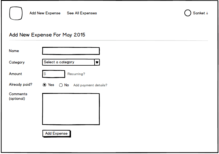
add-new-expensePretty self-explanatory but here are some pointers that the mockup doesn’t bring out:

  • The name field is a textbox but once you start typing, it will show suggestions that you can pick from as well. This ensures that you don’t end up using Adwords, adwords, Ad-words for the same item, making it easier for grouping and comparison later. Of course, if you want to add a new item, you can disregard the suggestions.
  • Category is to be picked from a drop-down so that you don’t end up creating too many new categories. If you want to create a new category, there will be an option in the menu. Or you can choose none if you want your item to be a sub-head by itself.
  • Amount can be made recurring for things like spend on tools for SEO or email marketing, retainer contracts with agencies or long-term campaigns. It’s a pretty frequent use-case to be out there. You can choose the currency at the time of setup.
  • Already paid? Then you can choose to add payment details like mode of payment and date. If not paid, you can ask to be reminded. You will get a reminder email and it will show up in your dashboard.
  • Additional comments are helpful to add details on the creative you used, campaign results (later on) and so on. It really could be used in so many different ways that I cannot fathom right now, so we will have it.

See All Expenses
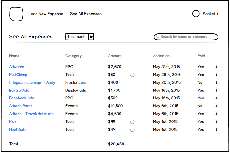
see-all-expenses

Additional details:

  • The expenses are listed in chronological order based on the date they were added on.
  • You can click on an expense to see details, edit or delete it.
  • By default, you see all the spends for this month but you can also choose last month, this quarter, this year and other well-defined time periods.
  • Clicking on the categories head will group all expenses under a category (see a use case for it?), the amount head will display spends in descending or ascending order and the like.
  • You can also see all spends on freelancers this year by first selecting this year as the time period and then searching for freelancers in the search box. You can search for individual items as well.

Dashboard
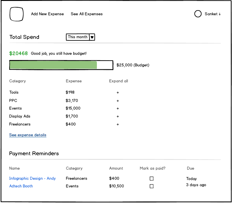
dashboard

The dashboard is rather simple.

  • It shows what % of your budget for the month have you spent already. If you overshoot the budget, the bar will turn red. The budget can be set during onboarding and changed from settings for current month onwards.
  • You get a quick breakdown of the spend by sub-heads right below with the option to show individual expenses under that head. Think we need it here or would people rather go to See All Expenses to see it in complete detail?
  • You can compare your spend against previous month/previous quarter/any chosen time period (you are allowed to select months for this, not individual days) by using the Compare option the date picker provides (very similar to how Google Analytics has it).
  • And finally at the bottom, you get payment reminders for everything that is due. If you have already paid something, you can simply check it and add payment details from the dashboard itself.

That’s it. That’s all I would build in v1 of the product..

Future Additions

Of course, I have ideas for what else can be added to the product. Who doesn’t? But as I said, I will evaluate them once v1 hits the market and I have data points on how people are using it. Here are some of the ideas:

  • Simply send an email to a particular address to add an expense.
  • Build a mobile app. Or probably start off as an app itself.
  • Automatically pull spends on Google Adwords, Facebook Ads and everything else that can be automated.
  • Show RoI for different campaigns. Again the details are a little fuzzy, but if the product could show RoI, it becomes a lot more valuable than a simple expense tracker. And a lot more embedded into the marketing team’s workflow.
  • Show possible savings. If the product is tied to Google Adwords, I could show ideas on which campaigns can be optimized.
  • Suggest additional channels to advertise on. You have budget left over for the month. Why not try out some additional growth areas? It’s a tricky problem to solve but a problem a lot of people have. And going from passive expense tracking to providing active suggestions makes it so much more valuable.
  • Some kind of gamification or feed to show who added what expense. If people see others are adding every expense and detailing them out, they will be pushed to do it too. Adding marketing expenses, after all, is not the most exciting job on the planet.

What do you think?

Is this a pain point you or other people around you face? Does a product like this help you? If you were to build this, would you build it any differently? Or prioritize the functionalities differently? Would love to have your feedback.

Why am I doing this?

Why would I put out a pain point and then discuss how to solve it in so much detail? Why wouldn’t I just go build it?

Because coming up with the initial product idea and actually building, marketing and supporting it are completely different beasts. Moreover, I want to get better as a product person. I want to be able to identify opportunities better, learn how to tackle them better and how to prioritize what to build. As much as I tried to find detailed case studies on how other products opportunities were spotted, how they thought of the solution, the trade-offs they made, I was not able to find good study material.

I have a bunch of product ideas that I have made notes on over the years. If this post turns out well, I will do the same with them. So do add in your feedback, brickbats or bouquets and help me become a better product thinker. Thank you!

Follow me on Twitter: @sanketnadhani

Behind the scenes of the new FusionCharts website – A step by step account

On 1st Feb 2014, we launched a new website for FusionCharts after 7 months of intense work. And two months after launch, now that we are done fixing all the bugs and optimizing the important touchpoints, I thought it might be a good idea to share everything that went into the new website – right from the objectives we set for ourselves to the tech and design choices we made to the SEO and analytics strategy we implemented.

I am going to set the context by interviewing myself after which we will jump right into the slideshow having the detailed process.

(Sanket – interviewer): 7 months for a new website, huh? Don’t you have better things to do?

(Sanket – guest): No.

(Sanket – interviewer): Why don’t you have better things to do?

(Sanket – guest): Because the website is our main shop, so it’s very very important for us.

Interviewer: Ha! So why did you need a new website in the first place?

Guest: Because I felt like it.

Interviewer: Being cocky is my job.

Guest: Sorry.

Well, we needed a new website because there were a lot of pain points we had with the previous one and also because we wanted to build for the future.

The previous website we had had started looking old, wasn’t particularly fast, could not be SEO-d properly because of architecture limitations, and had also gotten clumsy with all the additions we made to it over time.

Also, we wanted to have a responsive website given that 10% of our visitors are from mobiles and tablets (and will only increase in the future), move to the LAMP stack (from IIS6), integrate a CMS into the website, build measurability into everything we have on the website and most of all, have a great experience across all touchpoints which in turn would improve our conversion rates.

Interviewer: Still doesn’t sound like a lot. Why did it take 7 months?

Guest: Yeah 7 months is a long time but we really wanted to get our website right this time. It has over 400 pages of content (or 1400 if you were to count our complete demos section), so it was a massive project. We also redid all our demos, which are very comprehensive themselves. And the biggest reason why it took so long is because we did all of it in-house with a 4-person team – me, 1 designer, 1 front-end developer and 1 back-end developer (excluding the demos which had a separate team).

Interviewer: You talk a lot.

Guest: Didn’t you call me here for that?

Interviewer: What was the process like?

Guest: And then you say I talk a lot.

We started right from setting the objectives, putting together what success would look like in the end, define the journey users would have on the website, get the information architecture in place, write content, design, develop and launch it. And of course, there are things like choosing the server hardware, incorporating the SEO strategy and building analytics into every action we wanted to measure. I have detailed all these steps in the slideshow below.

And even after we launched it, we are constantly optimizing and improving the experience on the website by looking at the data coming in and the feedback from our users.

Interviewer: So you are still not done, huh?

Guest: You could say that.

Interviewer: Are you happy with the results? Did you achieve everything you set out to achieve?

Guest: Wish I could say that.

Interviewer: So you wasted your time?

Guest: No, never said that. I would say we have achieved 70% of our objectives and are still working on the others – constantly experimenting, optimizing, keeping what works, documenting what doesn’t.

Interviewer: Not too bad then?

Guest: Yeah, not bad at all.

Interviewer: One last question. Do you like interviewing yourself?

Guest: Absolutely. I will do it again.

The complete process – Slideshow

And now without further ado, here is the slideshow that captures everything that went into revamping our website. I hope you will find it helpful when you decide to revamp your own website, either entirely or in part.
And of course, if you have thoughts on what we could have done better, please let me know in the comments.

Dear Marketers — Let’s create more value, not more marketing

Yes, you are going to lose weight, stop smoking, learn a new language and spend more time with your family next year. And while you are in the make-a-bunch-of-resolutions-to-be-totally-awesome-next-year phase, there’s another resolution I want you to consider. As a marketer, do not create more marketing. Create more value.

[Warning: This is going to be brutal. So come along only if you are not afraid of pain.]

7 things to learn about business from a stripper doesn’t really have a lot to learn from, neither does Lady Gaga’s hairstyle. x ways to do y like z where x=7 or 10; y=business, marketing, sales or customer relationship; z=stripper, drug dealer, Lady Gaga or Justin Bieber is done to death. Stop. Now.

Cut down on the sensational headlines and link bait posts. 10 secrets you didn’t know about aren’t really secrets. The Web is a big place, and there’s a ton of information out there.

Those infographics about nothing in particular and then those infographics about infographics are not helping either.

Stop shoving that highly-acclaimed guide of yours as soon as I hit your blog. Let me read the blog post I came to read.

Your dumb social media quizzes aren’t really creating engagement. They are dumbing down an entire generation. Last time I checked, they were the single biggest reason for bringing down the collective IQ of humankind to 40.

Your case studies aren’t really case studies. They are glorified customer testimonials. Might as well call them that.

Your seats aren’t really limited and time is not really running out. Figure out better ways to create urgency.

Your offers and discounts are hurting sales cycles at large. Buyers now expect discounts from everyone. Get people to buy from you because you have a great product, not because you have a discount running.

Creating more value

Over the next couple of years, we marketers are going to gain more and more clout as buying behaviors tilt more towards the marketing side of things. Our budgets will increase and instead of using that to create more marketing, we can use that to create more value. A lot more value.

Create tools and widgets that help people do their job better and faster. In turn, you will earn their trust and respect. Think Hubspot’s Marketing Grader or Twitter’s Bootstrap.

Create best practices guides that are not a rehash of what you can get from the first three search results on the topic. Think deeper about the topic, ask around your team, talk to your customers and then create the guide.

Have an opinion. That list of 25 WordPress plugins isn’t too hard to get. What’s hard to get is the experience people have had with the plugins and what comes recommended by them.

Curate content. The exponential rise in content marketing is also leading to an exponential rise in content marketing crap. Create value for your audience by going through all of it and suggesting the must-read pieces for them, thus saving them time and some terrible writing.

And most of all, stop thinking of yourself as a marketer. Start thinking of yourself as the guy who creates the best possible experience for the users. Right from their first click to when they renew with you. Personalize the website for them, predict what they need next, give them a great mobile experience, give them content tailored to their needs and make it super easy for them to contact you when they need to. And when they do, again give them the best experience by giving your teams complete visibility of all previous interactions. And this is not an easy job. This will require you to get the entire organization in line with your vision, make it everyone’s job to give users the best experience, get your systems talking to each other and and put in place the infrastructure required to give you end-to-end visibility.

Final words

From creating more marketing to delivering the best experience for our users, we marketers have a long way to go. But admitting it and taking a pledge to change the way we think is an important first step. From there, it can only go upwards. And if we all pledge to do it, the entire marketing community can go from being called the guys who put lipstick on the pig to the guys who actually create value.

What about you? How are you going to stop creating more marketing and create more value instead?

Reblogged from Poke & bite

How Visual Website Optimizer got to 2,500+ paid customers through great content and rigorous A/B tests

Last month, I promised to bring you stories of how Indian startups took their products to the world and got the inside scoop on how WebEngage used educational content and live demos to get to 7,000 users in less than 15 months. While I have been slow in bringing more stories to you, this one should more than make up for it.

In this post, I bring you the story of Visual Website Optimizer in conversation with its founder and CEO Paras Chopra. Visual Website Optimizer is an easy-to-use A/B testing tool that allows marketing professionals to create different A/B tests using a point-and-click editor (without needing any HTML knowledge). It is one of India’s fastest growing startups and has got to 2,500+ paid customers including the likes of Microsoft, AMD, Groupon & Airbnb using great content and rigorous A/B tests.

Let’s get started.

How did you get the initial buzz going for your product? 

Paras: Initial buzz was entirely product driven. The concept of visual A/B testing was non-existent then so the product was radical in that sense. A/B testing existed, but it wasn’t this easy.

Did you have marketing built into your product, and were you marketing your product as you were developing it? Or did it all start only after you had a finished product?

Yes, we detected successful A/B tests and requested for a case study from the customer automatically. The case studies gave a lot of buzz. First MVP was done in a month and after that product evolution and marketing started simultaneously.

Did you have a marketing plan in place when you started?

No, I did not have any plan. It was very organic without any plan whatsoever.

Who do you pitch your product to in a company?

Marketing analysts. Our target customer is a person who actually does the A/B tests.

I remember you mentioned on your Mixergy interview that you didn’t want the world to know that you were a one-man show to begin with. Was it difficult to look like a credible company that way? And was that an even bigger issues being an Indian product company?

No, it wasn’t difficult. As long as they were getting a good product and quick service, the customers didn’t care to verify whether it was a one-man show or a 100-people company. Interestingly, many people still don’t know we’re an Indian company.

As Visual Website Optimizer grew, how have you scaled up your marketing? Increased frequency in terms of content? Bigger campaigns? Targeting higher-value customers for your enterprise plan? Also, how have you scaled up your team to take care of these activities?

A bunch of things. Increased frequency from one post per week to two on our blog. Parallel guest posting. Making guides and dedicated landing pages for SEO. Comprehensive retargeting. Started PPC and display to measure ROI. I don’t think marketing should aim to target higher-value customers. They probably need a lot more offline interaction, so marketing works on nurturing them currently.

On the people side, we scaled it by bringing in additional super-smart people. Including me, right now we have a team of three. We’re looking to expand it by adding three more people. Yes, now we have a plan and going forward clearly defined roles in content marketing, generalist tasks, paid marketing and design.

What marketing channels have you used? What has been the most effective for you? Why have they been so effective?

Most effective has been our own case studies and comprehensive guest posts in prominent publications such as Smashing Magazine, SEOMoz, CopyBlogger, MarketingProfs, etc. We also nurture our user base by regularly sending them case studies and use cases.

What about paid channels? How do you go about choosing the right ones? 

We’re still learning on this, but the key is to explore new paid marketing channels that haven’t been exploited yet. All good paid marketing channels dry up ultimately and ROI dwindles. So you have to be on the edge of exploration. That’s how markets work.

How do you measure the success of your marketing campaigns? Do you compare them to your other campaigns? Industry benchmarks? Or just get an overall feel whether they are successful or not?

The only metric our marketing cares about is number of free trials. I believe that once free trial is generated, product should speak for itself so revenue should be a function of product if free trials are from the intended audience. Shares, visits, etc. are all fluff. We don’t obsess about them. We do compare all our activities to see which one gives most bang for the buck and most volume.

How do you use VWO to improve your own conversion rates? What are the top 2-3 biggest successes you have had from A/B testing?

We conduct many tests. Some examples:

http://visualwebsiteoptimizer.com/split-testing-blog/headline-test-increases-clickthroughs/

Behavioral targeting: http://visualwebsiteoptimizer.com/split-testing-blog/behavioral-targeting-case-study/

Heatmaps: http://visualwebsiteoptimizer.com/split-testing-blog/increase-conversions-using-heatmaps/

http://visualwebsiteoptimizer.com/split-testing-blog/left-vs-right-sidebar-which-layout-works-best/

Right now, five different tests are running on our website :)

Apart from the A/B tests, what other numbers do you look up on the website? Funnel drop-offs, bounce rate, what else do you look at?

Navigation paths and traffic sources with highest conversion rate.

I love the blog you have. How did that get started? And how do you measure its impact?

I love writing. Have written a book on Nihilism, so I can write whole day long :) Impact, was measured in terms of traffic to blog and then conversion of that traffic to trials.

What kind of community do you have around your products? How do you keep them engaged?

We have a very lively community on Twitter, GPlus, Facebook and our blog. We have 3000+ followers, 2000+ blog readers and remember that A/B testing is a niche. In terms of content, again case studies with actual learning work best. Just numbers without flesh doesn’t work.

What about partnerships and integrations? ClickTale, Drupal, how have they helped you increase your reach? How did you go about getting them?

Yes, partnerships increase reach if done properly. For commercial companies like ClickTale, they approached us. For open-source like Drupal, we simply developed modules.

What about your personal brand? Have you built that and used it to take the word out about your products in turn?

Yes, I think so. My blog and interviews such as on Mixergy help a lot. Our bootstrapped story helps a ton too.

What about the marketing team? How big is it and what roles do each of them play? What do you think is an ideal marketing team for a tech startup?

Ideal marketing team is: content, paid, generalist and designer.

We have a lot of good products being built in India but very few go on to become blockbusters. Where do you think these startups are faltering with their marketing? What advice do you have for them?

I think they do a very poor job on using the content effectively. My advice would be to product great content consistently, share it with influencers, build a brand of the company around content and eductation and just keep scaling that up.

That’s some great advice Paras. Thanks a lot for sharing them and being an inspiration to the Indian startup community at large.

Dear readers, what did you think of the interview? What else would you like to know when I talk to more successful startups about their marketing? Let me know in the comments.

Reblogged from PokeandBite.com

How educational content and live demos got 7,000 websites using WebEngage in 15 months

I believe one of the best ways to learn marketing and business in general is to learn from other people’s successes. And in a bid to do that, I am going to bring to you interviews of Indian startups that have taken their products to the world. We will talk about how they got the initial buzz going, where they got their first set of customers from, how did they scale that up, what marketing metrics they measured, the mediums they used, the stories they went to press with, the biggest mistakes they made, how they handled criticism and more.

Here I am in conversation with Avlesh Singh, co-founder and CEO of Webklipper, the company behind WebEngage. WebEngage is a powerful customer engagement suite for your website that lets you collect feedback, gather customer insights and ultimately drive sales and conversions. They have gone from nothing to 7,000 customers (both free and paid) in less than 15 months and have done it all with a very lean team. Let’s get started.

What does WebEngage do? How does it help websites engage their visitors better?
Avlesh: WebEngage is an in-site marketing toolkit for online businesses. We help companies improves sales/conversions and help them collect awesome insights from their customers. All in real-time.

Using our Notifications, companies run targeted promotions by offering discounts and value adds to people “most likely” to purchase. Surveys on the other hand help customers collect insights to measure customer satisfaction and do lead generation on their site. And our Feedback product is the world’s simplest customer support tool that gets you up and running with a no-frills support channel on your website in less than a minute.

So who do you pitch your products to in a company? Marketing?
Our primary audience is Marketing and Product Management. They see the most value in this tool.

What’s your pitch to them?
Simple. In this order:

  1. Ever walked into an offline store? How often did the salesmen try to educate you or nudge you into buying something? We let you do something similar; ah, for your online store!
  2. Not sold yet? Okay, your marketers can run in-site campaigns without changing any code on the site; without seeking any developer or IT help. Oh yes. This is true. And these are truly rich messages with dynamic targeting capabilities. Care about user insights on your product or catalog? Care about user feedback?
  3. Not sold yet? Okay, see who uses our products. Also see some live demos on these sites.
  4. Not sold yet? Okay, take a live demo.
  5. Not sold yet? Here’s the website and our blog. Look forward to work with you. Bye.

Let’s back up a bit here. Tell me how you got the initial buzz going for your product? What part of it were you able to convert to real paying customers? Where did you get your first customer (or first set of customers) from?
We were in private beta for 5 months. Forget paying customers, we had a tough time finding the bigger guys to use our product. We focused a lot on education through content on our website and blog, answered direct question on Quora etc. Our live demo feature went viral and a lot of developers came out of curiosity to the site to find out how that thing worked. Here’s a sample of how curious developers got :-)

From free to paid, it was a three month journey. We went live in Oct 2011 and it took as good 2 months to get our first set of paying customers. We reached out to our beta users announcing the paid plans and features that would come along with it. Some tried out but never paid; a few took the big leap of faith and became our first set of paid customers – Art.com, Park-n-Fly, MobileDevelopmentIntelligence, Cleartrip, Justeat, Makemytrip etc to name a few.

75% of our customer base (free and paid) is outside India. That is how it was to begin with, too. With most Indian customers, early on, we had to go for F2F demos and explain the product in-depth for them to take the plunge.

Did the marketing start as you were developing the product or only after it?
It almost went hand-in-hand. So far, we have only done content marketing. And we have been done a fair job. Our plan is to do 100x better with content.

Did you have a marketing plan in place? Did you have numbers, like say, I would be able to get 100 signups if I do this and this and this? How much of that worked out?
No, we never had that. And it’s difficult for our category because customers are not “looking” for a push messaging tool on Google. We are trying to “create” a market and content is the only predictable way to go about it. This is definitely not true for customer support tools as they can direct their marketing spends on Google because too many people look for such tools everyday.

Also I see you have a Powered by WebEngage link in your surveys and feedback? Is that like a major marketing channel for you? What kind of traffic and conversions does it bring in?
It is the biggest source of inbound leads for us. Over 40% of our sign-ups happen from those logos in the three products. It is also a blessing in disguise because over a period of time we have started commanding huge premium from our enterprise customers who would otherwise want to get rid of those logos on their sites. We end up losing a lot of visibility but then get paid well for it too.

What other marketing channels have you used? What has been the most effective for you? How do you go about figuring which marketing channel will work for you?
We tried display ads. We tried paid app directory listings. We tried outsourced sales and marketing arms in the US. None of these worked very well from customer acquisition viewpoint. Content continues to rule our marketing plans. We are spending a lot of time and money now on building great quality content – videos, how-tos, galleries, use-cases etc. In the next month or two, you’ll see a lot of stuff on this front. We plan to do display advertising too, but with some corrections by incorporating learnings from our previous experiences.

As WebEngage grew, how have you scaled up your marketing?
In our case, we focused a lot on support. We used to (and still do) take calls at 2 in the night, pretty much everyday. We have managed to do this with great success. Happy customers are the best marketers. We got a lot of referrals from them. Most of our marketing efforts are around content creation. And so far, we have managed to do it in-house. We haven’t spent too many ad dollars.

How do you measure the success of your marketing? Compare them to historical data, industry benchmarks or…? And by marketing I don’t just mean paid campaigns, even a new website, new onboarding emails or anything on those lines.
We measure it based on conversions. Be it paid marketing or content, we have always believed in creating a workflow to measure and track conversions. Free tier sign-ups through paid marketing don’t work for us. That’s the reason we don’t spend ad-dollars. Content gives us a low cost channel of customer acquisition which we can further up-sell/cross-sell to. That’s one area we are trying to improve upon.

For our website, blog, video etc, we measure the success by amount of time spent on each of these. Customers on an average spend over 7 minutes on the site. It used to be less than a minute 6 months ago. In any SaaS business, customers want to read a lot and be sure that they want to pay before choosing to do so. Content helps in decision-making.

How do you keep a visitor engaged right from the first time he hits your website to him becoming a customer? How does your tool itself help with this?
We eat our own dog food. Spend a minute on our pricing page and you’ll come to know :-) . Take a look here – http://blog.webengage.com/2012/11/24/how-we-eat-our-own-dog-food-at-webengage/
Plus our live demo feature keeps users busy and educates them very well on what we do; it generates a lot of leads for us too.

What are the top 2-3 insights you got using WebEngage that you wouldn’t have got otherwise?
Here, in this order:

  1. The amount of time and effort needed to sell a $100/month product is the same as $1000/month product. I’d rather channelize my efforts into finding high ticket size deals than smaller ones; I used to think otherwise until an year ago.
  2. There is no better marketing tool than a bunch of happy customers. Some of our biggest enterprise deals have been through warm intros by such customers. How did we keep them happy? Beautiful product and proactive support; I undervalued the importance of latter until an year ago.

What are some of the biggest mistakes you have made on the marketing side of things?
We “outsourced” our sales/marketing to a sales-on-demand team in the US. I won’t name them. We spent crazy money in “retainer” fees and had 0 conversions by the end of pilot. Their so called “smart team” had no clue of what we were building, even towards the end of the pilot.

What marketing numbers do you measure? How often?
Money spent. Number of conversions – free and paid. Every month.

Let’s talk pricing. How did you get to the $15-$99/month model you have? Is that the price you started off with as well?
Mostly by talking to customers on how much are they willing to pay. Yes, this is our original pricing. But, we have made a lot of tweaks to the features being offered in each of these plans.

What tools and systems do you use?
Our own for tool for in-site marketing. And Adwords. Nothing major apart from that.

Your new website is a massive improvement over the old one. How has it increased your conversions? What objectives did you have in mind going into the new website?
Oh yes. We had only one objective, have people spend more time on the site and “see” what we do. Everywhere you go to, there are links to see our products in action. That was the only way to educate people on what we do. Take a look at this page – webengage.com/how-it-works

What advice do you have for startups planning to do an overhaul of their website?
Only one – decide what you want from it. Sign-ups, Conversions, Branding, Education … You can’t design a site to do all of the above. That’s the area we generally go wrong. Designing it with one objective always helps.

What kind of community do you have around your products?
None, yet. We want to build one.

What about partnerships and integrations?
We have focused a lot on integrations. Take a look here – webengage.com/integrate-with/your-website. This has worked out very well, because all of a sudden, customers start discovering you on new platforms. They would have otherwise not even known about us. We continue to focus on this. Second, we are building robust API’s with a larger goal of involving developers in building some intriguing applications on top of WebEngage. First cut here – docs.webengage.com

We have just started exploring partnership opportunities. Too early to comment.

What about your personal brand? How have you used that to increase the visibility of your products?
Yes, I am a classified spammer in the virtual and real world who leaves no stone unturned when it comes to promoting my product. Too bad, I know.

What do you think is an ideal marketing team for a tech startup?
I keep saying this – initial selling and marketing has to be done in-house and preferably by the founders themselves. If you, as a founder, cannot sell your product, no sales guy can. It is that simple. But its tough to understand as well, because I see most founders in tech companies get uncomfortable upon hearing this.

With 6700+ customers, you have been very successful in taking your products to the world. What advice do you have for other Indian startups who are looking to take their products to the world at large?
See, how fast things are changing. That number is now 7100+, both free and paid :-)

Here, in this order:

  1. Build a good product. Great brands were not built by advertising or marketing.
  2. Make sure there’s zero human touch in the product. Customers outside India don’t like getting stuck in a workflow that needs human intervention.
  3. Selling and marketing is a D-I-Y job until you reach significant scale.
  4. Network with right people. Don’t shy away from seeking help or intros.
  5. Have a good website. There’s no alternative.

Educational content and live demos definitely go a long way with marketing a product that customers are not looking for. Thanks Avlesh for the great insights.

Dear readers, if you have any follow up questions for Avlesh, please leave them in the comments below. He’s a busy man but I will get him to answer them :)

This article was originally published on Sanket Nadhani’s blog Poke and Bite

Zomato “gets” foodies, and it gets them so well

I am a foodie. And a big Zomato fan, no pun intended anywhere. Here, I am going to talk about everything we foodies love about Zomato and all the things it could do better.

For the uninitiated, Zomato is a restaurant discovery platform with 74,800 restaurants listed across 19 cities and 4 countries, and claims to have served 62.5 million foodies till date. More simply, it is about food and where to find the best of it.

So this is how I met Zomato. I was in college till 2009, and whenever I needed to know of new places to eat or hang out at, I just asked a couple of friends and I had more recommendations than I could handle. But once I entered the world of technology, everything in life started to begin with a Google search. But that’s not how I discovered Zomato. That’s how I discovered that websites of restaurants, when they have one, are completely useless. They talk about everything except what I need to know.

I got to know of Zomato in a rather funny way. I was looking for some kickass About Us pages on the web, and a friend of mine pointed me towards Zomato’s team page on Facebook. It spoke the same language I spoke, had this young and fun feel about it, quirky bios of everyone on the team. I loved it. Then I gave their product a try. And I uttered — “My precious.”

And we have been together ever since. It’s been a rather smooth relationship, and now I will tell you of all the things I love about it.

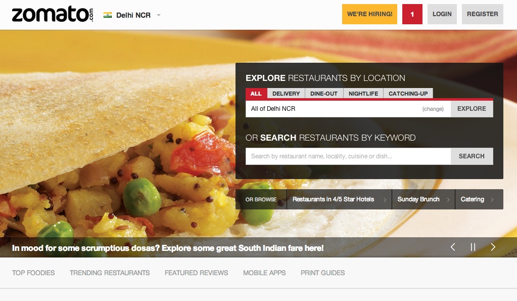
When do you look for a new place to eat at? Most likely when you are in the mood for some good Italian food but have been to little Italy thrice in the last fortnight. Or you are at a friend’s place in your shorts and floaters, probably a little drunk, and want food delivered to your doorstep? Hyderabadi Biryani has not been very kind on your stomach lately, so you want to go for someplace lesser spicy. Zomato delivers on both counts by allowing you to search for restaurants by fine dining or delivery in your city. There’s also catching up and nightlife if you are in the let’s-go-hangout mood. And if you like searches the Google way, then you have a simple Search bar you can throw in all your keywords into.

But that is no rocket science, is it? No it isn’t. Actually most of the things that Zomato does isn’t rocket science. It’s just that they do it well, really well.

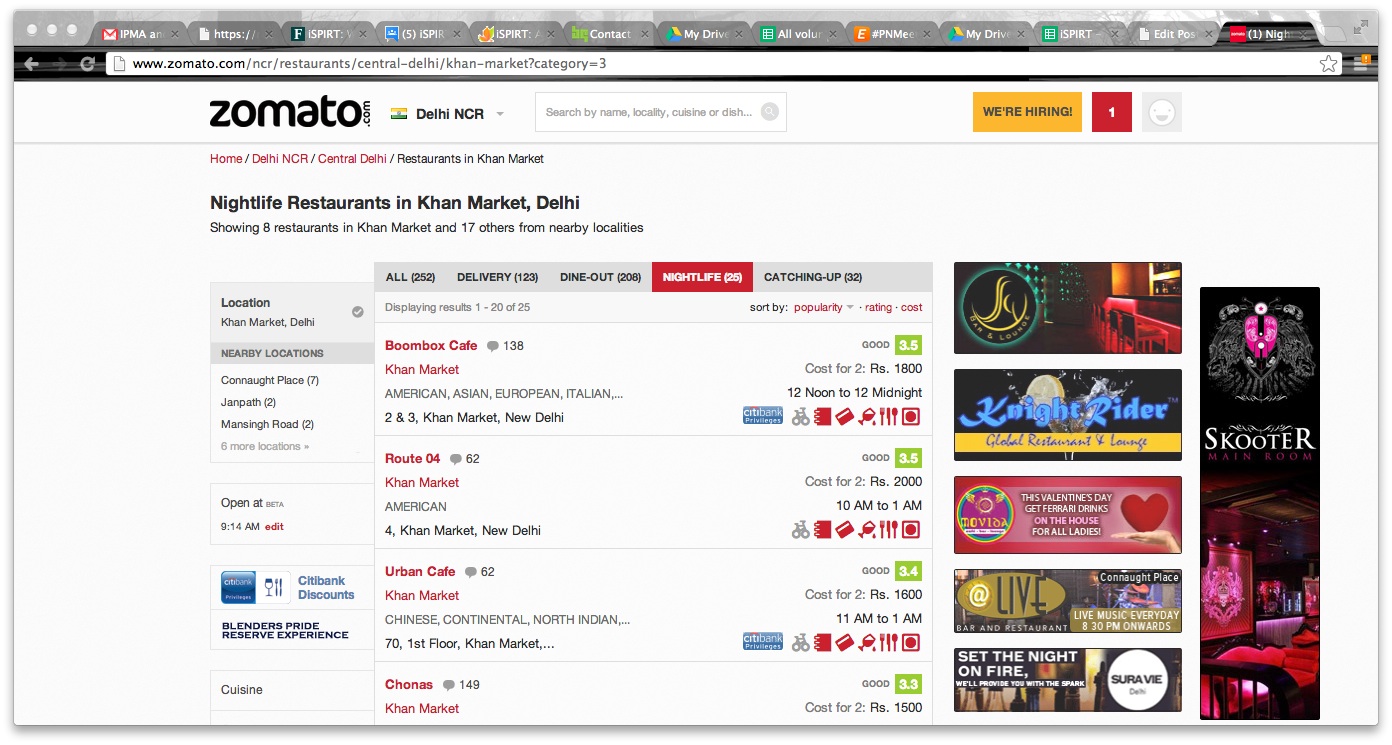
Then you get your search results in 0.035 seconds in a beautifully laid out page with everything you need. Ratings, timings, cost for two, bar or no bar, cash or card, reviews from people you follow (more on this later) and more. And then you can apply filters like wifi, outdoor seating, buffet and whatnot to find that perfect someplace for you. Again, all of it in what I can only call a lovely interface.

Then you choose a restaurant, and are presented with all the details you need on the restaurant. Up-to-date scanned copies of the complete menu (which they go door-to-door and collect manually), photos of the place and food (not the best, but manageable) and most importantly reviews. Comprehensive reviews from foodies, big foodies and connoisseurs. The reviews tell you everything about the ambiance of the place, the service, the dishes to try and then they give you more photos.

The reviews were not always these helpful. Then Zomato decided to create a food social network of sorts, and there has been no looking back ever since. You can follow foodies, so every time they add a new review, it comes up in your notification bar. Passionate foodies and wannabe food critics use this as an opportunity to educate their followers about food and the best of it.

As the number of reviews you post increase and more people find it helpful, you go from foodie to connoisseur, and you also become eligible for the leaderboard which is displayed in each city’s homepage. The catch is you have to enter a review having more than 50 words, and when you are doing that, you might as well write a good detailed review. And with the recent Instagram integration in the reviews, you can add pics for other foodies to drool over.

Sounds like the perfect love story, doesn’t it? Well, almost. There are some things that Zomato could have done better though.

The ads. They are some of the ugliest ads I have seen on the web. Every time I search for restaurants, a bunch of these ads come up in the right panel. And every time I see them, my eyes bleed and a little part of me dies. I understand Zomato has to make money and restaurants work with shitty digital agencies, but there has to be a better way. Featured listings, photo albums, more details, whatever it is that they can make money from as long as the ugly ads can go out the window.

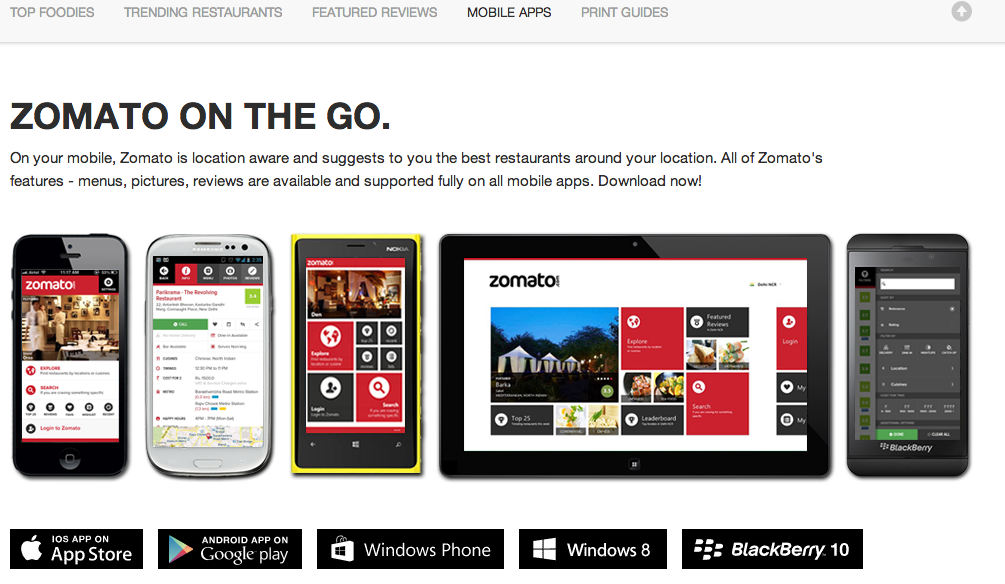
iPhone app. While it has seen big improvements over time, it still isn’t as good as the website experience. And the consistency is missing across the two interfaces. You can just search by location or cuisine on the app, not by delivery, dine out, catching up and the like. But an interesting feature is the instant recommendation that tells of you of a random new place near you — if you don’t like it, just shake the phone and a new recommendation will come up. I think I could use a variant of this on the web interface as well.

The tags. A cafe is a cafe to me, so when it comes up in my search for Italian food, I start getting cranky. And this happens because under the cuisines tag, the cafe has American, European and Italian marked against it when it serves four dishes for each of those cuisines, and pretty bad one at that. Same with pubs having Indian, Mughlai, Chinese and Italian slapped against them. Of course, I have no qualms if the cafe or the pub serves really good food, but when I am looking out for good Indian food, neither a pub or a cafe or a restaurant having a total of three Indian dishes is what I am looking for.

Notifications. While I like to be notified when someone I am following posts a new review, why do I have to be notified when someone I follow follows someone else? I want to follow their food trail, but not every single thing they do.

All that said and done, I have to commend Zomato for everything it has done for us foodies, and for the industry as a whole. Only time will tell how it fares against the Yelps of the world as it expands into more mature markets, but it’s got an international product and the balls to take on the world.

I wish them all the best.

Building for the world? Then take it to the world.

[This post is written for Indian startups. If you are not one, you will not find much value in it. But don’t take my word for it. Read through the post to know for yourself.]

I have been noticing an interesting trend in the Indian startup landscape over the last 12-15 months. Or something like that. Indians are building good solid products that they intend to take to the world, only to end up becoming world-famous in India. Indulge me, will you?

The Indian startup community has been shaping up pretty well over the last couple of years, and these folks are well connected to each other. Startup events, emails, Twitter, all of them put together keep the spirit going. Now when a startup gets to work on its next big idea, they go to this community for feedback and nice people that they are, they send in a lot of it. The team soaks in the best ideas, puts together a solid product and gets ready to launch to the world.

They send in a note to PluggdIn and YourStory who do a nice roundup on them, and ask the startup community to go spread the word for them. They are promised a t-shirt. And of course, these folks are happy to see the feedback they sent implemented in the product, so they go tell their first-degree LinkedIn connections about this new world-changing product.

The team sees a lot of “buzz” around the product and some customers start trickling in. These are early days, and it can only grow from there. Happy with the results, they go back to writing code. They have a whole list of features that people had asked for.

They implement one feature, two features, 17 features, and blog about all the awesome new stuff they have added in the product. They engage in conversations about their product philosophies with the startup community on Twitter who commend them for their passion.

Good things will happen soon.

But six months down the line, the trickle of customer continues to be a trickle. The “virality” the initial buzz promised is nowhere to be seen. The sales cycles for whatever customers are coming in is much longer than they expected.

They go back to the startup community to bounce off ideas. Over a beer, they conclude that customers are to be blamed. Companies want to be at the bleeding edge of technology but feel buying from a startup is risky. They still want their software to come from monstrous enterprises. So it’s a problem with the buyer’s mindset, not with the product itself. But soon they will realize that the enterprises are unable to keep up with the rapid strides in technology, and they will come knock startup doors.

It’s only a matter of months, they all agree.

Drawing comfort from the collective grief and the solution in sight, they go back to work on the killer social integration feature they have been planning for long.

Social integration done, 47 other features done but 12 months down the line, the customer story is still the same. A trickle. They write a big long rant about how the world has to become accepting of startups because it is the small companies that move the human race forward. They elaborate on their point with blasts from the past and heart-touching anecdotes. They see a lot of buzz around this post. 92 likes, 45 tweets, 23 comments.

Ego massaged, they go back to…you see the cycle? And then there comes a point in time when the startup finally asks — how is it that I am able to create all this buzz but the customer graph refuses to budge?

Time for my rant.

You made a product for the whole wide world, and you took it to the whole wide….country. Your early people were all from India. And so were the people they spread the word to. The coverage you got and the rants you wrote reached the same set of people, again. So essentially all buzz you thought you created reached a small set of startup folks in India.

So what’s the solution? Go out, get covered in the TechCrunchs and Mashables of the world? If you have a good product in a sexy market, why not?

But not every product is meant to be TechCrunch’d, and not every product has to be. First, there are other sites like The Next WebGigaOm and PandoDaily that people keep forgetting about. Second, getting your product covered is not the only way to make two-hour Internet glory. Guest posts are an awesome way to get the word out as well. A lot of these sites look for guest posts during the weekend, when news is going slow and their staff is taking it easy. So put in some more work on the wonderful industry pieces you have been writing and reaching a total of 235 people, and pitch it to these guys instead.

Or what about the lessons you learnt from your entrepreneurship journey that you talk about on your blog? The mistakes you made, the lessons you learnt, the things you did differently, the rants. Why not pitch that to an entrepreneurship-focused blog like OnStartups or A Smart Bear?

How about the core philosophies you built your product on? Why not bring them out on A List ApartSixRevisions or Sitepoint?

Get yourself invited on a webinar in your niche that isn’t geographically challenged.

Get into one of those Twitter conversations that you usually have with heavy-hitters from the Valley instead. Mark SusterDave McClure, the list is endless.

Get into a heated exchange with one of your American competitors.

And if you don’t have time for any of these, just go buy some ads. PPC ads, newsletter sponsorships, display ad units.

If you are building a product for the world, take it to the world.
This article was originally published on Sanket Nadhani’s blog Poke and Bite

BrightPod makes collaboration for digital marketers simpler and faster, much faster

Synage Software, more popularly known as the DeskAway guys, are on to their next thing and they are calling it BrightPod. Sticking to their expertise of developing collaboration software, BrightPod is a collaboration tool built specifically for digital marketers. I got an early peek into it and while the the product and the segment they are going after hold promise, it needs work on the interface and a big push on the adoption side.

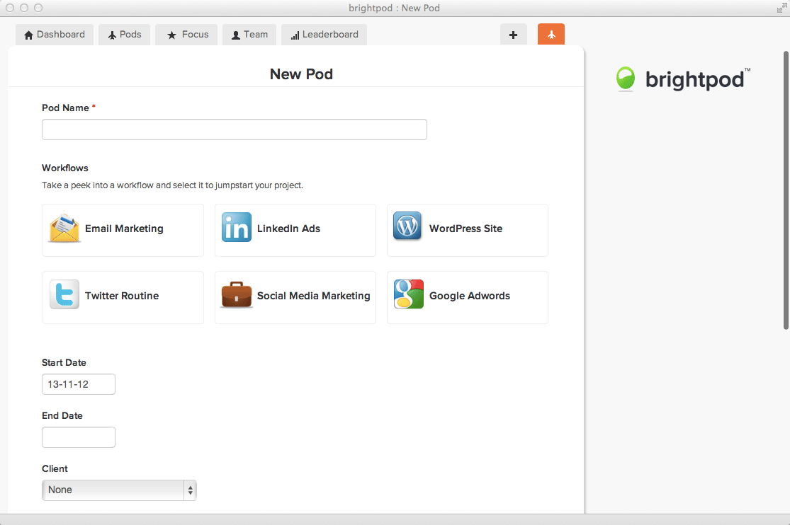
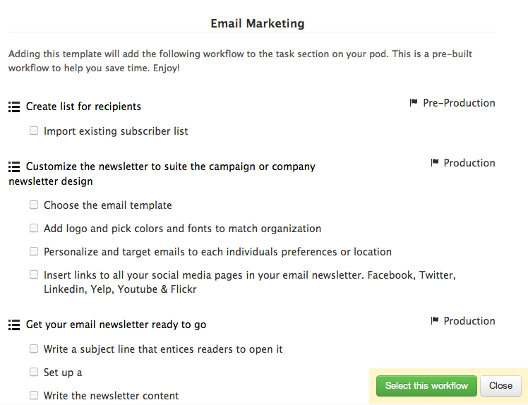
Just like any other collaboration tool, you create a new pod (a fancier term for project) to get started. But that’s where the similarity ends. Now instead of adding individual tasks to it, you choose a workflow from the existing ones or you create your own (coming soon).

Most common marketing projects like an email marketing campaign, a Google Adwords campaign and a social media campaign are covered. Select the email marketing workflow and all the tasks that it needs are automatically added to the pod. Just assign a client, set deadlines, add team members and you are good to go. Digital agencies, who run the same kind of campaigns (at least structurally) for different clients will find this a huge time saver.

I tried two of the workflows – Google Adwords and email marketing. While the Google Adwords workflow was well defined, email marketing had me lost. The team would do well to reduce the number of tasks or mark the ones that not everyone bothers about as optional. Another challenge going ahead with the workflow would be that a large company works very differently from a startup, who would overlook a lot of the tasks to push the campaign out of the door as quickly as possible.

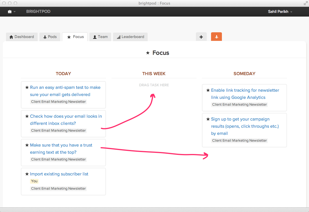
Moving on, BrightPod has another two more very interesting features. Focus and Round Up. Focus, as the name suggests, helps you focus only on key tasks and drown out the others. Temporarily from your mind, I mean. Marketing, unlike other functions in a company, is typically about a lot of small things coming together to form the complete piece. Star a task that is important, and it will appear in your Focus tab to allow you to, well, focus, on the task.

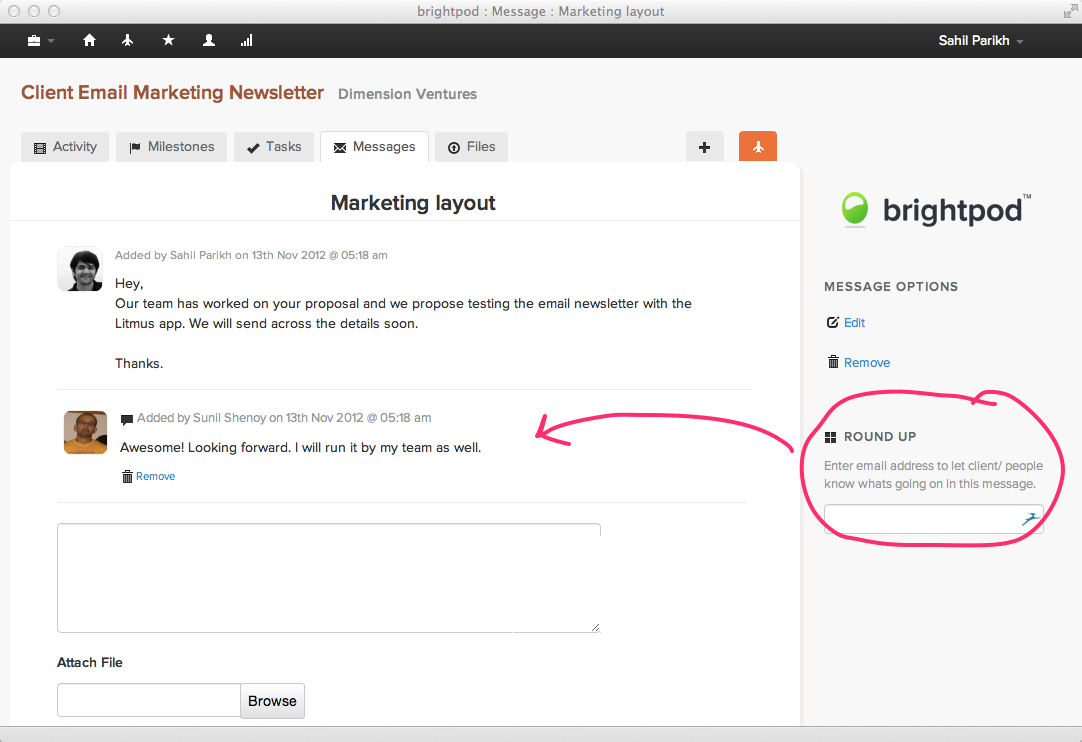
Before we get to Round Up, you need to get this. BrightPod is meant for marketers, with workflows and terminologies that marketers feel at home with. But marketing never functions in isolation. You have design involved, you have the web team involved, you might have other agencies involved and if you are an agency yourself, you need to get the client in on the project. This is where Round Up comes in. Just throw in the email address of the person you want involved in the conversation and they are in. They don’t have to get on to yet another app, they can just reply to that email and it will get added to the pod.

So far, so good. Now the things that BrightPod needs to improve. Simplicity is one of the main principles BrightPod is built on and while it delivers on certain counts, it doesn’t have the same kind of simplicity that Asana (something I have used extensively) or Trello (something that I have seen in use around) have.

The BrightPod dashboard, the first thing you will see each time you log in, has an activity stream of all the active pods. Every task added, every comment added, every milestone added, every task completed. For me, that was plain overwhelming, given how each workflow adds 20-30 tasks straightaway. When you log into your collaboration tool first thing in the morning, you want to see a list of the tasks that are due, the overall state of different projects and the important tasks for the day. While tasks due are presented in the dashboard, they are on this section on the right that doesn’t catch your eye first thing.

Also when you click on a pod to make additions and modifications, the navigation is different from that of the main screen, again leaving you a little lost. While these are small things that a user can get used to in a week of working with the app, these are things that typically come in the way of getting the buy-in of the whole team to move to a new application, or even earlier during the evaluation phase.

The biggest challenge BrightPod will face with adoption is getting companies used to the idea of having a specialized collaboration tool for marketers. Organizations like to have the same tool for everyone in the organization, so it would be interesting to see how the company solves this challenge.

All said and done, the product is still in alpha phase, so a lot of these things will get better with time. If you are digital marketer, go ahead, sign up for a BrightPod invite and let us (and the BrightPod team) know what you think.

If you are going through hell, take pictures for Facebook and other famous marketing quotes

Great people have come, and great people have gone. But what they have left behind for us is timeless wisdom that has survived the change of marketing models from 4Ps to 4Cs, Al Gore inventing the Internet and funny cats doing funny things. Here’s bringing to you marketing wisdom from eons back, and their translation in today’s world.
Only two things are infinite, the universe and human stupidity, and I’m not sure about the former ~ Albert Einstein back in time
What it means today – Only two things are infinite, the universe and social media agencies, and I’m not sure about the former.
I hear and I forget. I see and I remember. I do and I understand ~ Confucius
I click and I forget. I search and I remember. I open multiple tabs and I forget again.
Go to Heaven for the climate, Hell for the company ~ Mark Twain
Go to Heaven for the climate, Hell for the direct marketers.
Give me six hours to chop down a tree and I will spend the first four sharpening the axe ~ Abraham Lincoln
Give me six hours to chop down a tree and I will spend the first four reading how-to posts and best practices guides.
If you are going through hell, keep going ~ Sir Winston Churchill
If you are going through hell, take pictures for the Facebook page.
Three things cannot be long hidden: the sun, the moon, and the truth ~ Buddha
Three things cannot be long hidden: the sun, the moon, and discount coupon codes from affiliates.
My advice to you is get married: if you find a good wife you’ll be happy; if not, you’ll become a philosopher ~ Socrates
My advice to you is get married: if you find a good wife you’ll be happy; if not, you can make a viral video about it.
You have to give people something to dream on ~ Jimi Hendrix
You have to give people something to make a meme on.
I am not afraid of an army of lions led by a sheep; I am afraid of an army of sheep led by a lion ~ Alexander the Great
I am not afraid of an army of lions led by a sheep; I am afraid of a marketer with a drip marketing campaign.
First they ignore you, then they laugh at you, then they fight you, then you win ~ Gandhi
First they ignore you, then they look at you, then they click you, then you make money.
Some cause happiness wherever they go; others, whenever they go ~ Oscar Wilde
Some cause happiness wherever they go; others, wherever they click.
A man who dares to waste one hour of time has not discovered the value of life ~ Charles Darwin
A man who dares to waste one hour of time has not discovered the value of Internet memes.
You can avoid reality, but you cannot avoid the consequences of avoiding reality ~ Ayn Rand
You can avoid reality, but you cannot avoid the consequences of installing an ad blocker.
Hollywood is a place where they’ll pay you a thousand dollars for a kiss and fifty cents for your soul ~ Marilyn Monroe
Hollywood is a place where they’ll pay you a thousand dollars for a kiss and fifty cents for clicking on an ad.
I’ll be back ~ Arnold Schwarzenegger
I’ll be back.
Got some of your own wisdom to share? Bring it on, and become a living legend.

5 Tips for creating a compelling product tour

In between that 90-sec video on the homepage introducing your product and a visitor actually signing up for a free trial, there is this glue that is required. The glue that helps visitors map the problems they are looking to solve to the features your product offers. Or the other way round. Back in time when men hunted for food and the web had animated star-shaped red-colored 50% OFF buttons all over, it was a lengthy page usually called Features. Today, when people are busier and the web richer, it has been replaced by what is called the Product Tour.

A product tour is an all-round summary of a product. An all-round summary because it has to bring out all aspects of your product but without going into details like how it allows the color of the error message to be changed from red to pink. It is a very important piece of your product literature, and I am going to talk about the best practices for creating a compelling product tour.

Sell benefits, not features

You have heard this a million times. Make it a million and one. But when it comes to a product tour, the importance of this point cannot be overstated. In fact, it is one the main differences between a deathly-dull-almost-useless feature list and a product tour. A feature list tells the visitor what a product can do, a product tour tells what the product can do for him.

Apple is a master at this, like at most things marketing. For the iPad, rather than listing out all the business features of iOS and the apps it comes along with, Apple just says how business users can be productive right from the start itself.

iPad's product tour

Write these benefits like you write tweets — simple and crisp, conveying just one point at a time.Mint does this really well with its product tour, a very important piece of literature for them given the sensitive nature of the product.

Mint's product tour

Make your benefits easier to understand with use cases. Don’t come up with problem-solution scenarios that everyone can directly relate to — they just don’t exist. Use scenarios 80% of your audience can relate to straightaway and let the others draw a parallel. It is better to hit the exact spot with a majority of your audience than try hit close to the spot for all of them. TheFusionCharts product tour, which I was a part of conceptualizing, uses examples in plenty to drive home benefits that would have taken otherwise taken multiple paragraphs.

FusionCharts' product tour

Group similar benefits

Do not throw all the benefits of your product at once on your visitor’s face. It worked back in the day when the length of the feature list was as important as the features themselves but man has evolved now. Firstly, too much content overwhelms the visitors. These days, they digest it much better in bite-sized chunks. Secondly, for people interested in only a particular angle of the product, a page talking about that angle and around makes it much easier for them.

Freshbooks does this well by grouping benefits under simple action-driven heads.

Freshbook's product tour

Or you could group them in the sequential manner the product is going to be used in. With an email marketing tool like Campaign Monitor, a user will design the campaign first, then send it over and finally track its effectiveness, so that’s a good logical way of grouping the benefits.

Campaign Monitor's product tour

Make it visual

Get your screenshots, diagrams and photos to do a bulk of the talking. Sure, copy is important and be sure to sum up your point really well in words but the visual is what will ultimately drive home the point. Also, visuals are much easier to scan through and remember.

FusionCharts, which is all about data visualization, has an open layout for the product tour and uses visuals in all shapes and sizes.

FusionCharts' product tour

Get the visual to convey as much of the benefit as possible. If you can depict a complete use case with the visual, go ahead and do it. Don’t get Company A to work on Project 123 in the screenshot — use real data and real people, like Basecamp.

Basecamp's product tour

Do a complete roundup

Users don’t just buy a product, they buy a solution. Tell them what kind of documentation your product comes with. Do you also have demos that helps them get started quickly? What about tech support? MailChimp does this well in its tour.

MailChimp's product tour

Do you have an API for developers to create their own apps and add-ons? Is there a community developing them already? JIRA has a dedicated slide about add-ons.

Jira's product tour

And finally, it’s time to establish the credibility of your product.

FusionCharts' product tour

Think your navigation through

Now that we are done talking about the content, let’s talk navigation. Where do visitors come to the tour from and where do they head out? What about the things in between? Since the product tour is a glue between attention and conversion, this is a very important piece of the puzzle.

Typically a visitor comes to the tour from the homepage or a landing page. Could the tour be used as a landing page by itself? After all, it sums up the product pretty well, doesn’t it? Unfortunately, there’s no clear answer for this. It depends on your product, the problem your visitors are looking to solve when they hit your website and the length of the tour itself. Just be sure to add the promise of your product right at the start of the tour if you decide to use it as a landing page, so the visitor has the right context before he takes a deep dive into the product.

FusionCharts Product Tour

What about linking to blog posts and videos for more information on a particular feature? Isn’t that a good addition? The products I have used as examples in the post are evenly divided on this question. MailChimp sprinkles links liberally throughout the content and after it.

MailChimp Product Tour

Basecamp, on the other hand, keeps it all clean.

Basecamp's product tour

For me, internal links are not a good addition. The intent with the product tour is to give the visitor an all-round summary of the product and then send him packing to the free trial. Additional links only divert from the intended navigation flow.

If you have to have the deep dive resources, put them all together at the end of the tour. Interested people can check it out from there, and others can simply ignore it.

And now the final part. For product tours having multiple slides, more simply pages, what should you link to at the end of each slide? Rather what should you link to most prominently — the next slide or free trial signup? Again the thoughts on these are pretty mixed, but here’s what I consider best. The slides should have link to the next slide most prominently. Links to sign up for the free trial or register for the newsletter could be present but in lesser glory.

JIRA Product Tour

The idea is that if the visitor wants to spend more time understanding the product, let him do that before forcing him to sign up. For someone who figures your product will solve his pain point and wants to sign up immediately, he can always find that link from the main navigation or pick from where they are put out in lesser glory.

Over to you

Do you think the product tour as important as I make it out to be? What are other important considerations to keep in mind for a compelling product tour? Got good examples to share? Go for it.

[Helpful read: Behind the scenes of the FusionCharts product tour]

3 objectives your homepage has to accomplish

As a tech startup, your homepage is the first encounter a visitor will have with your business. The first real encounter. And as a business, what is it that you would like to convey during this encounter? Ideally, you would talk for 30 hours straight but then people have lives to live, promises to keep and food to eat. So what do you do?

Get your homepage to cover you on three simple grounds. Three primary objectives. Here they go.

What’s your promise?

Every company has a promise. The promise answers the question Why should I look at your products? and sets the expectations before the visitor takes a dive into your offerings. Are your products the easiest to use in the market? Most powerful? Reliable?

For companies having a single offering, it is the promise of that single product itself. MailChimp promises easy email newsletters as opposed to Campaign Monitor’s beautiful email newsletters.

MailChimp's Homepage

For companies having multiple offerings, it is the common promise that runs along all the products, more like the promise of the company. 37signals’ promise is making collaboration productive and enjoyable for people every day while Atlassian’s promise is to help innovators everywhere plan, build, and launch great software.

Atlassian's hompage

However, if you have been chosen as the special one and different products of yours have different promises, it is best to stick to the promise of your flagship product.

Talk about your products
This is a drill you know all too well, so I will just focus on how this differs for a multi-product company from a single-product company.

If you are a company with a single offering, just talk about the benefits of your product liberally sprinkled with examples and use cases like FreshBooks does. FreshBooks' Homepage For multi-product companies, it is best to display the most important products from the portfolio with a short description of them and link them to the respective product pages. 37signals Homepage Remember the homepage is not about throwing all the information you have in your visitor’s face, it is about sending them the right way in the right frame of mind.

Build credibility

Would you have dinner at a restaurant where you would be their first guest at 10 pm? Would you go to a concert that starts in 2 hours but has sold only 300 tickets till now? No. If there isn’t anyone else at the restaurant, or there aren’t thousands of people attending the concert already, it just isn’t good. Period.

Human beings are social animals, and for us to be convinced that something is worth our time and money, we need to be told that other people have used the product earlier and found it to be food. We need to be ascertained of the credibility. And as a tech startup, you establish credibility using customer names, testimonials, success stories and press coverage. If you have all of them in aplenty, the world just gave you a standing ovation. If not, a couple of them work fine too.

Campaign Monitor's Homepage

However, building credibility is a bit of a chicken-and-egg problem. A prospect will become a customer only if he can see a customer list, and you can have a customer list only if prospects convert to become customers. In cases like these, get customers to invest emotionally instead — tell them the story of your company, show them the pedigree of your founders and give them a behind-the-scenes peek.

Final words

Of course, you can get creative with the order and medium of the obejctives I mention above. You can have a 90-sec video, an illustration where your mascot does all the talking, screenshots of the product itself or wax eloquent in good old text.

What’s your take? Do you think there’s anything else that a product homepage has to have?

Cross Post – PokeandBite.com

Untested ideas to increase the effectiveness of your B2B newsletter

What does a typical B2B newsletter look like? An announcement from the company talking about the latest feature. A featured blog post with a link to read more and a list of other “must-read” blog posts. New success stories, white papers and how-to videos. And upcoming events, webinars and job openings in some cases. It pretty much sums up everything the company wants the recipient to know. But what makes the recipient take more than a 3-sec glimpse at the newsletter when he is sifting through tens, if not hundreds, of emails? Wouldn’t he rather hit your website at a time convenient to him and learn all of it from there? What can you do to increase the open rate and time spent with your newsletter? Here are two untested ideas, more simply just ideas, to increase the overall effectiveness of your email newsletter.

How about writing an article exclusively for the newsletter as its main story? The article doesn’t go up on your blog or get tucked away in the resources section after the newsletter goes out, not even after a fortnight. It is for the newsletter and stays just there. If the reader misses it, he misses it. Tell people about the exclusivity when they are signing up for the newsletter. Also, make sure this article teaches the recipient at least 23 new ways of doing his job better. So if you are selling an email marketing solution (how meta I know) give him tips on how to break through the inbox clutter, or how QR codes can be used to get super busy people to sign up for the newsletter. In addition to increasing the open rate of your newsletter, the exclusive content also primes the space for a big bang when you announce a new product.

Now what about the case where your newsletter hits the inbox at a time when the recipient doesn’t want anything to do with email marketing? How can you get him to at least glance through the newsletter and come back to it later if he finds something of interest? How about having a cartoon strip that takes a dig at the jargons used in the email marketing space? Or a meme bringing forth epic email marketing fails? Maybe an email marketing version of Clients from Hell? Anything that gives the reader a quick chuckle yet is relevant to your industry. And if you are funny enough, he might pass around the newsletter to colleagues and friends just for the funnies, who knows?

Over to you. Do you think these ideas will work for you? What else have you tried to increase the effectiveness of your newsletter?

Original Post can be accessed at PokeandBite.com

5 Indian companies that get marketing

Indians have been known to be poor marketers for long, especially when it comes to taking products to the world. It is easy to blame the lack of good management schools for this but there are a whole lot of other softer aspects at play – limited exposure to different cultures around the world, limited hobbies with watching pirated movies being the favorite one, poor taste in things proven by the fact that Chetan Bhagat still writes and the lack of a sense of humor. And it gets even worse in the tech world where talking to a screen for sixteen hours ensures normal conversation skills are gone out of the window too. But the good news is things are changing. The last 2-3 years have seen a bunch of companies who know better than to put lame plugs in every forum they can lay their hands on, and blast emails starting with “Dear Sirs/Madam.”

This post brings to you 5 Indian startups and small businesses that really get marketing. These are companies that have been able to cut through the noise and claim their rightful positions in the market. These are your new homegrown marketing heros.

Visual Website Optimizer (Wingify) #1

Visual Website Optimizer is in the business of selling A/B testing tools to help marketers increase sales and conversions. When it comes to their own marketing, they don’t do anything different or fancy. They just focus on getting the basics right and measure it down to the smallest decimal. Then they play around with the page heading, call-to-action buttons, microcopy and measure it again. Rinse and repeat.

What they get right:

  • Clean website that explains the product, builds credibility and leads the user to try it out instantly.
  • Obsession with numbers. For every feature and success story, they mention how they increased conversions by 137% rather than over 100% or multiple times.
  • Excellent blog with fundamentals of A/B testing, case studies from varying domains and enough sparks to get the reader to try out their own tests.

What they don’t (aka unsolicited advice):

  • The sea of numbers gets a little too mechanical at times and Visual Website Optimizer could bring a more human touch to their communications. The homepage could tuck in an image of actual people using their product. Ditto for their banners which just have their tagline slapped on them. Also their blog posts need to have the author names displayed prominently so the readers know whom to address in the comments. People connect to people, not to some faceless entity.

Zomato #2

Zomato is India’s largest restaurant guide. For them, a major part of their marketing is done by the product itself. A clean interface, comprehensive restaurant info and in-depth reviews by passionate foodies makes this the goto destination for everything food. I have made sure to pass on the word to all fellow foodies and gluttons.

What they get right:

  • The social aspects they introduced recently with a foodie leaderboard of sorts, an option to follow other foodies and trending restaurants. I call myself a foodie on most of my online bios but have never written a restaurant review. Now with the added incentive, I sat down to write a couple of my own reviews and started following people who I see have similar tastes.
  • The rebranding from Foodiebay to Zomato. It allowed them to expand into other verticals without the name being a constraint, and kept legal troubles with eBay at bay.
  • Their events and contests. While I haven’t participated in any of them, I can see a lot of buzz on Facebook every time there is one happening.

What they don’t:

  • Blog. Have you ever clicked on the prominent blog link from their main navigation? It takes you to a blog talking about their learnings along the startup journey. Now people come to Zomato to know more about restaurants and food, not about startups. They should have a blog talking about the new hotspots in the city, dishes to try out, restaurant reviews and overall trends from the world of food. Funny thing is they do have another blog calledZomato Crunch talking about a bunch of the topics I mentioned, but it gets no love from the main website. I don’t remember how I chanced upon it and have to google the name to get there every time.
  • Twitter over-flooding. A lot of people ask Zomato for restaurant recommendations when they are in a new city or want to discover more places to eat. Zomato just re-tweets it out and during the weekends, it ends up clogging my timeline. So here’s what I would suggest – Link to content on Zomato Crunch from the main handle and have another handle for helping fellow foodies with restaurant recommendations, maybe even different ones for different cities.
  • Banner ads. Zomato was able to beat Burrp at the food game owing to their cleaner interface. However, with multiple ads slapped on the right panel every time you are checking out a restaurant (and most of them are yuck!!) this will come in the very way of what got them to ramp up so quickly. Of course they need to make money for which they could either do sponsored listings, or go the Google Adwords way.

Cleartrip #3

Cleartrip is another company where the product does the talking. Every time I have to book an air ticket, it’s straightaway Cleartrip for me. I don’t even bother checking any other place.

The funny part about Cleartrip’s marketing is I haven’t seen them market their product at all. Their blog talks about a couple of TV ads but the only time I have seen them are on their YouTube channel. They focus on making their product simpler every single day and that’s what they talk about on their blog and Twitter. And they have been able to build quite a fanfare going that route.

What they get right:

  • Positioning. In an industry where everyone has been screaming “Save 30%, DISCOUNT!!!, Rs 1500/- off” for years, they have been able to carve a niche for themselves targeting business travelers and developing loyal customers (don’t really have numbers on this but I am sure there are more people like me).
  • Twitter timing strategy. Every time they have something new to tweet about, you will see 2-3 tweets coming from their account one after the other. All of them are re-worded versions of the same tweet, but this tactic ensures that you are not going to miss the tweet as you scroll down your timeline.
  • No junk emails. In an industry where constant emails talking about discounts to places I never want to go to are the norm, Cleartrip again stands apart. I have never received an email from them that I wasn’t expecting. And the emails that I get are very nicely done.

What they don’t:

  • SEO. If you google for “flight tickets”, even Cleartrip throws “free”, “cheap”, “save 15%” in the paid results and more surprisingly in the organic ones too. While they say these SEO tactics are working well for them, they could probably do better leveraging the Cleartrip brand name and mentioning how easy it is to book tickets with Cleartrip.

Freshdesk #4

Freshdesk provides help desk software, a crowded space having bigger players like Zendesk and Desk.com. But with the right marketing stunts (and I guess a good product), they have been able to create their own space in the market. Their biggest stunt came when a cloud analyst Ben Kepes called them a Zendesk rip-off just because of the “desk” in their name. The Zendesk CEO joined in the attack too and then one of Kepes’ Twitter followers called them a bunch of Indian cowboys. Freshdesk created a separate website detailing these blows, mentioning that they are proud Indians and talking about how Freshdesk outshines Zendesk. The entire incident made Hacker News glory too. Since then, Freshdesk has kept at it and is now a popular name in the help desk space.

What they get right:

  • Keep true to their name. All their communications have the element of freshness liberally sprinkled through them. Their blog supposedly gets you “Your daily dose of peppermints, orange juice and oatmeal cookies” and they have a whitepaper…err green paper…called “Is your support team ready for a zombie apocalypse?” And no, they are not wannabe attempts at being cool. They are cool.
  • Positioning. Have positioned themselves as an underdog rival against the mightier Zendesk, they are able to generate excellent media coverage for themselves.

What they don’t:

  • Discounts. Their website has so many “discounts” and “free” slapped all around that you are bound to ask for one even if their product is the best thing since sliced bread. Also playing too heavily on the discounts angle makes it look like the product is inferior.
  • Website navigation. There were a bunch of times when I had no idea which section of the website was I in, or what was I supposed to do next. The different navigation structures at the top and bottom certainly don’t help, and neither does the absence of breadcrumbs.

??? #5

I cheated. I am only going to give you four companies that get marketing. You, my friend, give me one.

Which Indian company do you admire for their marketing? The idea is not just to create the initial big bang, but to be at it regularly measuring and improving as you go along. If that company is yours, don’t be shy. Just be ready to explain why. Over to you.

Original post can be accessed at Pokeandbite.com

Want mass media coverage? Dumb down your story.

As a startup or small business, getting covered in The Economic Times or India Today can give your business the wings it needs. Investors take notice. Smart people working elsewhere look up your company. Team members thump their chest and show the coverage to their wives and girlfriends. You reach potential customers too if India is a part of your target market. Now, if you are in a sexy consumer business, getting covered is not difficult. Ask Zomato. Or those online lingerie people. But what if you are in a business your mom doesn’t understand a word of?

The thing with mass media is that they only cover stories that inspire, educate, entertain or piss off the common man. Your job is to figure out how to do that. Your job is to dumb down your story to fit the mould. Or sex it up, which is pretty much the same thing from the other side of the fence.

As a tech business, you have to be ready to take the product out of the equation and work another angle into the story. Was the company founded by two 16-year olds? Did you have 70 customers even before you had the product ready? How about having no HR member even with a 100-person team? The common man loves crazy. Was the company started from Shillong? Are you entering a game that Google has been playing for long? The common man loves underdogs. He loves drama. The smell of blood. Cleavage.

When I was at FusionCharts, we were able to generate some good press for ourselves and I will take you through one of the stories we created. If you really want to know, FusionCharts helps you create delightful charts in JavaScript. The common man doesn’t give a flying fuck about that. So what angle could we bring in? Turns out the angle brought itself to us.

One fine day we got to know that the Federal IT Dashboard, a project undertaken by the US government to track 600 billion dollars of IT spending, uses FusionCharts in plenty. How about we pitch that to the press? Interesting but no thanks. Just a couple of days later, we came across a picture of Barack Obama using the Federal IT Dashboard. Would “Barack Obama uses FusionCharts as a part of the Federal IT dashboard that tracks 600 billion dollars of IT spending in the US” work? 600 billion dollars is definitely impressive but what’s this Federal IT Dashboard thingy? Also the message was too long. After playing around with the language to make it crisper, we finally decided to cut it down to “Barack Obama uses FusionCharts.”

The story got covered in all leading publications of India. The press took the liberty of modifying it to suit their agenda as well. When Obama came to India in late 2010, we got to see coverage on the lines of “Barack Obama uses made-in-India FusionCharts in spite of his anti-outsourcing policies.” Over time, the story has gotten a little old but still no publication passes a chance to tuck it in some corner of a FusionCharts coverage.

Every company has a story. What’s yours?

Original Post can be accessed at Pokeandbite.com