On Organizations and Lessons from the Industrial Revolution

The Industrial Revolution was possible because organizations could be built and managed effectively. Today too, problem #1 in business is creating the organization in the right way.

changing landscape, in the 19th century (photo credit: thomasgenweb.com)

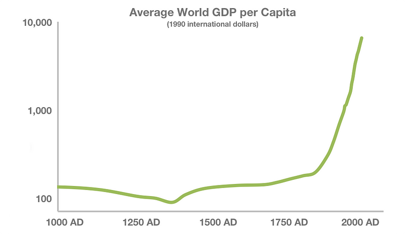
The first time I saw this chart below, a light bulb went off in my head.

It shows the world’s average GDP per capita over the past thousand years. It is basically represents an average human’s economic productivity over time. Note: this is on a log scale.
source: http://www.j-bradford-delong.net/TCEH/1998_Draft/World_GDP/Estimating_World_GDP.html

I mainly want to talk about the last couple of hundred years in this chart, but let’s get a couple of things out of the way upfront. Firstly, the GDP estimates go back a million years, but most of human history is rather uneventful from an economic perspective. Secondly, the dip around 1300 AD is due to the “Black Death” plague that killed nearly a third of the world’s population, most devastatingly in Europe.

After the plague, productivity recovered with the population, and started improving as we kept getting a little better at what we did. But what made the line shoot up so drastically in the 19th century?

The Industrial Revolution happened.

Firstly, technology.

There were newer, more sophisticated machines that made large scale manufacturing possible, and there was power available to run these machines.

The textile industry is everyone’s favorite example. Historically, production of cloth used to be largely a domestic enterprise and sometimes a cottage industry. Farmers’ wives would spin the cotton at home, and the men would then weave it into cloth. It would take four to eight spinners to supply one handloom weaver. Enter the Industrial Revolution: at the time the textile industry was inventing the Flying Shuttle and the Power Loom, the steam engine was also being invented. And very quickly, the two came together to enable large factories where steam-powered machines would do the work of hundreds of people.

Secondly, people formed organizations.

The most important part (in my mind) of the Industrial Revolution was the rise of the business organization and of management as a function.

While the initial spurts of technological advancement led to the creation of many businesses, they were still run by one or a few owners or partners trying to do everything, and that could not scale. You could draw an analogy with startups today, but it wouldn’t be accurate as we do have access to management tools. Back then, it just didn’t exist. The railroad companies spearheaded the science and practice of management, being one of the largest organizations and requiring large numbers of people across different aspects of the entire operation to act as one unit. They realized they could organize into departments and appoint managers who planned tasks and supervised the workers that carried out those tasks.

Organizations of an unprecedented size and scale could exist because of this, kicking off many self-fueling virtuous cycles, and not just enabling co-ordination across a large enterprise but also dramatically improving processes and workforce utilization. This is what made the right side of the chart possible.

While it seems like a blip in history, this took time: nearly two hundred years. It completely elevated what we as a species are capable of, but also came at a great societal cost (large scale unemployment and severe exploitation of those that were employed).

And it hasn’t ended: that line is only going up (and perhaps with different kinds of costs).


Now, based on all this, I’m going to posit:

Now, based on all this, I’m going to posit:

The key to all progress lies in creating scalable organizations.

Misallocating Entrepreneurship

There is an interesting example that elucidates this point. This article — India is a much more Entrepreneurial Society than the United States (and that’s a problem) — talks about the problems when a society cannot scale its organizations:

India is a much more entrepreneurial society than the United States. That may seem surprising since India is poor and we typically associate entrepreneurship with being rich but it’s clearly true. Only ~15% of Indians work for a firm compared to approximately 90% of US workers.

It digs into why it can be a problem.

Entrepreneurship in India isn’t a choice, it’s a requirement. Indian entrepreneurship is a consequence of India’s failed economy. The problem with developing countries is not that they lack entrepreneurs but that entrepreneurs cannot grow their firms large enough to become major employers.

Entrepreneurship, like other factors of production, can be misallocated. India has great entrepreneurs but their hard work, creativity, and risk taking is being wasted building tiny, stunted firms.

Entrepreneurship, like other factors of production, can be misallocated.

But our culture is becoming more individualistic, in all aspects of society. In business, everyone wants to be the entrepreneur, and is looking for “non-entrepreneurs” to recruit to their cause. And it has never been easier to start a company — limited liability and easy access to capital, distribution and technology have made sure of that.

Perhaps the optimal size of the firm will change in response to these forces, but I don’t see evidence of that yet — quite the opposite, if anything. Perhaps this chart above will sober up for a bit, or perhaps technology (general AI?) will render people irrelevant in the scheme of things. Until then, building high-functioning, scalable organizations that fit into the cultural mood will have to be the foremost problem company-builders need to solve.

(Huge thanks to Michael Dearing for showing me this chart for the first time, and opening up the first principles of management for me. I highly recommend his General Management course.)

Simple Dynamic Pricing for Mobile Games and Apps

There are many tactics mobile games and apps can borrow from retailers and e-commerce stores when it comes to selling In-App Purchases. Dynamic Pricing is one of the most powerful of them. This post is going to look at the low-hanging fruit with dynamic pricing that almost every mobile app or game can take advantage of, quickly and effectively.

WHAT is Dynamic Pricing?

Changing the effective price of an item based on the situation or context is dynamic pricing. Note that it is “effective” price. If the grocery store stocks half a gallon of milk for $2.00, and one gallon of milk at $3.00, the full gallon is actually cheaper even though the total dollars paid by the customer is more.

The simplest way to change the price is to offer a straight-up discount to the customer: a dollar off on a $2.99 item.

There are other ways to vary prices:

  • Quietly sticking a new price on the tag.
  • Creating a bundle of different items with a single price tag such that the individual prices cannot be determined.
  • Creating a premium class of the item via additional value (organic milk?) or a limited supply.
  • Etc.

For the low hanging fruit, we will just focus on discounts.

HOW can you give discounts on the In-App Purchase items?

Both Apple and Google require you to declare your In-App Products up front (in iTunes or the Play Store) and assign static prices. The workaround is to create multiple products for every item, but at different prices. The SKU or Product ID will be unique, but you can create a “disable ads for $0.99″, a “disable ads for $2.99″ and a “disable ads for $4.99″ item that all maps to the same item / functionality.

Here are instances of some of the popular apps doing this (showing examples from AppStore because PlayStore doesn’t show IAPs):

Go to the LinkedIn App in the App Store and scroll down to the In-App Purchases section. This is what you will see. Notice the same items at a different price?

Here are Hay Day, Candy Crush Saga and Spotify too:

Or, some games offer bonuses at existing price points like this:

WHEN should you give a discount?

This is the “dynamic” part of Dynamic Pricing. Big businesses, especially retailers, have teams of data scientists trying to determine the most optimum answer to this very question.

The low hanging fruit for mobile games and apps is in determining the basic rules or conditions under which a discount will get a user to make the purchase. Obviously, discounting the same item for everyone at the same time is a really bad idea – you should only do that when having a closing sale: “everything must go”.

Here are some instances of when you should offer a discount:

  • An Abandoned Cart: A user clicked on an IAP but cancelled out at the confirmation dialog from iTunes or PlayStore. Track these events and offer a discount to that user for that item the next time they are in the app. Will this teach users to hit cancel and wait for the discount? It could. One way around it is to offer the discount only when the abandoned cart is by an infrequent buyer.
  • Free Users: Users who have been using the free version of the app for a while and are not paying for the premium upgrade or game currency likely think the price is too high. Offer them a discount once they have used the app for enough time. Extra effectiveness if you offer the discount at a time when they will immediately be able to benefit from the upgrade (extra health just after running out of lives?).
  • Potential Power Users: If there are users who are buying the small packages: the weekly subscription instead of the quarterly, the $1.99 coin pack instead of the $4.99, consider giving them a discount on the larger items to give them a nudge into becoming power users.

These are three “dynamic” discounts your app should have as soon as it goes out of the door. There are lots more, and if you want to pick our brains about them, drop us a line!

HOW MUCH discount?

The next question is obvious: how much should you discount? 10%? 20%? 50%?

The answer is not as obvious: do not pick a number based on your gut. You will invariably be wrong. The human psyche has a tendency to qualitatively evaluate numbers based on the nearest comparison. You might decide 20% is a lot of discount, based on what you see in the grocery store down the street. But the grocery store has a different cost structure and RoI than your app or game.

The right answer would be to test a few different discounts levels: 20% and 40% are good numbers to start with. Apple makes the price choices a little easier by letting you change the price only in $1 discrete amounts.

Also see what other similar games or apps do. If you see the Hay Day example above, they drop the price of their “Bag of Diamonds” from $4.99 to $0.99 – that a huge 80%! The level of discount can also depend on when you are offering the discount: if it is to a first-time buyer for their first purchase only, getting the conversion is more optimal, so the largest discount is the right strategy at that point.

Don’t you incur a loss by dynamic pricing?

Not if your product is 0s and 1s getting duplicated in computer memory. The cost of duplicating is 0. Any price you sell the item at is a profit. In fact, you incur a loss if you DON’T do dynamic pricing. For every user who does not buy your product because the price was too high for them , you incur a loss of the price they would have bought at. This is true of all products that have a zero marginal cost.

All you should focus on is the total revenue, which needs to be greater than your total cost of building, marketing and running the app. Price per unit is not important.

The Lattice system is built to automatically do dynamic pricing in your app. If you want to find out what it can do for your app, drop us a line!

Personalized UI: Shape Shifting

Whenever we think of Personalization the first thing that comes to mind is Amazon displaying products we are likely to be interested in. The next thing that come to mind is like advertising on the internet. A little more pondering, and Google’s search results and Facebook’s news feed would strike us as being personalized too.

Notice how personalization is invariably assumed to apply to information — whether products to buy or ads to click or statuses to like. The structure around which information is placed often goes ignored — and underestimated — when it comes to suiting the individual.

20140812-shapeshiftingui-man-bike-phone

On the mobile, the ubiquity results in apps rarely getting more than a few fleeting glances. Darwinian economics of App Stores thus have necessitated apps evolve into the leanest units of functionality possible. Any unnecessary clicks, pauses or confusion that could trigger distraction are an evolutionary disadvantage.

Darwinian economics of App Stores have necessitated apps evolve into the leanest units of functionality possible.

A fluid UI that shifts shape depending on the user and their context can streamline the user experience.

There are many simple ways for interfaces to adapt to the user’s context without the need for sophisticated personalization algorithms.

Mobile Games were probably the first to innovate in this area. Starting with a dedicated First-Time User Experience (FTUE or ‘fatooey’) that would run only for new users to introduce them to basic game elements and get them started. In freemium games, it is not uncommon to see different views when trying to buy game currency packs: for players who have never bought before, these packs will be sorted with the lowest priced option on top. But for regular buyers, they are sorted with the highest priced option on top.

(Image Source: kryshiggins.com)

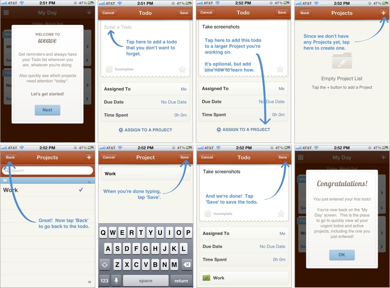
Other apps have started to take a leaf out of this book: the image above is a walkthrough of the FTUE of Weave, a popular ToDo app. Secret and Slack have recently received accolades for their FTUE too. Smashing Magazine has a really interesting guide to FTUEs on mobile:

Adapting UI to context is prevalent in more ways than just the FTUE in mobile apps

1. Screens on GPS devices switch to a darker color scheme at night, for low glare.

2. Language localization is perhaps one of the oldest forms of adapting the interface for the user.

3. Responsive web pages are a great example of the UI adapting automatically, with the context being your screen size.

4. The Uber app changes its default view after you have requested a car, to directly show you where it is and when it will arrive, and put the relevant information immediately in front of you.

5. The new Foursquare app, that notifies you of interesting place around, only triggers the notification when it senses that your location has changed.

(original source: It’s A Read/Write Web by Luke Wroblewski)

6. Knowing that most users use a single thumb of their dominant hand, it might be a good idea for apps to structure their navigation accordingly, AND laterally invert key elements for left-handed users. (If you know of any apps that already do this do let us know in the comments.)

In contrast, desktop user interfaces have static, making all options available at once, and expecting the user to “pull” what they want.

3 key ingredients to consider while designing personalized UI are Identity, Context and Behavior.

Identity

There are two parts to Identity: the first part is knowing every user, being able to recognize them when they come back to your app even if on different devices. Knowing every user more is part of this – various traits that let you tailor the app experience: whether the user is left-handed or right, their internet bandwidth, language preferences, social graph, etc.

The other part of identity is created by the user: their identity in your app. How they use your app, and the persona they create in your app is a large part of this. For example, users portray themselves very differently on Facebook vs. Instagram vs. LinkedIn. Sometimes users use Instagram to post pictures of what they sell to their audience, while other times users use Instagram to share personal photos with their friends.

Context

Context is about the here and now. Knowing if a user is at home or walking on the street can play a big role in shaping the UI of a restaurant recommendation app. Or a payment app — whether a history of transactions on the main screen is more important, or a pay here button. What screen the app is being used on – a TV or a car – will govern what actions are front and center. The user’s local time, whether the user is currently on a subway train or running down the jogging track, whether they came to the app from a specific notification are all piece of context that can be used to personalize the experience.

Behavior

Interpreting users’ collective previous actions to anticipate what they might do, and shaping the UI accordingly is where personalization gets complex but also magical. All content recommendations – products, music, search results, news – do this. With UI, it overlaps with the second part of Identity mentioned above: is the user using a calendaring for their business or for personal scheduling? Can the payment app know if it is being used to pay for purchases or to send money to friends? Can a news app learn about your sharing habits to decide the prominence of the sharing button?

BUT there is a slippery slope to ultimate confusion

The best UIs are the ones that are familiar – the user instinctively knows where to click and how to reach their goal. Too fluid a UI can create confusion. Getting the personalization wrong can be even worse. It is always the right thing to make changes in small steps, and A/B test to learn from how users react.

Hiring Is Growth Hacking

Hiring is Growth Hacking applied to organizations.

What does that mean?
It is expensive to pay a staffing consulting $10k – $20k per hire, so creative, guerrilla tactics have to be adopted. Using your network to reach out to your audience, relying on word of mouth, the referral program that extends beyond employees, Quora/Twitter/LinkedIn for lead generation, fancy videos and blog posts with great content, etc.

It can be harder for large companies to do real growth hacking, whether to acquire users or employees, for many reasons, some legitimate: agility, red tape, risk averseness, etc. But there are always inspired employees in these companies making an exception.

So how should one go about hiring like a growth hacker?

1. Double down on metrics
Draw out funnels for every channel you are sourcing candidates from. Measure success rates (define success explicitly: an interview accept? the actual hire?) and work on drop off points. Be ruthless about cutting out the underperforming channels, regardless of how cool they are right now. It is an optimization problem.

2. Growth is a culture
You have to build acquisition and retention into your product DNA. Same for your organization. Every employee should be an evangelist. Every employee should be helping with the hiring process.

3. Initial user experience
If the first interaction requires a prospective candidate to commit to a job search or going through an interview process, it’s an anti-hack. It’s why you choose to ignore those InMails. Elicit a “wow” the first time, then take it from there.

4. Spread success stories
Get new employees to update LinkedIn profiles, Facebook/Twitter statuses immediately. Ask them to blog about their first day. Show off internal successes.

5. Multi multi channel
That’s two “multi”s. Everyone is already multi-channel: they’re on LinkedIn, Quora, Twitter, StackOverflow, etc. Find more channels. Treat everything as a channel. Exactly why this is like growth hacking: the answers are not already available.

6. Create content
Content is one of the best ways to engage your audience. The Kixeye hiring video. The Facebook Engineering blog. Meet The Team sections on so many company websites.

7. Bootstrap
When you’re starting from zero, you have to bootstrap. An online education startup bootstrapped by creating courses themselves from publicly available course material. A local services marketplace bootstrapped by letting you type in any service you wanted, and then going out to find and sign up a provider for that service. An e-commerce selling diapers online started by fulfilling orders by buying diapers from the local Target store.

Got any more growth hacks that can be applied to hiring? Leave a comment, and I’ll add it to this list.

The Most Important Metrics Immediately After Launch

Just released or about to release a mobile app? Do you have a checklist of which metrics you should be tracking?

Deciding which metrics to track is simply deciding which questions you want to answer. And the key is in asking the right questions.

Getting information about your app usage shouldn’t be like this.

1. User Acquisition

The main activity after launch is user acquisition. Even if you are flying under the radar to iron out bugs and optimize primary user flows, testing main acquisition channels should still be a big part of post-launch ops.

  1. Which channels are getting you the most users?
  2. What is the average acquisition cost per user of each channel?
  3. Which channels to focus early marketing efforts & budget at? (a combination of low cost + quantity and quality of users)
  4. Which channel was a particular user acquired from? Being able to identify this later becomes important in knowing which channels are driving the most valuable (loyal, paying, etc.) users

2. Retention

Retention tells you whether your users are coming back, or leaving you. Issues with retention, unless fixed immediately, can quickly translate into a survival problem for the app.

  1. What is your retention? D7 and D30 retention are popularly quoted numbers, but make sure they are the right numbers for your app. If your app is a messaging app, D2 retention is more important: you want your users to chat with their friends the next day, not 7 days later.
  2. Does any acquisition channel have a significantly lower average retention rate for users from that channel than from the other channels? If so, early marketing efforts are better focussed on the other channels.
  3. How are your users coming back to your app? Does some other app drive them to your app (like how tapping on an Instagram URL in the Twitter app opens the Instagram app)? A notification from your app? See if you can leverage that channel to further improve retention. A word of caution: there may be overlap and double counting here, if the same user comes back to your app from different channels at different times.
  4. When looking at retention rates over multiple days: D1, D2, D3, D4, etc, is there a cliff on any day where a large % of your users drop off and never come back?

3. Engagement

Engagement metrics tell you more about your retained users – how loyal they are and what keeps them loyal.

  1. How often does a user open your app? The number of active days in a week or the number of sessions per week are good indicators to distinguish between your most loyal users and less loyal users.
  2. How long does a user stay engaged with your app? Measuring this using a count of actions or progress in your app is more useful than actual time spent.
  3. What are the most popular actions carried or content consumed by users?
  4. Or any actions that you thought would be popular but aren’t? It is important to quickly validate assumptions about user behavior made while designing the app.

4. Revenue

If you are charging users for subscriptions or in-app items, revenue metrics become even more important to track upfront. You need to be able immediately identify problems and fix them before the revenue loss adds up.

  1. Conversion rates: what % of users become paid users?
  2. Compare average conversion rates for users from each acquisition channel. Is any acquisition channel performing significantly worse than others with regards to this metric?
  3. What % of your payers pay a second time? How much time (or sessions or progress) in between their first and second payments?
  4. What are the retention and engagement numbers for the payers? How is it different from non-paying users?

It may be useful to start tracking LTV (Lifetime value) of users and keeping tabs on the gap between the early LTV and user acquisition costs. The goal would be to close the gap as soon as possible.

Virality is another big area to keep track of, if your app has viral loops, and we will address that in a later post.

Premium vs Freemium vs Subscription

For mobile apps, there are three dominant pricing strategies: Premium, Subscription and Freemium.

According to a report by app-store analytics company, Distimo, freemium now accounts for 71% of Apple AppStore revenues in the US, up from somewhere around 50% last year, and rising. In Asia, freemium is 90% of App Store revenues.

71% app revenue from freemium

Is freemium always the most optimal? What factors should you consider when choosing a pricing strategy?

Firstly, here is what these different pricing models mean, as applied to mobile apps:

Premium apps (or Paid apps) have an upfront price before they can even be downloaded. Similar to licensed software, except that the App Store makes all future upgrades to the premium app free once purchased.

Contrast this with freemium (a portmanteau of “free” and “premium”), where the app is free to download and use. However, some features inside the app are unavailable until you pay for them. App stores make it dead simple for developers to charge small amounts of money inside the app.

Subscriptions are a regular fixed fee the user is charged automatically via the App Store for using the app. Magazines in the iOS Newsstand are usually subscription-based. Subscriptions can actually overlap with either premium or freemium models. For example, Spotify requires you to have a subscription to even use the app (premium), while Pandora is closer to freemium where you can pay a subscription to get ad-free and unlimited hours of music.

How do you decide which to choose?

Premium has very limited use today

Perception is a large factor in how high a price is acceptable, and going premium helps create that perception. With premium, every user pays upfront, but the amount each user pays is fixed, regardless of how much utility each gets. Also, users have come to expect apps in the $2 – $5 range (a few niche apps can charge $10-$20) and there is no way to get higher ARPU.

In general, premium works in the following situations:

1. There is a strong demand for your app – niche areas are good candidates here.

2. You have a strong brand already and can establish trust with users where they are willing to pay before they download the app.

3. There is not a lot of competition that will almost certainly drive the price down.

4. You don’t care much about reach – which will be much smaller because of the “pay gate” into your app.

5. There are no ongoing feature or content costs that can drive up the average cost of of supporting a user to levels higher than what the user paid for the app.

Freemium helped create those million-dollars-per-day games

Freemium was popularized by casual games in Japan and Korea and has quickly become the winning model in mobile apps. It works really well in the following situations:

1. There is enough competition that users invariably have other cheaper or free options (low barrier to entry). This has been partly the reason for most mobile apps today moving to freemium.

2. When reach is important. You need large amount of users quickly to create network effects. For example, to drive virality or gather significant data.

3. When there are a small % of power users willing to pay significantly more than the other light users. The pay-as-you-go model facilitates this. Hard core users can drive as much as 100 – 1000 times more revenue than the other users. This is why some free-to-play games are reaching a $1MM per day revenue runrate.

chart of freemium vs fixed priceMore users in freemium, but a small percentage of them drive astronomical amounts of revenue.

The mobile app economy has progressed to a point today where all of the above usually hold true. Freemium does require some operational effort in managing your free and paying users, converting the former to the latter, and driving repeat purchases. However, this helps create a sustainable business rather than a one-time hit.

Subscriptions: the Holy Grail?

A subscription provides a guarantee of repeat transactions and hence, businesses with subscription revenues tend to be valued far higher. The subscription price is usually smaller than the one-time price to incentivize the user into a longer term commitment. As the seller, you make up for the discount by being guaranteed future transactions.

A single issue of The New Yorker costs $6, but a year’s subscription of 52 issues is $70. That is a 77% discount and is still better, revenue-wise, than selling individual copies. Of course, they make a lot of money through advertising, so a guaranteed customer in the future is far more important to them. This may not be the case in all businesses. Amazon gives you a ~15% discount to “subscribe” to certain household items.

But the subscription model does have a few drawbacks:

1. Like premium, there is a single price for all users, regardless of how much they use. There is a lot of money left on the table because hardcore users willing to pay a lot more cap out at the fixed price. There is some more money left on the table where the subscription price and commitment is too high for a large number of light users who will not sign up.

2. Tiered subscriptions does let you set different prices, but still creates ceilings on both price and consumption. Netflix has a 1 DVD plan for $8, 2 for $12, all the way up to 8 for $44. The lost opportunity? (a) A user can only do 8 DVDs. There may be a few subscribers who want much more. (b) A $44 price tag for DVD rental has a sticker shock. It is easier to charge $5.50 eight times than to charge $44 one time.

So when should you use subscriptions? Whenever you can – subscriptions are considered the holy grail of revenue models, BUT it is important to make sure you are not leaving money on the table just to get a subscription commitment from a customer.

The ideal pricing strategy

loaded grocery shopping cartEscalators are faster than stairs, even faster if you run up them.

At the risk of over-generalizing, a combination of freemium + subscription would be ideal for most apps.

Not everything being sold lends itself to subscriptions. Impulse purchases typically don’t. For example, a power-up that will help you cross this level in a game, or an Instagram filter that makes this photo of yours look exceptional. In such cases, it is best to start with a freemium model and then offer subscriptions to your  regular customers to drive  purchases further. Content (magazines, music streaming, movie streaming)  has more commonly been a subscription business. For these, it is a good idea to start with the accepted subscription, but remove any ceiling on purchases and consumption by offering more content that can be purchased in-app in addition to the subscription.

The mobile app economy is already large and growing even bigger. Get all the value you can out of it.

Drop in a comment, or shoot us an email if you want to chat about this for your app. We’re happy to help!

Update:

Marco Arment wrote his thoughts about our post:http://www.marco.org/2013/10/02/lattice-labs-freemium. Do read that too – it is an interesting debate and certainly not over yet!