The author extrapolates learnings from the last ten years of the Indian Automotive industry and makes the point that all things remaining equal, success in emerging markets depends largely on how premium a design feels in the hands and eyes of consumers. He suggests that Microsoft adopt a bold and fresh approach in the redesign of Windows 10.
I have been using Microsoft Windows since 1990, i.e. for over 25 years. I have also been associated with Windows beta programs and have had the chance to see a preview of Windows 95 way back in 1993.
Today, I use Windows 8 at work, at home, on my tablet and on my phone
You can read a little more about my interests here.
It’s evident that Windows 8 has not been the gushing success that Microsoft thought it would be with consumers i.e. people who have a choice of personal home and desktop computing platforms. Corporates in most cases do not have a choice but people do and I believe they have spoken by staying away from the platform.
My urgency for writing this article is the upcoming Windows 10 Preview that Microsoft is expected to show to the world on January 21st, 2015. And while I don’t expect them to turn their ship overnight, in the 6 – 9 months running up to their launch in mid to late 2015 I can only hope Microsoft can make some adjustments to its design keeping in mind the sensibilities of a billion Indians. And why just Indians? I think this can apply to a consumer in any part of the world.
I ran my own digital and web design team for 6 years in the mid – late 1990’s, a time when the closed Indian consumer market was just opening up to brands. It was an exciting time and it taught me that traditional “European and American” aesthetics do not always work for the vast majority of Indian consumers.
What follows below is my analysis of how Microsoft can learn from carmakers and their travails in tackling this hard-to-understand yet lucrative consumer market.
Doors and Windows: Yes. Cars and Windows: Yes.
I track the growing auto industry in India/Asia very closely because I love cars, motorbikes and driving in general. I’ve also read every decent car magazine that’s sold in India for the past 15 years. I’ve observed the Koreans, Germans, Czechs & Japanese come into this market to try and succeed. I have also observed how Indian auto manufacturers have tried to stay relevant and competitive in the face of impending competition.
Is it really possible to try and draw a parallel between Windows 8/8.1 and foreign carmakers in tackling the Indian consumer? I believe there is because just as people have personal preferences in choosing their next car, they also have preferences when it comes to devices. The two are not that different if you think about it.
Windows 8 & METRO: Why it was needed
I totally get why Windows 8 was what it was. Microsoft needed a differentiator in the tablet/touch market and Windows 8 allowed them to try and have a crack at the iPad. It was a huge risk and as it happened, one that failed.
For those who don’t know, Windows 8 was Microsoft’s attempt to try and make the traditional desktop and newer touch worlds coexist at the same time. In addition, Windows 8 also incorporated the Metro design language, a flat design language that relied more on typography, function and content, and less on graphics.
Unfortunately, Microsoft wasn’t able to attract enough consumers to embrace and use Windows 8. And while one may argue that the Windows 8 numbers (350 million now?) are high enough, we also know that a large part of this is in the corporate/enterprise space where customers really don’t have an option.
I’ve spent many hours at IT supermarkets and have seen the lack of interest amongst shoppers in the Windows Laptops on display from the big OEM’s: HP, Dell, Lenovo, Acer…and so on. And while these OEM’s do not make bad PC’s, the Windows 8 screens and interfaces are just unable to excite even a casual shopper to stop and take a look.
But, before I offer any suggestions, let me elaborate on Indian market demographics and the overall positive sentiment that exists for Microsoft.
Why India should matter
India as a market should matter to Microsoft.
Almost every Indian I know has a friend or relative working at Microsoft Redmond. Bill Gates, and now Satya Nadella, are role models for many an Indian parent and child and the Microsoft story is an exciting one. Many markets in Indian cities and small towns have huge signboards that advertise courses in MCSE/IT Administration, Word, Excel, MS Office, and SQL Server. I’d estimate that more than half of the software engineers in this country work on .NET, C#, ASP and so on. Most SME’s in this country run Windows Server and Microsoft Office. Nearly everyone I know has used Windows at some point in time in their careers. Overall, India is bursting with positive energy for Microsoft as a company.
But, India is also a market where costs are an issue for mainstream computing products. MacBook’s and iPhones cost twice as much here and are a complete rip-off in my opinion. And because volumes aren’t high, I doubt if Apple will ever want to, or be able to drive costs down.
That leaves Chromebooks. The half-PC’s that aren’t really PC’s for anything other than light browsing and some media consumption. You NEED to be connected to make Chromebooks work well which is a problem because not only are data plans expensive in India, connectivity by and large is downright horrible. (And yes I know that Chromebooks can sort-of work offline but…)
India also does NOT yet have a popular BYOD (Bring Your Own Device) culture at the workplace. This further increases the likelihood that many professional workers use company-provided Windows devices and MSOffice in their places of work.
So, you have expensive MacBook’s/iPhones on the one hand AND Chromebooks crippled by poor connectivity on the other. In this kind of market, could there be anything more important for Microsoft than Windows 10 to ride this perfect storm of opportunity?
In short, no. But they HAVE to get it right.
Let’s take a few examples of hits and misses from the automotive industry in India.
Skoda & VW
In the mid to late 1990’s, Skoda, a small and relatively unknown Czech carmaker was greeted with sales success here in India with its maiden model, the Octavia. This surprised many as Skoda cars are perceived as ‘cheap’ in Europe and were known to have after-sales issues that exist even today. But somehow Skoda did great by any standards and probably even exceeded its own targets.
Skoda succeeded here because Indians fell in love with their designs, AND, the relative affordability of buying into a European brand. It was only natural that Volkswagen, Skoda’s parent company, followed suit some years after, hoping to match if not exceed the success of its junior brand. The Skoda Octavia now started competing with the VW Jetta. The Skoda Superb with the VW Passat.
Needless to say, the numbers were less than encouraging for VW. What made it even more difficult to digest was the fact that every model they launched was qualitatively superior if not similar to their Skoda counterpart. After all, these cars shared common components and relied on a global pool of high quality suppliers.
What was the problem?
The answer lay in the design. VW’s design was far from inspiring for Indian tastes. While dark grey dashboards, steering wheels & interior upholstery are actually seen as cool and avant-garde in Europe AND in some cases even represented as premium (e.g. BMW M3/M5), these design elements do NOT excite the Indian consumer in any way.
Skoda sold better here because Skoda’s car are generally prettier than their VW counterparts. They have edgier styling with chrome accented bodywork, wood-panels and chrome linings on the steering and dash together with rich beige two-tone interior upholstery. And Indians lap this stuff up. Looks work. It can make you feel like a thousand bucks when you park your new car next to your neighbours’.
Of course there are aberrations to this success story (like the Skoda Fabia and Skoda Yeti, both oddball designs), but I’ll leave that aside for a future article maybe.
Fast forward to today. VW cars sold in India now have chrome body accents, wood-panelled dashboards and more visually appealing looks and their sales numbers are back to where they should be. It’s the little things that make a design look and feel premium, and VW had to bear the ignominy of low sales till such time they figured out the Indian consumer.
A few years is a long and costly affair in the automotive Industry. Heads roll, CEO’s change, blame is apportioned and everybody walks away bruised. All things remaining equal, consumers expect good looking and well-designed products. To draw a parallel, Metro and Flat UI’s may work for the digitally-evolved set, just like dark-grey works great on a BMW M3, but it doesn’t and never will work for most of the Indian consumers.
I’m a little concerned because as recently as last week, I saw some leaks on the to-be-announced Windows 10 Consumer Preview with more of the modern and minimalist.
Hyundai: Appealing Designs.
Unlike the conservative Japanese, the Koreans are naturally flashier with their design sensibilities. Every Hyundai car that has been launched in India to compete with the entrenched Maruti-Suzuki (Japanese) has been very successful. And it’s because Hyundai designs them to be stylish, with chrome bits outside and in, gorgeous dashboards and upholstery. Hyundai also manages to give more kit at same or lower prices. They really figure out the best combination of looks, features and price.
My personal opinion is that Japanese cars are better engineered than the Koreans. But, the Koreans are able to keep up by launching spicier designs of feature-loaded models at similar or lower price points.
Sometimes good design can hide an averagely engineered product which Windows 8 is not.
And sometimes good design is required even when the product is cheap. The next example about the Tata Nano is one such case about how NOT to do it.
The Tata Nano. Cheap is good. Cheap-Looking not so.
The Tata Nano was designed to be the cheapest car on Indian roads by one of the country’s largest conglomerates: Tata Sons. In fact, the global press hailed the Tata Nano as the cheapest petrol-engined 4-door, 4-seater car in the world which it probably was.
A noble cause. It should have worked. It had everything going for it.
The Nano was/is a great piece of frugal engineering BUT it failed to capture the imagination of the Indian consumer because it came across as cheap and built to a price. (Conversely, Tata later launched a real beauty of a multi-utility-van (MUV) called the Tata Aria, but blew it because it priced it over its rivals.)
I’ve been tracking recent attempts by Microsoft at the cheap end of the tablet market with its near-zero Windows 8 licensing policies. But cheap, like the Tata Nano, doesn’t always work unless it’s backed up by attractive and premium design.
MacBook’s and iPhones are gorgeous to look at and experience. But, so are the lower-end Android phones. And even though in my opinion they (the low-end Android phones) are poorly engineered devices at best, they do more than enough to keep the cash registers ringing.
I hope Microsoft can learn a lesson from the above.
Gorgeous does work.
Switching for a brief moment to Windows Phone.
I’m a huge advocate of the Lumia 730 and Lumia 530. I am almost sure that a few of my employees were convinced by me to get them. But, recently, two of them upgraded their phones to Xiaomi Redmi Note 4’s last week. This phone retails for the same price as the Lumia 535 in India (Rs. 9500 approx.). BUT, one look at its gorgeous 5” screen, beautiful wallpaper with its silky smooth swipe animations and you know right away this was something special.
This phone had me at hello!
The overall product, the screen clarity, speed, navigation and animations feel buttery smooth and awesome. These Xiaomi phones are not running stock Android, BUT, a gorgeous skin made by their manufacturer Xiaomi (dubiously known as the Chinese iPhone maker).
And while these phone may not have the same build quality of a Lumia, they appeal to consumers to whip out their wallets and buy. (BTW, one of my colleagues returned his Xiaomi handset just yesterday because the USB charging port came loose within a day or purchase.)
Gorgeous does work AND it does get products off the shelves.
While we are on Android phones, let me add that the much hyped material-design influenced Android One has failed in India for more reasons than one. I can only guess that flat-design may have had something to do with it, in addition to not-so-friendly business terms from Google.
Design tips for Microsoft Windows 10 Consumer
So, taking a cue from the Indian automotive industry, I’m going to try and suggest ways in which Microsoft can make Windows 10 a huge hit with consumers not just in India, but worldwide.
1. Staid, Sober, Scandinavian, and Minimalist does NOT work here
Boring, dull, flat and minimalist designs do NOT appeal to Indian consumers. Ever been to an Indian wedding? Noticed the explosion of colour and senses. This IS what we are about as a nation of a billion people. We like designs that are a bit Over-The-Top with a bit of bling and kitsch thrown in.
We don’t live in homes with wooden floors, white walls and Ikea furniture. Well maybe some do, but those are the minority and they buy expensive iPhones and Macs to begin with.
We are an aspirational people and our consumer choices are a reflection of our individual and social perceptions.
And Microsoft, please don’t expect and wait for third-party developers to skin the OS in case it lacks ZING out-of-the-box. No Stardock Modernmix can solve this problem.
2. Don’t listen only to the people in Windows 10 Preview.
It should be evident to Microsoft that the 1.5 million people, myself included, who are a part of Windows 10 Preview will probably buy it anyway! But do these 1.5 million represent that 1 billion Windows users? No Microsoft. They don’t.
I shudder when I see comments from some folks in the Windows Insider Program about how Microsoft should leave Metro untouched because it is so awesome. Come on! This strategy may work for enterprise users but will not fly with consumers.
For every person that is vocal about embracing Metro, Metro Apps & the Windows 8 Start Screen, there are 10 others who stay silent.
3. Be bold Microsoft.
Computing and graphic power has been getting progressively cheaper. And yet, UX’s have been getting flatter and less graphically intensive. And while some people love flat and modern and I can completely respect that, it doesn’t do it for me.
Have Microsoft/Intel learnt nothing from the Film and Television industry?
TVs improve to accommodate better quality content and content providers continue to improve the quality of their sitcoms, movies and sports coverage. It’s a symbiotic relationship that improves business for both. And yet, as the personal computing landscape has gotten cheaper, faster and more powerful processors, the UI’s have reverted back to being flat. This is one trend I will never fully comprehend.
I fear the real problem lies with today’s UX designers. Design is cyclical and for the last few years it has been flat and functional. If you are a hip and happening UX/UI designer today, you WILL shun gradients, textures, shadows and three-dimensional effects in favour of large typography, whitespace and minimalism. But I believe the two worlds CAN co-exist and these designers must be pushed to their creative limits to turn out something spectacular.
The designers at Microsoft are working on what might be the last major version of Windows. And to think Windows 10 Consumer should have an Office or OneDrive inspired UI would be poor judgement on Microsoft’s part. I use the aforementioned products to get work done. Is it too much for me to ask not to be reminded of work when I’m setting my morning alarm or watching a movie? Must my watch resemble a fitness band? Please…
So, Microsoft:
FIRSTLY, the goal for your design team has to be to make customers stop in their tracks when they see a gorgeous Windows 10 PC Screen on display. The attention span of an end-user needs to be captured at the initial user interface or else you have lost them no matter what amazing functionality you build into the platform.
SECONDLY, don’t ONLY dish out a flat user-interface! I realise you must do this for Enterprise customers but don’t stop there. Give every user a SECOND option that is the complete opposite i.e. lustworthy – put in the bells and whistles – the textures, silky smooth animations and navigation. After all, you’ve tried the flat UI approach and the world has answered. You’ve got nothing to lose and everything to gain.
If you can do the above, you will take the discussion away from ecosystems AND focus it back on a gorgeous product called Windows 10 staring at consumers on market shelves later this year.
Yes, I DO want my yet-to-be-purchased i7 quad-core NVidia-powered hybrid to shimmer and ripple with each buttery smooth swipe and click.
And no, I do NOT want Windows 10 Consumer to be like my Kindle. I already have one and it puts me to sleep every night…yawn.
 Harvey Firestone, an American businessman, and the founder of the Firestone Tire and Rubber Company once said, “Capital isn’t so important in business. Experience isn’t so important. You can get both these things. What is important is ideas. If you have ideas, you have the main asset you need, and there isn’t any limit to what you can do with your business and your life.”

 Contrary to general perception, design process strives to find the correct problems. Solution to these form the second half of the process and which has complete dependency on the earlier, yet is more celebrated.


 Many of us lead our lives with bags of things that we believe impossible to achieve – spoons that we cannot bend. The spoon may be the aspiration to be an Olympic athlete, climb Mt Everest, run for the president’s office, or as common as a resolution to resist the urge to overeat, read a book every moth, blog regularly or make time to connect with old friends. We are often limited by our own ambition and tenacity. There is no such thing as an unattainable goal. The trick is to realize that the constraints that limit us from realizing our full potential may only exist in our mind.
 Let me illustrate the point with the narrative that I heard from the man himself –
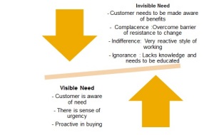
  A good balance of both factors is required. If the scarcity is already being addressed, there may not be any need for a new solution. If the surplus is already monetized, it may be difficult for the producer to engage with more means of monetizing the surplus.
 In fact, disruptive innovation can be subject to legitimate criticism, but not along the lines of many of Lepore’s arguments. Christensen sees disruptive innovation as a new way of doing things that is often inferior to the existing way, but one which advances rapidly thereafter, so much so that it can overtake the sustaining innovation trajectory at some point. One of the difficulties I have always found is identifying which (potentially) disruptive innovation will actually succeed and which will fizzle out.
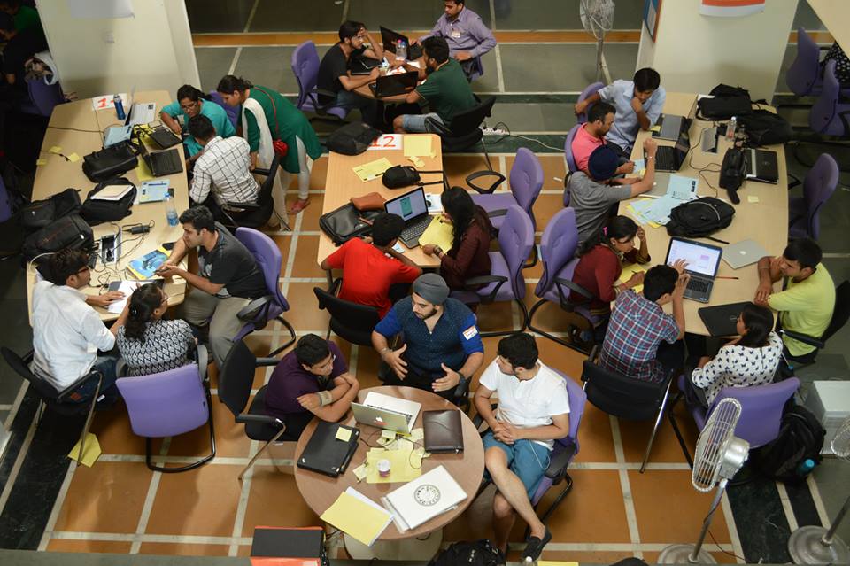
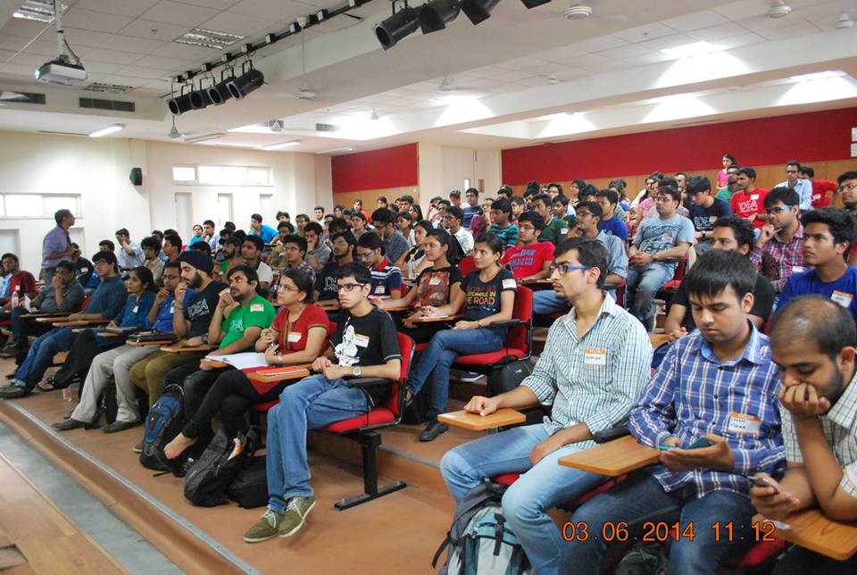 I had found my core argument for the day – I was going to challenge the group to think of their own personalities, experiences, behaviours. I was going to inspire them to reflect on who they are, and who they want to be and how they would differentiate themselves first before thinking of great, differentiated, innovative products that they would design, develop and bring into the world. I would show them how living (and using) on the edge of technology is almost a pre-requisite to pushing the boundary further; how great ideas evolve from personal needs and small advances which turn into big stories cause as the follower crowd discovers the same challenges when their use graduates and are happy to use the solutions the leaders have created.
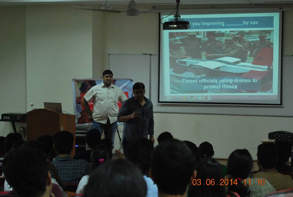 As I look back at the end of the week, I find myself thinking again about the ‘conformity” of our post-independence indian culture; the regimentation of our education system and our social expectations that we need to break first before disruptive, revolutionary innovators and entrepreneurs will emerge. Hope this brief note makes you think a bit about yourself!
 India routinely does badly on the World Bank’s survey on ease of doing business. But, from talking to entrepreneurs, I get the sense that setting up a new services business is fairly straightforward, that’s why we see so many new service businesses springing up all the time. While there is always scope for improving the time taken to set up a service business, the real issue is with manufacturing businesses.