Design thinking Playbook Roundtable by Deepa Bachu

desk-931928_1280

The core idea of a startup is to tap into the previously unexplored markets, identifying unsolved problems and bringing to the market innovation that disrupt the existing eco-system. It’s about understanding complex problems and coming up with innovative, disruptive solutions…a process that requires understanding the consumers’ requirements and behavior patterns to create a well-thought out solution for the customers’ benefit.

While most entrepreneurs spend weeks brainstorming about the idea, they often ignore the key ingredient to innovation : design.

Design /dɪˈzʌɪn/ (noun) – do or plan (something) with a specific purpose in mind.

The Design thinking Playbook Roundtable organized by iSpirit and conducted by Deepa Bachu from Pensaar helped startup founders understand the importance of design thinking and integrate design into their workflow. Here are some key takeaways from the Playbook Roundtable held at the head office of Instamojo in Bangalore:

Design thinking is not just about the graphic elements, UI or tools. It is a creative approach to a problem. It is a problem solving methodology – whether it is blueprints for a building, a beautiful graphic design for a brochure, a sleek UI for a website or a comfortable piece of furniture, design helps to solve any problem, visual or physical.

While it is important to engage a professional, it is crucial that everybody on the team thinks DESIGN. Entrepreneurs should be able to step away from their immediate environment to look around and view their idea from the perception of the consumers, a process that requires creative thinking.

As a good product manager, a startup founder should be able to connect the dots in non-obvious ways to come up with a unique and innovate solution for the consumers. It is crucial for entrepreneurs develop a deep insight of the problem they are seeking to solve and be passionate about it before coming up with a solution. More startups focus more on the solution and forget the initial problem statement. You must never lose sight of your problem, constantly revisiting it while fine-tuning and tweaking the solution.

A product is valuable only as long as the consumer users it. It is thus important for entrepreneurs to understand customer behavior in order to make their product user friendly. Usability studies though interesting, aren’t always reliable. Startup founders thus have to seek out customers and work with them closely to understand what they need, what they think, how they use the product and how they feel about it.

Customer behavior v/s customer intent – it is important to understand the difference between the two. While a user may want to do something in the ideal world (intent), she may not be able to do it in the real world (behavior). As entrepreneurs it is important to differentiate intent from actual behavior. If this is geographically impossible, startup founders should not hesitate to use data analytics to tap into the users’ behavior patterns and modify the product.

Design thinking allows entrepreneurs to look at their idea holistically and come up with the best possible solution for their users. Design after all enables people to create and come up with the unimaginable and unexpected designs.


Need 9 months to get baby out

One of the pressures and challenges of working on products is to get it out soon – the release. But I often recollect one of the leaders that I have worked with saying “need 9 months to get baby out”.

9monthBaby1

What’s the right time for a product release – Some Considerations?

Build for market, not a customer

9monthbaby2

Remember products are not built for one customer, its built for several of them, for a market. I highlight this as especially in India, we have abundant  services companies and people with great experience driving innovations and solutions for one customer, and often the release time for such delivery can be done in a shorter duration as we are working towards a specific requirement set.  Its different to build it for a market or many customers in mind.

Enough research time to iterate

9monthbaby3

The other key aspect of building a product is to spend good time on researching the market, understanding user problems and figuring out what to build, before start building it. In certain cases it could also be some initial prototypes to get the thinking process going. Often this time is ignored when building products.

9 moms cannot make 9 babies in 1 month

9monthbaby4

By getting more people assigned is not the solution to get the products out faster, actually it could be counter productive as there may not be enough components that can be built parallel and also could result in confusion on co-ordination.

It’s not just about development

Many software products fail primarily because they put all the time and effort only in engineering and developing the product and do not plan for an effective early adoption and go to market (including pricing) launch time planning. They consider this as lesser important task and often consider this as a post product release activity. But the market readiness and go to market should be planned well ahead, and enough time to be allocated to early adoption and launch cycle.  The other aspect that gets ignored many a times is user empathy and design for user interaction and interface.

Focus on quality, differentiators

9monthbabay5

Bugs are fine in software, can be fixed is the typical attitude in software industry. But depending on the mission critical nature of the products, quality is going to be key criteria. Thorough testing and quality is an important part and while dates can be compromised, quality should not be compromised as the word spreads if its buggy. Get it out with good quality.

9monthbaby6

Many products compromise on features and differentiators, to deliver a product in time. This again can be dangerous in the current extremely competitive world.

So usually the right time of the release should have key focus on quality and differentiators.

Alpha, Beta….

We come across examples of products that get released to market without alpha, beta cycles – without being taken to first few customers or users to try out. This can be dangerous, inspite of the time pressures or the brutal confidence that you may have about your products and self testing, there should be time allocated for alpha and beta trials.

Rapid release cycles

9monthbaby7

The other side consideration here is that while products have to be planned, it can’t take too long as well. Many of the established players get into this syndrome where they spend too much time planning and laying it out but by the time the product comes out, the market is lost or captured by some one else. This is where agile methodology comes in handy. Products should be planned in such a way that there is minimum viable scope covered coming in from the research and there is agility built into cover a rapid release cycle post the first launch, where more enhancements can be planned, based on customer adoption.

So if you started reading the blog hoping to get the answer on the right time for a product release, sorry for disappointing you. But from my experience where I have been involved with enterprise software products that were built in 3 months, 6 months, 1.5 years, 3 years etc. , some of the above points were the learnings for the success or failure of the product. Plan time for the ideation/research, design, development, thorough testing, beta and GTM launch planning before getting your baby out…

Share your experience or other considerations that I may have missed here…

My final comments on a Twitter discussion about Design & India focused startups

Here’s the starting point of the discussion on Twitter:


Just to summarize my thought: the original referenced article talked about design being a key pillar of a startup. My contention is that that is a developed market centric view which should be applied carefully to India focused startups. It is first more important to understand the consumer’s concerns & see how design fits in there. Saying that the design sense of the Indian consumer is “not evolved” is saying that consumers haven’t yet caught up – that’s wrong. It is not the consumer’s job to “catch up”, it is the job of a company to understand what are the drivers of earning the consumer’s business. Design has become such an important differentiator in developed markets because consumer does not have issues of systemic trust.

None of this is suggesting that design is not important. But as entrepreneurs we need to allocate capital and resources correctly and figuring which problems are the biggest drivers is critical to that exercise. Design, IMHO, comes after trust has been earned, after operations are smooth … it is not a 1st order concern.

Sense of aesthetics is also fundamentally affected by surroundings: garbage on the roads, construction everywhere; the average consumer’s desire in India is just to have things work and be clean. Aesthetics is not yet a mass concern. Think of the online banking site of any Indian bank – from global standards of UI/UX they are horrible. In fact the one I use (large well known bank) is downright buggy and randomly logs me out. This has not been fixed in over 6 years; 6-long-years! You’d think this would be the death knell for the bank. But they have retail locations everywhere, they advertise heavily and for an average consumer that solves the first order problem: this bank will not run away with my money or go down tomorrow.

Take a look at these two great posts that came up in the Twitter discussion:

In short: when doing business in Rome, study Rome.

Design in Indian Startups

A brief look at the state of the Indian startup ecosystem from the lens of design and how well it is understood or misunderstood. How the next generation of the technology startups are battling the design challenge in a globally connected ecosystem for the right consumer audience.

According to Dave McClure the founding team of a startup should include the holy trinity of a hacker, hustler and a designer. In simple terms a dream team comprising of members responsible for the technology, business/marketing and the design. Dave is no stranger to entrepreneurship or India, and as the founding partner at 500Startups (internet startup seed fund and incubator program based in Mountain View, CA) each of their accelerator programs have seen interest and presence from a number of Indian startups.

“Holy trinity of hacker, hustler and a designer”

This then begets the question of what exactly is an “Indian startup”? Unlike Israel a nation known both for its military prowess and high-technology startups along with the fact that it has the highest per-capita VC investment in the world. Startups in India like the nation itself conform to no unifying sector or theme. On one hand we have Delhi based Langhar helping connect foodies with authentic home cooked local cuisines on the other we see SarkariExam a portal dedicated to helping people find government jobs. Even after applying the filter of technology and technology enabled startups with their constantly blurring boundaries in the internet & mobile space, the bandwidth of the spectrum is still large.

If one goes by the estimates of AngelList, a platform dedicated towards the startups and the investors; there are 1500+ startups in India. This by no mean implies that all of them would be independently successful or have a profitable exit. Many of them would eventually shut shop and might not even exist the next summer. Despite this uncertainty and the increasing belief of Indian founders in their idea have led to a rising entrepreneurial activity. Catering to everybody from the hyper local audiences to products specifically built for the customers abroad. Helping us establish the fact that there is no single way to explain or define as to what constitutes an Indian startup. If question of the Indian-ness wasn’t tough enough the attention to design has increased the complexity of the understanding manifold. Invariantly a handful of startups like Cleartrip (travel), Zomato (food), Paytm (payment) and Hike (messaging) have become the poster boys for the best designed products being built in and in certain cases for India. This then progresses us to our next challenge of “What is design in the context of the startups and what is the role of the designer?”

Depending upon who do you ask, one is bound to get various forms and interpretation of what constitutes design? Making it easy to complicate things for the humble hackers and the hustlers trying to fathom as to why their designer is unable to deliver in the face of the challenge for their startup. Going over from formal the definitions provided in academic institutions of design being ‘a noun and a verb’ to the one followed by design practitioners whereby they try to highlight the difference between “art and design”. One thing that emerges is that, design has been and will always remain at its core a form of problem solving.

“Design has been and will always remain at its core a form of problem solving”

Had things been as black and white as they seem we wouldn’t have startups explaining their design strategy in terms of the visual design. Or in the case they understand the value of design keep looking for that one mythical designer who could solve all their problems. With the ever changing relationship and interaction of humans with technology; and it’s constantly evolving nature the boundaries of what explicitly is the job of a designer or the hacker is quickly overlapping.

Take the case of Rasagy Sharma who after finishing his undergraduate degree in computer science & engineering joined a Bangalore based startup as their UX Designer. One of the first ‘design’ hires in the team comprising of hackers, leading him to explain his role to the people around him. If the challenge of understanding what exactly entails in these new design roles wasn’t tricky enough, Rasagy highlights the emerging debate of ‘Should designers code?’ “The answers vary from the extremes of ‘Designers can code and should code’ to ‘Designer cannot code and is not expected to code’ with a comfortable middle ground emerging in the form of ‘Designer can code but is not expected to code’ ” says Rasagy.

“Designer can code but is not expected to code”

But if there is no one designer who can solve all of the problems of the startups which range from visual design & interaction design to in certain cases industrial design; and finding the talent is tough. Then shouldn’t we see the limited resources of the startups being spent on the function (technology) than form (design and by extension user experience)? One of the most interesting theme to emerge while talking to a number startups as a part of the research was their unanimous agreement in pushing design forward for their product. Neeraj Sabharwal who heads the design at the Hyderabad based NowFloats quotes Tom Peters when he says “The dumbest mistake is viewing design as something you do at the end of the process to ‘tidy up’ the mess, as opposed to understanding it’s a ‘day one’ issue and part of everything.” Even in the case where the technical founders thought of design as nothing more than a marketing gimmick they did approve of increasing the resources dedicated to certain design activities by either hiring talent or outsourcing the process. And putting the bill under what they felt was the ‘cost of customer acquisition’.

The cost of starting an internet business is decreasing by the year and in no other period of history have we seen more entrepreneurial activity than the present. Faced with the simple market forces of consumer choice, a positive user experiences is a simple measure of how efficiently the technology works to help the user achieve his goals. In a somewhat surprising trend that in hindsight makes perfect sense, some of the best designed startups being built in the country include a designer as a part of the founding or the founders atleast have the design aesthetics in place to drive things forward.
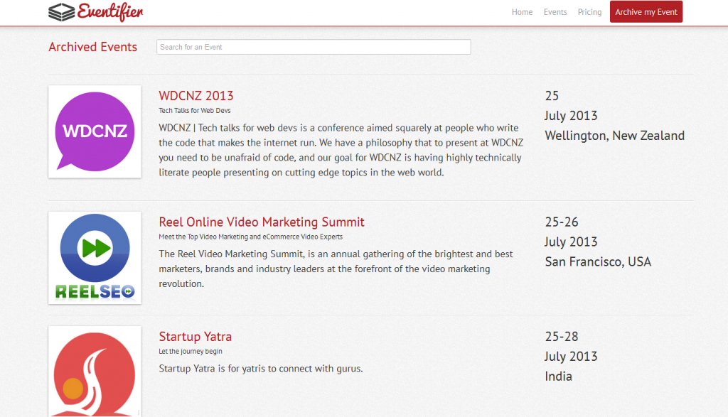
Eventifier is being built in the southern city of Chennai at The Startup Center. Eventifier helps keep all the social media chatter around an event including the conversation, photos, videos, presentation decks in a single place. They are one of the few startups using the hacker, hustler and the designer approach since the day they began. Mohammed Saud holds the mantle of the Chief Design Officer and one would give weight to his belief when he says “Being equally proficient in all facets of design even when their underlying principle might be the same is difficult.” His solution is the one that is increasingly becoming common, become proficient in one form of design yet understands the other well enough to guide somebody with your vision. A similar ideology was put forth by Arun Jay, who amongst a number of other claims holds the post of the principle designer at SlideShare and the senior UX designer at LinkedIn. By academic training Arun began as a communication designer but his experience with film making, photography and web based technologies makes him the ideal choice for the unicorn designers so many startups look for.
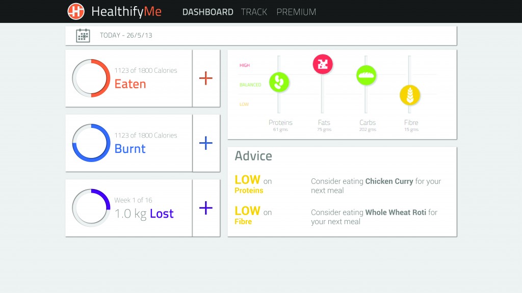
But it wouldn’t be fun if there weren’t a few startups breaking the mould. HealthifyMe and NowFloats are two startups which were a part of the Microsoft Accelerator program in Bangalore. On one hand we have Neeraj Sabharwal from NowFloats with no formal training in the various disciplines of design yet relying on his industry experience and understanding of design thinking principles to lead the charge. On the other we have Tushar Vashisht co-founder of HealthifyMe attributing the fact that “Lack of a dedicated designer in the founding team even with the team valuing design, cost them precious resources in the decision making and product building exercise. With HealthifyMe treating the user experience as an integral part of the product building process getting Rohan Gupta as a designer onboard has positively affected our shipping time.”

But believing that a well-designed product is the end all in the product building exercise would be plain naïve. Design is one of the integral processes amongst the host of other responsibilities held by the hustlers and the hackers which make a product successful. Brij Vaghani is the founder of live traffic monitoring service, Traffline which currently operates in three metropolitan cities. His team is working in close association with a design studio for the soon to be launching next version of their product. “Even though we understood the value of design, the founding team relied upon our core strengths of technology in the early stages of the product. An approach which we feel might have had an impact on the metrics we use to track the product success but something that was within permissible levels”

Where are we headed? Great design and technology have always existed. The founders are still looking for that elusive designer who can handle all their design problems, but as unicorns go those beings are still rare to find. The consumer internet is nearly twenty years old, the smartphone nearly six and the tablet less than four. Yet the potential of the startups building upon and specifically for these platforms is seeing an exponential growth. We haven’t even begun scratching the surface of the potential and can’t predict the trajectory of the startup economy in India serving an internal audience of a billion plus people and catering to those abroad. But the fact remains that the designers seem to have finally found a voice and Indian startups are rearing for them to go.

Author’s Note: This article was written for a collaborative publication: Create Change for Kyoorius Designyatra 2013 produced by Kyoorius and British Council, India and is a part of British Council’s design writing programme.

The post has been slightly modified for the web by adding of the appropriate hyperlinks to the startups and the resources mentioned to aide the reader. You can download the PDF version of the print magazine in all its glory here. The article is on page sixty-nine.

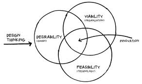
#DesignThinking: Desirable. Feasible. Viable

We all know quite well the value of Design to business, and Design Thinking to problem solving. But what remains a bit fuzzy for many start-ups, organizations & individuals is the gap between thinking and doing or making it happen.

In this time of volatility and complexity, the role of design to drive meaningful innovation and change is growing and while there are multitude of factors that need to be taken into consideration for a product design that is desirable, feasible & viable the design thinking process can help overcome these product characteristics. 

Yes, great design starts with design thinking! Reminds me of David Kelly from IDEO who puts this together as empathy or being empathetic. In other words focusing on what users value the most and building on top of the ideas they share with every incremental value we deliver to make designs better.

In an effort to bring all designers, engineers, product managers & entrepreneurs together via an informal coalition of like minded design thinkers community to help promote the how-to’s of design thinking, MakeMyTrip in co-ordination with #PNMeetup hosted a day long #DesignThinking event in its premises inviting them to discover the stories, solutions and tools that design thinkers are putting to work, from start ups to multinationals helping them find inspiration and learn how real world solutions are provided using innovation & technology to work to solve complex global challenges. 

This event was a first step in NCR UX community with series in pipeline with start of an exciting thought-leadership plank in the UX ecosystem in the country towards creating a platform to nurture design thinking & promoting design thinker’s community fostering an ecosystem that promotes delivering great experiential online products. Industry experts from LinkedIn, Mettl & Anagram Research supported the event with inspirational talks on subject and sharing how they practice the same in their respective job functions, startup’s & organizations thereby embracing the process in their day-to-day routine while driving the product vision at their setup. The experts also covered upon bootstrap strategies for startups who cannot afford the UX agencies or a big design team and face design challenges day in day out during their product design journey. Some even illustrated the design thinking approach to problem solving of product features design and helped them uncover the latent needs, behaviors, and desires for their users. 

Altogether,  #Design thinking event saw noteworthy achievement with 40+ design thinkers joining us from NCR and could leverage the platform listening some inspirational talks from speakers and meeting few like minded folks around. Had participant mix from passionate startup entrepreneurs to designers & dev engineers. Audience was glued to program embracing the talks & interactive workshop from functional experts in domain. 
Check out what happened at the First #DesignThinking Workshop on http://t.co/g0DDFbP7kS  

Guest Post by Dushyanth Arora, Head, User Experience & Design MakeMyTrip

Promoting Design Thinking in the NCR

design thinking

In the last 2-3 years there have been well designed products coming out of the NCR startup ecosystem. Mettl, Visual Website Optimizer, Paytm, and Oogwave, especially come to mind where Design Thinking has been an integral part of the product development process, and not an after thought by giving it just a cosmetic veneer.

There is a noticeable increase in design sensibility while attending various Meetups and pitching design services to startups. However, there is still a gap in how to make it happen. In other words, how do startups and product managers cover the distance between thinking of design and making it actually happen.

With support from ProductNation, a few design professionals from Design For Use, MakeMyTrip, WoodApple, DSYN, Zomato and U2opia Mobile have formed an informal coalition to help promote the how-tos of design thinking,

Please join us for our launch session this Saturday (May 18th) at the MakeMyTrip office. There will be a talk by Mettl founder, Tonmoy Shinghal, followed up a 3-hour workshop on how to practice Design Thinking in your company by Devika Ganapathy of Anagram Research. Not to mention plenty of networking opportunities during coffee breaks and lunch. Please check out the details and register soon (only 30 participants).

Usability Review of @Bubbles – A new kind of mail service

In a startup, the design is usually an afterthought after the more important challenges of business and technology are solved. Which means by then the design is more like a band aid or a lipstick on the proverbial pig. Probably the main reason why products here still lack that world-class feel, even though they are better in terms of features and performance.

A successful product usually has the right blend of usefulness, ease-of-use and engagement or emotional connect through aesthetics. For example, Facebook might score high on each of the three attribute, while a game like Grand Theft Auto may deliberately keep the ease-of-use difficult. Each of these attributes should be part of the product roadmap at the onset. By how much should you dial up or down each attribute or in other words what is the overall design vision? And who will be responsible to achieve this vision?

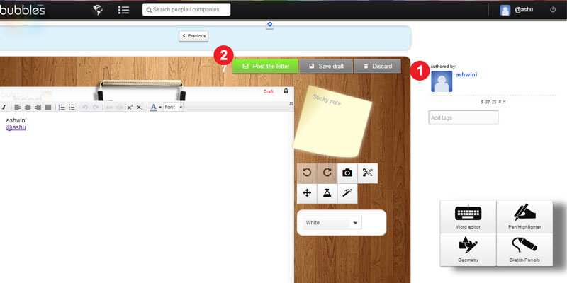
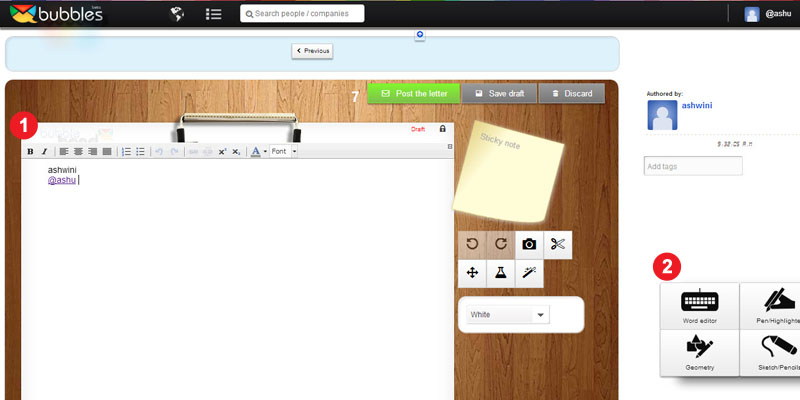
We feature the first of several quick audits to get a conversation started around the importance of design when you are a startup. We did a quick review of @Bubbles, a six month old startup trying to re-imagine email by bringing it closer to the art of letter writing from the good old days. It enables tools for your creative expressions, allowing you to scribble your thoughts, stick photos, sketch cartoons, draw diagrams, and attach sticky notes to your email as you would do on a physical letter.

We evaluated it on 4 key user experience parameters.

How well does it COMMUNICATE to users?


To reduce user’s memory load, it is important to use terms & language that connects to their existing mental model. Once you have adopted a mental model or a metaphor, then try to be consistent.

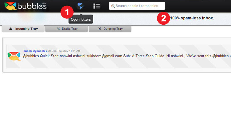
  1. Terms like “Open Letter”, “Direct letters” are not commonly used in context of letter or email writing and hence can lead to different interpretation. It also adds to the learning time for the user.
  2. Similarly, “No Posts” and “100% Spam free inbox” violate the mental model of letter writing. Either use a “letter” or “email” metaphor but use it consistently.

How easy is it to NAVIGATE?

  Ease of use is vital. The user should always be in control and take the intended direction to perform a particular task. To be able to do this, it is essential that the user understands the flow of screens or sequence of actions.

  1. The incoming and the outgoing mails have the same look and feel, which leads to some confusion. The status of the site or where you are at a given point is not well communicated.
  2. Same page for public & personal letters – The sending route should be selected after the letter has been written. There could be multiple paths to doing this too.

How easy is it to INTERACT?

The information structure should make relevant connections between different pieces information and tools (features) to enable user to achieve desired goals.

  1. Editing tools for the letter are scattered all over the page. A fixed layout for the toolbar would make it easy to use. Some drawing tools like – copy, paste, resize, rotate, etc could be integrated at one place to create a seamless experience.
  2. Every selection or user action should be followed by an appropriate feedback. For example, when a user selects a Pen tools, there is no feedback that it has been selected.

Does it create the right EXPERIENCE?

Overall, it is about experience.

  1. Sent mail is a personal letter as well as a promotional letter for Bubbles, so it should be designed so as to attract more customers, who are not currently on Bubbles.
  2. Keyless Login creates a good experience but the learning curve should not be high.

Undoubtedly, Bubbles is a much better designed product than most. There is a design sensibility with some effort and thought behind each screen, icon and color palette. However, it seems that though there was an emphasis on graphic design (engagement or aesthetics), it could still be improved significantly with some thought on interaction design (usability).