In 1999, Vistaprint, a four-year-old French startup, launched its internet-based printing services in the highly competitive US market.
Going against the popular advice to target the bigger companies (who would spend more money on printing), the Vistaprint team went for the micro businesses (who were then considered as a terrible market, as they were close to impossible to reach).
To tackle that, the Vistaprint team came up with a direct marketing strategy, which turned out to be a runaway success, becoming their core acquisition flywheel in no time.
And, it’s simpler than you think.
Basically, this was their offer: Customers could get 250 full-color business cards (that were being sold for about $85 online and about $200 to $300 offline, in those days) printed for free, and pay just a nominal charge of $5.67 for shipping and processing.
They could place this order as many times as they wanted, and Vistaprint would fulfil it for them, under a few conditions:
● The free cards will be printed only using one of a set of 40 designs
● It will take three weeks to deliver them
The customers who wanted a different card design, or wanted to get their cards delivered faster, would have to pay a premium price.
This strategy, that worked wonders for the printing company (which had about 17 million people individually buy from them by 2009), lies behind the freemium model in the present-day lexicon.
(Note: If you’re new to the freemium concept, head over to this post that outlines what the freemium model is and how it works, and then get back here. We’ll wait for you.)
However, all is not perfect in the freemium fields.
Even though a plethora of SaaS success stories including SurveyMonkey, FreshBooks, and Prezi have managed to make the model dance to their tunes, we can quote an equal number of accounts where businesses have fallen prey to its deceptive allure – Baremetrics, Ning, and Bidsketch, to name a few.
So what’s the deal with this elusive model? What does it take to win over it?
When does the freemium model go wrong?
VistaPrint already had a full-fledged card publishing and manufacturing technology in place, when they started providing business cards for free. Thanks to the economies of scale, the more cards they printed, the lower their manufacturing cost.
As you’d probably know by now, the basic premise that the freemium business model operates on is this:
Several hundred thousands of users sign up for the freemium plan, and then a good cohort of them will convert into paying customers.
“The easiest way to get 1 million people paying is to get 1 billion people using.” – Phil Libin, CEO of Evernote
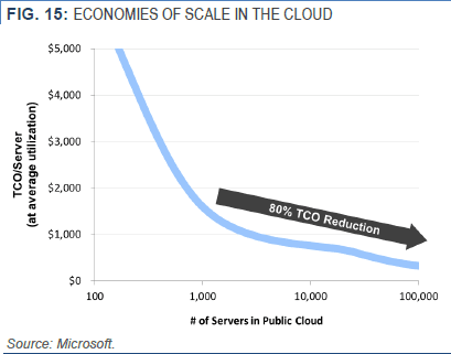
So for the freemium model to work out, one specific product attribute must already be in place – low marginal distribution and production cost. Only if you can keep the cost as low as possible, an additional free user will cost you nothing more than a database entry.
SourceMicrosoft, in one of their whitepapers, showing how the cost plummets with quantity
Although this is an inherent characteristic of SaaS products (as shown above), if you’re not careful enough, your freemium pricing can still go completely awry.
The number road to failure is pretty straightforward: Keep investing in more and more infrastructure to handle new users, without generating additional revenue (or having a backup plan) to offset the growing cost.
A majority of websites that sell downloadable content fall under this category. These businesses don’t charge their freemium customers and rely solely on ads for revenue. So when they can’t make enough money from the ads, every new freemium user will exert a bit more strain on their existing infrastructure, to ease which, they will have no other option but to augment their resources.
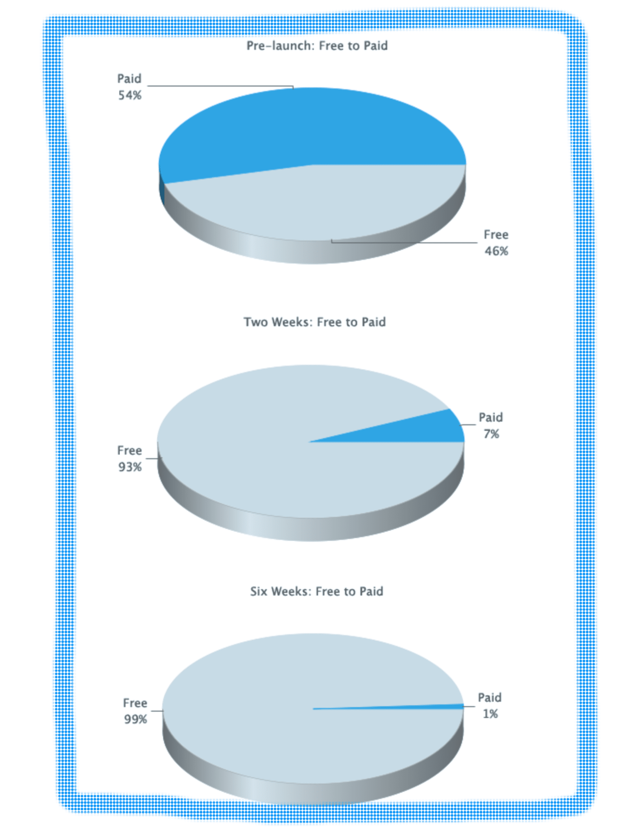
About 11 weeks after having launched their free plan, things were looking positive for the Baremetrics team – over a 1000 free accounts had been created, of which the eligible paying customers sported a conversion rate of about 11.5%.
And over a period of two years, their free users outnumbered their paid customers, and they found themselves grappling with increasing server and performance issues. The result? More dissatisfied customers began leaving them, because of the “down time, delayed data and inaccurate metrics”.
Source“Our free plan was causing our business to slowly implode.” – Josh Pigford, Founder, Baremetrics
Countless such services have gone under because they weren’t able to bear the weight of the overwhelming scale of operations, both financial and infrastructural.1
But, that isn’t the only reason that leads SaaS businesses to succumb to the dark side of the freemium model and shut shop (or pivot, if they’re smart).
Had the Baremetrics team restricted the data import/export for the free users, they could’ve saved up on the server usage, and have in turn strengthened the reason to upgrade.
Here’s our next SaaS example, Bidsketch’s free to paid conversion rate over the weeks:
SourceFrom “Great!” to “Grmph.” to “Grrrr!”
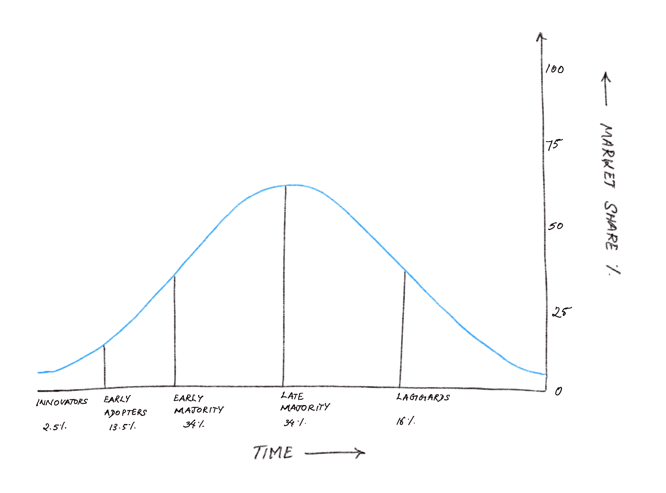
What’s happened here is a textbook example of how the different kinds of adopters operate as per the “Diffusion of innovations” theory.
The real game begins after you move past the Early Majority adopters
Once the Early Majority customers have moved up the pricing ladder, the conversion rate starts tapering down, as the Late Majority and Laggards are more averse to change. The trick is to keep innovating and adding more value to your premium plan, thereby nudging them down the conversion funnel.
Summarizing this section, the main reasons that contributed to the failure of the freemium model in these businesses are:
● Not having a business model that’s cut out for freemium, where every new user puts more pressure on the existing resources. Adding to that – under such circumstances – not having been equipped with a solid strategy to accommodate the growing load.
● Not striking the right balance between your freemium and premium offerings – if the freemium plan isn’t attractive enough, then you won’t attract new users, and if the freemium plan is too heavy, then the new users won’t move to the premium plan.
● Not communicating well to the free users, a straightforward and solid benefit of upgrading to a paid plan.
● Not constantly hitting on the innovation pedal and making your premium product more and more lucrative, to convince the users in the Late Majority and Laggards categories to upgrade.
When does the freemium model pay off?
1. A DIY product/service, where the cost of servicing a new customer is close to nil. These are the businesses that are designed for the freemium model by default.
SaaS examples: Massive Open Online Courses (MOOCs), Webflow.
This business model accommodates the main ingredients that were missing in the previous section – economies of scale, and low marginal cost.
While MOOCs incur an initial significant fixed cost on course development, contrary to a regular classroom, they don’t have a restriction on the number of students. So a $500,000 fixed cost will be brought down to about $5 per student, if 100,000 students enroll for the course.
Also, the marginal cost of serving an additional student can also be brought down to $1 per student, as there’s no personalization of the service, the product doesn’t have a steep learning curve, and a community-based support will suffice.
The premium plans usually consist of certificates from reputed universities, and according to Daphne Koller, Coursera’s co-founder, they’re able to monetize around 20% of the total registrations.
Moreover, a majority of the students drop out mid-way, thus lowering their streaming cost (their biggest marginal cost). Only around 10-20% students make it to the final exam, and they are the ones who will most likely be interested in paying for certificates.
Now these aspects aside, the other deciding factor for the success of your freemium plan is your value metric.
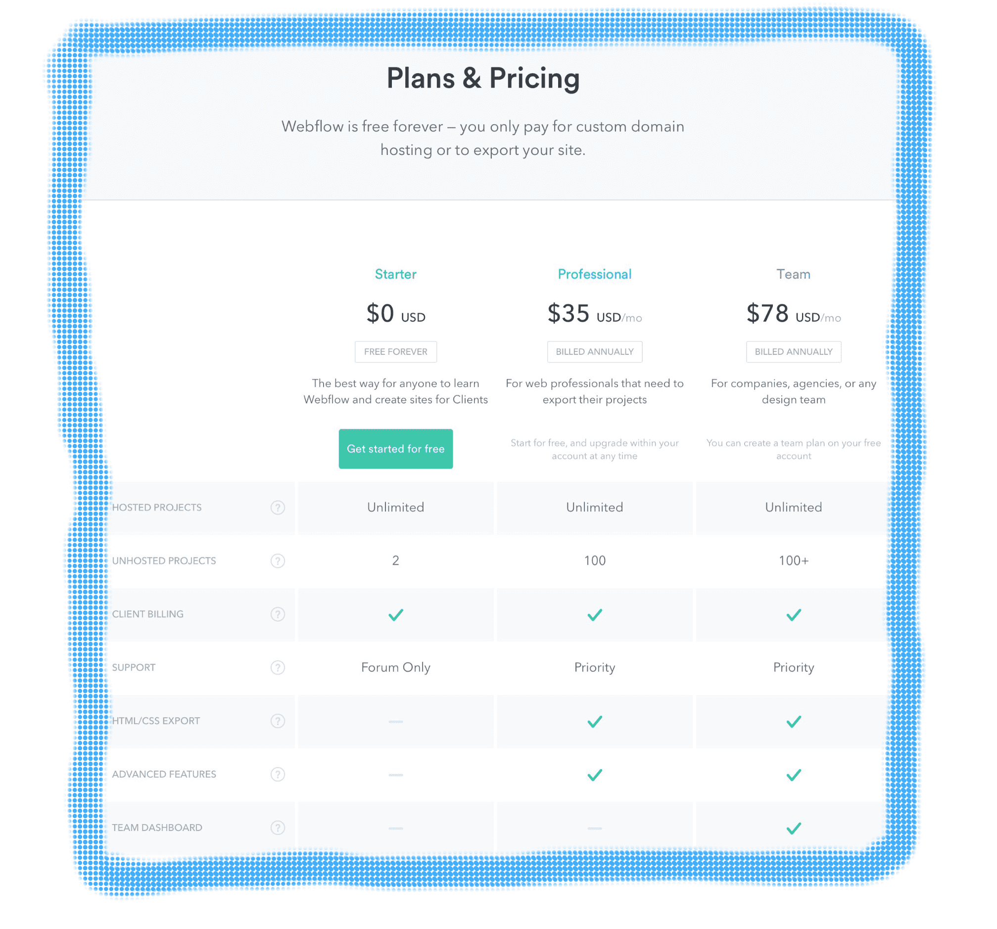
Check out Webflow’s pricing for instance.
An attractive freemium plan + an even more appealing paid offering = a very satisfied cash register + an even more satisfied customer
These guys have nailed it in coming up with a super compelling reason to upgrade – they have used the collaboration feature (they call it the Team Dashboard) – one of the fundamental activities of website building – as the value metric.
This ingenious move set them up for success, and it wasn’t as easy as you think it was.
Only when you have a crystal clear idea about your customers’ Jobs to be Done (JTBD), will you be able to pinpoint the exact feature that will deliver the ultimate value for the price that you’re charging them.
So if they get a freelancer web developer on board, Webflow can either have them in the freemium plan, or they can make a decent sum of money in the Professional plan, and the moment the freelancer grows into a company of at least 2 members, they directly take them to the Team plan and charge them $78 per month.
The product is designed in such a way that it keeps track of the IP addresses; you can’t log in with the same ID more than once, and you won’t be allowed to view the same folder. For a user who is thoroughly impressed with the product, and is looking to collaborate, these enforcements act as a natural motivator to upgrade to the higher tier.
Which highlights the next factor: it all comes down to how irrefutable your offering is to the customer, and how effectively it gets their job done.
2. Businesses which deliberately try to assimilate and absorb the cost of operations, support, and service, to have a freemium model up and running.
Now why would anyone do that, you ask? Well, for one or more of the following reasons:
● When you’re having your freemium plan as a differentiator in the market.
About 75 startups were already operating in the American market when VistaPrint set foot on it. Millions of dollars were being raised by e-printing companies, and the competition was cut-throat. And they counted on their strategy to target a different market and to offer a freemium deal to give them a spotlight.
SaaS example: SALESManago.
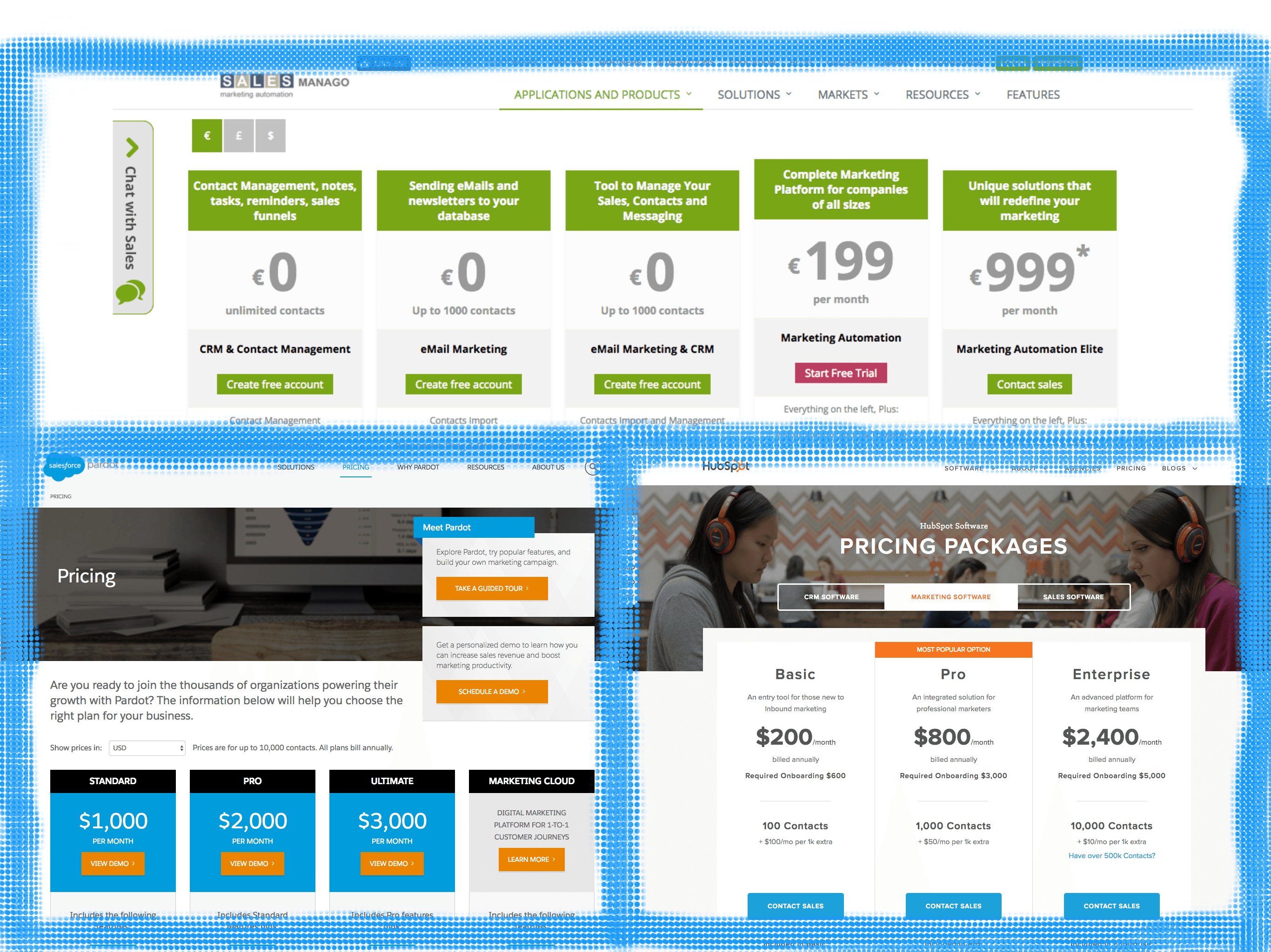
This Polish marketing automation startup knows what it’s up against – giants like HubSpot, Pardot, and Eloqua. And that’s precisely why they double downed on nailing their pricing strategy, to stand out from the crowd of Goliaths.
Notice how the 0’s stand out in the collage of screenshots with numbers strewn all over them? There you go.
And they seem to have done a great job at it. This February, they have raised about $6 million, following a 200% growth over the previous year, 2015.
Let’s examine their pricing plans for a moment – clearly segmented free plans, each with their own specific set of benefits, and the introduction of a premium plan only when the customer’s business grows large enough to integrate and automate the marketing activities. Just like Webflow, it is evident that the SALESManago team has a thorough knowledge of their customers’ JTBDs and pain points that they’re solving.
The result? The customers get an offer that they can’t refuse.
● When you’re employing your freemium plan as a free branding tool.
Wait. The VistaPrint team didn’t have just two conditions attached to their freemium offering. There was one more. Apologies for missing it in the introduction.
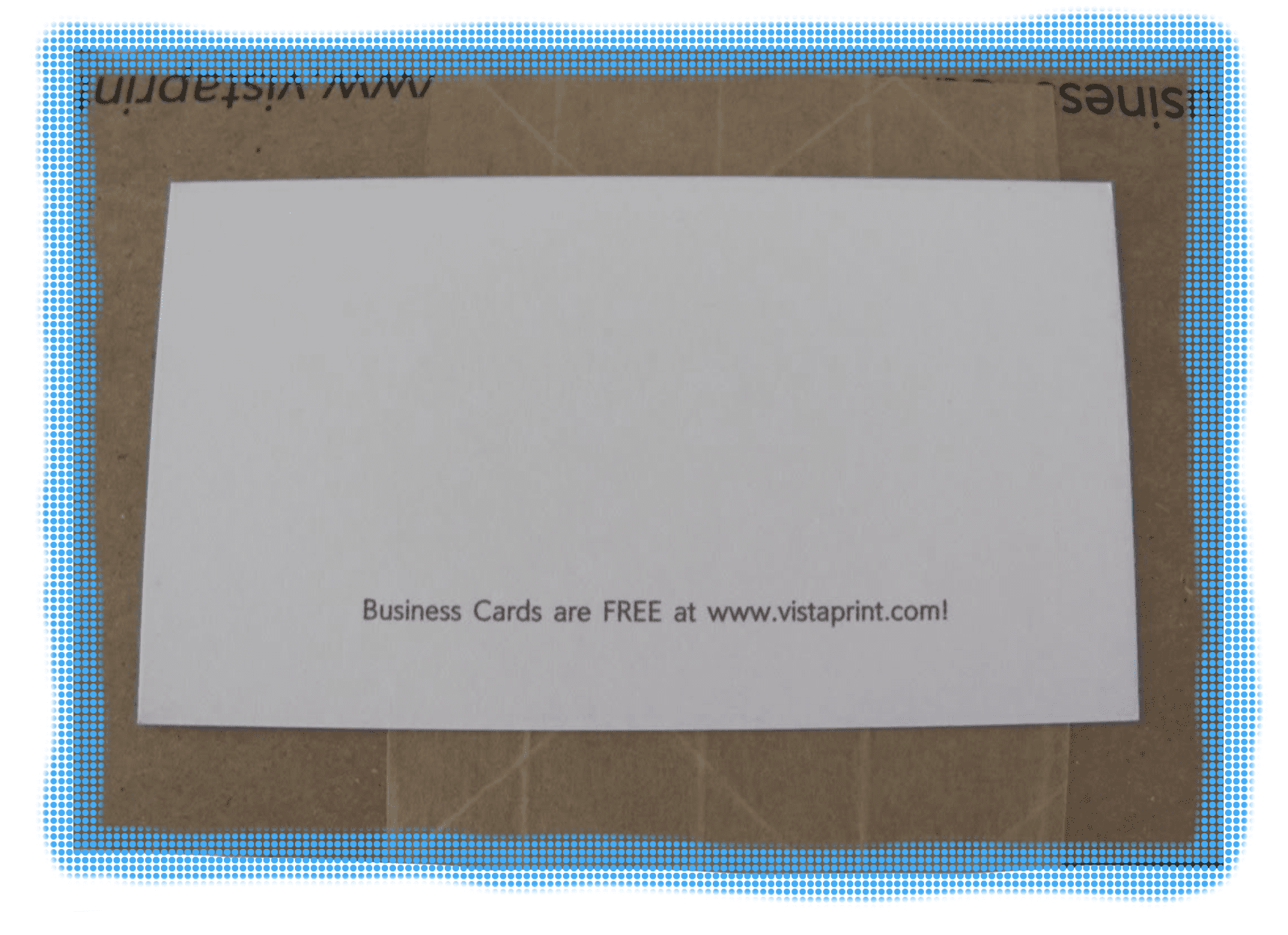
Yet another tactic of theirs is that all their free cards will have “Business Cards are FREE at VistaPrint.com!” printed in small fonts at the backside bottom. Those customers who wanted to get the line removed, will have to pay.
SourceViral branding at zero cost – Check.
SaaS examples: Zendesk and Typeform
At the time when they had just launched, Twitter was Zendesk’s highest referrer. Zendesk had a freemium tier back then, where they’d brand the Help Center’s URL. So everyone who was on Twitter and had to get in touch with the support team had to do so via twitter.zendesk.com. Easy, free, referral program to earn new customers!
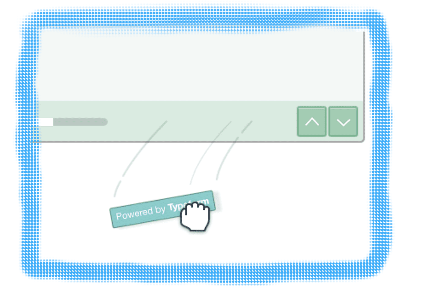
Typeform does that at present. With the “Powered by Typeform” signature on the bottom right corner of the free forms.
SourceWant to replace Typeform’s brand with yours? Become a PRO!
If just by including a line at the bottom or by adding your brand name to the URL, you’re able to generate ample volume of new users through your existing customers, why would you mind giving it away for free? The cost that you incur because of the freemium plan can then be brought down under your marketing costs.
● When you’re having your freemium product to market your paid product
VistaPrint’s objective was clear. They wanted to sell anything and everything that will help their customers to brand their own businesses – brochures, presentation folders, stationery, apparel etc, and printing business cards was the starting point to get there. Give away business cards for free, and use them to market/sell your other paid products.
Even though this particular category doesn’t fit the textbook definition of the freemium model, the underlying intent is very much aligned to that of the model. And the SaaS world has a name for this: Side Projects.
SaaS examples: Crew and Intercom
When the Crew team was running low on money and were desperate to turn the tables, they created Unsplash, a website that curates and gives away hi-resolution stock photographs for free. The results? Unsplash was (and still is) the number one referral source to Crew, that brought in around 5 million unique visitors.
Mikael Cho, Crew’s founder, quotes Jay Baer to back his faith in side projects (they have since developed a truckload of free side projects – 13 to be precise).
“Due to enormous shifts in technology and consumer behavior, customers want a new approach that cuts through the clutter: marketing that is truly, inherently useful.” – Jay Baer, Youtility
Intercom does that too. Their free product? A customer intelligence platform.
In short, businesses that belong to these three categories, spend those extra dollars to sustain their freemium product, because they know that the free users are paying through one medium or the other –
● They will either use the product and allow it to become a part of their workflow, thus pay for it with their mindshare, or
● They will pay for it by marketing the product
How to find out if the freemium model is right for you?
There’s one school of thought that argues that freemium is dead and gone, and businesses must shift to the next big thing to stay afloat. Then there’s another side that vouches for the abundance mindset, where websites like Craigslist let people post ads for free, and still manage to earn $400 million. Both make sense, and both are equally right.
Vistaprint entered the US market just after the infamous dot-com crash, as a result of which they weren’t able to raise much money compared to the other bubble companies. And its founder believes that that situation, in fact, saved them; because they weren’t able to pool in investments, they had to operate leaner, come up with better strategies, and work harder to make a profit. And that set them apart from the rest of the venture-backed companies.
This is also the reason why they were able to go big with free products and over-the-top distribution strategies, which backfired for most of those latter companies; Vistaprint was clear about its customers and what they wanted, and in turn, the right fodder that will fuel its growth.
Ultimately, it all comes down to how well you understand the value that you’re bringing forth to the market, and how well it aligns with the freemium model.
Dan Martell sums it up in four crisp points, and says that you’ll have to get 3 of them right, to evaluate if the freemium model will work for you:
- The number of potential users in your market: The more, the better – remember, only around 5% of the free users will eventually end up paying you
- The specific market advantage required to win: What do you want the freemium model to win for your business? Is it a competitive advantage? Is it free distribution? Is it getting more referrals? And how realistic is this goal?
- The max complexity of your product and how it works: How simple and straightforward is your product? Does your offering set itself apart from the din around? Is it lucrative enough for your customers to ascend the pricing tiers?
- The specific cost each additional user can have: Is the marginal cost of serving an additional customer negligible? Can you ramp up your operations without shooting up your cost? Do you have the capacity to handle the exponential escalation in scale?
MailChimp launched their freemium plan after about 8 years of building a “powerful, affordable, profitable, self-serve product,” and after gathering and analyzing “tons of pricing data”, to justify the 10:1 ratio of free to paid users of the freemium model.
“The question to ask yourself is whether or not your “one” is big enough to pay your bills yet. For eight years, our company never thought about freemium. We didn’t even know the concept existed. For eight loooong years, we were focused on nothing but growing profits… … In other words, we’ve been laser-focused on the “1” side of that 10:1 ratio. We’d never consider freemium until our “1” was big enough. Enough to pay for 70+ employees, their health benefits, stash some cash for the future, etc.” Ben Chestnut, Co-founder of MailChimp
Guest post by Sadhana Balaji, ChargeBee. The blog was originally published here




 For multi-product companies, it is best to display the most important products from the portfolio with a short description of them and link them to the respective product pages.
  Remember the homepage is not about throwing all the information you have in your visitor’s face, it is about sending them the right way in the right frame of mind.