Whenever we think of Personalization the first thing that comes to mind is Amazon displaying products we are likely to be interested in. The next thing that come to mind is like advertising on the internet. A little more pondering, and Google’s search results and Facebook’s news feed would strike us as being personalized too.
Notice how personalization is invariably assumed to apply to information — whether products to buy or ads to click or statuses to like. The structure around which information is placed often goes ignored — and underestimated — when it comes to suiting the individual.

On the mobile, the ubiquity results in apps rarely getting more than a few fleeting glances. Darwinian economics of App Stores thus have necessitated apps evolve into the leanest units of functionality possible. Any unnecessary clicks, pauses or confusion that could trigger distraction are an evolutionary disadvantage.
Darwinian economics of App Stores have necessitated apps evolve into the leanest units of functionality possible.
A fluid UI that shifts shape depending on the user and their context can streamline the user experience.
There are many simple ways for interfaces to adapt to the user’s context without the need for sophisticated personalization algorithms.
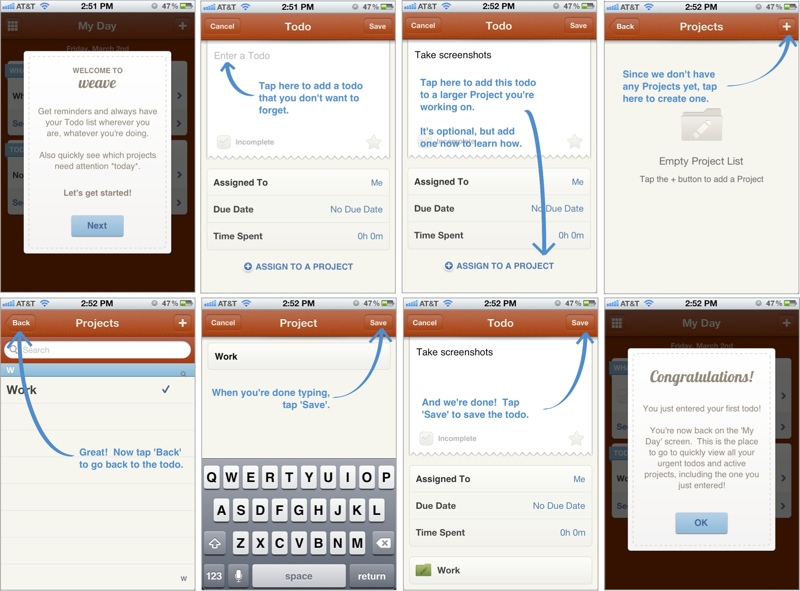
Mobile Games were probably the first to innovate in this area. Starting with a dedicated First-Time User Experience (FTUE or ‘fatooey’) that would run only for new users to introduce them to basic game elements and get them started. In freemium games, it is not uncommon to see different views when trying to buy game currency packs: for players who have never bought before, these packs will be sorted with the lowest priced option on top. But for regular buyers, they are sorted with the highest priced option on top.

Other apps have started to take a leaf out of this book: the image above is a walkthrough of the FTUE of Weave, a popular ToDo app. Secret and Slack have recently received accolades for their FTUE too. Smashing Magazine has a really interesting guide to FTUEs on mobile:
Adapting UI to context is prevalent in more ways than just the FTUE in mobile apps

1. Screens on GPS devices switch to a darker color scheme at night, for low glare.
2. Language localization is perhaps one of the oldest forms of adapting the interface for the user.
3. Responsive web pages are a great example of the UI adapting automatically, with the context being your screen size.

4. The Uber app changes its default view after you have requested a car, to directly show you where it is and when it will arrive, and put the relevant information immediately in front of you.
5. The new Foursquare app, that notifies you of interesting place around, only triggers the notification when it senses that your location has changed.

6. Knowing that most users use a single thumb of their dominant hand, it might be a good idea for apps to structure their navigation accordingly, AND laterally invert key elements for left-handed users. (If you know of any apps that already do this do let us know in the comments.)
In contrast, desktop user interfaces have static, making all options available at once, and expecting the user to “pull” what they want.

3 key ingredients to consider while designing personalized UI are Identity, Context and Behavior.
Identity
There are two parts to Identity: the first part is knowing every user, being able to recognize them when they come back to your app even if on different devices. Knowing every user more is part of this – various traits that let you tailor the app experience: whether the user is left-handed or right, their internet bandwidth, language preferences, social graph, etc.
The other part of identity is created by the user: their identity in your app. How they use your app, and the persona they create in your app is a large part of this. For example, users portray themselves very differently on Facebook vs. Instagram vs. LinkedIn. Sometimes users use Instagram to post pictures of what they sell to their audience, while other times users use Instagram to share personal photos with their friends.
Context
Context is about the here and now. Knowing if a user is at home or walking on the street can play a big role in shaping the UI of a restaurant recommendation app. Or a payment app — whether a history of transactions on the main screen is more important, or a pay here button. What screen the app is being used on – a TV or a car – will govern what actions are front and center. The user’s local time, whether the user is currently on a subway train or running down the jogging track, whether they came to the app from a specific notification are all piece of context that can be used to personalize the experience.
Behavior
Interpreting users’ collective previous actions to anticipate what they might do, and shaping the UI accordingly is where personalization gets complex but also magical. All content recommendations – products, music, search results, news – do this. With UI, it overlaps with the second part of Identity mentioned above: is the user using a calendaring for their business or for personal scheduling? Can the payment app know if it is being used to pay for purchases or to send money to friends? Can a news app learn about your sharing habits to decide the prominence of the sharing button?
BUT there is a slippery slope to ultimate confusion
The best UIs are the ones that are familiar – the user instinctively knows where to click and how to reach their goal. Too fluid a UI can create confusion. Getting the personalization wrong can be even worse. It is always the right thing to make changes in small steps, and A/B test to learn from how users react.

