BSB is a start-up funded by Bharti & SoftBank building mobile products for the Indian market. Hike is a messaging app which allows instant messaging and group chat on your phone with friends who have Hike, as well as those who don’t have Hike. We caught up with BSB’s head of products and strategy, Kavin Bharti Mittal (KBM), to talk about Hike, right before he was getting ready to launch Hike 2.0, a major update to the messaging app.
Introduction
Hike is a pure Made-in-India product. BSB is based out of Gurgaon, and the product was built from scratch by this team. Under the guidance of KBM, who is also the resident UX guru, the team brought out a beautiful and highly functional product in Dec, 2012 when the team size was 15. They are 30+ now, and furiously working on next set of features, supporting users and handling the success!
Product Highlights
- The product has been designed from grounds-up by Hike team.
- The design is beautiful and minimalist.
- They chose a more efficient protocol for communication (MQTT, which is less chatty than the better-known and more-often used XMPP).
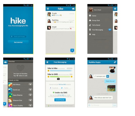
- In India, Hike allows its users to message to non-Hike users by converting Hike message into an SMS (each user is given 100 free SMS every month). This is a key differentiator for Hike, in addition to a cool and modern design.
Product Development
- Following an agile development model, they schedule a release every 4 weeks with a stop gap release for performance and related fixes in the middle if need be. Such a schedule ensures that they are not hitting the users with too many changes too often, and still stay responsive to market feedback.
- KBM controls the product UX and works with his designers to create detailed wireframes and mockups before engineering starts working.
- They have a very product-focused culture and so engineering-design conflicts are minimal as everyone understands the need for a great design and works hard for it.
- They work on multiple platforms in parallel, so lessons learned on one platform are quickly incorporated into other platforms in the same release cycle.
Product Strategy
- Beautifully designed product – Made-in-India products are not known for good designs. Hike is a notable exception and this will help it gain ground quickly.
- Messaging Hub – In the world of Facebook and Twitter, there is a huge amount of information generated and consumed by people, causing information overload. Hike aims to cut this clutter and allow you to create a closed network of friends with whom you share right amount of information. This is a good differentiation strategy.
- Close partnership with carriers – With smartphone penetration going up all over the world and cheap smartphones being available, messaging applications are well-positioned to kill SMS (and jeopardize a large portion of carrier revenue). Hike can offer opportunities to carriers to offer value-added services and retain (and enhance) that revenue.
Adoption
- The messaging app space is very crowded (WhatsApp, Facebook Chat, WeChat, Nimbuzz , etc.) and Hike is a late entrant to the party. Still it has created considerable buzz in the market and have some impressive numbers to show.
- In 4 months since the launch (they launched on 12/12/12), they have crossed 5M users (adoption is measured by # of active users – sending at least 1 message a day) and growing fast!
- Over 50% of their users use hike2SMS feature, which is a key differentiator for them
- They have used rewards (Talk-time rewards, ended now) and incentives (50 free SMS for each successful invite) to good effect to create good buzz. However, as KBM says, buzz and going viral work only when you provide a good value to the users. Hike 2.0 is expected to bring in lots of features.
- Using digital channels for marketing and support very well: Blog, support site, Facebook page and twitter handles (@hikeapp and @hikesupport) are all well used by users and well-responded by Hike team.
Hike 2.0 and beyond
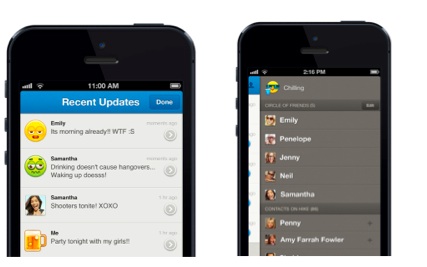
On Apr 17, BSB announced Hike 2.0, a significant release which introduces ‘circle of friends’ notion and many other features. With Hike 2.0, you can now create a circle of friends (consisting of your close friends), post status and mood updates to them, and review their recent updates. This is similar to Facebook’s Improved Friend Lists and Google + . Read the announcement for full list of Hike 2.0 new features and enhancements.
‘Status updates’ are asynchronous models of communication (you don’t expect your friends to read and respond immediately, though this Facebook generation usually does!) while messaging is supposed to be synchronous – you engage in conversation in real-time and expect a response. With 2.0 release, Hike is positioning itself as the ‘messaging hub’ for mobile-first crowd, and taking a ‘closed group, more engagement’ approach (as opposed to ‘everyone reads everything about me’ philosophy). While this might pit it against Facebook and G+ in terms of functionality, I think this is good strategy going forward to capture mindshare of an audience who is a public enough to chat with anyone, but private enough to need the solace of ‘circle of friends’. This also attracts users like me who prefer private and deep conversations and shun messaging apps because of its openness.
As Hike grows beyond the feature-functionality debate, it needs to give more focus on back-end: messaging is critical for its audience and disruptions caused by planned maintenance or rush to get new release must be avoided at all costs.
The Road Ahead
My address book contains my US, China and India friends which add up to about 400 contacts. When I installed Hike on my phone (Nokia 710), I found hardly 5 friends who were on Hike (Hike looks for those who are on Hike and adds to your friend list). I did the same for WhatsApp, and I saw 80% of my contacts show up as using WhatsApp, including some of the people I didn’t think were in the target segment of messaging apps!
Hike has a long way to go, but I think they have started with the right product and are travelling in the right direction. May the force be with them!

