Does Mobile Only strategy point to lack of Design Thinking?

The runaway success of Indian e-commerce show is driven by the single biggest attraction of hefty discounts available almost on all products! More than any other value proposition of e-commerce such as more choices, convenience, 24×7 availability, payment options and faster deliveries, the Indian customer was lured to e-commerce by the sheer scope for discounts she would not get elsewhere! The intense competition over market share among the e-commerce players ensured that there is always a counter offer for any blockbuster offer from one player. The eternal discount chasing customer is smart enough to sense this opportunity to compare prices of every item on offer with other vendors and settle on the maximum discount offer. While this was the modus operandi of the average online buyer, e-commerce players were sweating out on how to better their offer by attempting to do enormous scales that would only push their quest for profitability farther and farther.

Gme Changer or - Image_1As the dog fight continues to grab market share, e-commerce players are trying to outdo one another by introducing newer business models and innovations; the latest being Mobile Only format. Though there have been many successful experiments that defined the online buying culture in India such as Cash on Delivery, easy hassle free returns and EMIs, the latest experiment’s success is not pronounced yet, while many of the digital enthusiasts are upbeat about it.

Sorry, Mobile Only -Image_2Here comes the Mobile Only strategy!  While all the arguments for Mobile Only strategy evangelize the potential of the native app technology and innumerable values it promises to the marketer, an honest assessment of the anticipated compromises on the side of the customer is yet to come i.e what possibilities it takes away from the customer in order to cut short longer sales cycle.  Ironically, the deterrents for marketers to sell more are also the very value drivers for the consumers to buy more!

What is undisclosed about the real motive behind the Mobile Only strategy? Is it just Customer apathy?

During the years Indian e-commerce players took their baby steps to entice the buyers, this space also spawned innumerable deal aggregators and price comparison sites in empowering the value hunting customer to gleefully snap the best deals in the online space because of customer’s sheer capability to compare and choose across multiple vendors offering products of same specification. While online customers enjoyed this newfound freedom and capability, e-commerce players dreaded this unfettered nature of competition. This had made e-commerce players’ life a nightmare and the only possibility to woo customers was to settle for lowest price and provide faster delivery – both demanded extreme back-end efficiency and truckloads of money to operate at wafer thin margins; if not at loss.  Every e-commerce vendor had been eagerly looking for an effective way to fortify his customer from being weaned away by a better offer from competition. In these circumstances some enthusiasts find the Mobile Only format a perfect antidote for limiting customer’s newfound capability.   Lets look at how the Mobile Only format plays out!

  • In a Mobile Only format, the ease and speed of operation make the customer blind to the loss of the market options- i.e. to compare and weigh the market offers and to arrive at his maximum discounted vendor decision!
  • Deprived of option to compare the customer would be less confused about product choices with other competing products – the bliss every marketer longs for.
  • Customer decision cycle will be relatively short and quick compared to an open market situation like many players offering competing and comparable products as in the case of web.

Thus, effectively marketers are trying to cage customers to the controlled environment of their app and subtly cut off customer from the open market and invisibly condition and constrict his buying behavior for the benefit of the marketer, hoping that customer would fall in place as per their design!

However, what boggles the mind is the unpredictability as to how the customer would react to this stealth move by marketers!

The Mobile Only format yet to sink into the customer mind!

Hostile UX- Image_3
The inevitability of Mobile Only customer experience

Despite all hype around personalized content spiced with data analytics, the user experience remains the single largest bottleneck for going Mobile Only format. A large section of online users, especially those who have access to PC still consider viewing the products on large screens and doing one’s own market study before placing orders. A lot of online buying is driven by such consumer behavior born out of web format capability, but this turns out to be a huge challenge in Mobile Only format as SEOs are still at nascent levels in indexing app pages effectively to provide actionable comparison. Moreover for the user it becomes quite tricky to compare different sites considering the smaller screen of mobile device, while for the marketer app based approach opens up plethora of possibilities. That brings us to the cross roads in deciding how to navigate between marketer opportunities versus customer centricity?

The behavioral profile of online buyer and the Mobile Only format – a case of mismatch?

  • One of the main characteristics of online buyer is his appetite for best deals with maximum discounts available across vendors.
  • He also derives satisfaction that the deal is actually the best by comparing it with other offers. Therefore he is a value hunter and much less brand loyal.
  • Similarly, the app only promotions may not entice the buyer as buyer may feel the buying experience to be incomplete without going through this essential buying process or may remain non impulsive to respond to a targeted notification in the app.
  • The idea of enhancing personalized buying experience and brand building may be misplaced here, as there is a mismatch between vendor offering and customer expectation.
  • Majority of the mobile Internet users have been using online buying just recently and are yet to realize the compromises they have to make while on a Mobile Only format. Eventually they would conclude that the benefits of web may outweigh those of the Mobile format.
  • When the buyer realizes that marketers are effectively limiting the possibilities of the buyer, the disenchantment may lead to a lot of anguish in the minds of customer and eventually she may look beyond Mobile format.

While we have so much pointers to customers’ buying process already on the table, a complete disregard to customer behavior and expectation will have serious implications in winning a pie from the increasingly discretionary customer participation. On the one hand all the leading e-commerce players claim that 70% to 80% of their total orders come through their mobile platform; on the other hand they admit that 25% of these orders are originally discovered in PC platform and the mobile platform was used only at the clinching stage of order execution. Hence ignoring this huge market will be destroying the value they have hopefully awaited over the years.

Thus, only time will unfold whether Mobile Only format is a game changer in delivering value or a big value destroyer? The early reports suggest that Myntra had mixed response to their app only strategy. Interestingly Myntra’s parent Flipkart has put on hold Flipkart’s app only format originally scheduled from 1 September 2015. In the just concluded Big Billion Day sale in October 2015, Flipkart continued the web format and was heavily promoting the app platform by offering app exclusive launches and additional discounts on app based purchases indicating that despite all the best efforts to push consumers to app only format there is considerable volume coming from web format and marketers cannot ignore consumer preferences.

Going by Flipkart’s main competitor Snapdeal’s founder & CEO Kunal Bahl’s admission, Myntra’s app only strategy has greatly helped Snapdeal’s fashion business ever since Myntra shut down the website from May 15, 2015.   Is Myntra’s case a straw in the wind vis-a-vis the Mobile Only strategy? Industry is watching this space very keenly for more signals!

If Mobile Only is overkill, what is the right balance?

Given the growth of Indian Internet users at YoY growth rate of 32%, the 375 million users (as per IAMAI November 2015) augur well for e-commerce players. More than 60% of these 375 million users are mobile Internet users and the share of mobile Internet users are set to grow at faster rate given the continuous reduction in smart phone prices and more and more 3G & 4G network availability. Apparently, this paradigm shift in net access point very much endorses the idea of going Mobile First strategy. However the Mobile Only strategy is self-inflicting to all categories of products especially for high involvement category products. Categories those are low involvement and completely transaction based and used frequently such as taxi hailing services, bill payment services, travel booking sites, event ticket booking and restaurant services may have a case to go Mobile Only at the risk of losing a small portion of their business, as even those category demands multi channel access points simply because of heterogeneous customer behavior.

Mobile Only, does it sound lack of Design Thinking?

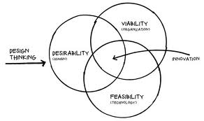
According to IDEO’s President and CEO; “Design thinking is a human-centered approach to innovation that draws from the designer’s toolkit to integrate the needs of people, the possibilities of technology, and the requirements for business success.”

Where does Mobile Only falls short in integrating needs of consumer and requirements of business with possibilities of technology?

Understand your customer really well: There are many reasons cited for going Mobile Only such as better maintainability, cost savings, huge data mining capability which in turn can power data analytics driven marketing functions like greater segmentation, contextual targeting, user engagement and rapid personalization at scale. While all these are the possibilities for the marketer to embrace the new format, the same possibilities turns out to negate the possibilities of the consumer that is essential for a sustainable growth of ecommerce category. Mobile Only enthusiasts seems to be missing the plot by ignoring customer decision journeys to understand what motivates people and what puts them off and apparently loses opportunities for creating delightful experiences.

Empathize your customer with customer advocacy: While more and more businesses are waking up to the real world business need of ‘empathy’ mapping by putting the customer at the center of problem solving equation, the Mobile Only format looks highly skewed towards the marketer. Apparently we are still not finding a holistic reason for Mobile Only format apart from the ulterior motive of customer confinement, rather born out of customer apathy or total disregard for customer preferences. Building this wide gap requires rallying customer advocacy and customer centric empathy across all functions of business to deliver value and keep customer experience as the most important metric.
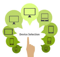
Device Option- Image 4Design to delight: Instead of Mobile only format, to fully capitalize rapidly growing net users the e-commerce players should repurpose all the touch points rather than limiting to only mobile touch points. Marketers should offer all options of net access points including web along with mobile, with all screen options and continuously reexamine the new touch points of value creation.

It is very important to explore all the digital channels for effective customer outreach when we are talking about bringing in all the 375 million net users to meaningful online purchases. A deep understanding of customer experience across all channels is just the starting block of the long process. To assume that customer’s interaction with a brand can be effectively managed only through an app (in an app only ecosystem as envisioned by Mobile Only enthusiasts) seems like an incomprehensive view as customers preference to multiple digital channels such as web & mobile advertising, email, search engines, social media and video are increasingly playing a decisive role in customers decision journey.   To capture the multiple touch points of customer interactions every e-commerce company should aspire to capture a comprehensive view of its customers, by implementing mature systems for collecting and organizing those deep insights. It is all the more important for ecommerce vendors of high involvement categories to provide a feel of the product through multiple and large visual interactions that is closer to actual physical experience to reassure the expectations of the product to user. Such affirmative and inclusive measures would increase the adoption of ecommerce at even faster rate.

The need is to remain attuned to customer decision journeys and understand how to use new capabilities to serve customers better. This is possible when marketers prioritize to understand each step of customer’s purchasing journey and design and deliver best experience across all formats. Every marketer’s goal should be to continuously discover efficient frontiers of value delivery without undermining superior user experience essential for occupying the numero uno position in customers’ mind space.

Personalized UI: Shape Shifting

Whenever we think of Personalization the first thing that comes to mind is Amazon displaying products we are likely to be interested in. The next thing that come to mind is like advertising on the internet. A little more pondering, and Google’s search results and Facebook’s news feed would strike us as being personalized too.

Notice how personalization is invariably assumed to apply to information — whether products to buy or ads to click or statuses to like. The structure around which information is placed often goes ignored — and underestimated — when it comes to suiting the individual.

20140812-shapeshiftingui-man-bike-phone

On the mobile, the ubiquity results in apps rarely getting more than a few fleeting glances. Darwinian economics of App Stores thus have necessitated apps evolve into the leanest units of functionality possible. Any unnecessary clicks, pauses or confusion that could trigger distraction are an evolutionary disadvantage.

Darwinian economics of App Stores have necessitated apps evolve into the leanest units of functionality possible.

A fluid UI that shifts shape depending on the user and their context can streamline the user experience.

There are many simple ways for interfaces to adapt to the user’s context without the need for sophisticated personalization algorithms.

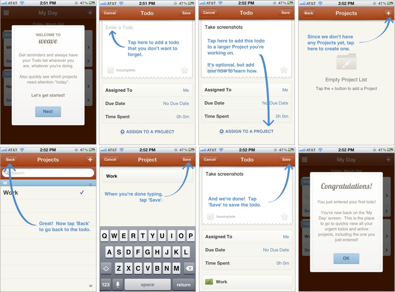
Mobile Games were probably the first to innovate in this area. Starting with a dedicated First-Time User Experience (FTUE or ‘fatooey’) that would run only for new users to introduce them to basic game elements and get them started. In freemium games, it is not uncommon to see different views when trying to buy game currency packs: for players who have never bought before, these packs will be sorted with the lowest priced option on top. But for regular buyers, they are sorted with the highest priced option on top.

(Image Source: kryshiggins.com)

Other apps have started to take a leaf out of this book: the image above is a walkthrough of the FTUE of Weave, a popular ToDo app. Secret and Slack have recently received accolades for their FTUE too. Smashing Magazine has a really interesting guide to FTUEs on mobile:

Adapting UI to context is prevalent in more ways than just the FTUE in mobile apps

1. Screens on GPS devices switch to a darker color scheme at night, for low glare.

2. Language localization is perhaps one of the oldest forms of adapting the interface for the user.

3. Responsive web pages are a great example of the UI adapting automatically, with the context being your screen size.

4. The Uber app changes its default view after you have requested a car, to directly show you where it is and when it will arrive, and put the relevant information immediately in front of you.

5. The new Foursquare app, that notifies you of interesting place around, only triggers the notification when it senses that your location has changed.

(original source: It’s A Read/Write Web by Luke Wroblewski)

6. Knowing that most users use a single thumb of their dominant hand, it might be a good idea for apps to structure their navigation accordingly, AND laterally invert key elements for left-handed users. (If you know of any apps that already do this do let us know in the comments.)

In contrast, desktop user interfaces have static, making all options available at once, and expecting the user to “pull” what they want.

3 key ingredients to consider while designing personalized UI are Identity, Context and Behavior.

Identity

There are two parts to Identity: the first part is knowing every user, being able to recognize them when they come back to your app even if on different devices. Knowing every user more is part of this – various traits that let you tailor the app experience: whether the user is left-handed or right, their internet bandwidth, language preferences, social graph, etc.

The other part of identity is created by the user: their identity in your app. How they use your app, and the persona they create in your app is a large part of this. For example, users portray themselves very differently on Facebook vs. Instagram vs. LinkedIn. Sometimes users use Instagram to post pictures of what they sell to their audience, while other times users use Instagram to share personal photos with their friends.

Context

Context is about the here and now. Knowing if a user is at home or walking on the street can play a big role in shaping the UI of a restaurant recommendation app. Or a payment app — whether a history of transactions on the main screen is more important, or a pay here button. What screen the app is being used on – a TV or a car – will govern what actions are front and center. The user’s local time, whether the user is currently on a subway train or running down the jogging track, whether they came to the app from a specific notification are all piece of context that can be used to personalize the experience.

Behavior

Interpreting users’ collective previous actions to anticipate what they might do, and shaping the UI accordingly is where personalization gets complex but also magical. All content recommendations – products, music, search results, news – do this. With UI, it overlaps with the second part of Identity mentioned above: is the user using a calendaring for their business or for personal scheduling? Can the payment app know if it is being used to pay for purchases or to send money to friends? Can a news app learn about your sharing habits to decide the prominence of the sharing button?

BUT there is a slippery slope to ultimate confusion

The best UIs are the ones that are familiar – the user instinctively knows where to click and how to reach their goal. Too fluid a UI can create confusion. Getting the personalization wrong can be even worse. It is always the right thing to make changes in small steps, and A/B test to learn from how users react.

Hiring Is Growth Hacking

Hiring is Growth Hacking applied to organizations.

What does that mean?
It is expensive to pay a staffing consulting $10k – $20k per hire, so creative, guerrilla tactics have to be adopted. Using your network to reach out to your audience, relying on word of mouth, the referral program that extends beyond employees, Quora/Twitter/LinkedIn for lead generation, fancy videos and blog posts with great content, etc.

It can be harder for large companies to do real growth hacking, whether to acquire users or employees, for many reasons, some legitimate: agility, red tape, risk averseness, etc. But there are always inspired employees in these companies making an exception.

So how should one go about hiring like a growth hacker?

1. Double down on metrics
Draw out funnels for every channel you are sourcing candidates from. Measure success rates (define success explicitly: an interview accept? the actual hire?) and work on drop off points. Be ruthless about cutting out the underperforming channels, regardless of how cool they are right now. It is an optimization problem.

2. Growth is a culture
You have to build acquisition and retention into your product DNA. Same for your organization. Every employee should be an evangelist. Every employee should be helping with the hiring process.

3. Initial user experience
If the first interaction requires a prospective candidate to commit to a job search or going through an interview process, it’s an anti-hack. It’s why you choose to ignore those InMails. Elicit a “wow” the first time, then take it from there.

4. Spread success stories
Get new employees to update LinkedIn profiles, Facebook/Twitter statuses immediately. Ask them to blog about their first day. Show off internal successes.

5. Multi multi channel
That’s two “multi”s. Everyone is already multi-channel: they’re on LinkedIn, Quora, Twitter, StackOverflow, etc. Find more channels. Treat everything as a channel. Exactly why this is like growth hacking: the answers are not already available.

6. Create content
Content is one of the best ways to engage your audience. The Kixeye hiring video. The Facebook Engineering blog. Meet The Team sections on so many company websites.

7. Bootstrap
When you’re starting from zero, you have to bootstrap. An online education startup bootstrapped by creating courses themselves from publicly available course material. A local services marketplace bootstrapped by letting you type in any service you wanted, and then going out to find and sign up a provider for that service. An e-commerce selling diapers online started by fulfilling orders by buying diapers from the local Target store.

Got any more growth hacks that can be applied to hiring? Leave a comment, and I’ll add it to this list.

Data and User Experience: Two ends of the spectrum

Every product that you build has to be used by people.

This is irrespective of “who may pay for the product“. This is an often brought up topic of “User vs Customer“. And if the product is used only by machines and not by real people, then it’s perhaps best to call it “technology”.

As far as technology products are concerned, a significant factor of differentiation they claim and deliver on is by leveraging data about usage and user behavior. And in a product team, the cycle goes this way:

  • Product Manager thinks up the product (you can assume that in all these steps, others also contribute meaningfully, as product creation is both an intensely cerebral and collaborative exercise)
  • Designer helps visualize the user experience
  • Engineers code it and get it ready for prime time

The plot:

1. Roll out the current version of your product
2. Get users to use your product, engage with it and contribute inputs (read Data)
3. Collect usage and behavior data, analyze it and generate ideas for the future features
4. Design & develop the new features
5. Start from Step 1 again

If you notice, in this iterative and cyclical process, the two constants are Design new features (UX) and Collect more data. While this cycle goes on, imagine the various changes that happen to your company:

• People added/removed
• Infrastructure modified (change offices/locations etc)
• Technologies changed/added
• Investors changed/added
• Markets discovered/validated
• Pivots created/executed/dropped
• And the list can continue

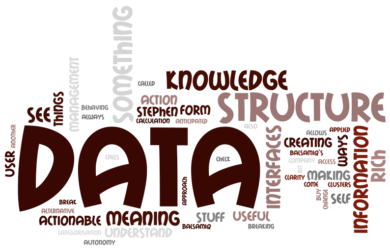
But the core 2 tasks remain: Design UX for your user, Collect Data from your user, both of them aimed to improve their value proposition. This prompts me to call Data & UX as the two ends of the spectrum of building a tech company. It’s very interesting to note that if Data connotes Scale, UX connotes Empathy. To build a successful company, I imagine that one needs both Scale and Empathy and not just one of them.

What do you think? Let me know in the comments.

#DesignThinking: Desirable. Feasible. Viable

We all know quite well the value of Design to business, and Design Thinking to problem solving. But what remains a bit fuzzy for many start-ups, organizations & individuals is the gap between thinking and doing or making it happen.

In this time of volatility and complexity, the role of design to drive meaningful innovation and change is growing and while there are multitude of factors that need to be taken into consideration for a product design that is desirable, feasible & viable the design thinking process can help overcome these product characteristics. 

Yes, great design starts with design thinking! Reminds me of David Kelly from IDEO who puts this together as empathy or being empathetic. In other words focusing on what users value the most and building on top of the ideas they share with every incremental value we deliver to make designs better.

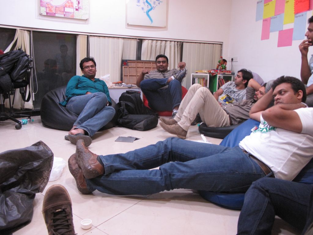
In an effort to bring all designers, engineers, product managers & entrepreneurs together via an informal coalition of like minded design thinkers community to help promote the how-to’s of design thinking, MakeMyTrip in co-ordination with #PNMeetup hosted a day long #DesignThinking event in its premises inviting them to discover the stories, solutions and tools that design thinkers are putting to work, from start ups to multinationals helping them find inspiration and learn how real world solutions are provided using innovation & technology to work to solve complex global challenges. 

This event was a first step in NCR UX community with series in pipeline with start of an exciting thought-leadership plank in the UX ecosystem in the country towards creating a platform to nurture design thinking & promoting design thinker’s community fostering an ecosystem that promotes delivering great experiential online products. Industry experts from LinkedIn, Mettl & Anagram Research supported the event with inspirational talks on subject and sharing how they practice the same in their respective job functions, startup’s & organizations thereby embracing the process in their day-to-day routine while driving the product vision at their setup. The experts also covered upon bootstrap strategies for startups who cannot afford the UX agencies or a big design team and face design challenges day in day out during their product design journey. Some even illustrated the design thinking approach to problem solving of product features design and helped them uncover the latent needs, behaviors, and desires for their users. 

Altogether,  #Design thinking event saw noteworthy achievement with 40+ design thinkers joining us from NCR and could leverage the platform listening some inspirational talks from speakers and meeting few like minded folks around. Had participant mix from passionate startup entrepreneurs to designers & dev engineers. Audience was glued to program embracing the talks & interactive workshop from functional experts in domain. 
Check out what happened at the First #DesignThinking Workshop on http://t.co/g0DDFbP7kS  

Guest Post by Dushyanth Arora, Head, User Experience & Design MakeMyTrip

Pixel Jobs – Product review of a job portal by designers for designers

Pixel Jobs Image

Pixel Jobs, designed by the talented folks at Sparklin, is a refreshing look at the boring world of job portals. The problem to solve was simply, “How to get a job post seen by the best creative talent?” An old fashion job-board served as a physical metaphor to yield a clean, simple and inviting job portal cheekily named – Pixel Jobs. It has nifty filters to make searching easy and a straightforward form that allows you post a job in a few minutes.

Pixeljobs Screenshot


On April 3rd, Avinash and I had freewheeling chat with the young founders of Team Sparklin – Gurpreet Bedi and Himanshu Khanna – on the hows and whys behind the product. 

How did it all began? Are you trying to become Cleartrip for the job space?

“Pixel Jobs really started based on internal need of hiring the best designers. Sparklin started a Facebook group last year to reach out to the designers through personal networks and within a short time close to 1200 people had signed up. That clearly indicated a need for a specialized job site for designers. There are already sites for coders, so why not for designers. This is purely a niche product,” on the why.

“There was a concern on excessive moderating to ensure the postings to be creatively-relevant and accurate. I had to overly moderate the Facebook group for the first couple of months. But then everything kind of fell in line. The relevancy and quality of postings sort of improved on their own. Very little moderation was required. That’s when an open job forum became a viable next step. We still moderate but only for completeness.”

So what is the initial marketing strategy?

“We have deliberately taken a slow approach towards marketing this portal. First, we want to ensure that the platform is robust enough to handle large volumes. Second, by only allowing a selected well-known companies in the creative domain to post (for now) will increase the quality and credibility enough to not warrant a serious marketing push,” elaborating on the initial word of mouth approach.

How is the product going to evolve over next few months? Semantic search, LinkedIn connect, company-based hosting, additional views, etc. are some gaps.

“This is only a version 0. We are improving the product on a daily basis. All these features and many more are in the pipeline and you will see a gradual improvement over next few months. For instance we are working on an Android app to launched soon and targeting companies to use Pixel Jobs to host jobs on their sites. They can just use our embed our code with their branding on their site. There is a big need for this. For example, some of our clients already have a job board on their site but prefer to here.”

Even though the initial version is impressive, there are some user experience improvements to consider. For instance, extending the card metaphor by not going to the next page for a more fluid interaction (too many new windows), introducing category tags as alternate searching mechanism (search only for graphic designers), making search more central to the experience, introduce shared vocabulary (minimal difference between UX Designer and UI Designer), personalizing content based on previous searches and making it easy to follow-up on interesting jobs.

“We agree with all these points. Most of these are being worked on currently. For example, in the Android app you can favourite your job and city. Only those jobs will then be shown by default. These will help personalize your experience. Easier to do this on Android for now and eventually we will introduce them on the web as well.”

How do you plan to distinguish the experience between job seekers and posters?

“This will be a very important strategy once we build some traction and gain volume. For now the obvious focus is job seekers which will help drive better companies to the portal.”

Why is there a disconnect between brand Pixel Jobs and the URL (jobs.pixelonomics.com)? This could split the brand between Pixel Jobs and Pixelonomics. Better to build a single brand for consistent messaging.

Without elaborating on this too much, “We will merge these very shortly under a new brand name in the next release. We could also launch series of boards across other verticals as well – mobile developers, etc. under the same brand.”

It will be hard for the creatives to search on cluttered and difficult to use popular job sites from now on. 

#FoundersMeet 3 – Collective learning of 20 Early Stage Startups

Background – I was fortunate to be invited for the #FoundersMeet 2; informal get-together of 7 startup founders last year. This time around AnirudhSidNischalDeven and I suggested to move it beyond our circle and extend it to 20 startups to come together and share our small success stories, failures and challenges. We also wanted to create a strong connect for ‘Mumbai-Pune Start-up Ecosystem’ which sort of never existed.

The 3rd #FoundersMeet happened in Mumbai on Wednesday 23rd Jan 2013 (a working day)., was expected to go on for about 7 hours, the interaction continued for 13.5 hours (yes!) with some amazing insights discussed and shared. I’m sharing this post on behalf of all the startups (& their founders) who participated.

Selling a SaaS Product:

  • International Customers are more inclined towards using self-service products. Indian counterparts expect hand holding and need assurance of customer service at arm’s length even when not required.
  • Customers in India will insist even on customizing a standard SaaS product. This tends to be service-model trap, best avoided.
  • As long as the user-proposition communicated during sales pitch or on the product is fulfilled, International customers are satisfied. They will switch the product fast if they find another product delivering more value. On other hand, Indian customers take time to switch product if a good relationship is established.
  • If a competitor is offering a product for free, users will not like to pay you for that product.
  • Sell the product to the poster-boys of the industry, rest will follow by themselves. 

Product Pricing:

  • There is a disproportionate value in the word ‘Free’. Use it whenever you can.
  • Over 90% of users will sign-up on the Free plan. When they move to the premium plan, they are most likely to use the plan that has the lowest value. Ensure that this low value plan has a disproportionate value for its price. That makes customers love you instantly.
  • When someone is making money because of your product, make sure you are making money out of it too.
  • Positioning your product / business is important. It can either be in Income side or Expense side. Always pitch / present your product on income side – “we help you generate money / your earnings will increase / your savings will multiply.”

Up-selling Product:

  • Acquire with freemium plans. Ensure enough hooks are in place that leads the customer to purchase the product post the free period or upgrade to the next paid plan.

Identifying Product Drivers:

  • A SaaS based product will not be driven by technical people, its driven by functional people. Build a product that can be installed by techies in less than 5 minutes, and can be driven by functional people without interference of tech people.
  • Sell the product to decision makers. Never pitch any product to a tech person. The tech person will always think that he can build it by himself.

User Acquisition Hacks:

  • For B2C products: Sell traction of existing users to new users. Create a feel that – Yes, there are people here, you’re not alone. That gives new users confidence about the product.
    Example – In Mumbai when you see 3 Vadapav stalls on a street, unknowingly you will go towards one that has maximum people eating and buy from there.
  • For B2C products: Show activity. Existing activities drive more activities.
    Example – IRCTC, startup folks and early adopters think the platform sucks and fails whiles booking; common people think of IRCTC to be a big corporation that there is always high demand. That leads to perception of credibility for IRCTC.
  • Use Associations for Endorsements – IRCTC mentions – ‘A Government of India Enterprise’. This is a big endorsement for IRCTC and brings credibility to it.
  • Bounce Rate Reduction – A transactional consumer site was featured in leading newspapers. When they mentioned ‘As seen on Newspaper A, B and C’ on their homepage – it boosted its credibility and reduced the bounce rate.
  • Social Proof for User Acquisition – The Facebook widget that displays people who have liked the brand also builds credibility.
  • Real People – A SaaS based startup focusing on product for Chartered Accountant features a local/prominent CA on its homepage. That quickly build credibility for itself in eyes other CAs. It was easy to acquire more customers.
  • Investor Hack – For SaaS startups, whenever any VC reaches out to you, get them to introduce to its portfolio companies. Its quickest way to demonstrate more traction and more importantly to add new customers.
  • Physical World – Example., Printed Coupons redeemed at Restaurants are social proofs in real world. Makes other users curious on how did a customer get discount / where did he get the redemption coupon from.

Ecommerce:

  • Thoughts on heavy discounting in current Ecommerce business in India, its like ‘Selling a Rs.100 note for Rs. 90′.
  • Potential in disrupting offline business is huge. All online businesses are not even 1% of the offline businesses.
  • Offline products are indeed cheaper than online. Consumers researching online and transacting offline is big. This market is ripe for disruption.
  • Ecommerce players are now less focused on doing marketing campaigns, but more focused on increasing conversion ratios of existing traffic.

User Experience:

  • UI is ‘relative’. Focus on User Experience.
  • Cleartrip is loved by all of us; but its clearly MakeMyTrip / Yatra that works with masses.
  • Make the product work 100% of time for what you promise.

Entrepreneurship:

  • Don’t fall in love with your product. Fall in love with being successful.
  • Things that work in west don’t work in India. Specially with funding and investments. Currency for investment in India is not traction, its revenue.
  • Be a salesman. Never miss a opportunity to make noise about your product.
  • Don’t focus on a niche market, there are very high chances of failure. Instead focus on a large market opportunity, its more likely to find success here.
  • Notice early signs if things are not going your way. Pivot fast.

Product Distribution:

  • SaaS products: Explore opportunities to integrate with large platform players – Domain Cpanels, or ecosystem creators like Shopify, BigCommerce, etc.
  • SaaS products: Label your widgets – ‘Powered by You’. They are most valuable for Inbound leads.

Product Scaling:

  • Don’t just design products for scale / growth; also ensure you design the business model for scale.

Essential Traits of Consumer Product:

  • Curiosity. Rely on Curiosity – (Example LinkedIn – 2 people have seen your profile today).
  • Build the – Theory of Reciprocation into your product.
  • Gamify some features, let users do free marketing for you before unlocking information. (Example – Tweet about something to show details).
  • Understand show-off value in your product. People love to show off on Twitter & Facebook. Capture such points to your product.

Social Media Marketing:

  • Twitter links have a CTR of 0.5% to 0.8%. Customer acquisition here happens in scale. Spend energy wisely.
  • Don’t spend time on talking to random folks on Twitter based on their conversations. Extremely time consuming and most unlikely to convert.
  • Facebook advertising does not lead to conversion. Its best suited for brand building.
  • Facebook Contests that involve sharing real pictures of users online brings lot of credibility to brand.

Competition:

  • Once a user has signed up for the product; make sure it works it. Don’t bother about competition. He has taken pain to signup to your product, make the promise work.
  • You’re the only one who know about your competitors; not your customers.
  • Many SaaS verticals are getting crowded to an extent that price remains only factor to decide. Only the ones that are able to innovate will survive.

Visibility:

  • Founders should be visible on Social Media. Talk about the product and should be able to convince their followers about their passion. Only passion attracts initial traction.

Market Penetration:

  • If you are doing something innovative (either B2C or B2B) – you will need to spend good amount of time on educating your users / customers. Its easy to get frustrated in this loop.

Content Focus:

  • Don’t get carried away by ‘Content Marketing’ or ‘Content Sharing’.
  • Building products that have content plays is difficult – content creators are few and content sharers are in plenty (Usually 1% to 99%)
  • Look for plays that involves sharing of content already created.

Building Relationships:

  • B2B: Build great relationships with your marquee customers. Keep them educated on new initiatives, new market dynamics and help them monetize better.
  • B2C: Continuously stay connected with your early adopters and take feedback from them. Keep them informed of new updates, they’ll love you. Whenever any suggestion is considered, incorporated into the product – communicate to users.

Driving Engagement:

  • Build features that would enable discovery of relevant / contextual information – that leads to higher engagement on the product.
  • Keep users involved… the trick is dashboard views. They create the “I’m in control” feeling for users.

Search Engine Optimization:

  • Figure out what you are optimizing for & the competition on that. Example., if you are trying to optimize now for ‘Apple iPhone’ – you would be the millionth website trying to do that. Get your own niche, it works best.

Mobile Apps:

  • Discovery of mobile apps is biggest challenge for them. Notice that many apps are trying a generic name for better discovery while users are searching for any other app.
  • Integrate app with key functions of phone. For example, on Android – phone book integration, and so on.
  • There are many hurdles in mobile app development cycle, best to understand from multiple startups who have built mobile apps earlier.
  • App Ratings matters, a big consideration factor for user to download the app. Get the initial ratings by distributing the app between family & friends.

PR:

  • A press release in India goes not get you much traffic. Its great channel for visibility, but don’t depend too much on this channel.
  • International Blogs & Coverage had a higher conversion ratio for products. International users give a try to product, sign-up, explore and use it.

Mobile Advertising:

  • Despite all the hype, Mobile Advertising is still considered as experimental budget.
  • Mobile Industry – one cannot be stuck in a region or one product for more than 18 months. Fast innovation required.

Venture Capital:

  • Stop chasing VCs or attending events that have VC meets or Demo Days. Hardly any investments happens that way.
  • A VC is most likely to invest in your startup when he is chasing you.
  • Indian VCs are yet to understand product driven consumer web-plays despite traction. Skip them and move to the west, it also brings lot of traction.

Biggest Learning of #FoundersMeet: Keep Plumbing. (Those who were present would understand this!)

Note: Some of these thoughts/hacks listed above may sound very generic since we have decided not to mention the context / startup involved. Providing too much information in public domain would not be right for startups who participated. You can connect with any of them directly, the founders would be glad to help you.

#FoundersMeet 3 Participating founders:  AnirudhDevenNishcalSiddharthKunalSahil,PravinKulinSameerTalvinderGargi,
GarimaShekharAvleshRohanSushrutSarangRaxit,NoelSoumNitinRonakPranay,
AnnkurDivyanshu

Many thanks to all startups who participated in the #FoundersMeet 3. Thanks to Nischal, Deven, Anirudh and Sid for reading/editing the draft of this post. Special Thanks to the wonderful folks at The Playce (a great co-working place for startups), Mumbai for hosting us.

Stay tuned for the next #FoundersMeet 4!

Design-Led Software Engineering Improves User Experience

Editor’s note: Focus on user experience now shows up in numerous surveys as a major determinant of success in software product sales. We interviewed the co-founders of software development provider Clarice Technologies: Sandeep Chawda, who is also CEO, and Shashank Deshpande, who is also president. Between them they have more than two decades of experience in user-centric design (especially at Symantec/VERITAS) and now lead Clarice Technologies in design-led innovation for Clarice’s software customers. 

SandHill.com: Please explain what you mean by design-led innovation in software development. 

Shashank Deshpande: Design-led innovation is to understand users and their needs to come up with a design that is usable and consumable and then to apply technology innovation to translate it to a user-centric product. It is about providing an optimal balance of design and technology in the process of product development to ensure intuitive and high-performance products. More often than not we see that products are over-designed or over-engineered, and neither is good for consumers and end users. A product that really delights the customer has a good balance between design and technology.

SandHill.com: What causes developers to over-design or over-engineer? 

Sandeep Chawda: It’s caused by the lack of sensitivity of one aspect or the other. We seldom see companies with an ecosystem that has the right mix of designers and technology engineers. If the product is designed without considering various technology aspects, that will cause the product to be over-designed. There are several design studios where designers take a flight of fancy in the product design without really considering whether or not that can be meaningfully engineered.

And the same applies for the engineering side. Many technology companies try to build the product without having a meaningful information architecture in how product functionality is presented. This results in a product that won’t be exposed to the users properly and they won’t be aware of its key functionality, or they may be aware of it but will tend not to use it.

SandHill.com: What do you do differently in design-led engineering to avoid these problems? 

Shashank Deshpande: We do up-front design of the complete product without writing a single line of code. We come up with “product storyboard,” which is a pixel-level detailed mockup of the key screens of the product, and we tie them together so as to mimic the complete product. All this is done without writing a single line of code because changing pixels is an order of magnitude easier than changing code.

These mockups are then used by multiple stakeholders of the product in a very effective manner. Product Management can use it for validating the product functionality. Sales can use it for talking to customers about the product roadmap and what is going to come. And the storyboard acts as refined requirement specifications for the engineering group to go ahead and build the product.

We use this process iteratively when developing software products for our customers to ensure there is a heavy emphasis and high priority on the user-experience angle.

Read the complete post at Sandhill.com

Usability Review of @Bubbles – A new kind of mail service

In a startup, the design is usually an afterthought after the more important challenges of business and technology are solved. Which means by then the design is more like a band aid or a lipstick on the proverbial pig. Probably the main reason why products here still lack that world-class feel, even though they are better in terms of features and performance.

A successful product usually has the right blend of usefulness, ease-of-use and engagement or emotional connect through aesthetics. For example, Facebook might score high on each of the three attribute, while a game like Grand Theft Auto may deliberately keep the ease-of-use difficult. Each of these attributes should be part of the product roadmap at the onset. By how much should you dial up or down each attribute or in other words what is the overall design vision? And who will be responsible to achieve this vision?

We feature the first of several quick audits to get a conversation started around the importance of design when you are a startup. We did a quick review of @Bubbles, a six month old startup trying to re-imagine email by bringing it closer to the art of letter writing from the good old days. It enables tools for your creative expressions, allowing you to scribble your thoughts, stick photos, sketch cartoons, draw diagrams, and attach sticky notes to your email as you would do on a physical letter.

We evaluated it on 4 key user experience parameters.

How well does it COMMUNICATE to users?


To reduce user’s memory load, it is important to use terms & language that connects to their existing mental model. Once you have adopted a mental model or a metaphor, then try to be consistent.

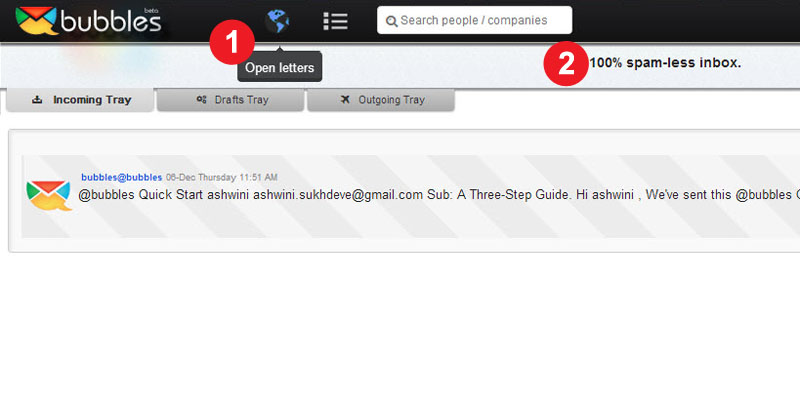
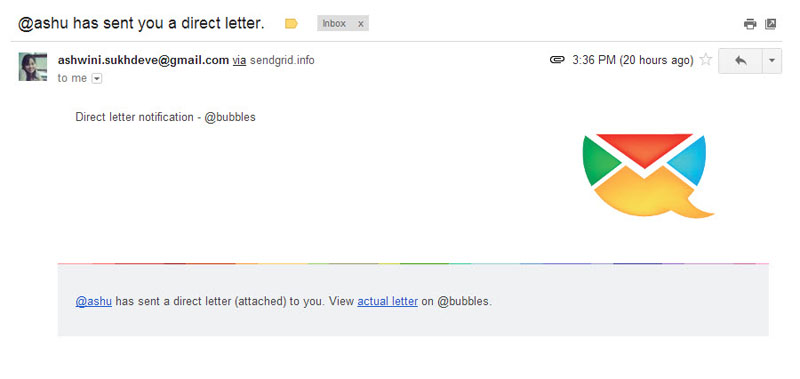
  1. Terms like “Open Letter”, “Direct letters” are not commonly used in context of letter or email writing and hence can lead to different interpretation. It also adds to the learning time for the user.
  2. Similarly, “No Posts” and “100% Spam free inbox” violate the mental model of letter writing. Either use a “letter” or “email” metaphor but use it consistently.

How easy is it to NAVIGATE?

  Ease of use is vital. The user should always be in control and take the intended direction to perform a particular task. To be able to do this, it is essential that the user understands the flow of screens or sequence of actions.

  1. The incoming and the outgoing mails have the same look and feel, which leads to some confusion. The status of the site or where you are at a given point is not well communicated.
  2. Same page for public & personal letters – The sending route should be selected after the letter has been written. There could be multiple paths to doing this too.

How easy is it to INTERACT?

The information structure should make relevant connections between different pieces information and tools (features) to enable user to achieve desired goals.

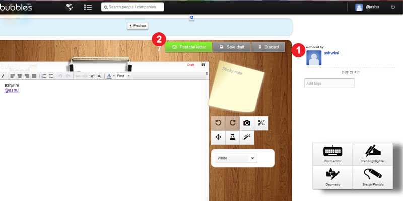
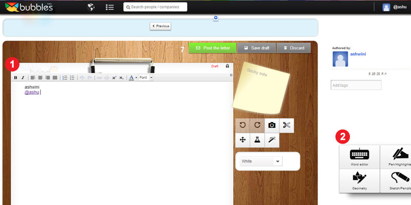
  1. Editing tools for the letter are scattered all over the page. A fixed layout for the toolbar would make it easy to use. Some drawing tools like – copy, paste, resize, rotate, etc could be integrated at one place to create a seamless experience.
  2. Every selection or user action should be followed by an appropriate feedback. For example, when a user selects a Pen tools, there is no feedback that it has been selected.

Does it create the right EXPERIENCE?

Overall, it is about experience.

  1. Sent mail is a personal letter as well as a promotional letter for Bubbles, so it should be designed so as to attract more customers, who are not currently on Bubbles.
  2. Keyless Login creates a good experience but the learning curve should not be high.

Undoubtedly, Bubbles is a much better designed product than most. There is a design sensibility with some effort and thought behind each screen, icon and color palette. However, it seems that though there was an emphasis on graphic design (engagement or aesthetics), it could still be improved significantly with some thought on interaction design (usability).