PeopleWorks – Selling Thought Leadership

I recently visited the office of PeopleWorks to meet Hemant Tathod who Heads the Product Management function.

Spin-off from the parent

Hemant chronicled the initial journey of the formation of PeopleWorks. It began as a need identified by Mr Ram, President & Executive Director of Crossdomain Solutions who was looking for a solution to cater to existing policies of Crossdomain without demanding tweaks their in current HR practices. During this process he realized this solution to be a product opportunity for Small & Medium Enterprises as target segment & initiated market research to validate. The research indicated that the existing product had low growth value but it also identified an opportunity that lay beyond. As a result there was a decision to break PeopleWorks away to focus on an opportunity for delivering cloud based HR workflow. A Beta product was created and validated with a handful of existing clients. During this spin-off they managed to maintain and upgrade 50% of existing clients.

Validate the product with customers

During this phase of building the Beta product, PeopleWorks team set a plan to develop customer insights through various means. Beta product testing, Focus group discussions and also direct gap analysis using inputs gathered by the sales force. The Product Management team, who also had sales experience, knew the value of insights gathered by the sales team and various other sources merge that into the product roadmap.

Push/Pull strategy for sales

While acknowledging that the cost of acquisition is high for a push-based sales strategy, PeopleWorks management’s initial focus is on generating conversions via direct sales. They are investing in search and social optimizations for building a pull-based sales strategy. There is Sales enablement piece with Objective to groom the sales team on how to approach prospective clients to make a successful conversion and Onboard them faster.

Under promise and over deliver

PeopleWorks Product team is very clear of the product capabilities, the focus targets and to only promise what is possible. It is better to openly back out of a prospect conversation if their needs are not feasible to fulfill. With cloud based delivery model it is very easy for clients to “move out” and migrate to other competitive systems.  Acknowledging this is clearly messaging confidence in their product, interest in building trust relationship with client and a promise to be on their toes to service the customer. PeopleWorks has Implementation team to help transition of data for a new client from an archaic solution to their cloud-based system.

Sales & Consultant partnerships

Hemant mentioned that PeopleWorks engages Channel Partner’s to provide better reach and comfort to clients. Many sales companies have established channels in the market of HR systems. Additionally there are several HR consultancies that consult on best HR processes. Working with these consultancies & sales channels provides references which lead to shorter sales cycles than the direct efforts.

Selling thought leadership

One story Hemant narrates is that of Sales team attending to a lead of  conglomerate with 300,000+ employees across the globe. The PeopleWorks team shared with the said Company their gap to address their large needs considering the global set. The PeopleWorks team then engaged said company management on discussion around best practices followed by the users of PeopleWorks and how Human Capital Solution can be automated to streamline employee management processes. Few days later the large group signed up with us to implement PeopleWorks for a group company with  300 employee users in India, prior to scaling up. What’s unique here is that the Sales team chose to lose a potential sale in the interest of maintaining a reputation as a thought leader in the space. This actually ended up building confidence in the client leadership and a potential trial phase. PeopleWorks management has taken this model further and initiated sales certification and boot camp training for its sales force. Importance is given to understanding the CxO business challenges, their thought processes, language to use with them and try to anticipate their needs and match them to the product capabilities if possible.

Summary of key takeaways

Continuously validate your product and value to clients. Don’t be afraid to make strong recommendations for better growth prospects.

  • Under promise and over deliver.
  • Sell thought leadership.
  • Leverage partnerships with existing sales channels or domain consultancies.


Product Management mantras from the 26th Playbook Roundtable

The 26th playbook roundtable was held last week (8th March 2014) at Delhi NCR and brought together over 15 startup and product practitioners to discuss and gain insights on some of the challenging aspects of growth and monetization in product companies. This roundtable was hosted at Eko India Financial Services office in Gurgaon, and was led by Amit Ranjan, Cofounder of Slideshare, and Amit Somani, CPO of MakeMyTrip. In a span of over 5 hours, a diverse set of topics were discussed. Prominent takeaways from the roundtable were insights on approaches to pricing, virality, growth decisions, pivoting, user experience etc. The following paragraphs detail the key learning from each of these above aspects.

Pivoting in a Business

Creating a successful company is essentially a search for the repeatable and scalable business model. To succeed in this search, companies should frequently make and test predictions about what will work in their business models. Businesses, no matter, which stage they are in are always pivoting. As a business, while you do focus on your revenues, but you also need to constantly keep thinking what will drive the revenue in 3 years from now and ensure that you slowly move in that direction. Of the so many internet companies, perhaps only a handful will survive 10 years. Amit Somani mentioned how MakeMyTrip is constantly looking at the next big thing. It started from a flight booking venture for NRIs to become the largest flight booking portal for the Indian market and is already evolving to cater to hotels and holiday packages. The next challenge for the company is mobile and ensuring that the company is successful in an increasingly mobile world.

IMG_2851Amit Ranjan talked about how often ventures have to 3-4 side projects or “distractions” that help you understand what will work in a fast changing industry and ensure you evolve to address these changes.

Moving from early adopters to 10x Growth

One of the best ways to achieve 10x growth after successfully validating your product and without spending too much or no money is virality. By definition, virality is designing and engineering your product such that it markets itself. A viral product derives much of its growth from its current users recruiting new users. A user could recruit another through a simple invitation (“Check out this product, it’s cool/useful/entertaining!”), or directly through using the product (“I want to send you money on PayPal!”). Virality is not an accident. It is engineered. Virality is more about width and depth. Amit Ranjan shared interesting insights on how the homepage of Slideshare during the initial days was designed for virality (with several banners and stickers to attract audience) during the initial days and when the portal was able to achieve significant growth, the homepage was redesigned for user experience.

Prioritizing Customer Inputs in a B2B Product

If you manage a product or service in the business-to-business (B2B) market, customer requests for features will be a regular part of your work. Requests come in through the sales team, service reps, and senior management, as well as directly from customers themselves. This makes it difficult for companies to decide which feature to include in the product or not. A good thumb of rule to decide whether to include the feature or not is that if 3 customers want it or a pushy a customer wants it and you can sell it to 2 more customers, then you should go ahead and include that feature. A key issue is to how do you know multiple customers have the same request? A common way is to utilize software which allows customers to post ideas, suggestions and requests. There are idea management providers that are good for this. Or you can user customer feedback sites. These asynchronous, always-on, open-to-all sites are well-suited for capturing suggestions.

IMG_2852In addition, you may need to check other areas. Your email often contains customer suggestions. Or you have a service ticket database you can check. Relevant knowledge will be in people’s heads, those who directly work with customers.

Also, it is very important to validate this feature. This can be done by rolling out first to your employees and then to few customers. This will help validate your thoughts.

Documentation and User Training

Generating user training manuals and videos can be a tedious job, especially for ERP kind of solutions, especially when the product is frequently undergoing changes. Also, the general trend seems to be that users have stopped reading trend. Even if people did decide to read the instructions, showing too many at once increases users cognitive load. Because users cannot read the hint overlay and use the app at the same time, they are forced to memorize the instructions and then apply them. Thus, it is more effective to focus on a single interaction rather than attempting to explain every possible area of the user interface.

Rather than generating documents and videos which will very soon become redundant, a better approach will be to have built in CTAs in the product to help/guide the users. This includes things such as built in FAQs (built using services such as Zendesk), using coachmarks etc. Presenting hints one-by-one, at the right moment, makes it a lot easier for users to understand and learn instructions. This interaction pattern has the added benefit of teaching the user at which point in the workflow these interactions or functions become applicable.

Making Sense of Data

As a product usage grows, enormous amount of data gets collected and sometimes making sense of the data becomes a challenge for Product Managers. It is no wonder that big players such as LinkedIn, Facebook etc. have large teams comprising of data scientists. Data crunching from this team of scientists even help the companies to validate the probability that a particular feature will be liked by their audience.

Product Managers are knee deep in the product and data can help take an unbiased look at the product, often yielding amazing insights and learnings. Data Analytics are important for one major reason: What you don’t measure, you can’t improve. Without knowing what the state of the system is, it is very hard, if not impossible, to do much to change or affect the system. You can, of course, make changes  blind, but without analytics you will never know whether the system was changed or whether nothing happened. It allows you to see what is currently happening, make a change and see what effect the change has.

IMG_2849A good way to make sense of data is to have an hypothesis and then look for local maximas. Apart from that, product managers can apply operations such as segmentation, funnels and cohorts to make more sense of data. Over time, as the system changes and improves, the KPIs (and consequently the metrics) will change, which in turn leads changes in what needs to be measured. It is likely that new flows and metrics will be discovered that prove crucial to the system so whatever the analytics used, they will need to be continuously adapted to meet this change and keep you on top of what’s happening in your product.

Encouraging Users to Sign Up

For a consumer product, completely logged in experience versus a logout experience is a choice between distribution and engagement. Slideshare and Youtube offer a complete logout experience as users do not need to login to access the portal. Linkedin devised an interesting way to incentivize users to sign up. They show a glimpse of profile to users who then need to sign up to view the full profile. It is also imperative that the process to get users through the front door of an application and engaging with content needs to be as simple and seamless as possible if an organization wants to win and keep mindshare.

Increasingly a lot of companies are using gamification, but it is more geared towards engagement rather than acquisition.

How To Model and Evaluate Your Consumer Web Business

Premise: Wealth creation by humans happens in 2 forms, by making “something desirable” or by helping the maker sell it. Everything else is a support function that brings efficiency to these 2 activities. The Web being a communication medium can only help sell something, which happens through some form of lead generation. One might argue that SaaS tools are “desirable” products on the web but the way to see it is that web or the Internet only acts as a distribution medium for the actual product.

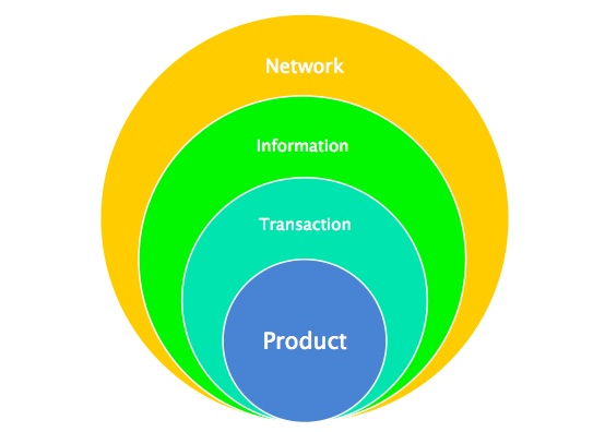
Product-network-transaction-information

There are 3 dimensions or criteria for evaluating a web business.

  1. How far is it from the “something desirable”?
  2. How exhaustive or selective the target audience is?
  3. Is it single power centered or distributed?

1. Distance from Product: Transaction – Information – Network

The representation above will help you visualize the value chain. The transaction layer is the closest to the product and has most control over the chain – in terms of pricing, availability, purchase experience. Though, this is also the most commoditized layer since most factors are internally controllable.

The information layer helps you discover a product and decide about the purchase. The Network layer helps you connect with the information. The outer most layer has little control in terms of purchase but it is the most defensible layer for a web business.

  1. Value in this chain is created when you push a user inwards from an outer layer. Every change in layer is a lead generated. User moving from one destination to another in the same layer leads to more confusion and is a sign of feature gap.
  2. Facebook and Google Search* are network layer that generates traffic for information sites, like FindYogi, TripAdvisor etc., which in turn generates leads for transaction layer.
  3. Most web businesses are generally an overlap of two of these layers. An effective use of these network with information – like Quora or Twitter is powerful. Tripadvisor is probably the best example of marrying the info+network layer. Ecommerce companies are making a decent attempt at marrying transaction with information so that they can influence the value chain better. MakeMyTrip, Cleartrip already enable transactions; with ratings/reviews they are covering the information layer as well.  Since there is nothing like review/rating in flight booking, this business is getting commoditized and the players are looking to move to lesser standardized products like selling hotels, holiday packages.
  4. Sticking to transaction layer only will make you no better than a payment gateway, which has been commoditized. The fulfillment part in the transaction layer is mostly offline. PayZippy from FlipKart and PayUMoney are making small steps to capture the network layer along. PayPal is a great example of transaction+network layer execution.
  5. The success of each layer depends on what bait you can fetch from the inner layer to entice the user and push her inwards for more. A good basic bait does not generally generate revenue but helps you keep your destination alive. A promoted bait generates revenue for you.
  6. Any layer is useless by itself. You have to do a lot of seeding from inner layer initially and develop relations with your adjacent layers to grow (through SEO, Affiliates, SMM, Content marketing, Ads). Networks by itself are not useful unless it has information. The information layer by itself is not useful if it does not push you to a transaction and the transaction layer triggers the end fulfillment.

*Google search is essentially driven by what human networks are referring to, the search result page is an organized way of showing the information. An overlap of network with information layer.

2. How exhaustive or selective the target audience is: Bundling – Unbundling

The bundling-unbundling theory has been well highlighted by Benedict Evans through his examples of Craigslist and Linkedin. Most web business are trying to solve the same problems in more efficient ways. The eCommerce, travel, social networking and classifieds industries have existed for long on the web, yet every day we hear of companies trying to disrupt these spaces.

For any new business the easiest way to get a foothold in a saturated market is by unbundling a very specific feature for a very specific audience and doing it better than the large established players. As the market grows and your business matures, you add more features and start bundling everything in your industry. The cycle continues. The unbundling-bundling evolution will never cease.

Unbundling can be done based on geography, user demography, product category or a particular feature. Whatsapp is a great example of unbundling of chat from social network and only for your phonebook contacts. Ixigo started as price comparison for flights, then bundled all forms of travel comparison and is now bundling reviews, all this while focusing on a single geography and single industry of travel decisions.

In eCommerce in India, unbundling has failed big time. Most vertical commerce players haven’t survived. The basic reason for this might be the fact that when unbundling based on product category, a major component of fixed costs remains same. Since the game is about scale, the economics does not work out if you try execute a single category better than the market leader. Have we seen any vertical ecommerce player adding more value than FlipKart/Amazon/Myntra and not survived? Zivame has done a focused execution and seems to be surviving.

The parameter you choose to unbundle on is very important. A lot of times unbundling can only get you noticed, you have bundle up to justify economics and user behavior.

Paytm is taking a bold step of unbundling based on user interface. Paytm’s marketplace is available only on mobile app. We will have to wait to see how it pans out.

Good part of unbundling is that it lets you keep a smaller audience 100% happy and grow there on, rather than keeping a larger audience partially happy. As Paul Graham says, “it’s easier to expand user-wise than satisfaction-wise”. The way to evaluate the scalability of business is to see how easily can more geography, user, target product be bundled up.

Unbundling lets you get deep into a vertical, the way FlipKart did with books. Though, there is an issue of market positioning when you later try to bundle more target products. MakeMyTrip faced this challenge trying to re-position from a flight booking site to a holiday booking site. You could mean different things to different users but one user is going to remember you for just one thing – you have a choice of how broad or narrow you want that to be. TripAdvisor, as a company, is focused on travel decision making but it maintains 17 websites, each solving a different travel need with minor overlap, to avoid any dilution in individual value proposition.

Examples of successful unbundling that might happen in India –

  1. While some players, like FindYogi, are trying to crack the buying decision problem, Roposo is taking a crack only at the influencing female fashion.
  2. There is Holidify that is trying to crack only the first step of travel planning – “where to go”.
  3. Jaypore is taking a crack at only high end fashion ecommerce and doing quite well.
  4. Zomato was good at unbundling restaurant search from horizontal local search. There is LoyalOye that is unbundling only event venues search.

3. Is it single power centered or distributed – Pipe vs. Platform

This theory is borrowed from Sangeet P. Chaudhary. He professes this theory in detail at his blog, platformed.

A pipe type web business is one in which the atomic unit of value is created by a single source, or the business under-writes the original source. Example – Ecommerce stores, Blogs. This gives you great control over quality and can usually work at all scale.

A platform is when business opens up to let a larger set of audience create value. Example – Marketplaces. This gives you lesser control over quality but is more capital efficient at scale.

The differentiator is more around how the value is created and not how it is consumed. Both Pipe and Platform have their pros/cons.

When you look at scale in a web business, converting from pipe to platform can give you a great leverage in the market. A lot of businesses change their proposition when looking to scale, though a good move from Pipe to Platform is when the end value delivered and the target audience remains unchanged or expands. What you do as a business internally will change tremendously but that should not affect the end product delivered.

  1. The move by FlipKart from Ecommerce to Marketplace is a good example. Though the company is yet to adopt to a pure play marketplace but the slow transition is making sure the end value is intact. If you look internally the company is now doing less of trading and more of technology.
  2. At small scale, FakingNews is a good example of converting Pipe to semi-Platform when they launched my.fakingnews.com – a UGC based satire news destination. Same target audience, same value proposition but more value creators. “Semi-platform” because the decision making around what gets published is highly moderated by editor. A full-fledged platform is more like 9gag, where everything gets published but only the best gets surfaced.

You create ‘entrepreneurs’ by distributing powers, that means more rewards in the whole system as a function of higher risk taking capability. Platform also enables decentralization of power/decision making, thereby creating lesser bottlenecks and higher efficiency.

The Chief Irritation Officer – Why Product Companies Need A Customer Champion

This is a true story – one that taught me a very useful lesson. I hope you will find it useful on your journey as well.

In 2000, Adobe launched InDesign 1.0 to critical acclaim. With its modern code-base, fresh UI, transparency and powerful text engine, finally here was a challenger to the dominant Quark Xpress. Though it was late by over a year (which v1.0 product is not lateJ) and it was not yet fully powered to knock out the incumbent, the potential was there to see and sure enough over the next 3-5 years, InDesign overtook Xpress as the dominant page layout and composition tool.

But my story is not about InDesign – it is about its predecessor, the humbler (and still standing), PageMaker – one of the first mega software tools that had come to dominate an industry. As Adobe focussed its engineering and innovation might on InDesign v1.0, PageMaker with its old code-base, 10+ years of legacy, and challenges with the architecture had been sick and losing weight (read revenue) with each quarter. Age had caught up with it and the end was near it seemed. No engineer worth his C++ wanted to poke into its C code – why waste hours on globally scoped pointers when you had the safety of InDesign’s COM architecture.

Yet, PageMaker had millions of users. Users who were gainfully using the tool day in and day out. Livelihoods depended on it though increasingly with its weak integration with other new-age tools and old-age limitations, it may have been the cause of plenty of heartburn and some occasional hypertension itself. PageMaker was a misfit in the 21st century desktop and fixing it needed some ‘fools to tread in’. No prizes for guessing who the fool was in this case!

My team had just delivered a bunch of plugins for InDesign v1.0 and we were high on adrenalin (mostly testosterone variety) and blinded by our powers of concentration, seeped in enormous patience due to our culture and motivated at getting a shot at a product with a couple million users. So we jumped at the opportunity to build a new version of PageMaker (and delivered PageMaker 7.0 – the last release for the product and probably the first product mostly developed from an India campus). We had to setup a renegade team with non-conformists and I had to put on my best “nothing can stop us” mantra to power thru many many, many many, many many issues but that is another story.

Today’s story is about how the collective wisdom and efforts of people can fail if you don’t have the right inside knowledge. Its also about how critical it is to understand the evolution of systems before one can inherit a legacy. And finally about how a sense of humour can turn a nasty situation into a friendly productive work environment.

So, after 6 months of working 60+ hours a week, with minimal team and near zero code documentation, the Zoji-la team (code name for PageMaker 7.0) reached the summit. All planned features were done, all major bugs fixed, no major new bug had crept in, and the UI had had some fresh paint – new icon, new splash and some proud Indian engineers on the about screen. Then disaster struck (what else were you expecting). Nay, catastrophe rather. Our shining new build would not print. NO PRINTING ? The whole purpose of a page layout program is to PRINT, damn-it!!

Sure, it would work with PCL printers (mostly HP) but ask it to postscript and it would simply eat up all your pages. And we had not made a single line of change to the printing sub-system (we were too scared of touching printing anyways). NO POSTSCRIPT PRINTING? Can you even imagine what people will say, Adobe, the creator of postscript could not get PageMaker (a tool to demonstrate postscript efficacy) to PRINT POSTSCRIPT ?? We could not have this, could we?

After a couple of days of frustration and anxiety we broke the rule – seek help from the old foggies at Adobe who probably had some stories about PageMaker in their years. And floated a simple question – hey guys, we did not change anything on Zojila printing sub-system but guess what, its not printing postscript? Know what’s happening?

There were many responses. One particularly funny one that I remember is a good friend and colleague saying “You are doing PM 7.0? Who set you up” (to do this). The more helpful folks offered advice on driver checks, version checks, print to file, steps on tracing and debugging – the whole nine yards. We might was well have written the OS ourselves. Time was running out and the team was losing momentum – perhaps all the Nay-Sayers were right and we were wrong and foolish to have tried this; perhaps our desire to cover ourselves with glory had blinded us.

Then came a ray of hope. A golden light dressed up in the darkest of languages. A curt one liner – “did you change the application name?” Of course we changed the application name, you $#%@^&, I told myself. It’s a new version of the application, it can’t have the same name. My insides were screaming to write back to write my best one-liner and show the respondent his obvious folly  but sanity prevailed and I sent back a safer and ignorant response – “Yes we did. Anything we should be knowing that we don’t?”

The glorious reply to this made me wiser beyond years. Turns out that back in the days of DOS, when postscript had just been introduced and Microsoft could not find a way to integrate the postscript driver into their printer driver, a special “hack” was created in the operating system for “PageMaker” – the printer driver and ‘PageMaker” were joined at the hip so to say and the printer driver would behave differently for other apps while “PageMaker” got pride of place and a postscript highway. Of course, once you know who all are in the bed, it is easier to figure out who to jump on to get your fix – lo and behold we had fixed the issue. All was well!

At our weekly post-mortem meeting, our project manager, a hard-working simple bloke who was tired with all the poking around to figure out the issue and bore the brunt of jokers saying – “huh, this team will be revving up PM, they can’t even get it to print!” could not hold his anger any longer – he pointed his baritone at the gentleman who had given away the cosy secret between Adobe and Microsoft and challenged him – “and just who the hell are you? And why the hell did you not let us know this six months ago?” A fairer question had not been asked before, I was sure, and did well to put the gent in his place, I said to myself.

A moments silence ensured. Most of us were expecting a strong rebuttal with a “hell with you. I don’t work for you” type response. But this gent was made of different steel – “I am X. And think of me as the the CHIEF IRRITATION OFFICER” he replied to loud guffaws and smiley faces. Chief Irritation Officer – indeed! He had done his job well!!

So, as I said earlier, the combined wisdom of people will fail if you do not have an inside track of how things have evolved in an industry. This is why context and continuity are important. Also, there are many co-workers who can irritate you with their smartness, mannerisms, politics and sometimes just presence. Whenever you feel like killing one of them, think of my new CIO – unless you have a champion for the consumer on your team prepared to ask hard questions, chances are your product will fall short on some parameters.

To all customer champions out there – keep pushing !!

The Three Design Elements for Designing Platforms

What does the traditional world of manufacturing have in common with the way networked platforms work? How can a basic understanding of factory design help us change the way we think about designing internet platforms, marketplaces and social networks?

I’ve written previously about the distinction between pipes and platforms. If you haven’t already read it, you must definitely check it out. It lays out many of the basic principles that underlie the strategies I discuss on this blog.

The fundamental shift, I believe, the world has seen, is the move from linearity to networks. Putting 3D printers and other recent maker movement trends aside, factory-based manufacturing has traditionally remained the same. And that’s what I refer to as Pipes, as captured by the graphic below:

Pipes are characterized by the firm as the producer and a linear flow of value.

In contrast, Platform Thinking allows for users as co-producers. Value doesn’t flow linearly from a firm to the consumer. Producers and consumers are connected with each other over a network. The platform’s role, unlike a Pipe’s, isn’t production. The platform connects producers and consumers over a network and provides them the tools to interact with each other. It then uses data to match them with each other.

Business Design for Fifth Grades

Let’s look at business design at a very high level. At a fairly abstract, stratospheric level, the goal of business is the creation of value and the capture of some part of it to generate a profit.

If we get back to Pipe Thinking, and take the example of manufacturing, value is created in a factory or on an assembly-line.

The factory’s goal is value creation. 

The factory does this by setting up a set of value creating actions that add value on to the product.

There is an end-to-end process that is responsible for value creation.

But here’s the most important, yet obvious, bit. There is a unit of production and consumption which moves through these processes AND gathers the value that is added to it by the factory. Finally, in the hands of the consumer, this unit delivers value to the consumer.

We call it the product, the object that is manufactured in a plant. It’s the car running through Toyota’s assembly line or toothpaste tube getting filled out at Colgate-Palmolive.

This object is the basic unit of production and consumption in the industrial world. 
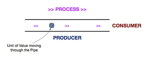
So if we think of it, the design of a manufacturing plant goes about in the following manner:

  1. Start with the object you’re creating; the product.
  2. Lay out the steps required to create it (value-creating actions)
  3. Design the process that encapsulates this flow of action
  4. Design the factory (and organization) that can execute this process.

The factory design enables the process.

The process design enables value creation.

But all of this starts by first looking at the unit that is being created, determining what value needs to be created on it and designing the entire business in a way to facilitate that value creation.

It doesn’t work the other way round. You don’t start with building a factory and an organization and then deciding how you structure the process. Any change in the organization or factory infrastructure is started by a change in the process which is started by a change in the need for value creation (often because of customer feedback owing to which you tweak the product).

SO… WHAT?

So all this sounds great, you say! You just told us a bunch of obvious things using some fancy words. Where are we going with this?

I believe the fundamentals of business never change whether you’re in an agrarian economy, an industrial economy or an information economy. Let’s use what we already know from the above and figure how this applies to platforms.

Business design, as we just noted, doesn’t start with the factory, it starts with the unit that is produced. Unfortunately, in the design of a lot of networked platforms, we see the design process start from the factory i.e. the website or the app. That, instead, should be the last step in the design phase.

Let’s take a step back and get back to the Pipe:

Now, let’s watch it change when we talk about Platforms:

There are two key changes that happen as we move from pipes to platforms.

  1. The value creation shifts from inside the Pipe to outside the Platform.
  2. The producer role shifts from inside the Pipe to outside the Platform


These are the two fundamental shifts captured in all the talk about Open Innovation. And these are the two fundamental shifts we need to be aware of while designing platforms.

(Note: The platform can be the producer in many cases but most platforms will allow for external production in some way or the other.)

So let’s go about the job of designing platforms.

INTRODUCING….

1) THE SEED

As in the case of Pipes, let’s start with the unit that is produced or consumed. This is the most interesting part. When we think of platforms or any form of internet businesses, we rarely think of what is being produced or consumed, we think of it in terms of a website or an app, or some other physical/visual manifestation. In actuality, since we’re talking about information businesses, the unit being produced and/or consumed should be content/information.

Seed and Parties, no Platform

What is YouTube? A website? An app? A platform for the hosting (production) and viewing (consumption) of videos?

Kickstarter? A platform for the hosting (production) and backing (consumption) of projects!

Twitter? A platform for the creation (production) and consumption of tweets!

Etsy? A platform for selling (production) and buying (consumption) actual physical products leveraging information about them (listings)!

Uber? A platform for booking a car leveraging information (car availability) to match producers (taxi drivers) with consumers (taxi seekers)!

Irrespective of the actual exchange being physical or digital, the unit that powers the matchmaking of producer with consumers (on the platform) is an information unit.

Start with the unit! If you’re designing the Twitter for X, look at what the Tweet for X looks like.

If there is one thing that’s central to Platform Thinking, it’s this. Large platforms look clunky, you don’t know where to start. Start with the unit that is being produced or consumed – I like to call this the Seed – build out from there. More on this in one of my subsequent posts.

Start with the Seed!

2) THE INTERACTION

Great! So we started with the unit. What’s next?

In the case of Pipes, one moves from the unit to the process that adds value to the unit all through.

There’s one interesting difference between Pipes and Platforms though. Consumers don’t typically add value in real-time to this unit. They just consume. On platforms, consumers may add value as well. A creator may take a picture on Flickr but consumers may tag it. A creator may upload a video on Youtube but consumer votes determine how often it gets consumed. There are various ways in which consumers add value.

So what’s the counterpart of the process in Pipes? A set of actions involved in the creation and consumption of value?

I like to think of this as the Interaction. Every Platform has at least one Interaction.
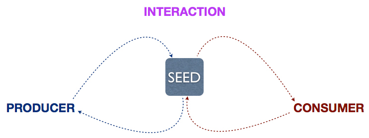
Seed, Parties, Interaction

Creator uploads video, Consumer watches it, votes upon it. This is the primary interaction of YouTube.

Creator starts a project, Consumer consumes it, backs it etc. The primary interaction on Kickstarter.

The interaction is essentially a set of actions required for the creation and consumption of Seeds on the Platform. (This is an incomplete view but I’ll get further into it in a subsequent post, to avoid detracting from the main point.)

Note that a platform may have multiple seeds and multiple interactions but there will specifically be one that is core to the value proposition of the platform. YouTube is not a place where you go to create and consume comments, it’s a place to create and consume videos. In most cases, the primary seed and interaction are fairly obvious. In subsequent posts, we’ll look at a few cases where these are not.

3) THE PLATFORM

Finally, we come to the platform. Once you know the seed and design the interaction as a set of actions, platform design is a lot simpler.

You’re just creating a network and an infrastructure that enables this interaction. 
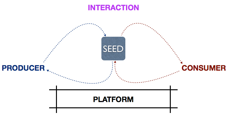
Seed, Parties, Interaction, Platform

Well, there’s a lot more depth there but for the purposes of this article (remember, we addressed this to fifth graders somewhere up there), the key point here is that platform design should start with the seed, flesh out the interaction and then design the platform as a consequence. Not the other way round.

Even with platform design, one must distinguish between the system and the interfaces. YouTube is a complex system but has many different interfaces/functionalities for creators, viewers, brands, advertisers, media houses etc. on different channels like web and mobile.

The design of the interfaces should be true to the design of the system. And that is achieved when one starts by focusing on the seed and the interactions it enables.

I’m going to be digging into this in detail over the next 2-3 months to lay out a detailed framework for designing and running networked platforms. I’d love to hear your thoughts first up, whether you agree or disagree.

THREE KEY PRINCIPLES

Let’s quickly recap the three key principles of platform design:

1) Platform design should start with defining the value that is created or consumed, the Seed.

2) The Seed should lead to the actions that enable the creation and consumption of that value.

3) Only in the last step should one go about designing the system and interfaces that enable those actions.

There is a fourth key element missing here, the role of data. I will be covering that in future posts. For this post, in particular, I wanted to focus on the contrast between pipes and platforms. The role that data plays on a platform is very unique to a networked world.

It’s been a late start to the year but I’ve spent the last three weeks bringing a lot of my thinking on platforms together in an effort to start creating a structure around it. I’m getting that stared with this post.

Everything old is new again! Hopefully, the magic lies in using the old to interpret the new!

This article was first featured on Sangeet’s blog, Platform Thinking (http://platformed.info). Platform Thinking has been ranked among the top blogs for startups, globally, by the Harvard Business School Centre for Entrepreneurship

Building that 1-Click magic in your Product

Many startups struggle when it comes to building features for their product. Their product road-maps are a list of features they plan to include over next 6-9 months; once they are built out – its a feature mess ~ too many things to do that leaves the user confused.

This does not stop here., entrepreneurs always have this gut feeling – the next feature will be ‘the one’ that will make it up for us. End result is the product becomes feature-heavy or too complex to use.

On my last post – 15 Steps towards building a Great Product, I posted about a simplified approach towards building products; this post is about adding a little magic with just 1-Click.

Here are some examples of 1-Click features:

  • Amazon: 1-Click Checkout (Transaction)
  • AngelList: 1-Click Apply to Accelerators (Application)
  • AngelList: 1-Click Introduction for hiring talent (Hiring)
  • Facebook: 1-Click Sign-in for 3rd Party Apps (Registration)
  • Foursquare: 1-Click Check-in (Location)
  • LinkedIn: 1-Click Endorsement (Interaction)
  • LinkedIn: 1-Click Apply (Hiring)
  • Quora: 1-Click Upvote (Endorsement)
  • Twitter: 1-Click on # for Topics & Trends (Buzz)
  • Uber: 1-Click to Book-a-Cab (Location)

The equation is simple here – what is the core data the product has about the end user and figure out the 1-click feature that best suits your product use-case.

Example.,

  • Amazon stores user data & credit card information which enables it to do single click checkout.
  • AngelList has a startup profile that it connects with investors / accelerators / talent.
  • Facebook has user information & social graph through which it allows users to signup for 3rd party apps.
  • LinkedIn has professional profile of the user through which it allows users to apply for jobs.
  • Foursquare has user’s location that is used to check-in at a venue.
  • Quora has user’s credentials that are used to upvote (or endorse) a particular answer.
  • Uber has user’s location that is used to book a cab.

Similarly there are opportunities for 1-click on-site distribution. Share on Facebook, Retweet on Twitter, Re-pin on Pinterest or Re-blog on Tumblr are some superb examples of on-site distribution achieved by a single click!

Concluding Notes:
Many startups choose to ignore simple means to add a magical experience to their products. Focus on building too many features makes the product a bit complicated and difficult to use.

Remember – most startup products / features are just connecting two dots. Do that with a single click and make it feel like magic!

Zoho, Cloud, Sridhar Vembu

Those who know me well have heard a lot of stories about my experience at Zoho when they transitioned from AdventNet to Zoho. I worked there between 2001-2004 when it was quite a new thing in the indian product ecosystem to talk of Product Management etc. During that period, the company went through a very significant phase of transformation which I was fortunate to be part of, see & learn from close quarters. Today, Zoho was named 4th best Cloud company to work for – makes many of us very proud.

The first thing that struck me was Sridhar’s focus on leveraging data. It went to a point where we realised that inefficient code can put paid to aspirations of leveraging data. And he rethought the data model for our suite of products ground up. The larger ambition was “Deliver software as service, not as installable“. This was in 2003! Back then, the company had about 5 big platform products (SNMP, WebNMS etc). Rethinking the data model, writing and enforcing code that didn’t obfuscate the database (most code was in Java, so it was easy enough to write inefficient code) were tough but important changes he brought about.

Sridhar cared a lot about how teams were organized – large teams are an inherently inefficient lot! Sridhar had the view that teams should be less than 7 people, cross-functional. The reward for growing a team beyond 7 was that it will be split :). His view was that since “Software will be delivered as a Service”, the company should transform from 5 big ships to a 1000 speed boats. To do that, each team team had to focus on a specific market, build and ship a unique product. By 2004 when I was leaving for Yahoo!, there were already 18 products underway. Before the end of the last decade, they were doing over a 100 products!! To go from 5 to 100 in just a few years is quite something.

There’s a lot to lay by the founding DNA of a company and what it can accomplish. While building Credibase which I’ve cofounded a few months ago, here are a few lessons I took away that we try to practice:

Data is God

Focus on the User and all else follows

Small teams create great work

Code always goes from Simple to Spaghetti, but never comes back

Product Pricing – The biggest mistake companies make is to fix the price based on their costs

There is no magic formula for pricing a product. You can make a start by getting answers to these queries:

  • Can you estimate the value to customer in terms of increased revenue or cost savings?
  • How does your competition price their product?
  • Should your product be priced higher/lower based on more/less capabilities?
  • What is your total investment and annual expense (development, support, sales and overheads) in building the product? How many copies do you expect to sell in next 2 years?

The biggest mistake companies make is to fix the price based on their costs. The primary reason to be in product space is to generate non-linear revenue based on value being delivered.

Early pricing

Based on competitive pricing and your own value proposition, you can have a pricing band as a starting point. The next decision is whether to be a high volume/low price player or a premium provider. You can then set a tentative ‘list’ price.

Test this pricing with early customers. Be consistent with the quoted list price, but offer variable discounts based on what it takes to win early deals.

When you start selling, you will be eager to win deals, and may compromise heavily on rates. This is natural. Win those early birds with steep discounts, but try and select the right ones first.

Ideal first clients (‘anchors’) are strategically important for their brand value or volume of business. Signing up a well-known company becomes a great validation of the product. Pricing should not stand in the way of closing such deals.

In some accounts, the person you are dealing with will have a certain spending limit. If possible, structure the offering to be within this limit and avoid another level of approval. Occasionally, the customer will tell you at what price they will buy. If it fits into your discount structure, and the business is important at that time, go ahead.

Pricing variables

Payment terms may consist of some advance and rest against deliverables such as installation, customization, deployment and acceptance. Actual payments at each stage can vary from immediate to 45-60 days from date of invoice. Cash flow is an important consideration, so maximize initial payments and minimize invoice to payment time. When finalizing a deal, offer to trade more discount in return for a bigger advance.

If you have a mix of licensing options (permanent, subscription, lite/standard/premium, usage based etc.), it can enable you to offer a broad range of pricing options. This can be useful at times, but can also cause the customer to get more confused. Experiment with two or three choices and assess what is working.

Stabilizing the price

Once you have gained some confidence with customers signing up and revenue coming in, then it is time to adopt a more business-like approach.

If you are getting clients easily, without significant discounting, then your product is probably priced too low. Conversely, if most prospects are not signing up, look for root cause. It may not be the cost – the problem may be in the product, how you sell, or which customers you are pitching to.

Test the elasticity of your pricing with higher rates for the next few prospects. Deals may be delayed or lost at higher price, but fewer deals may still bring in greater revenue. For example, at twice the price, you need half the deals to earn same revenue. Higher rates can delay decision making, while low price means you have to be targeting more prospects.

Theoretically, if you plot quarterly revenues against unit price, it should result in a bell curve. Revenues will first rise with incrementally higher revenue per sale, but will peak at a certain price beyond which it is considered too high by the market. In practice, there are too many variables for such an exercise to be worthwhile.

Instead, experience will tell you what is working. The right selling price is the one when you are winning most customers with low to moderate discounts, and losing only a few. Hopefully, at this price, you are making a reasonable profit too.

With increasing confidence and maturity, you will learn to be patient when negotiating deals. Do not concede on rates quickly. If your product is good, clients will pay. Learn to walk away from a deal if the price is too low.

As your client base increases, the list price, discounts and payment terms will begin to stabilize. However, business is always in flux. Keep tracking factors that influence rates: competition, more value from new releases, cost increases, profitability, deal loss rate, new pricing models etc., and always strive to maximize revenue.

What’s Freemium Gaming?

Freemium has become the preferred business model in mobile game development, accounting for almost 93% of mobile gaming revenue in 2013. Many, if not all game developers around the world have adapted their mobile development strategy to harness the power of freemium. As counter intuitive as it may sound, “Freemium” games are in-fact more lucrative than one time purchase games (premium games). If you don’t believe me, then go see the highest ranked games in terms of gross revenue, and there will always be a freemium game in the top 5.

How can a free game earn more revenue?

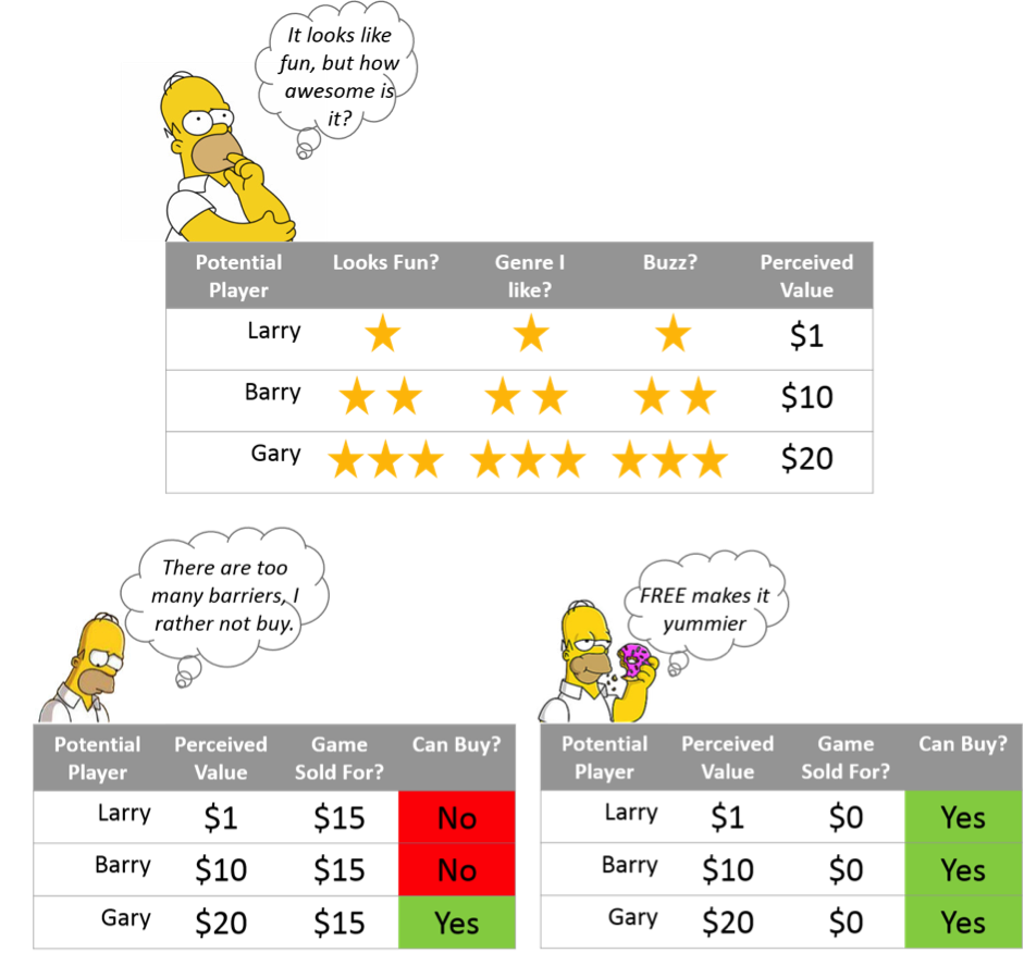
Well for one, it lowers your barriers to play the game (mainly the cost). However, there are many factors that go into the age old question, “Do I want to play this game?” As a consumer (or a hard-core gamer, if you are one), we always consider factors such as, is this game going to be fun? Or is this the type of game I like? We then price out what the perceived value of the game is to us and then shell out the necessary dollars to buy the game. However in a freemium model, everyone is allowed to play, including Larry and Barry (see below)!

freemium1

Price discrimination is the key

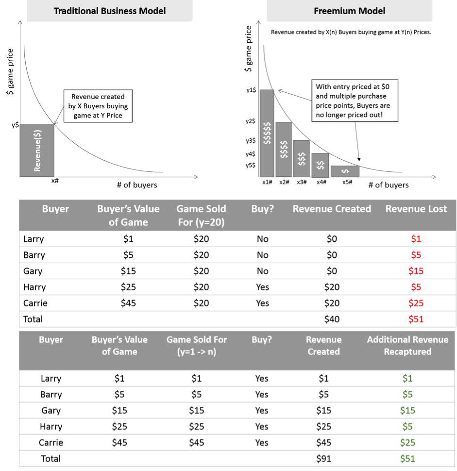
So here are the conclusions from our illustration above, traditionally, a single price point was given and you were either in or out. Even if you were in, it’s a one size fits all type of affair. You love this game so much, and even $75 does not seem too bad for such a game? Well, too bad. In addition to losing the revenue upside, by excluding players who have perceived your game to be of higher value, you are also losing the revenue downside, by pricing your game higher than the perceived value.

freemium2

To sum it up, Freemium games allow you to price yourself within the game. The revenue upside in the game is a factor of the engagement and the player investment you can have within the game. In the above example, it has in fact almost doubled the revenue that would have been possible with a premium game.

The Evil Side of Freemium Gaming

Well Freemium models in a casual gaming market seem like a no brainer right? Well, it’s not that simple. With hard-core gamers who can purchase a fully featured game between $1 – $100, may now possibly have to shell out a lot more to enjoy the full power of a game. A case in example of the recent launch of “The Dungeon Keepers” game and this reviewer’s scorn for the pricing of the appointment mechanics within the game. It’s very important to remember that a player’s investment in the game should always be balanced out with reasonable opportunities to grind through the game, without making it seem like a Pay to Win strategy.

What do you think?

Freemium Business Models seem to be here to stay in the mobile gaming market. Low barriers to entry means that there will be a lot of games to choose from. Lots of games in the market means a lot of noise and a lot of noise means, it gets harder to stand out. Also with integrated payment systems built into mobile platforms, it makes purchases of in-app consumable items all that easier. As a nation that’s out to build revolutionary products, do you see yourself adapting some of the best practises from this model? Do let us know in the comments below.

Before you start with Growth Hacking

Building a product startup is exciting. Most startups look to raise capital early and investors look no other measure but traction to take their bets. This need for traction puts immense pressure on the founding team to grow their startup. That leads to implementing multiple tips and tricks to improve the key product metrics – most importantly to show traction to investors. Founders get into the so called ‘growth hacking’ mode.

Growth hacking is the new buzzword in the startup town. There is nothing wrong with ‘hacking growth’ – most of the tricks attempted in this phase end up being short-term techniques. They might work for a while, bring traction for a while (which might lead you to raise investments) but these techniques don’t help in long term and the growth is not sustainable and quickly falls off.

Startups tend to neglect the simplest rules of product management before starting with growth hacking. According to me, here are the 5 Basic Rules of Product Management:

  1. User Engagement > Growth Hacking
  2. Retention > Acquisition
  3. Context > Activity
  4. Own growth channels > External channels
  5. Being Valuable > Being Social

A. User Engagement > Growth Hacking
Remember startups like BranchOut, Glassdoor, Viddy, Socialcam – that famously hacked growth through Facebook Dialog Feeds? Though they showed amazing growth curve initially, it soon fell off. Most users dropped off the product as quickly as they signed up never to return again. Reason – zero engagement on the product. Ensure that there are enough engagement loops on the product before you do any sort of ‘growth hacking’.

B. Retention > Acquisition
Acquiring users is the simplest thing to do, retaining them is the key. Any user acquisition technique should retain a good percentage of acquired users. Not just that., over a period of time the users who dropped off should be reactivated – there should be enough methods to pull them back – emailers / network effects / and so on. If the product has strong engagement features, retention is a easy task.

C. Context > Activity
Most products undermine the importance of context. In today’s world – anything that is not context is considered spam. The finest examples of a context driven product is Quora that lets you follow topics of your interest and helps you discover relevant content. Also important are products like Twitter (that lets you follow users) and Pinterest (that lets you follow boards) to build a information stream in context thats relevant to you. Think of context when you build features.

D. Own Channels > External Channels
Many startups focus on external channels for growth. Branchout was focussed on Facebook Dialog Feeds, Zynga was focused on Facebook Activity Wall, Viddy was focussed on Facebook Open Graph. Perfectly fine – if there are enough engagement loops and good retention strategy. However depending on external channels might not be sustainable – many startups hacked the Facebook Open Graph to get significant users – this led to users complaining about to the noise on Facebook wall, Facebook in return built many approvals / controls to prevent applications from spamming the users and giving users ease to block spam applications.

Large startups like Facebook, Dropbox, WhatsApp were completely focussed on driving growth through channels owned by self and had very little or no external dependence for growth. Don’t depend too much on external platforms like Facebook, Twitter, Google (SEO) for growth – build our own channels. Facebook’s journey of growth hacking is well documented. Also Dropbox as mentioned in next point.

E. Being Valuable > Being Social
There are also startups that focus on building ‘too-many’ social sharing features, expecting users to share almost everything and anything on to their social profiles (Facebook, Twitter, etc). Users are smart – they don’t fall in this trap and founders keep wondering why no social sharing happens. Instead of trying to be forceful on social, focus on being valuable.

Example –  Dropbox, it was a very valuable product that had super methods to hack growth – by connecting FB or Twitter account with Dropbox and providing users additional storage space by asking them to spread a message to their social circle or invite email contacts.

Concluding Notes:
Can you hack growth first and implement these rules later? No. There are startups that hacked user acquisition and raised initial investment on traction., and later things did not go according to the plan. Not just startups, that leaves even investors wondering what went wrong after the initial impressive growth metrics.

Startups are about growth, no doubt. Getting Techcrunche’d (PR release), top position on Hacker News or Video that goes viral might bring one-time traffic boost / user sign-ups. You can get good amount of traffic by integrating with Facebook Open Graph, optimizing site for Google (SEO) or even paid user acquisition – but make sure that the product has enough engagement, retention loops, value and context to sustain the users you are acquiring!

You may hack growth., but you can’t hack success. Building the next billion dollar company is a big deal!

How Startups Compete with Friction in Product Design

Startups need Traction. A startup which doesn’t get discovered doesn’t go anywhere. This is all the more critical for platform businesses which rely on their users to create value and network effects. In the specific case of platform businesses, Traction dictates the value that is created. A social network without enough users or a marketplace without enough activity isn’t going anywhere. Traction essentially refers to the additional value that is created on these businesses by the users using it, value created through interactions between users.

Often, one of the core principles of building for Traction is removing Friction from the product experience. Friction comes in the way of users using the product and, hence, in the way of value creation. Friction may result from anything that acts as a barrier to a user for using the product. Friction may be created by design (e.g. users are curated before they get access) or by accident (e.g. poor product navigability).

Traction and Friction don’t go well together. We’re living in an age where frictionless is increasingly synonymous with desirable design.

But Friction continues to have an important place in the world of platform businesses. Getting Friction right is critical to the success of an internet startup. Through this essay, I’d like to explore some of the top design considerations while building for friction.

As with all design considerations, the ultimate goal of a platform startup (marketplace, community, social network, UGC platform etc.) is to facilitate interactions.

Hence, as a rule of thumb:

Friction is a good thing if it facilitates the interaction instead of coming in the way of it.

Let’s dig further!

The Traction-Friction Matrix

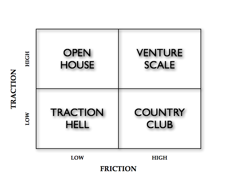
This is pretty much how the traction-friction trade-off works out:

Traction 1

High Friction-Low Traction: There are two reasons your startup may be in this quadrant: by design or by accident. You’re either curating who gets access or you’re suffering from really bad design.

Low Friction-High Traction: Again, a startup hits this quadrant for one of two reasons: frictionless experiences by design or lack of checks and balances.

High Friction-High Traction: This is a great place to be and ultimately successful startups migrate to this quadrant after starting off in one of the quadrants above.

Low Friction-Low Traction: This is clearly the worst quadrant to get stuck in for too long.


Movements in the Matrix

1. Pivoting around Friction:


2. Avoiding friction altogether: CraigsList pretty much allows anyone to do anything, except for a few categories that it polices and a few categories where listing are paid.


3. Embracing friction with scale: Quora has been increasing friction as it scales. Anyone could ask a question in the early days but asking a question now requires the user to pay forward in points.

4. Relaxation of norms:  App.net started off with high friction with a $50 subscription fee. However, it has gradually reduced friction to allow for traction.

5. Scaling the country club: Several invite-only platforms have successfully scaled with this model.


Design Considerations For Friction

As mentioned earlier, Friction, like every other design consideration, should lead to smoother and better interactions between users on the platform. With that as a guiding principle, let’s look at a few case studies where Friction works well.

Interestingly, two platforms in the same vertical and category often compete and co-exist by being in two different boxes in this matrix, as the examples below demonstrate.

Friction as a Source of Quality

Some platforms risk losing activity (interactions) when there is a lot of noise on the platform. Women tend to avoid dating websites which attract stalkers and men with poor online etiquette. Clearly, noise leads to lower probability of interactions.

Some dating websites invest in incentivizing women to join the network. An alternate model is to increase friction on the other side and curate the men that get access to the network. Sites like CupidCurated have taken this approach as a way to differentiate themselves from existing dating sites which relied on incentivizing women.

High Friction-Low Traction: CupidCurated

Low Friction-High Traction: Match.com

Friction to Create Trust

Some interactions may require a minimum guarantee and an environment of trust. Hiring a babysitter is different from asking a question online. False positives can cause much greater damage in the former case.

In such scenarios, Friction in the form of curation of babysitters provides a critical source of value. In contrast, the Friction-less Craigslist is hardly the destination for finding babysitters online.

High Friction-Low Traction: SitterCity

Low Friction-High Traction:  Craigslist

Friction as Signal

In both examples above, Friction not only controls who gets access to the platform, it also creates some form of signal about those getting access. Curation of babysitters yields exact parameters which would be used by parents for making a decision. Hence, Friction also helps with signaling.

Interestingly, financial markets work with signaling too. VCs, in private markets, are responsible for due diligence and determining whether a startup is worth investing in.

Crowdfunding tries to disrupt venture capital but most current models (like Kickstarter) merely unlock new sources of funds, they don’t necessarily provide the expertise curation and signaling that a VC fund would. Startups like RockThePost are working on the Country Club model and allowing only heavily curated startups to raise money through their platform. In this way, the platform is placing a bet on the fact that signaling and curation need to be part of the platform, to credibly provide an alternative to venture funds.

High Friction-Low Traction: RockThePost

Low Friction-High Traction: KickStarter

Friction on One or Both Roles

Most platforms support two distinct roles: consumers and producers. In all the examples above, Friction was being applied to only one side. This is the model used in most cases. However, where there is  high overlap between the two roles i.e. the same user produces as well as consumes, Friction can be applied to both roles. Quibb is an example of a network that applies Friction across the board. It works for Quibb because users want to be part of an exclusive community, to benefit from superior quality interactions. But more often than not, applying Friction on both sides comes in the way of creation of network effects, as demonstrated in the next example.

High Friction-Low Traction: Quibb

Low Friction-High Traction: Reddit

Friction as a Barrier

For all the hype and fanfare surrounding App.net’s launch, the platform has never quite lived up to its initial stand of providing an alternative to Twitter. There were two design considerations that were fundamentally flawed in this case:

1) Applying Friction to both producer and consumer roles. The core value of Twitter is the ability to build a following. By restricting who could access App.net, the platform limited its ability to deliver that value to producers.

2) More importantly, the source of Friction did not guarantee any form  of quality, trust or signal. Friction was created by charging an access fee. That didn’t help make interactions on the platform better in any way. If any thing, it just came in the way of these interactions. App.net realized it wasn’t getting anywhere and subsequently brought down the access fee, through a series of revisions, by 90%.

High Friction-Low Traction: App.net

Low Friction-High Traction: Twitter 

In summary, the following is a non-exhaustive list of design questions to consider while introducing Friction onto a platform.

A. Do you add Friction to one side or both sides?

B. What criteria are used to create Friction? Does it improve quality and add value?

C. Does Friction lead to higher likelihood of interactions?

D. Is the interaction high-value or high-risk? In other words, how important is trust, signal or quality as a source of value?

Tweetable Takeaways

Friction in design is helpful if it facilitates the interaction instead of coming in the way of it. Tweet

Two competing platforms can co-exist by varying the levels of friction in their design. Tweet

If you’re restricting access, it better provide additional value. Think SitterCity, not App.net. Tweet

Every element of platform design should be aimed at incentivizing interactions. Tweet

This article was originally published on Sangeet Paul Choudary’s personal blog Platform Thinking – A blog about building early stage ventures from an idea to a business, and mitigating execution risk.

15 Steps towards Building a Great Product!

This for all founders & product geeks (that includes me too) who want to build the next great product. Sharing all this for #StartupKarma (Heard this from Bowei – ‘Continue to give away and help other entrepreneurs with a hope that it comes back to you someday!’)

The Background:
As a startup founder, one gets bombarded with advice on pitching, raising investments, growth hacking, marketing and so on. It comes to us through one-on-one interactions, posts we read or multiple startup events and meetups. Unfortunately there is very little or no advice that actually helps you build your product.

Over months, I have studied product patterns in several successful products (like Facebook, Twitter, Quora and so on). This has made me believe that building great products is not just about picking random ideas and shooting in the dark, its a art and science both put together.

Here is a step by step guide for building a great product. I have taken Twitter in this case to demonstrate the examples, however you will be surprised to see the similarities with other products.

Note: Don’t proceed without understanding #0; and without finishing #1 & #2.


#0 | Think: Product does Marketing
The thumb rule for any great product is that you don’t need to market it; it requires zero marketing spends. Instead, it is the users who spread the word, acquire more users which leads to high growth. High virality and strong engagement are the two striking characteristics of a great product.

So here is the step by step guide towards building the next great product!

</end 0>

#1 | Think: What product are you building?
Have clarity about the product you are building. Make your product statement!

Here are the rules:

  1. Define your product in < 10 words. This is not your pitch statement, its your “product statement”.
  2. Be grammatically correct, include name of your product in these 10 words.
  3. No references with other startups / products. This cannot be “AirBnB for Cars” or “Facebook for Companies”.

Share this product statement with others. Does it communicate ‘everything’ your startup is going to build? If it does not, work on this again!

</end 1>

#2 | Think: Vision
Most startups have beginnings over a random idea (usually this sounds like a billion dollar idea then). Once those ideas get built in 3-6 months, the founders are lost and clueless on what next!

Have a vision around this product you are building. You can run out of ideas, but you can’t run out of vision. Build a product roadmap around this vision. (I mentioned it last year too – point 5 )

Make a note of the vision for your startup / company. Check if the product statement you wrote in Step 1 is the right to achieve the vision you just stated.

Now lets start with building!

</end 2>

#3 | Think: Atomic Unit of Product
I picked this up from Fred Wilson’s post which got me thinking for days on my our own product and even inspired me to rethink on our product / vision.

What is the atomic unit of your product? Example; Atomic unit of Twitter is a ‘Tweet’. For Facebook it is a status update. For Instagram it is a photo. For Gmail it is a email. For YouTube  it is a video.

Simple rules about Atomic Unit of your product:

  1. It has to be owned by you.
  2. It should be only one. More than one atomic unit? Signs of trouble!
  3. Your product statement and vision should be centered around this atomic unit.

</end 3>

#4 | Think: Features

Were always confused on figuring out which features to build and which to let go? Answer is simple – build features only around the atomic unit of your product.

Example., Twitter’s core features – reply, retweet, favorite & follow (a user who tweets) are build around its core atomic unit – “tweet”.

Rules to remember:

  1.  List down all features you can think / build around the atomic unit of your product!
  2. Strip down all the features you have on your product that are not centered around this atomic unit.
</end 4>


#5 | Think: Engagement
Want your users / customers to engage with your product – ensure that features you have selected to build around the atomic unit lead drive engagement.

Example., In case of Twitter, the engagement is Retweets, Favorites and Conversations that one can have around the atomic unit ‘tweet’. Similarly for Facebook it is – Likes, Comments, Shares and so on.

Don’t getting fascinated by engagement features around popular products and force-fit them on your product. Example., force-fitting the favorites like functionality from Twitter on your product.

Rules to remember:

  1. Drive engagement around the atomic unit of the product.
  2. Be innovate. Try multiple options to figure out the perfect fit around your product.
  3. Engagement should be measurable! (Example., 35 Retweets)
</end 5>
#6 | Think: Flexibility

Most startup founders I meet are not flexible. They don’t want to change their product and want users to follow a certain flow which they believe which is right. When asked why, most of the times the answer is “we don’t want to let user play around the product”.

Think twice. Your product should be flexible and your users ‘must play’ with your product. Your product should be flexible at its core – at its atomic unit! Example., Twitter lets you tweet text, a photo, video, post, location & in multiple languages. Others., Facebook lets your post a status that is a text, photo, video and so on. Same for Quora, Tumblr and the rest.

Rules to Remember:

  1. Give freedom to your user to play with your product.
  2. List down all formats in which a user can express the atomic unit of your product.

</end 6>

#7 | Think: Distribution

Key to success of any platform – distribution. Why does this come so late? – You need to build your product right before you even think distribution.

Most founders think distribution is ‘sharing on other platforms’. It is not! Before you even get to allow users to share & distribute to other platforms like Facebook or Twitter, get users to distribute on your own product.

Example., Retweet on Twitter, Share on Facebook, Upvote on Quora, etc are the best examples of on-site distribution.

Rules to Remember:

  1. Distribution should be centered around the ‘atomic unit’ of your product.
  2. If a user has not distributed anything on your product, very rarely would be distribute something outside of it.
  3. Don’t force-fit social in your product. Users will figure out way to share if they like something!
</end 7>


#8 | Think: Endorsements
Don’t we breath and live endorsements in our every day lives? Why do we forget to build that in the products we create. Great products use endorsements in every element – it brings out relevance & context to information.

Example., If you notice every element of Twitter has a endorsement if you are logged in. This includes – Retweeted by, Follow Suggestions, Profile Views and Search Results.

Rules to Remember:

  1. Endorsements work 100% of the time. Build them in your product.
  2. Anything that is not context is spam. (Said this earlier)
</end 8>

#9 | Think: User Psychology
Most entrepreneurs want users to love their product. Truth is, users don’t love your product. They love the content (or data) on it!

Example., We love to express ourselves on Twitter. Discover best answers on Quora. See moments shared by friends on Facebook.

So if you are building a product, remember to allow users to create their own content and discover relevant content. Don’t try to get users forcefully share something to Facebook or Twitter, it will not work.

Rules to Remember:

  1. Content should be expressed in the atomic unit of your product. Nothing else.
  2. Creation of content is much more valuable than sharing of content.
  3. If a user has created some content on your product, has something he owns – he is engaged.
</end 9>


#10 | Think: Content Dynamics
Once you let users create content on your site, ensure you understand the content dynamics – most importantly that user’s need for that content to be seen! This is step 2 of user psychology – he needs activity around it that will keep him engaged through the features you have built around the atomic unit.

Example., If I tweet something on Twitter, who consumes that content? Not all of my 1000+ followers on Twitter, many of them may never notice it. But there are few followers who will retweet that and amplify the tweet.

You need to have features (again around the atomic unit of the product) that amplifies / distributes the content. And users who do these are your content curators! That is all one needs to know about content dynamics!

Rules to Remember:

  1. Great content is created by just 1% of your users; That is amplified by 10% content curators – their actions make things go viral!
  2. When content from your product goes viral, in in true sense your product goes viral.
</end 10>
.
#11 | Think: One Point of Discovery

Building product with above elements is important, and now crucial is to package that all in to a exemplary product design. The thumb rule here is simple – user should be able to do everything that has been mentioned here (till now) on one screen.

Example., the logged in interface of Twitter, Facebook or Quora (though imo Quora still needs some improvements).

Rules to Remember:

  1. Don’t build a product around design. Build design around the product.
  2. Minimize page views, clicks. User should be able to complete 75% tasks / actions of your product from the screen he is displayed where he logs in.
</end 11>


#12 | Think: Privacy
This point is intentionally left blank. That is all I have to say about privacy!

</end 12>

#13 | Think: MVP
Stop building minimum viable products, users won’t adopt them. Instead build more valuable products, I wrote a full post on this topic – the minimum viable product trap!

Still not convinced, here are some examples –

  1. Bing is a good search engine (if you have not tried it lately, you should). Still we continue to user Google regularly and did not shift. Why? Because there is nothing more valuable it has compared to Google.
  2. Outlook, is now probably as fast as Gmail and with most (of the commonly used) features that users would expect. Yet Gmail continues to lead because Outlook provides nothing more valuable than Gmail.
  3. We did not move from Dropbox to Google Drive. Same., not more valuable.
  4. While in case of WhatsApp, we all moved not just from text messaging to WhatsApp, but also dumped Facebook Chat, GTalk and many other products. Why? – because it is more valuable!

Rules to Remember:

  1. Build something of value to users, that will drive adoption of your product.
  2. Build your product for real users, not for early adopters.
</end 13>


#14 | Think: Growth
If building the right product is the toughest thing to do for a startup, distributing it right is even more tougher. If your distribution plan includes advertising or spending $$$s – then you need to rethink your strategy.

As a startup, you need to completely rely on any existing network to bootstrap your initial growth. Even the existing successful products have, some examples –

  1. Twitter: Live tweets at SXSWi conference displayed on large TV screens.
  2. Facebook: Opened initially in Harward, and more schools later.
  3. YouTube: Nike Advt went viral. Plus many users embedded YouTube videos on then popular MySpace.
  4. Gmail: It was a mail service from Google. Invitation Only. Anyone searching for email services on Google.com was shown advts for Gmail.
  5. Quora: Initially opened to Facebook Alumni network
  6. Zynga: Facebook Feeds.
  7. Dropbox: Invites by Email + Connect Facebook & Twitter accounts.

Rules to Remember:

  1. Bootstrap your growth on other existing successful & large networks.
  2. The networks could be online or offline. Focus on only one!
</end 14>

#15 | Think: Shipping Fast
Many entrepreneurs / founders keep delaying their public beta as they wait endlessly to build a perfect product. This can be very frustrating since the perfect product is always 2 or 3 more features away. Some of the common reasons I hear is – “What if early adopters don’t like the current version of product? what if they rant about it on Twitter?”

Founders should also know that early adopters are very considerate – they know this is the first version of product that is being shipped. In my case, I rarely rant about early stage startups. To communicate something or to share feedback I shoot a email to the founders. In case I really like a product I spread the word for it. Yes, but I do rant if a startup has raised a Series A, in this case I assume you should have a product where silly mistakes are not acceptable :P

Rules to Remember:

  1. Ship a Imperfect Product. Its OK!
  2. Collect feedback and ship changes fast. Ensure your write to your users and update them when feedback is implemented.
</end 15>


Concluding Notes:
Building products is not easy! Most of the time its shooting in the dark with no clear modelling that lets the product manager believe if a feature you are building will work or not. As startups, we are pressed on time and a wrong feature can cost us time & money.

It took me quite some time to study and understand these unique patterns in several successful products which includes Facebook, Twitter, Tumblr, Quora and others; finally had a chance to put that on a deck and now on this post.

While this product management process has been personally very helpful for us at Wishberg; I plan to update this over time as I learn, understand and implement more. Would also want to hear your thoughts on this, please write to me on pj @ beingpractical.com on your learnings and inputs.

Thank You!

Reblogged from BeingPractical

Office Chat – The App for Messaging Securely” – Vipin Thomas, Product Manager – MangoApps #PNHangout

MangoAppsWith Office Chat, the goal was simple; we wanted to create a product like Whatsapp, but for enterprises. This app should seamlessly work between devices (mobile and desktop) and could also be sold alongside the other suite of apps offered by MangoApps (an enterprise social collaboration network). Although MangoApps has an IM client tool integrated in it, Office Chat differentiates itself by bringing out the social flavour from MangoApps, thus, offering a similar and robust IM Client.

Integration: The Key to Success

photoWhen we launched MangoApps, it was a Micro-blogging tool which had IM capabilities. As our customer base grew larger, we integrated modules that raised a lot of feature requests from our community of users. These feature requirements typically vary drastically from industry to industry. With over 8,500 customers from 28 countries, what has set MangoApps apart is its ability to integrate with almost 30+ applications such as SalesForce, SharePoint, Office 365, etc seamlessly. MangoApps architecture was built keeping in mind that any enterprise could plug and play with any existing solution that maybe used within the organization.

Office Chat gives companies a better way to communicate with colleagues and project members, by offering a solution that works across multiple devices. We have spent a lot of time in understanding the pain points of our customers and how our product could simplify their lives. The Office Chat team has also been dogfooding the app themselves by using the product internally, and providing relevant use cases to make the product simpler to use.

The motivation to use Office Chat is driven by the increased productivity from using a platform that allows the user to perform better because all the information is tightly integrated. As Product Managers we spend a lot of time demonstrating use cases to our customers. We have a public domain that allows any customer to sign up for free and kick off a Proof Of Concept (POC). It’s only after an entire team uses the platform do they see the value in using it, hence, we spend a lot of time evangelising the benefits of this social aspect inside organizations.

officechat

Deployment Models to cater to diverse organizations

Office Chat as a product fits into any industry. To cater to our diverse customers we segment our audience on the size of the organization and offer solutions based on the capacity of usage.

Public Cloud: This is a SaaS based model where a customer can purchase the app and can start using it immediately. We offer the App in three avatars, namely free, business and enterprise. The advantage of moving onto a more premium plan is that you will not have any limitations with integrations with 3rd party API’s or the number of users.

Private Cloud and On-Premise: This solution offers the customer the flexibility to choose his own hosting provider while deploying Office Chat. We also offer a range of on-premise solutions as well.

The Road Map

We spend a lot of time interacting with our customers. We try to understand the sort of challenges our customers face while adopting to the platform. When a customer requests for a feature, we usually take a step back to analyse if such a feature has been requested by other users to see if we can derive a pattern and based on this before we go about defining our product roadmap.

We are planning to integrate a slew of features (including real-time note pads) that increases the ability to collaborate between colleagues.

officehat2

#PNHANGOUT is an on-going series where we talk to Product Managers from various companies to understand what drives them, the products they work on and the role they play in defining the products success.

If you have any feedback or questions that you would like answered in this series feel free to tweet to me: @akashj


The Most Important Metrics Immediately After Launch

Just released or about to release a mobile app? Do you have a checklist of which metrics you should be tracking?

Deciding which metrics to track is simply deciding which questions you want to answer. And the key is in asking the right questions.

Getting information about your app usage shouldn’t be like this.

1. User Acquisition

The main activity after launch is user acquisition. Even if you are flying under the radar to iron out bugs and optimize primary user flows, testing main acquisition channels should still be a big part of post-launch ops.

  1. Which channels are getting you the most users?
  2. What is the average acquisition cost per user of each channel?
  3. Which channels to focus early marketing efforts & budget at? (a combination of low cost + quantity and quality of users)
  4. Which channel was a particular user acquired from? Being able to identify this later becomes important in knowing which channels are driving the most valuable (loyal, paying, etc.) users

2. Retention

Retention tells you whether your users are coming back, or leaving you. Issues with retention, unless fixed immediately, can quickly translate into a survival problem for the app.

  1. What is your retention? D7 and D30 retention are popularly quoted numbers, but make sure they are the right numbers for your app. If your app is a messaging app, D2 retention is more important: you want your users to chat with their friends the next day, not 7 days later.
  2. Does any acquisition channel have a significantly lower average retention rate for users from that channel than from the other channels? If so, early marketing efforts are better focussed on the other channels.
  3. How are your users coming back to your app? Does some other app drive them to your app (like how tapping on an Instagram URL in the Twitter app opens the Instagram app)? A notification from your app? See if you can leverage that channel to further improve retention. A word of caution: there may be overlap and double counting here, if the same user comes back to your app from different channels at different times.
  4. When looking at retention rates over multiple days: D1, D2, D3, D4, etc, is there a cliff on any day where a large % of your users drop off and never come back?

3. Engagement

Engagement metrics tell you more about your retained users – how loyal they are and what keeps them loyal.

  1. How often does a user open your app? The number of active days in a week or the number of sessions per week are good indicators to distinguish between your most loyal users and less loyal users.
  2. How long does a user stay engaged with your app? Measuring this using a count of actions or progress in your app is more useful than actual time spent.
  3. What are the most popular actions carried or content consumed by users?
  4. Or any actions that you thought would be popular but aren’t? It is important to quickly validate assumptions about user behavior made while designing the app.

4. Revenue

If you are charging users for subscriptions or in-app items, revenue metrics become even more important to track upfront. You need to be able immediately identify problems and fix them before the revenue loss adds up.

  1. Conversion rates: what % of users become paid users?
  2. Compare average conversion rates for users from each acquisition channel. Is any acquisition channel performing significantly worse than others with regards to this metric?
  3. What % of your payers pay a second time? How much time (or sessions or progress) in between their first and second payments?
  4. What are the retention and engagement numbers for the payers? How is it different from non-paying users?

It may be useful to start tracking LTV (Lifetime value) of users and keeping tabs on the gap between the early LTV and user acquisition costs. The goal would be to close the gap as soon as possible.

Virality is another big area to keep track of, if your app has viral loops, and we will address that in a later post.

Yammer is facebook for Business! – Product Positioning and Messaging!

Yammer is facebook for Business! – This was apparently the Product Positioning choice of its own CEO.  The CEO thinks that this is good shorthand for conveying what his product is all about. It could also be meant in a pejorative way. Users could feel that the user interfaces and functionality are too similar to each other, and so may not be too original!

Here is a funny example of bad product positioning:

This product claims that it can not only clean your skin but also gives you a burst of energy? Sort of Dove Soap combined with Red Bull? What else can it do? Increase your brain power and makes all your kids geniuses?

On the other hand, here is a terrific example of both excellent product positioning and messaging together:

http://youtu.be/lpCJ-H0iUzI

If you watch the ad carefully, you will see the words Born in America on the front of the truck and the camera dwells on it for a few seconds before it moves on. Also you see the word Tundra in huge letters on the side of the truck. This is because their main competitors in this class of truck are Ford, Dodge Ram and Chevy.  They bombard the airwaves with ads that claim that they are tough american trucks implying that Toyota trucks are not. So with this one commercial Toyota is trying to message two things.1. that they are tough enough to tow a space shuttle and 2. that these trucks are not only manufactured in the US,  but designed also in the US! Here are some samples of what Toyota was up against:

Built Ford Tough!

http://youtu.be/Bp6wgu3-uwk

Here is the other big competitor for Toyota – Dodge Ram.

http://youtu.be/s4qNhYBp59k

Product Positioning involves broadly the following:

*   The Product Category or the market in which the product will compete. Could be broad ones like Social Media, Business to Consumer (B2C), Business to Business(B2B), etc. or narrower than that,  like Customer Relationship Management (CRM) for Textile SME companies, for example.

*   Defining the Encapsulation or the Attributes of the product that define the Product Space more completely. Could be Status Updates, Images, Videos, Instant Messaging in the case of a Social Media product or attributes like Prospect Registration, Prospect Emails, Contact Tracking, etc in the case of a CRM product for SMEs.

*   Surveying the perceptions of a sampling of prospects, customers and clients about your product or idea or existing solutions from competitors. This is one area learning up on Lean Startups and how those methods are used could be invaluable..

*    Visualizing or mapping where your product stands in relation to others in the market.

*    Determining your current location in the Product Mapping and assessing how well your product fits the market.

*     Making adjustments to your product positioning and features so that you are comfortable with the new Product/Market fit that the changes would bring you.

Documentum is a great example of how a company changed its positioning a few times to become one of the most successful Document Management Software companies. They first started with a custom solution to store, index and retrieve Training Manuals for Boeing. They then morphed into a Document Management solution for Pharmaceutical companies that required a similar solution to manage a new experimental drug’s FDA approval process. They needed a system to store large volumes of data in documents and spreadsheets, index them and make them available through search easily. In addition they wanted a system where someone could check out a document for editing and check it back in when done. You don’t want two people copying a document, making changes independently and over writing each others’ edits. Their next move was to make this a general document management system that could be useful for many other groups of people – like attorneys and paralegals to store and edit filings for cases. Today they are part of EMC corporation who integrated workflow systems with the Documentum document management system to add to its utility.

The above is also a great example of how a “document management system” category could be merged with another category “workflow systems” to create a super category “Collaborative Environments”  to compete with other products like Microsoft Sharepoint Portal.

 Product Messaging involves the following and follows Product Positioning:

*  Following proper Product Positioning, the proper messaging efforts starts with profiling your prospect, client or customer depending upon what your product is. What is the buyer Persona or Personas?

*  What is your product’s value proposition to each of your buyer personas?

*  Evaluating your product’s value proposition. This is one area where Lean Startup methods come in handy again.  Is it as valuable to your customer personas as you think they are?

*  Evaluating your competitors’ messages

*  Crafting your own messaging

*  Testing your messaging

*  Rolling out your messaging but do testing and refining on a continuous basis

Here’s a great example of how Steve Jobs keeps the messaging about Macs, iPods and iPhones very simple and keeps it to the point!

http://youtu.be/of_8iC6P9Cg

Product positioning is critical to a product start-up’s growth and determines to a large extent what your messaging will be. It may be possible to change the positioning drastically earlier in a start-up’s life  but as you line up customers and revenues,  it may become more difficult to pivot. Clean slate approaches where you change the name of the company and the product is also possible and done often!  This is also when you realize that you need one or two other competitors in a product space to make it a proper category! Categories always make it easier to describe what you are doing  and explain what makes you different. Investors are also comfortable with categories since they provide some validation of the product space. If you have competitors, others may have invested in them and so, reduces risk for them!

I learnt the hard way about positioning in business, about catering to the right segments – Shaffi Mather.