
Bend Me, Shape Me, Anyway You Want Me – Long as you love me, It’s alright! – goes the catchy song from American Breed in 1968. It captures the essence of Responsive Design! Do not make people adapt to your web or mobile experience on various devices.. You make the user interface adapt to the device that is being used. And talk about adapting? Watch the drummer also play the saxophone towards the end! This song was so catchy and appropriate they used it for Flexon flexible eyeglass frames and Gap Stretch Jeans ads! Let’s enjoy that song first, shall we?
Why is responsive design needed? Let’s start with a simple example of what happens when I access the IRCTC website on my iPhone:

Here the website is not doing anything except display the desktop version in a smart phone with small fonts. I can barely see anything.

I will have to zoom in and locate the login section to login. The web page is doing nothing to adjust to my device. It is up to me to zoom around different parts of a static, same sized page and do my work.
To see Responsive Design in action, I took a good example of how they have done it at worldlife.org, the US web site of World Wildlife Federation. I visited them on my laptop, ipad and iphone and here is what I saw:
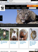
First my laptop:
Next the ipad when I hold it in a landscape mode:

Most of the details are still there in this rendering.
In the iPad Portrait Mode the browser adjusts and is able to show more of the screen; all fit within the available screen real estate automatically! Since it’s an iPad, the real estate is still big enough for them to fit everything in.
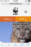
Now when I look at the same site through my iPhone Safari browser, the site strips it down to the bare essentials – the logo, the picture of the snow leopard and the two most important links to them – Donate and Adopt.. More of the picture is also visible in the Portrait mode.

In the iPhone Landscape mode the picture adjusts automatically all of the elements.
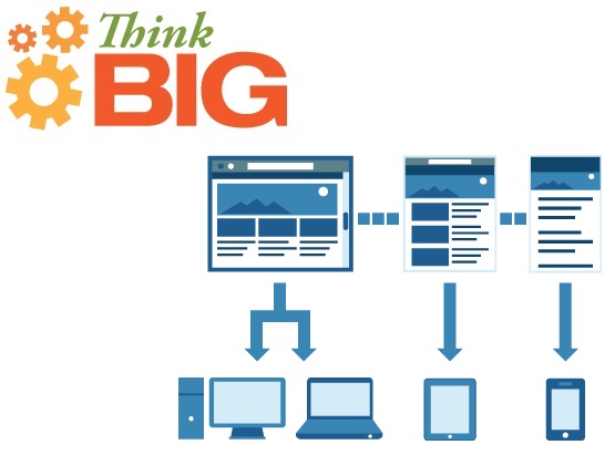
How do we do Responsive Design?
There are many different ways to do Responsive Design and all of them have pluses and minuses – You offer information and functionality only through browsers and make the pages be responsive to the device – laptop, tablets, smartphones or feature phones. Or on smartphones you can create apps that replace webpages or a dedicated mobile website. Initially the whole movement started as Responsive Web Design but the movement has spread to include mobile devices also since users are transitioning a lot of the time they spend doing things on those.. Ethan Marcotte has written a very good book, Responsive Web Design, that outlines a number of techniques to achieve responsive web design:
- Specifying design elements in terms of percentages instead of pixels
- Sensing the width or the browser and using different CSS Styles accordingly
- Extensive use of server side enhancements to enhance the user experience on mobile devices that have narrower bandwidths than an ethernet or wireless connection at home.
Responsive Design is not a single, monolithic approach. You don’t need to rigidly try to offer ALL of the functionality on every device. Like this blog entry on the facebook developer pages indicates, it can be optimized by different companies for different purposes for different devices. Luke Wroblewski writes in a compelling way that different devices like laptops, tablets and mobiles have different contexts of usages – some on your sofa at home, some in a hassled situation on the move on your mobile. What you would like to accomplish in those two situations are very different and so your user experience could be limited or more, depending upon this kind of context.
Clarissa Peterson provides a number of additional compelling examples in her presentation here.. If you are worried only about Mobile Responsive Design, the underlying approaches may be the same but the tools may be different. They are outlined here in this article with other references from there.
As with anything, any approach comes with their own pluses and minuses. This article – The Truth Behind Responsive Web Design: Is It the Next Great Hope or All Hype? explores some of the minuses in greater detail.
Benefits of Responsive Design
- Consistent user experience, same URLs on every device
- Single website/code base to create/maintain for a variety of devices
- Support for a variety of screens and also future-proof – New screen sizes are automatically accommodated
Drawbacks of Responsive Design
- Sometimes developing one app for each platform may be the right way to go! And sometimes for News, people prefer browsers over apps! You may have to look to your own application for an answer. Responsive design may not be applicable if you decide to go the app route!
- Not very efficient and can be slow on mobiles with slower connections. All elements may be downloaded whether they are displayed or not.
- Initial development cost could be more than developing just for a browser
- Consumers may not necessarily want the same user experience on every device
So next time you design something remember the song – Bend Me, Shape Me, Anyway You Want Me!
Simplify before you suppress. If it’s not worthwhile to show to mobile users, what value does it have to other users? – Ethan Marcotte