

Startups need Traction. A startup which doesn’t get discovered doesn’t go anywhere. This is all the more critical for platform businesses which rely on their users to create value and network effects. In the specific case of platform businesses, Traction dictates the value that is created. A social network without enough users or a marketplace without enough activity isn’t going anywhere. Traction essentially refers to the additional value that is created on these businesses by the users using it, value created through interactions between users.
Often, one of the core principles of building for Traction is removing Friction from the product experience. Friction comes in the way of users using the product and, hence, in the way of value creation. Friction may result from anything that acts as a barrier to a user for using the product. Friction may be created by design (e.g. users are curated before they get access) or by accident (e.g. poor product navigability).
Traction and Friction don’t go well together. We’re living in an age where frictionless is increasingly synonymous with desirable design.
But Friction continues to have an important place in the world of platform businesses. Getting Friction right is critical to the success of an internet startup. Through this essay, I’d like to explore some of the top design considerations while building for friction.
As with all design considerations, the ultimate goal of a platform startup (marketplace, community, social network, UGC platform etc.) is to facilitate interactions.
Hence, as a rule of thumb:
Friction is a good thing if it facilitates the interaction instead of coming in the way of it.
Let’s dig further!
The Traction-Friction Matrix
This is pretty much how the traction-friction trade-off works out:
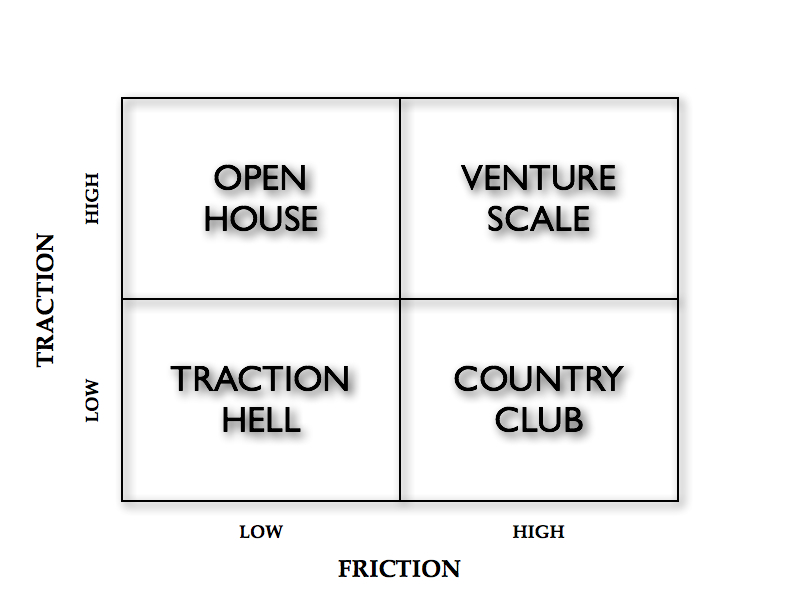
High Friction-Low Traction: There are two reasons your startup may be in this quadrant: by design or by accident. You’re either curating who gets access or you’re suffering from really bad design.
Low Friction-High Traction: Again, a startup hits this quadrant for one of two reasons: frictionless experiences by design or lack of checks and balances.
High Friction-High Traction: This is a great place to be and ultimately successful startups migrate to this quadrant after starting off in one of the quadrants above.
Low Friction-Low Traction: This is clearly the worst quadrant to get stuck in for too long.
Movements in the Matrix
1. Pivoting around Friction:

2. Avoiding friction altogether: CraigsList pretty much allows anyone to do anything, except for a few categories that it polices and a few categories where listing are paid.

3. Embracing friction with scale: Quora has been increasing friction as it scales. Anyone could ask a question in the early days but asking a question now requires the user to pay forward in points.

4. Relaxation of norms: App.net started off with high friction with a $50 subscription fee. However, it has gradually reduced friction to allow for traction.

5. Scaling the country club: Several invite-only platforms have successfully scaled with this model.

Design Considerations For Friction
As mentioned earlier, Friction, like every other design consideration, should lead to smoother and better interactions between users on the platform. With that as a guiding principle, let’s look at a few case studies where Friction works well.
Interestingly, two platforms in the same vertical and category often compete and co-exist by being in two different boxes in this matrix, as the examples below demonstrate.
Friction as a Source of Quality
Some platforms risk losing activity (interactions) when there is a lot of noise on the platform. Women tend to avoid dating websites which attract stalkers and men with poor online etiquette. Clearly, noise leads to lower probability of interactions.
Some dating websites invest in incentivizing women to join the network. An alternate model is to increase friction on the other side and curate the men that get access to the network. Sites like CupidCurated have taken this approach as a way to differentiate themselves from existing dating sites which relied on incentivizing women.
High Friction-Low Traction: CupidCurated
Low Friction-High Traction: Match.com
Friction to Create Trust
Some interactions may require a minimum guarantee and an environment of trust. Hiring a babysitter is different from asking a question online. False positives can cause much greater damage in the former case.
In such scenarios, Friction in the form of curation of babysitters provides a critical source of value. In contrast, the Friction-less Craigslist is hardly the destination for finding babysitters online.
High Friction-Low Traction: SitterCity
Low Friction-High Traction: Craigslist
Friction as Signal
In both examples above, Friction not only controls who gets access to the platform, it also creates some form of signal about those getting access. Curation of babysitters yields exact parameters which would be used by parents for making a decision. Hence, Friction also helps with signaling.
Interestingly, financial markets work with signaling too. VCs, in private markets, are responsible for due diligence and determining whether a startup is worth investing in.
Crowdfunding tries to disrupt venture capital but most current models (like Kickstarter) merely unlock new sources of funds, they don’t necessarily provide the expertise curation and signaling that a VC fund would. Startups like RockThePost are working on the Country Club model and allowing only heavily curated startups to raise money through their platform. In this way, the platform is placing a bet on the fact that signaling and curation need to be part of the platform, to credibly provide an alternative to venture funds.
High Friction-Low Traction: RockThePost
Low Friction-High Traction: KickStarter
Friction on One or Both Roles
Most platforms support two distinct roles: consumers and producers. In all the examples above, Friction was being applied to only one side. This is the model used in most cases. However, where there is high overlap between the two roles i.e. the same user produces as well as consumes, Friction can be applied to both roles. Quibb is an example of a network that applies Friction across the board. It works for Quibb because users want to be part of an exclusive community, to benefit from superior quality interactions. But more often than not, applying Friction on both sides comes in the way of creation of network effects, as demonstrated in the next example.
High Friction-Low Traction: Quibb
Low Friction-High Traction: Reddit
Friction as a Barrier
For all the hype and fanfare surrounding App.net’s launch, the platform has never quite lived up to its initial stand of providing an alternative to Twitter. There were two design considerations that were fundamentally flawed in this case:
1) Applying Friction to both producer and consumer roles. The core value of Twitter is the ability to build a following. By restricting who could access App.net, the platform limited its ability to deliver that value to producers.
2) More importantly, the source of Friction did not guarantee any form of quality, trust or signal. Friction was created by charging an access fee. That didn’t help make interactions on the platform better in any way. If any thing, it just came in the way of these interactions. App.net realized it wasn’t getting anywhere and subsequently brought down the access fee, through a series of revisions, by 90%.
High Friction-Low Traction: App.net
Low Friction-High Traction: Twitter
In summary, the following is a non-exhaustive list of design questions to consider while introducing Friction onto a platform.
A. Do you add Friction to one side or both sides?
B. What criteria are used to create Friction? Does it improve quality and add value?
C. Does Friction lead to higher likelihood of interactions?
D. Is the interaction high-value or high-risk? In other words, how important is trust, signal or quality as a source of value?
Tweetable Takeaways
Friction in design is helpful if it facilitates the interaction instead of coming in the way of it. Tweet
Two competing platforms can co-exist by varying the levels of friction in their design. Tweet
If you’re restricting access, it better provide additional value. Think SitterCity, not App.net. Tweet
Every element of platform design should be aimed at incentivizing interactions. Tweet
This article was originally published on Sangeet Paul Choudary’s personal blog Platform Thinking – A blog about building early stage ventures from an idea to a business, and mitigating execution risk.
