Approaching Mobile UX – A Product Manager’s Perspective

When building the mobile interface for their existing products, Product Owners are faced with quite a few perplexing questions, especially related to the user experience on mobile. A report from ZDNet says UX is one of the most critical concerns for enterprises looking to develop mobile apps while another study points out that users prefer usability and good user experience over brand names.

Before we start discussing about Mobile UX, let us first understand what User Experience is.  User Experience is not only about visual design. It is actually much broader — it involves the scientific research of users and can answer important questions about the audience for both new and existing products. These include:

• Who are your real users and what do these real users care about?

• How do they actually interact with your existing product?

• How will users interact with a new version or new feature?

MobileUX

While there are several UX design best practices from the desktop world that can be brought to mobile, this piece focuses on mobile specific issues.

The foremost thing to remember when building a mobile interface for your product is that while mobile UX design has similarities with web and software design, simply stripping down your desktop or web experience is not going to do it. While drilling down is fine on the Web, mobile users tend to act more linearly a mobile application. To design a good app, you need to start from grounds up, identifying the customer experience you want, and enhancing it with the right features of your existing product. Great mobile apps are uniquely mobile, they couldn’t be done the same way anywhere else.

When choosing whether to design for brand or device, put your preference on device. Your users have been using the device much before they start using your application. Developing custom interfaces will confuse users, slow down adoption, and put a significant obstacle in the way of engagement. Instead, take the principles of the OS-native interface kit, and subtly style your interface elements without altering the underlying functions.

password-engine
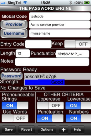
A classic example is the Password Engine iPhone app. iPhone users are used to certain ways to access settings or placement of the Back button. By not following them, the app increases the learning curve for users.

Mobile apps will always be subjected to interruption, whether by an incoming call or the user’s station arriving. Design your applications such that it is easy for users to pick up from where they left off  – save states, break larger tasks down into smaller chunks, and put context throughout. Usually users on mobile will on the move, and hence subjected to lots of distractions. Organize content in a way so that it is easy for consumers to browse through.  Take the example of the Gmail iPhone app.

google


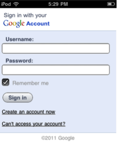
All the fields and Call to Action (CTA) are vertically aligned on the left side and thus the user’s eye needs to move in one consistent direction.


efilecabinet
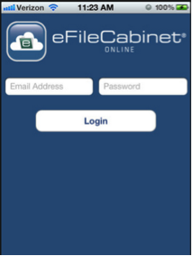
While the iPhone app from eFileCabinet forces the user’s eye to scan all around the screen. It has less CTA’s and hence a lot of the real estate on phone screen that could have been used.

Mobile devices generate a lot of information about the user apart from the traditional data generated from a web solution. This includes things like movement, location, sensor data etc. Think about using this data intelligently to pleasantly surprise the user. Customer satisfaction is great but customer delight is even better.

yelpYelp has recently updated its Nearby feature that now offers suggestions based on user’s location, previous Yelp check-ins and reviews, and Yelp friends as well as other data like the time of day and even the weather. This is a great update because it allows Yelp recommendations to be truly contextual. On a cold morning, it can recommend a good coffee shop while on a sunny day it can point to ice-cream parlours near you.


And finally, understand the limitations of mobile devices – constrained hardware resources, screen size and network bandwidth. Consuming too much power or designing buttons for cursors rather than fingers and thumb will lead users to delete your application. Prioritize and present core features from other channels that have especial relevance in a mobile environment and enable mobile users to navigate to the most important content and functionality in as few taps or key presses as possible.

Measuring UX performance

Like any product feature, you need to constantly measure UX and keep improving. A couple of ways to measure UX are:

1. Data

Identify some of the key KPIs for your app. Example of some of the common ones are:

  • Adoption: Track data such as DAU or 7 day actives
  • Retention: Analyze the users who are coming back
  • Engagement: Number of visits or time spent are good indicators of engagement
  • Task Success: Use the funnel analysis to figure out dropouts
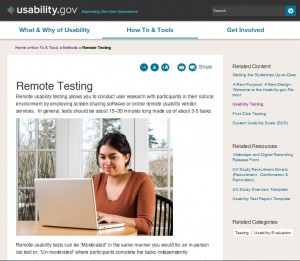
 

2. Usability Test

Observe users using the product.  Ideally, you would compare these usability tests to ones done on your prior product.  Does the new design achieve the intended goals, such as being more intuitive and driving users towards specific actions?

Resources

A great resource to start learning about the UX principles for mobile is the iOS Human Interface Guidelines. Another great resource for learning the basics of iOS UX and UI is Tapworthy: Designing Great iPhone Apps: Josh Clark. Android too has a few Design Guidelines, and it is always good to have a look at them when developing apps for Android.

Conclusions

The mobile user experience encompasses the user’s perceptions and feelings before, during and after their interaction with your mobile presence. Creating mobile user experiences that delights a user forces us to rethink a lot of what we have taken for granted so far with desktop design. Mobile user experience is still a developing field, and opportunities for improvement continue to emerge. But dissecting the mobile user experience into its key components, and placing the user’s expectations at the centre, gives us a conceptual framework for building and evaluating good mobile experiences.

Guest Post by Rajat Harlalka at PlayApps Inc He has over 8 years of experience in the mobile industry in different roles – technology, strategy and product management. He has worked with companies such as Marvell, ST Ericsson and Exicon  etc. and is currently a Product Manager developing mobile educational games and apps. You can find him on Twitter @RajatHarlalka

Bangalore: 30th Nov 2013 | Design Thinking round table with Eskild Hansen

On a typical Saturday morning in Bangalore, a small group of design practitioners and product folk got together at the Fusion Charts office in Koramangala. They were attending an informal round table discussion on the topic ‘Design driven innovation to help make the world a more beautiful and pleasurable place.’

As part of a design tour being organized by the Danish Government and the Ministry of Foreign Affairs, Eskild Hanson (a prominent Danish designer) was visiting Delhi and Bangalore. Members of iSpirit, Indian designers and design thinkers were invited to meet and engage with him on areas of common interest.

Eskild is a part of the Danish government strategic think tank that is developing and strategizing the ‘Danish Design Society.’
His previous workplaces include CISCO and Coloplast.
At CISCO, Eskild was responsible for establishing their first European Design Center in Copenhagen and during this period helped bring a fresh air to their previously ‘boring and bulky’ Wireless Routers. He won a Red Dot in 2011 for one of his designs.
More about his work at www.eskildhansen.com

Here are a few pictures capturing the event:

Roundtable Discussion
Participants introduce themselves at the start of the event
Eskild talking about a trend in executive roles - CCO (Chief Creative Officer) / CDO (Chief Design Officer)
Eskild talks about a trend in executive roles – CCO (Chief Creative Officer) / CDO (Chief Design Officer)
Making a point about the importance of competing on factors apart from price, features and technology. (COMPAL and Quanta Computer - Virtualy unknown but producers of most of the worlds laptops!)
Making a point about the importance of competing on factors apart from price, features and technology. (COMPAL and Quanta Computer – Virtually unknown – but producers of most of the worlds laptops!)
Technology as an 'enabler of innovation' (As opposed to 'technology as a driver')
Technology as an ‘enabler of innovation’ (As opposed to ‘driver of innovation’)
User research - A tool to drive and validate innovation.
User Research – A tool to drive and validate innovation.

The interactive session was a great forum to hear each other’s thoughts on topics related to design and design thinking.
It also gave participants an opportunity to learn more about the Danish Design approach and their innovation related initiatives in India – www.icdk.um.dk.

To know more about the session, check out this sketch note created by Rasagy Sharma, an NID student – https://twitter.com/rasagy/status/407165458303836161/photo/1/large


Bend Me, Shape Me, Anyway You Want Me – Responsive Design in Action!

Bend Me, Shape Me, Anyway You Want Me – Long as you love me, It’s alright! – goes the catchy song from American Breed in 1968. It captures the essence of Responsive Design! Do not make people adapt to your web or mobile experience on various devices.. You make the user interface adapt to the device that is being used. And talk about adapting? Watch the drummer also play the saxophone towards the end! This song was so catchy and appropriate they used it for Flexon flexible eyeglass frames and Gap Stretch Jeans ads!  Let’s enjoy that song first, shall we?

Why is responsive design needed? Let’s start with a simple example of what happens when I access the IRCTC website on my iPhone:

irctc-iphone2

Here the website is not doing anything except display the desktop version in a smart phone with small fonts. I can barely see anything.


irctc-iphone2

I will have to zoom in and locate the login section to login. The web page is doing nothing to adjust to my device. It is up to me to zoom around different parts of a static, same sized page and do my work.


To see Responsive Design in action, I took a good example of how they have done it at worldlife.org, the US web site of World Wildlife Federation. I visited them on my laptop, ipad and iphone and here is what I saw:

First my laptop:wwf-desktop

Next the ipad when I hold it in a landscape mode:

wwf-ipad-lands

Most of the details are still there in this rendering.


wwf-ipad-port

In the iPad Portrait Mode the browser adjusts and is able to show more of the screen; all fit within the available screen real estate automatically! Since it’s an iPad, the real estate is still big enough for them to fit everything in.

wwf-iphone-port

Now when I look at the same site through my iPhone Safari browser, the site strips it down to the bare essentials – the logo, the picture of the snow leopard and the two most important links to them – Donate and Adopt.. More of the picture is also visible in the Portrait mode.

wwf-iphone-lands

In the iPhone Landscape mode the picture adjusts automatically all of the elements.

How do we do Responsive Design?

There are many different ways to do Responsive Design and all of them have pluses and minuses – You offer information and functionality only through browsers and make the pages be responsive to the device – laptop, tablets, smartphones or feature phones. Or on smartphones you can create apps that replace webpages or a dedicated mobile website. Initially the whole movement started as Responsive Web Design but the movement has spread to include mobile devices also since users are transitioning a lot of the time they spend doing things on those.. Ethan Marcotte has written a very good book, Responsive Web Design, that outlines a number of techniques to achieve responsive web design:

  • Specifying design elements in terms of percentages instead of pixels
  • Sensing the width or the browser and using different CSS Styles accordingly
  • Extensive use of server side enhancements to enhance the user experience on mobile devices that have narrower bandwidths than an ethernet  or wireless connection at home.

Responsive Design is not a single, monolithic approach. You don’t need to rigidly try to offer ALL of the functionality on every device. Like this blog entry on the facebook developer pages indicates, it can be optimized by different companies for different purposes for different devices.  Luke Wroblewski writes in a compelling way that different devices like laptops, tablets and mobiles have different contexts of usages – some on your sofa at home, some in a hassled situation on the move on your mobile. What you would like to accomplish in those two situations are very different and so your user experience could be limited or more, depending upon this kind of context.

Clarissa Peterson provides a number of additional compelling examples in her presentation here.. If you are worried only about Mobile Responsive Design, the underlying approaches may be the same but the tools may be different. They are outlined here in this article with other references from there. 

As with anything, any approach comes with their own pluses and minuses. This article  – The Truth Behind Responsive Web Design: Is It the Next Great Hope or All Hype? explores some of the minuses in greater detail.

Benefits of Responsive Design

  • Consistent user experience, same URLs on every device
  • Single website/code base to create/maintain for a variety of devices
  • Support for a variety of screens and also future-proof – New screen sizes are automatically accommodated


Drawbacks of Responsive Design 

  • Sometimes developing one app for each platform may be the right way to go! And sometimes for News, people prefer browsers over apps!  You may have to look to your own application for an answer. Responsive design may not be applicable if  you decide to go the app route!
  • Not very efficient and can be slow on mobiles with slower connections. All elements may be downloaded whether they are displayed or not.
  • Initial development cost could be more than developing just for a browser
  • Consumers may not necessarily want the same user experience on every device

So next time you design something remember the song – Bend Me, Shape Me, Anyway You Want Me!

Simplify before you suppress. If it’s not worthwhile to show to mobile users, what value does it have to other users? – Ethan Marcotte

Design in Indian Startups

A brief look at the state of the Indian startup ecosystem from the lens of design and how well it is understood or misunderstood. How the next generation of the technology startups are battling the design challenge in a globally connected ecosystem for the right consumer audience.

According to Dave McClure the founding team of a startup should include the holy trinity of a hacker, hustler and a designer. In simple terms a dream team comprising of members responsible for the technology, business/marketing and the design. Dave is no stranger to entrepreneurship or India, and as the founding partner at 500Startups (internet startup seed fund and incubator program based in Mountain View, CA) each of their accelerator programs have seen interest and presence from a number of Indian startups.

“Holy trinity of hacker, hustler and a designer”

This then begets the question of what exactly is an “Indian startup”? Unlike Israel a nation known both for its military prowess and high-technology startups along with the fact that it has the highest per-capita VC investment in the world. Startups in India like the nation itself conform to no unifying sector or theme. On one hand we have Delhi based Langhar helping connect foodies with authentic home cooked local cuisines on the other we see SarkariExam a portal dedicated to helping people find government jobs. Even after applying the filter of technology and technology enabled startups with their constantly blurring boundaries in the internet & mobile space, the bandwidth of the spectrum is still large.

If one goes by the estimates of AngelList, a platform dedicated towards the startups and the investors; there are 1500+ startups in India. This by no mean implies that all of them would be independently successful or have a profitable exit. Many of them would eventually shut shop and might not even exist the next summer. Despite this uncertainty and the increasing belief of Indian founders in their idea have led to a rising entrepreneurial activity. Catering to everybody from the hyper local audiences to products specifically built for the customers abroad. Helping us establish the fact that there is no single way to explain or define as to what constitutes an Indian startup. If question of the Indian-ness wasn’t tough enough the attention to design has increased the complexity of the understanding manifold. Invariantly a handful of startups like Cleartrip (travel), Zomato (food), Paytm (payment) and Hike (messaging) have become the poster boys for the best designed products being built in and in certain cases for India. This then progresses us to our next challenge of “What is design in the context of the startups and what is the role of the designer?”

Depending upon who do you ask, one is bound to get various forms and interpretation of what constitutes design? Making it easy to complicate things for the humble hackers and the hustlers trying to fathom as to why their designer is unable to deliver in the face of the challenge for their startup. Going over from formal the definitions provided in academic institutions of design being ‘a noun and a verb’ to the one followed by design practitioners whereby they try to highlight the difference between “art and design”. One thing that emerges is that, design has been and will always remain at its core a form of problem solving.

“Design has been and will always remain at its core a form of problem solving”

Had things been as black and white as they seem we wouldn’t have startups explaining their design strategy in terms of the visual design. Or in the case they understand the value of design keep looking for that one mythical designer who could solve all their problems. With the ever changing relationship and interaction of humans with technology; and it’s constantly evolving nature the boundaries of what explicitly is the job of a designer or the hacker is quickly overlapping.

Take the case of Rasagy Sharma who after finishing his undergraduate degree in computer science & engineering joined a Bangalore based startup as their UX Designer. One of the first ‘design’ hires in the team comprising of hackers, leading him to explain his role to the people around him. If the challenge of understanding what exactly entails in these new design roles wasn’t tricky enough, Rasagy highlights the emerging debate of ‘Should designers code?’ “The answers vary from the extremes of ‘Designers can code and should code’ to ‘Designer cannot code and is not expected to code’ with a comfortable middle ground emerging in the form of ‘Designer can code but is not expected to code’ ” says Rasagy.

“Designer can code but is not expected to code”

But if there is no one designer who can solve all of the problems of the startups which range from visual design & interaction design to in certain cases industrial design; and finding the talent is tough. Then shouldn’t we see the limited resources of the startups being spent on the function (technology) than form (design and by extension user experience)? One of the most interesting theme to emerge while talking to a number startups as a part of the research was their unanimous agreement in pushing design forward for their product. Neeraj Sabharwal who heads the design at the Hyderabad based NowFloats quotes Tom Peters when he says “The dumbest mistake is viewing design as something you do at the end of the process to ‘tidy up’ the mess, as opposed to understanding it’s a ‘day one’ issue and part of everything.” Even in the case where the technical founders thought of design as nothing more than a marketing gimmick they did approve of increasing the resources dedicated to certain design activities by either hiring talent or outsourcing the process. And putting the bill under what they felt was the ‘cost of customer acquisition’.

The cost of starting an internet business is decreasing by the year and in no other period of history have we seen more entrepreneurial activity than the present. Faced with the simple market forces of consumer choice, a positive user experiences is a simple measure of how efficiently the technology works to help the user achieve his goals. In a somewhat surprising trend that in hindsight makes perfect sense, some of the best designed startups being built in the country include a designer as a part of the founding or the founders atleast have the design aesthetics in place to drive things forward.

Eventifier is being built in the southern city of Chennai at The Startup Center. Eventifier helps keep all the social media chatter around an event including the conversation, photos, videos, presentation decks in a single place. They are one of the few startups using the hacker, hustler and the designer approach since the day they began. Mohammed Saud holds the mantle of the Chief Design Officer and one would give weight to his belief when he says “Being equally proficient in all facets of design even when their underlying principle might be the same is difficult.” His solution is the one that is increasingly becoming common, become proficient in one form of design yet understands the other well enough to guide somebody with your vision. A similar ideology was put forth by Arun Jay, who amongst a number of other claims holds the post of the principle designer at SlideShare and the senior UX designer at LinkedIn. By academic training Arun began as a communication designer but his experience with film making, photography and web based technologies makes him the ideal choice for the unicorn designers so many startups look for.

But it wouldn’t be fun if there weren’t a few startups breaking the mould. HealthifyMe and NowFloats are two startups which were a part of the Microsoft Accelerator program in Bangalore. On one hand we have Neeraj Sabharwal from NowFloats with no formal training in the various disciplines of design yet relying on his industry experience and understanding of design thinking principles to lead the charge. On the other we have Tushar Vashisht co-founder of HealthifyMe attributing the fact that “Lack of a dedicated designer in the founding team even with the team valuing design, cost them precious resources in the decision making and product building exercise. With HealthifyMe treating the user experience as an integral part of the product building process getting Rohan Gupta as a designer onboard has positively affected our shipping time.”

But believing that a well-designed product is the end all in the product building exercise would be plain naïve. Design is one of the integral processes amongst the host of other responsibilities held by the hustlers and the hackers which make a product successful. Brij Vaghani is the founder of live traffic monitoring service, Traffline which currently operates in three metropolitan cities. His team is working in close association with a design studio for the soon to be launching next version of their product. “Even though we understood the value of design, the founding team relied upon our core strengths of technology in the early stages of the product. An approach which we feel might have had an impact on the metrics we use to track the product success but something that was within permissible levels”

Where are we headed? Great design and technology have always existed. The founders are still looking for that elusive designer who can handle all their design problems, but as unicorns go those beings are still rare to find. The consumer internet is nearly twenty years old, the smartphone nearly six and the tablet less than four. Yet the potential of the startups building upon and specifically for these platforms is seeing an exponential growth. We haven’t even begun scratching the surface of the potential and can’t predict the trajectory of the startup economy in India serving an internal audience of a billion plus people and catering to those abroad. But the fact remains that the designers seem to have finally found a voice and Indian startups are rearing for them to go.

Author’s Note: This article was written for a collaborative publication: Create Change for Kyoorius Designyatra 2013 produced by Kyoorius and British Council, India and is a part of British Council’s design writing programme.

The post has been slightly modified for the web by adding of the appropriate hyperlinks to the startups and the resources mentioned to aide the reader. You can download the PDF version of the print magazine in all its glory here. The article is on page sixty-nine.

Quick Research / Usability Methods: Lean Usability Testing

(Post 3 of a series on quick research and usability techniques. Start-up’s can use these techniques fairly easily to connect to and understand their end users better, as well as maintain usability standards on their products.)

Previous posts in this series showcased two discount usability engineering methods – Expert Usability Review‘ and ‘Heuristic Evaluation’. Both these methods are ‘expert based’ – i.e. an interface is reviewed by design or usability experts vs. getting feedback from end users – and are used to identify usability issues on an interface.

Post 3 introduces lean Usability Testing – A ‘guerrilla’ version of traditional Usability Testing.

Before discussing the how’s and why’s of ‘lean’ testing, here are a few basic points to better understand Usability Testing and why it’s important in context to start up’s.

USABILITY TESTING BASICS

Usability Testing (UT) is a research method used to gain insight into product usability.
It is a time bound ‘show and tell’ method where a moderator asks representative users to use and/or talk about the product being evaluated, in context to key task scenarios.
A basic test typically starts with open ended ‘interview style’ questions, followed by a longer scenario based ‘show and tell’ session and ends with a debriefing session.

Usability Testing can be conducted at various points of the product development lifecycle.
Although there are several types of usability tests and techniques that can be used, testing can be broadly classified into ‘Formative’ and ‘Summative’ Testing.

Formative Testing can be conducted at any stage of development. (Initial paper prototype / high fidelity prototype / even post release)
The objective is to aid iterative design. Formative Testing is typically qualitative in nature and the goal is to find specific pain points and highlight areas of improvement.

Summative Testing
is done only with designs that are complete or near completion.
The objective is usually to judge the design against quantitative metrics (like efficiency or productivity) or against competitive products.

Find out more about Usability Testing and how you can plan for and conduct a test, at Usability.gov.

Steve Krug’s demo video is also a good starting point to get started with Usability Testing.

Demo Usability Test


WHY TESTING IS IMPORTANT: THE MALCOVICH BIAS

The Malcovich Bias

The UT method is particularly relevant to start ups, where the environment is characteristically ‘inspired’ and ‘driven’ by a shared product vision.
In order to pull in the best talent and sustain momentum, start-up leaders ‘sell’ their product to themselves, to their investors and to their employees.

While this can energize teams and enhance productivity, it also fuels the ‘Malcovich Bias’.
(‘The assumption that ‘target users’ use things / see things / care about the same things that the ‘product / design team’ does.’)

In a high-pressure, super charged start up environment, it is easy to become ‘product / vision focussed’ rather than focussed on the people who are ultimately going to use the product.

Usability Testing puts start up teams in touch with their end users and their reactions to the product that is being built.

And seeing people struggle with what seemed standard or obvious reinforces the fact that assumptions made about the product or its features may be very different from the way users actually perceive or experience it.

LEAN USABILITY TESTING

That said, traditional Usability Testing can be difficult to incorporate into tight budgets and product timelines. However, several specific elements add to the cost, duration and complexity of testing, and can be substituted with lightweight alternatives that help make ‘Usability Testing’ leaner.

Lean Usability Testing is easier to fit in because it is cheaper and can be done more quickly than traditional testing. And more so in context to Agile Software Development – where a key practice is quick and incremental development.

For example, did you know that testing in a professional facility can add to the cost, but is usually not a ‘must have’?
At a basic level, a test can be conducted very effectively in any room that is quiet and available for use without interruption.

Other (cost effective) alternatives to a professional / formal testing space include:

  1. Remote (Moderated) Usability Testing
    Remote Testing follows the same objectives and a similar process to traditional ‘lab’ usability testing. The obvious difference is that the moderator and the user are in two different locations. (e.g. The moderator in his office / the user in his office or home)
    However, with good screen sharing and screen recording software, usability testing can be conducted easily and effectively with a remote participant. Besides saving costs related to renting or setting up a formal testing space, remote testing reduces the costs of accessing geographically dispersed target users.

    screen sharing software

    Recommended screen sharing software – WebEx, Adobe Connect, Skype, GoToMeeting

    screen recording software

    Tech Smith’s Camtasia Recorder is an easy-to-use tool that can be used to capture remote testing sessions for later reference and analysis.

  2. Guerrilla Testing: This is an impromptu method and therefore should not be tightly scripted or planned. The distinguishing characteristic of this method is its spontaneity.

    The method essentially involves:
    … taking your product to a public space
    … identifying and recruiting people who are interested / fit a broad profile from among a pool of strangers
    … conducting the test right after

    If your product is generic or targeting a wide audience, you can conduct guerrilla testing on the street / in a coffee shop / at a conference;
    For niche or specifically targeted products, a more specific space that is likely to be populated by your target users would work best. (Like outside a college for an educational product, or inside a mall for a product related to shopping.)

    Besides cost and time saving, Remote Testing and Guerrilla Testing are good DIY research options for start-ups who want to get end user feedback.
    They are easier to plan and organize than traditional usability tests. Several of the challenges related to scheduling and set up in traditional testing are no longer applicable here.

    Remote Testing

    Find out more about how you can set up and conduct a Remote Test at Usability.gov, Quick and Dirty Remote User Testing (A List Apart)More about Guerrilla Testing at – UX Booth

  3. In-Context Testing
    In this case, the researcher pre-recruits participants, and then schedules and conducts tests in the context they would typically use the product – rather than having participants come in to a formal testing venue.Testing in the participants natural context of product usage not only cuts costs associated with a formal facility, but adds richness to the test. Contextual influencers that would otherwise be invisible to the researcher now become added inputs to the research.

Coming up soon – How to be leaner in participant recruiting, selection of testing equipment / software, reporting and more…

Post 4 will discuss multiple additional ways in which start up’s can conduct a Usability Test at leaner costs and timelines.

Are you a design thinker evangelizing or facilitating user research and usability methods within your start-up?
We would love to hear about your experience / answer any questions that you have about the research and usability methods you use.

We invite members of the start-up community to volunteer their screens / functions for use as examples in upcoming posts showcasing additional research techniques.
Email me at devika(at)anagramresearch.com to check whether your screen is eligible for selection. 

Quick Research / Usability Methods: Heuristic Evaluation

(Post 2 of a series on quick research and usability techniques. Start-up’s can use these techniques fairly easily to connect to and understand their end users better, as well as maintain usability standards on their products.)

In my last post, I introduced a discount usability engineering method called the ‘Expert Usability Review’ – A method best suited to start-up’s who have access to skilled and experienced usability / design professionals who can conduct a Usability Review.

Post 2 introduces a related technique called the ‘Heuristic Evaluation’.
Start up’s that don’t have a usability / design team in place, can start focusing on usability and ease of use, using the ‘Heuristic Evaluation’ method – A method with similar goals to the Expert Usability Review, but a relatively easier starting point for novice researchers.

In a Heuristic Evaluation (or Heuristic Review), the reviewers identify issues by looking at an interface in context to a pre-decided set of heuristics. Violations to any of the heuristics indicate non-compliance / potential usability issues.

‘Heuristics’ are rules of thumb – Broader than design guidelines, typically available as self-sufficient ‘sets’ (e.g. Nielsen’s 10 Usability Heuristics / Gerhardt-Powals’ cognitive engineering principles) that can be used standalone / along with other sets.

Popular examples:

Visibility of system status: The system should always keep users informed about what is going on, through appropriate feedback within reasonable time. (Jakob Nielsen)

Reduce uncertainty: Display data in a manner that is clear and obvious. (Gerhardt-Powals)

The set of heuristics used act as a guideline – making this method more of a check list based audit rather than requiring reviewers to intuitively identify issues by drawing upon a deep knowledge of usability and UI in general.

(More about the technique and how to conduct Heuristic Evaluations at Usability.gov, Smashing Magazine and the NN Group)

One of the drawbacks of the Heuristic Evaluation method, is that the issues identified are dependent on the list of heuristics used. So if the set of heuristics is too narrow, there is a chance of some issues going unidentified. On the other hand, if the list of heuristics is very large, the review would take a very long time to do.

The most popular set of Heuristics are Jakob Nielson’s 10 Heuristics. However, these are broad guidelines – and may be too abstract for a lay person to interpret and apply.

10 Usability HeuristicsThe 275 Web Usability Guidelines from User Focus are more literal and therefore much easier to understand for the lay person. Moreover, these guidelines are available in a neat Excel spread sheet format that includes instructions on how to use them and an auto-calculated numeric rating for guidelines compliance.

275 Web Usability Guidelines


To end, here are a few tips you can keep in mind while attempting to do a Heuristic Evaluation:

Start with a Knowledge Transfer
Before critiquing a product, it is important to understand its context and usage.
The knowledge transfer must enable a good understanding of the product strategy and goals, target audience, known trouble points, constraints and design centres. The KT must include a walkthrough of all features, screens and task flows that are critical to the product.

Define the scope of the review
While this is not necessary for a simple product or a product with a manageable number of screens, in a complex or large product, defining the key task flows and screens to be reviewed is important to keep the review manageable.
With some exceptions, the 80 /20 rule is a good way to do this – Attempt to review 20% of the product features that are used 80% of the time.

Select the set of heuristics that are right for your product
There are plenty of heuristics available online.
Keeping n mind the product you plan to review, it is important to decide whether to use a generic set of heuristics (Like Jacob Nielson’s 10 Heuristics / User Focus guidelines) or whether domain specific / niche heuristics would be more effective. In niche or highly targeted products (products for senior citizens, children, disabled users, mobile phone hardware etc.) generic heuristics may be ineffective for unearthing all issues.

Select a set of heuristics that are right for the reviewer
The reviewers who are going to be using the heuristics, need to be comfortable / familiar with the heuristics in order to interpret and apply them effectively.

Focus on issue identification vs. recommendation
A common tendency among newbie reviewers is to jump right into fixing the problem / wording the issue as a recommendation. It is important to keep the Heuristic Review focused on issue identification, in context to a given set of heuristics. In fact, an issue may / may not be accompanied by a corresponding recommendation – Issues are sometimes too complex to be tackled by a quick written recommendation and need a larger, more focused redesign effort.

Rate issues to help prioritize
Doing this helps focus the post review effort of addressing the issues identified through Heuristic Review.

Are you a design thinker evangelizing or facilitating user research and usability methods within your start-up?
We would love to hear about your experience / answer any questions that you have about the methods that you used.

Post 3 coming up soon, will showcase a Guerrilla Research techniqueRemote Usability Testing. Look out for this post to learn more about the method and to compare the issues found through Usability Testing, against issues identified through the Expert Usability Review.

We invite members of the start-up community to volunteer their screens / functions for use as examples in upcoming posts showcasing additional research techniques. Email me  at devika(at)anagramresearch.com to check whether your screen is eligible for selection.  

Quick Research / Usability Methods: Expert Usability Review

(Post 1 of a series on quick research and usability techniques. Start-up’s can use these techniques fairly easily to connect to and understand their end users better, as well as maintain usability standards on their products.)

ProductNation in collaboration with a few like-minded design professionals, recently put together an informal forum for designers, engineers, product managers & entrepreneurs in the Delhi NCR region. The objective of this forum was to evangelize and encourage a dialog around Design Thinking among the start-up community.

I conducted a short workshop on this topic at the forum’s launch event – a day long interactive meet up – hosted at the MakeMyTrip office in Gurgaon.

During the workshop, I introduced participants to the concept of Design Thinking and touched upon a few design research and usability methods that they could use to support design thinking within their organizations. A brief recap:

Design Thinking is an approach to design rather than a specific technique or method.
A core principle central to supporting design thinking is iteration. A ‘prototype and test’ focused approach fuelled by empathy for the people who will ultimately use the product, is recommended to be followed throughout the product development lifecycle.
There are several user research methods that can help companies connect to and understand their end users better. Guerrilla Research techniques in particular, are especially useful  in context to the start-up environment – Where time is of essence, budget is limited, teams are small, people are typically multitasking and playing multiple roles.
Guerrilla Research includes research techniques that can be done more quickly, with less effort and budget, as compared to formal or traditional user research techniques. Remote  / Informal Usability Testing, Man on the Street Interviews, Micro-surveys, Fake Doors, ‘Design the Box’ and Personal Inventory are a few examples of quick research techniques that can be learnt and implemented fairly well by a newbie researcher / anyone on a start-up team doubling up as a researcher.

In this first post, I want to introduce a discount usability engineering method called the ‘Expert Usability Review.’

Like Guerrilla Research methods, a Usability Review is an effective way to quickly identify usability and ease-of-use issues on a product. However, unlike user research, this method does not involve talking to end users at all.

What it involves is ‘expert evaluators’ reviewing a product, to identify usability and ease of use issues across different UI areas like Navigation and Structure, Layout, Visual Design, Interaction, Error Handling, Content etc. The experts are able to identify issues by drawing on their own experience in the areas of design and usability.

Subjectivity is minimized and issue validity maximized (or attempted to!) by ensuring that issues identified map onto existing and recognized design guidelines / principles / best practices or heuristics.

The issues identified through review, can then be fixed as part of an iterative design process. The kinds of issues that a Usability Review typically identifies are the ‘low hanging fruit’ or obvious usability problems.

Doing a review helps to highlight any aspect of an interface that violates usability and design principles.

The issues that surface through a review are different from the type of issues that come up while using user based methods like Usability Testing. So a review is a good complement to other user research techniques that may also be employed.

(More on typical issues found through Heuristic Evaluation and Usability Testing vs. Expert Reviews)

To demonstrate the type of issues typically found through a Usability Review, I evaluated the ‘Submit Ticket’ function on Freshdesk. Freshdesk is an online customer support software, targeted at small and medium sized businesses looking for a cloud based solution.

Here are some of the issues that I found:

Note: This is not an exhaustive review of the ‘Submit Ticket’ page, but a few example issues that help illustrate the type of issues that may be found through a usability review.
The products selected to be used as examples in this series of posts are products that are well designed in general. This highlights the importance of iterative design / the type of issues that can be unearthed even in well-designed products, by using various usability and research techniques.

issue observation 1issue observation 2issue observation 3issue observation 4issue observation 5issue observation 6
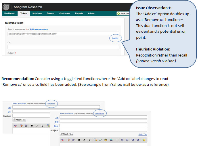
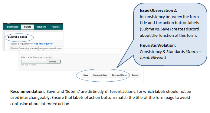
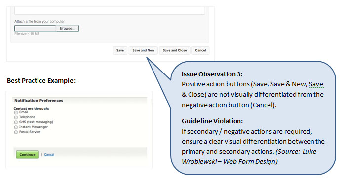
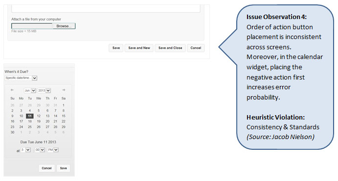
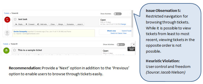
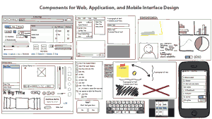
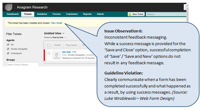
The examples shown above are just a fraction of the issues that a Usability Review could highlight.
The success and effectiveness of this technique is dependent on the experience and skill of the reviewer. A review is typically done by three or four experts in the field of usability and design.

This method is best suited for start-up’s who have access to skilled and experienced usability / design professionals who can conduct a Usability Review.

Post 2 coming up soon, will introduce a related technique called ‘Heuristic Evaluation’.
With similar goals to an Expert Usability Review, a Heuristic Evaluation is a relatively easier starting point for novice researchers – Ideal for start-ups who don’t have a formal design / usability team in place, but want to try their hand at usability evaluation.

Are you a design thinker evangelizing or facilitating user research and usability methods within your start-up?

We would love to hear about your experience / answer any questions that you have about the methods that you used.

We also invite members of the start-up community to volunteer their screens / functions for use as examples in upcoming posts showcasing additional research techniques. Email me  at devika(at)anagramresearch.com to check whether your screen is eligible for selection. 

#DesignThinking: Desirable. Feasible. Viable

We all know quite well the value of Design to business, and Design Thinking to problem solving. But what remains a bit fuzzy for many start-ups, organizations & individuals is the gap between thinking and doing or making it happen.

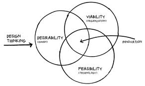
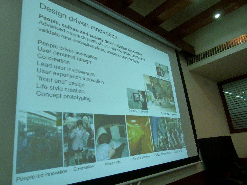
In this time of volatility and complexity, the role of design to drive meaningful innovation and change is growing and while there are multitude of factors that need to be taken into consideration for a product design that is desirable, feasible & viable the design thinking process can help overcome these product characteristics. 

Yes, great design starts with design thinking! Reminds me of David Kelly from IDEO who puts this together as empathy or being empathetic. In other words focusing on what users value the most and building on top of the ideas they share with every incremental value we deliver to make designs better.

In an effort to bring all designers, engineers, product managers & entrepreneurs together via an informal coalition of like minded design thinkers community to help promote the how-to’s of design thinking, MakeMyTrip in co-ordination with #PNMeetup hosted a day long #DesignThinking event in its premises inviting them to discover the stories, solutions and tools that design thinkers are putting to work, from start ups to multinationals helping them find inspiration and learn how real world solutions are provided using innovation & technology to work to solve complex global challenges. 

This event was a first step in NCR UX community with series in pipeline with start of an exciting thought-leadership plank in the UX ecosystem in the country towards creating a platform to nurture design thinking & promoting design thinker’s community fostering an ecosystem that promotes delivering great experiential online products. Industry experts from LinkedIn, Mettl & Anagram Research supported the event with inspirational talks on subject and sharing how they practice the same in their respective job functions, startup’s & organizations thereby embracing the process in their day-to-day routine while driving the product vision at their setup. The experts also covered upon bootstrap strategies for startups who cannot afford the UX agencies or a big design team and face design challenges day in day out during their product design journey. Some even illustrated the design thinking approach to problem solving of product features design and helped them uncover the latent needs, behaviors, and desires for their users. 

Altogether,  #Design thinking event saw noteworthy achievement with 40+ design thinkers joining us from NCR and could leverage the platform listening some inspirational talks from speakers and meeting few like minded folks around. Had participant mix from passionate startup entrepreneurs to designers & dev engineers. Audience was glued to program embracing the talks & interactive workshop from functional experts in domain. 

Check out what happened at the First #DesignThinking Workshop on http://t.co/g0DDFbP7kS  

Guest Post by Dushyanth Arora, Head, User Experience & Design MakeMyTrip

Promoting Design Thinking in the NCR

design thinking

In the last 2-3 years there have been well designed products coming out of the NCR startup ecosystem. Mettl, Visual Website Optimizer, Paytm, and Oogwave, especially come to mind where Design Thinking has been an integral part of the product development process, and not an after thought by giving it just a cosmetic veneer.

There is a noticeable increase in design sensibility while attending various Meetups and pitching design services to startups. However, there is still a gap in how to make it happen. In other words, how do startups and product managers cover the distance between thinking of design and making it actually happen.

With support from ProductNation, a few design professionals from Design For Use, MakeMyTrip, WoodApple, DSYN, Zomato and U2opia Mobile have formed an informal coalition to help promote the how-tos of design thinking,

Please join us for our launch session this Saturday (May 18th) at the MakeMyTrip office. There will be a talk by Mettl founder, Tonmoy Shinghal, followed up a 3-hour workshop on how to practice Design Thinking in your company by Devika Ganapathy of Anagram Research. Not to mention plenty of networking opportunities during coffee breaks and lunch. Please check out the details and register soon (only 30 participants).

Don’t Build Something Unless Someone Is Willing To Pay For It & Asks For It Twice!

Notes from the  Product Management Roundtable In Bangalore. Having attended the first ever iSPIRT Roundtable on Product Positioning in Bangalore and closely followed the second one held in Delhi, I was eagerly looking forward to the Round table in Bangalore on Product Management by Sridhar Ranganathan. Sridhar is a senior Product Management professional having spent considerable time in product management roles in companies like Zoho, Yahoo! and InMobi.

The 12 startups that participated in the round table consisted of a healthy mix of companies across various stages wrt their Product organization – some already had a PM function set up, some were scaling fast and were looking for ways to make their first PM hire and some where the CEOs or the founders were themselves donning the hat of a Product Manager.

The session started with a round of introductions and an open discussion around various aspects of Product Management – need for Product Management, hiring of Product Managers and setting up the team, prioritization, building an MVP etc. which set the right tone for the rest of Roundtable.


Sridhar shared his experiences of being a Product Manager and a Product Management leader in his previous roles. His experiences at Zoho were particularly of a lot of interest to the participants, as Sridhar was at Zoho during the period it transitioned from a company making Network Management Systems to the Saas giant it is today. He mentioned how the founders had a strong faith in setting up a Product Management function and empowering the Product Managers to lead the product efforts. He said it was like changing gears from moving in 4 big ships to 11 speedboats – with a Product Manager navigating each speedboat (a product). One insight Sridhar shared stood out, that the founding team needs to strongly believe that there’s a need for Product Manager(s) in the company and remain fully invested in the idea. Otherwise, there are very few chances of a Product Manager making a meaningful contribution and succeeding in their role.

Here  are some key insights from the discussions at the Round Table:

Product Management is a highly cerebral activity

The importance of setting a conducive environment for the Product Management setup was stressed upon heavily by Sridhar.  It is imperative that between the Product Manager and the immediate Product team (engineers, designers, QA), there be a very high amount of trust. The decisions of the Product Manager will directly impact the work, and subsequently the performance of the engineering team. Similarly, the Product Managers needs to believe that his engineers are capable and are able to solve the challenges he poses to them.  Laying the right foundation and building trust among the team is absolutely essential for the Product Management team to contribute significantly towards the company’s goals.

Framework to Solve Customers’ Pain Points

The discussion then moved towards prioritization of tasks, catering to customer requests for feature additions and customizations. Sridhar presented a very interesting framework which is quite handy to place customers’ pain points in the right context and solve them appropriately.


Depending on the target group size is and the complexity of the pain point, one can address the pain points in different ways

  • Education: Can you provide simple walkthroughs of the product through screencasts or tooltips, put down a set of FAQs that customers can refer to and get the help they’re looking for?

  • Process: Can you tell customers on how to do something? As an example, creating a 1-page document on how to apply for a passport and redirecting customers to that section would be a way of setting up the process.

  • Procedure: Taking the above example itself, if you actually build a feature to help customers apply for a passport, it would be creating a procedure to solve a pain point.

  • Solution: Any customizations/hacks over an existing feature/flow would fall under this.

  • Product: Enabling the customers to do something completely through the product itself. E.g. Employee payroll processing.

Building an MVP

How much time should one spend in building the MVP? One of the keenly debated questions was on the amount of time to spend to build an MVP. While there were multiple inputs based on the nature of the product and the market each of the companies was targeting.  However, Sridhar mentioned that one should invest enough time so as to avoid having to pivot at a later stage.

Is your product a ‘painkiller’ or a ‘vitamin’? It is important to understand this very well beforehand and pitch the product in the right manner to your first set of customers. You may be overselling if you’re trying to pitch a vitamin disguised as a painkiller and grossly underselling if it is the other way round!

What features get built into the MVP? Don’t build the product or a feature just because someone says it’s a good idea or if your prototypes ‘look good’. You need to validate that the customer is indeed willing to pay for the product. It’s even better if they ask for something repeatedly, which indicates that they have a pain point and they are willing to use the product/feature.

Taking the MVP to the market. Choose customers who can challenge you and make you think harder. The first 5% of the customers give 85% of the important feedback and the interest tapers off as you get the next set of customers. It is important to keep validating your view of the market and be ahead of the curve. You may have built something that was relevant at a previous time or maybe talking to a customer set that’s no longer representative of the larger market out there.

When to get a PM and what should the PM spend time one?

Sridhar suggested that whether or not there’s a formal designation assigned, there should be a Product Owner from Day 1, which is invariably one of the founders. Over time, it will be good if one can identify a good Product person from among the early engineers and have a Product person for a group of 7-8 engineers. The Product Manager should ideally be able to do 70% of everything! For the effective use of a Product Manager’s time, a helpful rule of thumb is that he spends 50% of his time planning for the future, 30% of the time on current initiatives and 20% of the time on firefighting.

Data, Intuition & Processes

How much does one trust data and how much does one rely on intuition to make decisions?

One of the participants remarked – “If you torture data long enough, you’ll get what you want”. It was general view shared among the participants and endorsed by Sridhar that data is good for discussions and not decisions. There’s a strong element of intuition and market understanding that go into making decisions and there should be ample scope for that.  Finally, it’s the Product Manager’s call on the direction of the product and he needs to be able to take views from multiple perspectives. Data alone being the decision criterion may not be the best way to go about it.

What about processes? Do they kill creativity or actually help in better productivity and accountability?

A quick poll on what the participants thought about process threw up some interesting responses. The hardcore engineers found process to be a bit of hindrance. However when they put on the founder/senior management hat, they found that there needs to be some way to maintain accountability and provide better visibility to a larger group as a company grows. As one of the participants rightly said, process is ‘doing what you say and saying what you do’.

Sridhar cautioned against having too many processes (don’t put policeman unless there’s a lot of traffic) ot of traffic), he also shared some interesting ways of bringing in process. Rather than enforcing process, can the employees themselves be stakeholders in implementing process and are ihe also shared some interesting ways of bringing in process. Rather than enforcing process, can the employees themselves be stakeholders in implementing process and are incentivized for taking an active part in the process and evangelizing it?

Each of the participants took away some key actionables which they’d go back and try out at their respective companies. They’d also stay in touch to share their learnings and experiences to help one another build a strong product management function. After all, we’re working towards transforming a nation with products!

Hike Messaging App – 5M users since 12/12/12, and counting!

BSB is a start-up funded by Bharti & SoftBank building mobile products for the Indian market. Hike is a messaging app which allows instant messaging and group chat on your phone with friends who have Hike, as well as those who don’t have Hike. We caught up with BSB’s head of products and strategy, Kavin Bharti Mittal (KBM), to talk about Hike, right before he was getting ready to launch Hike 2.0, a major update to the messaging app.

Introduction

Hike is a pure Made-in-India product. BSB is based out of Gurgaon, and the product was built from scratch by this team. Under the guidance of KBM, who is also the resident UX guru, the team brought out a beautiful and highly functional product in Dec, 2012 when the team size was 15. They are 30+ now, and furiously working on next set of features, supporting users and handling the success!

Product Highlights

  • The product has been designed from grounds-up by Hike team.
  • The design is beautiful and minimalist.
  • They chose a more efficient protocol for communication (MQTT, which is less chatty than the better-known and more-often used XMPP).
  • In India, Hike allows its users to message to non-Hike users by converting Hike message into an SMS (each user is given 100 free SMS every month). This is a key differentiator for Hike, in addition to a cool and modern design.

Product Development

  • Following an agile development model, they schedule a release every 4 weeks with a stop gap release for performance and related fixes in the middle if need be. Such a schedule ensures that they are not hitting the users with too many changes too often, and still stay responsive to market feedback.
  • KBM controls the product UX and works with his designers to create detailed wireframes and mockups before engineering starts working.
  • They have a very product-focused culture and so engineering-design conflicts are minimal as everyone understands the need for a great design and works hard for it.
  • They work on multiple platforms in parallel, so lessons learned on one platform are quickly incorporated into other platforms in the same release cycle.

Product Strategy

  • Beautifully designed product – Made-in-India products are not known for good designs. Hike is a notable exception and this will help it gain ground quickly.
  • Messaging Hub – In the world of Facebook and Twitter, there is a huge amount of information generated and consumed by people, causing information overload. Hike aims to cut this clutter and allow you to create a closed network of friends with whom you share right amount of information. This is a good differentiation strategy.
  • Close partnership with carriers – With smartphone penetration going up all over the world and cheap smartphones being available, messaging applications are well-positioned to kill SMS (and jeopardize a large portion of carrier revenue). Hike can offer opportunities to carriers to offer value-added services and retain (and enhance) that revenue.

Adoption

  • The messaging app space is very crowded (WhatsApp, Facebook Chat, WeChat, Nimbuzz , etc.) and Hike is a late entrant to the party. Still it has created considerable buzz in the market and have some impressive numbers to show.
    • In 4 months since the launch (they launched on 12/12/12), they have crossed 5M users (adoption is measured by # of active users – sending at least 1 message a day) and growing fast!
    • Over 50% of their users use hike2SMS feature, which is a key differentiator for them
  • They have used rewards (Talk-time rewards, ended now) and incentives (50 free SMS for each successful invite) to good effect to create good buzz. However, as KBM says, buzz and going viral work only when you provide a good value to the users. Hike 2.0 is expected to bring in lots of features.
  • Using digital channels for marketing and support very well: Blog, support site, Facebook page and twitter handles (@hikeapp and @hikesupport) are all well used by users and well-responded by Hike team.

Hike 2.0 and beyond

On Apr 17, BSB announced Hike 2.0, a significant release which introduces ‘circle of friends’ notion and many other features. With Hike 2.0, you can now create a circle of friends (consisting of your close friends), post status and mood updates to them, and review their recent updates. This is similar to Facebook’s Improved Friend Lists and Google + . Read the announcement for full list of Hike 2.0 new features and enhancements.

‘Status updates’ are asynchronous models of communication (you don’t expect your friends to read and respond immediately, though this Facebook generation usually does!) while messaging is supposed to be synchronous – you engage in conversation in real-time and expect a response. With 2.0 release, Hike is positioning itself as the ‘messaging hub’ for mobile-first crowd, and taking a ‘closed group, more engagement’ approach (as opposed to ‘everyone reads everything about me’ philosophy). While this might pit it against Facebook and G+ in terms of functionality, I think this is good strategy going forward to capture mindshare of an audience who is a public enough to chat with anyone, but private enough to need the solace of ‘circle of friends’. This also attracts users like me who prefer private and deep conversations and shun messaging apps because of its openness.

As Hike grows beyond the feature-functionality debate, it needs to give more focus on back-end: messaging is critical for its audience and disruptions caused by planned maintenance or rush to get new release must be avoided at all costs. 

The Road Ahead

My address book contains my US, China and India friends which add up to about 400 contacts. When I installed Hike on my phone (Nokia 710), I found hardly 5 friends who were on Hike (Hike looks for those who are on Hike and adds to your friend list). I did the same for WhatsApp, and I saw 80% of my contacts show up as using WhatsApp, including some of the people I didn’t think were in the target segment of messaging apps!

Hike has a long way to go, but I think they have started with the right product and are travelling in the right direction. May the force be with them! 

Collating Problems Worth Solving

In my experience working with Entrepreneurs for the past 9 odd years and possibly have seen a few thousand startups, there is one key attribute that instantly sets apart the startups that just might make it, to the ones that would struggle – the clarity on the problem they are trying to solve.

While we have made it a mandate in events like In50hrs that explaining the problem is crucial, we have realized that as a culture we havent yet learnt the art of observing the issues that around us – especially the ones that present opportunities along with it.

In an effort to help out, we have started collating interesting Problem Statements from entrepreneurs all around. Quite a few have contributed and we are starting to list them at the In50hrs site, as Problems Worth Solving (with due credits).

As a recently read article said, Focus on Talking about the Problems, and not the solutions, its evident that the key to building a thriving ecosystem is by building the capability to spot the problems, but for now, we are giving entrepreneurs a headstart and hopefully a sense of what to look for.

PS: If you want to prototype a solution to any of these problems, do sign up for an In50hrs Near you.

PPS: Want to add a Problem Statement? You can too.

How Adoor Gopalakrishnan’s Kathapurushan became a Software Product Entrepreneur ?

From being the protagonist of an Adoor Gopalakrishnan national award  winning movie to a graphics trainer, from a book publisher to a printer, from services to products, our guest today has been there, done that. Meet Vish, the MD of Logical Steps.

ProductNation: Hi Vish. Welcome to Product Nation. Let us begin with your story.

Vish: I was born in an entrepreneurial family. My family ran a printing press in Kerala. So I grew up living entrepreneurship and also picking up skills to run a printing press. Childhood was exciting, as we were always creating something. As far as my education is concerned, I enrolled for an undergraduate Physics program at the Moscow State University. University had some of the finest minds in Physics teaching the subject. But, the 1991 coup cut short all this excitement. This brief stint while I was in Moscow, made me realize that college education does not prepare you for life. Though, I was not keen to go back to college, it was family pressure that saw me write three years physics papers in one shot. All this for a degree from the University of Kerala, Trivandrum. Isn’t degree everything?

It was around the same time that I got introduced to computers. My father had made investments into offset printing and desktop publishing. I soon found an entire computer science department to myself, right from laser printers to 486 machines. I learnt everything from scratch. It was time for my first fling with entrepreneurship. It was an MS-DOS pocket reference manual. Using a microsoft reference manual as the guide, I printed out some MS-DOS reference manual copies and handed it over to a local bookshop for sale. Surprisingly, the book shop came back for more. Simultaneously, I also ventured into Desktop publishing training, as the printing industry was moving in that direction. These experiments gave me the confidence that I could do something on my own

ProductNation: When did you get the time to do the Adoor Gopalakrishnan movie? And why do you consider it your first product experience?

Vish: Adoor Gopalakrishnan is a family friend and I had done a small role in one of his earlier films. He talked me into playing the lead role in a film called Kathapurushan. It went on to win the National Award in 1996. He knew about my background in printing. So, during the film, I got involved into many aspects of the movie production – recording audio, printing of collateral and special books. And working with Adoor Gopalakrishnan, who cared about every little detail and to experience his passion and leadership. I consider that experience extremely precious and a sort of first in making a product.

ProductNation: Which were the other movies you did?

Vish: No, I went back into computer training with a company called Tandem. Tandem, which was based in Trivandrum, sent me to CDAC Pune for a course called DACA – Diploma in Advanced Computer Arts. As a trainer, I was to learn this course and come back to Trivandrum to teach. At this course, I was the only one from a non-arts background, as the others were all from JJ and similar schools. But, I topped the class and got a break into advertising with a Kirloskar group company – Pratibha Advertising. One of the noteworthy projects that I did while at Pratibha was a digital kiosk that was showcased at the first Auto Expo in New Delhi. I quickly realised that digital advertising in India at that time was still very early. So I packed up my bags and went to Singapore for a teaching assignment with a University. But, I ended up joining a digital marketing company there. It was here that I spent close to five years till the dot com bust in 2000 consumed it. During my stint here, I got in depth experience into e-learning.

ProductNation: Is that when you started your current company, logical steps ?

Vish: Yes. I came back to India, after the dotcom bust. And that is when we started Logical Steps. We began by supplying learning content for television. We were paid 10% of the contracted amount. That is when I understood the trouble of doing business in India. So, I went back to Singapore to source business and keep the business running. It was challenging. I was using my salary to finance the business. I was not keen to close down and let go of my staff who had picked up extremely useful skills. So, we kept going. It was during this that we got a chance to service AIG for one of their projects. So that is how our services business started.

ProductNation: What happened to e-learning, then? And the platform? How did you start silver bullet?

Vish: An opportunity came up to create an e-learning engine for the US Market in the area of Medical Entrance exam called MCAT. A doctor who was considered the guru of MCAT had already created a large amount of content plus created analytics metrics to appraise students. We were given the project to create a platform that could provide all of this. This project gave us tremendous exposure to learning frameworks and gave us the idea to create a product on our own. That is how the idea of SilverBullet came up.By that time, I had also realised the limitations of a services business. So, we were all set for a product pitch in late 2010. While we built the platform quickly, content became a challenge. So we had to invest resources in training teachers to address this issue of content. This consumed our resources and it was our services business that was feeding silverbullet. It took us some time to adjust to this new reality, as we were dealing with an individual customer, unlike a corporate entity as in our services business.

ProductNation: Let us talk about silver bullet? Any learnings that you would like to share.

Vish: Silver Bullet is an online learning system for engineering and medical entrance examinations in India. There have been tremendous learnings. Unlike servicing a business, in this case, it was a B2C online product. It took us some time to figure out our Go-To-Market approach. We felt schools were the touch point, but it wasn’t so. Then we tried facebook, and it wasn’t the touch point. The most profound insight came from my 10 year old daughter, who frankly said that students are not interested in adding more studies to their daily work. She went ahead and said that no one would like to put themselves into trouble by opting for a Free Trial. How true? Students are already overworked. In all this, we figured out that it is the parent who is the touch point. And the parent was in a totally different world and a world that wasn’t online. The only way to reach them was through traditional media. It was then, that we checked out the media budgets of other online learning companies and found that they spend 19% to 20% of their revenue on ad budgets that run into crores, it is a totally different league. And that is how these companies are reaching out to parents. Parents are more than happy to add to the kid’s collection of material to consume.

ProductNation: Interesting, allow us to end this interview, with a difficult question. Looking back on your career, it is easy to see that you have been all over the place. How has it helped you in approaching your product business?

Vish: [Laughs] The product business is much like the movie business. If you see, my experience in diverse areas has given me ideas and the aptitude to create a wonderful product. Whether it is design or delivery, content or its packaging, all my earlier experience have served me well in developing Silver Bullet.

ProductNation: Wearing two hats at the same time i.e. services and products. What would you prefer? And what challenges do you face, while doing so?

Vish: Product without a doubt. It is something that you can own. But, when working on a product, especially when you are just starting off, managing the internal aspirations of the team becomes difficult.

ProductNation: Thank you, Vish for talking to ProductNation. We wish you all the very best in living up to these challenges.

“Great Designers Steal”

Picasso Cubism

Picasso is purported to have remarked, “good artists borrow, but great artists steal.” He probably did not mean it in a literal sense. He wanted to inspire us from great works of arts and re-interpret or re-imagine them in a different way. Here are some references that have inspired us to become better designers.


Balsamiq Screenshot


1. Balsamiq: Its simple sketchy interface evokes a sense of nostalgia of our playing with crayons as children. The clients don’t get distracted by little details allowing us to focus on important things such as navigation, content prioritization, quantity of content, and what a screen does. You should definitely use this to visualize and share your vision before writing a single line of code. This is also a great tool to communicate user stories within the agile framework.

PatternTap Screenshot


2. Pattern Tap: Its a collection of crowd-sourced design inspirations for all page types and devices. The designs are categorized by facets, so search for “login” to be wowed by how a simple screen can be so beautiful. 

TheNounProject Screenshot


3. The Noun Project: “The mission of The Noun Project is to collect, organize and add to the highly recognizable symbols that form the world’s visual language so they can be shared in a fun and meaningful way.” The symbols are free and delightful. You have see them to believe.

Smashing Magazine Screenshot


4. Smashing Magazine: An online magazine for designers and front end developers, to stay current with the ever evolving tools and techniques. It also has a great compilation of books and ebooks that could be references on your next project.

365psd Screenshot


5. 365psd: 365 psd, needless to say, means one high quality psd file a day. A great resource for free UI kits, page templates, and icons to get you started or help get over the creative block. And do sign up for a freebie everyday.

Google Web Fonts Screenshot


6. Google Web Fonts: Are you still married to times, arial, and helvetica? Here are hundreds of open source free fonts to help design great looking yet highly readable sites.  Don’t forget to look at the “pairings” feature. It recommends best complementary font pairs to add that extra zing to the design.

So go forth and steal, and please keep adding to this list.

Zomato “gets” foodies, and it gets them so well

I am a foodie. And a big Zomato fan, no pun intended anywhere. Here, I am going to talk about everything we foodies love about Zomato and all the things it could do better.

For the uninitiated, Zomato is a restaurant discovery platform with 74,800 restaurants listed across 19 cities and 4 countries, and claims to have served 62.5 million foodies till date. More simply, it is about food and where to find the best of it.

So this is how I met Zomato. I was in college till 2009, and whenever I needed to know of new places to eat or hang out at, I just asked a couple of friends and I had more recommendations than I could handle. But once I entered the world of technology, everything in life started to begin with a Google search. But that’s not how I discovered Zomato. That’s how I discovered that websites of restaurants, when they have one, are completely useless. They talk about everything except what I need to know.

I got to know of Zomato in a rather funny way. I was looking for some kickass About Us pages on the web, and a friend of mine pointed me towards Zomato’s team page on Facebook. It spoke the same language I spoke, had this young and fun feel about it, quirky bios of everyone on the team. I loved it. Then I gave their product a try. And I uttered — “My precious.”

And we have been together ever since. It’s been a rather smooth relationship, and now I will tell you of all the things I love about it.

When do you look for a new place to eat at? Most likely when you are in the mood for some good Italian food but have been to little Italy thrice in the last fortnight. Or you are at a friend’s place in your shorts and floaters, probably a little drunk, and want food delivered to your doorstep? Hyderabadi Biryani has not been very kind on your stomach lately, so you want to go for someplace lesser spicy. Zomato delivers on both counts by allowing you to search for restaurants by fine dining or delivery in your city. There’s also catching up and nightlife if you are in the let’s-go-hangout mood. And if you like searches the Google way, then you have a simple Search bar you can throw in all your keywords into.

But that is no rocket science, is it? No it isn’t. Actually most of the things that Zomato does isn’t rocket science. It’s just that they do it well, really well.

Then you get your search results in 0.035 seconds in a beautifully laid out page with everything you need. Ratings, timings, cost for two, bar or no bar, cash or card, reviews from people you follow (more on this later) and more. And then you can apply filters like wifi, outdoor seating, buffet and whatnot to find that perfect someplace for you. Again, all of it in what I can only call a lovely interface.

Then you choose a restaurant, and are presented with all the details you need on the restaurant. Up-to-date scanned copies of the complete menu (which they go door-to-door and collect manually), photos of the place and food (not the best, but manageable) and most importantly reviews. Comprehensive reviews from foodies, big foodies and connoisseurs. The reviews tell you everything about the ambiance of the place, the service, the dishes to try and then they give you more photos.

The reviews were not always these helpful. Then Zomato decided to create a food social network of sorts, and there has been no looking back ever since. You can follow foodies, so every time they add a new review, it comes up in your notification bar. Passionate foodies and wannabe food critics use this as an opportunity to educate their followers about food and the best of it.

As the number of reviews you post increase and more people find it helpful, you go from foodie to connoisseur, and you also become eligible for the leaderboard which is displayed in each city’s homepage. The catch is you have to enter a review having more than 50 words, and when you are doing that, you might as well write a good detailed review. And with the recent Instagram integration in the reviews, you can add pics for other foodies to drool over.

Sounds like the perfect love story, doesn’t it? Well, almost. There are some things that Zomato could have done better though.

The ads. They are some of the ugliest ads I have seen on the web. Every time I search for restaurants, a bunch of these ads come up in the right panel. And every time I see them, my eyes bleed and a little part of me dies. I understand Zomato has to make money and restaurants work with shitty digital agencies, but there has to be a better way. Featured listings, photo albums, more details, whatever it is that they can make money from as long as the ugly ads can go out the window.

iPhone app. While it has seen big improvements over time, it still isn’t as good as the website experience. And the consistency is missing across the two interfaces. You can just search by location or cuisine on the app, not by delivery, dine out, catching up and the like. But an interesting feature is the instant recommendation that tells of you of a random new place near you — if you don’t like it, just shake the phone and a new recommendation will come up. I think I could use a variant of this on the web interface as well.

The tags. A cafe is a cafe to me, so when it comes up in my search for Italian food, I start getting cranky. And this happens because under the cuisines tag, the cafe has American, European and Italian marked against it when it serves four dishes for each of those cuisines, and pretty bad one at that. Same with pubs having Indian, Mughlai, Chinese and Italian slapped against them. Of course, I have no qualms if the cafe or the pub serves really good food, but when I am looking out for good Indian food, neither a pub or a cafe or a restaurant having a total of three Indian dishes is what I am looking for.

Notifications. While I like to be notified when someone I am following posts a new review, why do I have to be notified when someone I follow follows someone else? I want to follow their food trail, but not every single thing they do.

All that said and done, I have to commend Zomato for everything it has done for us foodies, and for the industry as a whole. Only time will tell how it fares against the Yelps of the world as it expands into more mature markets, but it’s got an international product and the balls to take on the world.

I wish them all the best.