Design-Led Software Engineering Improves User Experience

Editor’s note: Focus on user experience now shows up in numerous surveys as a major determinant of success in software product sales. We interviewed the co-founders of software development provider Clarice Technologies: Sandeep Chawda, who is also CEO, and Shashank Deshpande, who is also president. Between them they have more than two decades of experience in user-centric design (especially at Symantec/VERITAS) and now lead Clarice Technologies in design-led innovation for Clarice’s software customers. 

SandHill.com: Please explain what you mean by design-led innovation in software development. 

Shashank Deshpande: Design-led innovation is to understand users and their needs to come up with a design that is usable and consumable and then to apply technology innovation to translate it to a user-centric product. It is about providing an optimal balance of design and technology in the process of product development to ensure intuitive and high-performance products. More often than not we see that products are over-designed or over-engineered, and neither is good for consumers and end users. A product that really delights the customer has a good balance between design and technology.

SandHill.com: What causes developers to over-design or over-engineer? 

Sandeep Chawda: It’s caused by the lack of sensitivity of one aspect or the other. We seldom see companies with an ecosystem that has the right mix of designers and technology engineers. If the product is designed without considering various technology aspects, that will cause the product to be over-designed. There are several design studios where designers take a flight of fancy in the product design without really considering whether or not that can be meaningfully engineered.

And the same applies for the engineering side. Many technology companies try to build the product without having a meaningful information architecture in how product functionality is presented. This results in a product that won’t be exposed to the users properly and they won’t be aware of its key functionality, or they may be aware of it but will tend not to use it.

SandHill.com: What do you do differently in design-led engineering to avoid these problems? 

Shashank Deshpande: We do up-front design of the complete product without writing a single line of code. We come up with “product storyboard,” which is a pixel-level detailed mockup of the key screens of the product, and we tie them together so as to mimic the complete product. All this is done without writing a single line of code because changing pixels is an order of magnitude easier than changing code.

These mockups are then used by multiple stakeholders of the product in a very effective manner. Product Management can use it for validating the product functionality. Sales can use it for talking to customers about the product roadmap and what is going to come. And the storyboard acts as refined requirement specifications for the engineering group to go ahead and build the product.

We use this process iteratively when developing software products for our customers to ensure there is a heavy emphasis and high priority on the user-experience angle.

Read the complete post at Sandhill.com

Usability Review of @Bubbles – A new kind of mail service

In a startup, the design is usually an afterthought after the more important challenges of business and technology are solved. Which means by then the design is more like a band aid or a lipstick on the proverbial pig. Probably the main reason why products here still lack that world-class feel, even though they are better in terms of features and performance.

A successful product usually has the right blend of usefulness, ease-of-use and engagement or emotional connect through aesthetics. For example, Facebook might score high on each of the three attribute, while a game like Grand Theft Auto may deliberately keep the ease-of-use difficult. Each of these attributes should be part of the product roadmap at the onset. By how much should you dial up or down each attribute or in other words what is the overall design vision? And who will be responsible to achieve this vision?

We feature the first of several quick audits to get a conversation started around the importance of design when you are a startup. We did a quick review of @Bubbles, a six month old startup trying to re-imagine email by bringing it closer to the art of letter writing from the good old days. It enables tools for your creative expressions, allowing you to scribble your thoughts, stick photos, sketch cartoons, draw diagrams, and attach sticky notes to your email as you would do on a physical letter.

We evaluated it on 4 key user experience parameters.

How well does it COMMUNICATE to users?


To reduce user’s memory load, it is important to use terms & language that connects to their existing mental model. Once you have adopted a mental model or a metaphor, then try to be consistent.

  1. Terms like “Open Letter”, “Direct letters” are not commonly used in context of letter or email writing and hence can lead to different interpretation. It also adds to the learning time for the user.
  2. Similarly, “No Posts” and “100% Spam free inbox” violate the mental model of letter writing. Either use a “letter” or “email” metaphor but use it consistently.

How easy is it to NAVIGATE?

  Ease of use is vital. The user should always be in control and take the intended direction to perform a particular task. To be able to do this, it is essential that the user understands the flow of screens or sequence of actions.

  1. The incoming and the outgoing mails have the same look and feel, which leads to some confusion. The status of the site or where you are at a given point is not well communicated.
  2. Same page for public & personal letters – The sending route should be selected after the letter has been written. There could be multiple paths to doing this too.

How easy is it to INTERACT?

The information structure should make relevant connections between different pieces information and tools (features) to enable user to achieve desired goals.

  1. Editing tools for the letter are scattered all over the page. A fixed layout for the toolbar would make it easy to use. Some drawing tools like – copy, paste, resize, rotate, etc could be integrated at one place to create a seamless experience.
  2. Every selection or user action should be followed by an appropriate feedback. For example, when a user selects a Pen tools, there is no feedback that it has been selected.

Does it create the right EXPERIENCE?

Overall, it is about experience.

  1. Sent mail is a personal letter as well as a promotional letter for Bubbles, so it should be designed so as to attract more customers, who are not currently on Bubbles.
  2. Keyless Login creates a good experience but the learning curve should not be high.

Undoubtedly, Bubbles is a much better designed product than most. There is a design sensibility with some effort and thought behind each screen, icon and color palette. However, it seems that though there was an emphasis on graphic design (engagement or aesthetics), it could still be improved significantly with some thought on interaction design (usability).

BrightPod makes collaboration for digital marketers simpler and faster, much faster

Synage Software, more popularly known as the DeskAway guys, are on to their next thing and they are calling it BrightPod. Sticking to their expertise of developing collaboration software, BrightPod is a collaboration tool built specifically for digital marketers. I got an early peek into it and while the the product and the segment they are going after hold promise, it needs work on the interface and a big push on the adoption side.

Just like any other collaboration tool, you create a new pod (a fancier term for project) to get started. But that’s where the similarity ends. Now instead of adding individual tasks to it, you choose a workflow from the existing ones or you create your own (coming soon).

Most common marketing projects like an email marketing campaign, a Google Adwords campaign and a social media campaign are covered. Select the email marketing workflow and all the tasks that it needs are automatically added to the pod. Just assign a client, set deadlines, add team members and you are good to go. Digital agencies, who run the same kind of campaigns (at least structurally) for different clients will find this a huge time saver.

I tried two of the workflows – Google Adwords and email marketing. While the Google Adwords workflow was well defined, email marketing had me lost. The team would do well to reduce the number of tasks or mark the ones that not everyone bothers about as optional. Another challenge going ahead with the workflow would be that a large company works very differently from a startup, who would overlook a lot of the tasks to push the campaign out of the door as quickly as possible.

Moving on, BrightPod has another two more very interesting features. Focus and Round Up. Focus, as the name suggests, helps you focus only on key tasks and drown out the others. Temporarily from your mind, I mean. Marketing, unlike other functions in a company, is typically about a lot of small things coming together to form the complete piece. Star a task that is important, and it will appear in your Focus tab to allow you to, well, focus, on the task.

Before we get to Round Up, you need to get this. BrightPod is meant for marketers, with workflows and terminologies that marketers feel at home with. But marketing never functions in isolation. You have design involved, you have the web team involved, you might have other agencies involved and if you are an agency yourself, you need to get the client in on the project. This is where Round Up comes in. Just throw in the email address of the person you want involved in the conversation and they are in. They don’t have to get on to yet another app, they can just reply to that email and it will get added to the pod.

So far, so good. Now the things that BrightPod needs to improve. Simplicity is one of the main principles BrightPod is built on and while it delivers on certain counts, it doesn’t have the same kind of simplicity that Asana (something I have used extensively) or Trello (something that I have seen in use around) have.

The BrightPod dashboard, the first thing you will see each time you log in, has an activity stream of all the active pods. Every task added, every comment added, every milestone added, every task completed. For me, that was plain overwhelming, given how each workflow adds 20-30 tasks straightaway. When you log into your collaboration tool first thing in the morning, you want to see a list of the tasks that are due, the overall state of different projects and the important tasks for the day. While tasks due are presented in the dashboard, they are on this section on the right that doesn’t catch your eye first thing.

Also when you click on a pod to make additions and modifications, the navigation is different from that of the main screen, again leaving you a little lost. While these are small things that a user can get used to in a week of working with the app, these are things that typically come in the way of getting the buy-in of the whole team to move to a new application, or even earlier during the evaluation phase.

The biggest challenge BrightPod will face with adoption is getting companies used to the idea of having a specialized collaboration tool for marketers. Organizations like to have the same tool for everyone in the organization, so it would be interesting to see how the company solves this challenge.

All said and done, the product is still in alpha phase, so a lot of these things will get better with time. If you are digital marketer, go ahead, sign up for a BrightPod invite and let us (and the BrightPod team) know what you think.

Forget coding. Startup founders should focus on Product & Design.

Last year (2011) learning coding was hot, may be it still is. Sites like Code for America came up; startups like CodecademyLearnstreetUdacity, etc came up that were focusing on building products that enabled others to learn coding in an interactive way. Then it looked like a kind of movement, a revolution in making.

Being a startup founder some of those effects trickled down to India – that made me seriously consider coding. And there were some other reasons as well. We started Wishberg by outsourcing product development to another company. As deadlines were missed repeatedly, this whole ‘founders should be coders’ effect started growing on me.

During this phase I did two things a.) started hiring our own engineering team b.) learn coding inspired by this noise. I started learning very enthusiastically to an extent that my bio read that I was learning to code. Going through multiple forums, registering on these websites, taking lessons on LAMP stack and so on. A bit of background, being a engineering student (though Mechanical) – I had some basic coding background. Few years back, I even built some basic websites, did a bit of javascripts, etc.

As we started hiring engineering talent I asked myself two questions –

  • Will I ever come up to the level of proficiency that matches our engineering team?
    No. I was no where close to them.. while I was doing ABC of coding, our team was super involved in deploying code, implementing Redis / Node.js, building scalable architecture, mobile infrastructure and so on. I didn’t want my team to tell me I suck on programming (which I knew I did anyway). More importantly, I wanted the team to focus on building our product and not spend timing teaching me code or correcting my code.
  • Will I ever hire anyone who has learned programming through online sites?
    No

I also checked with few technical founders who raised investments; few agreed that being a tech founder was probably a added advantage while raising money. But many of them also mentioned that post investment they spent more time finding product-market fit, doing business, improving their product, user experience, managing investors (many a times!) and eventually spending lesser and lesser time on coding themselves.

Eventually all startup founders end up focusing only on consumption side of product (front end user experience, improving funnels and conversion metrics) than the one under the hood. This is when I gave up my decision to learn coding and started focusing on learning design (user design and user experience) which is as core to product as technology is. I started spending more time understanding design tools, design patterns and implementing them on Wishberg. I am no where saying underlying technology, architecture, speed, and scalabilty are not important.

For online businesses, there is no doubt scarcity of good engineering talent; but there is more scarcity of product designers and even much more scarcity of product managers. Startup founders knowingly / or unknowingly start getting into product management role.

I have been a product guy for about 7 years and now feel that I should have learned design long back. Our team not just gets product documentation from me, but also product designs including all scenarios and exceptions. There is a certain clarity of thought which engineers appreciate and exactly know what is to be built – which save lot of time while shipping code / features. Every month, we look at data, un-design by removing clutter, remove additional clicks and aim to improve conversions on every step.

Geek Example – The 2012 Formula 1 Season had 12 teams of which 4 had the winning Renault RS27-2012 engine on their cars. Yet there was only one winner – The Red Bull Racing team. The original Renault team (now Lotus Renault GP) which manufactured and supplied the RS27-2012 engine to Red Bull team stood fourth in overall 2012 championship. In fact Red Bull won the championship for last 3 seasons with the Renault engine. What really mattered – the product RB8 chassis. More importantly the people driving the product, its team – drivers Sebastian Vettel & Mark Webber, Team Principal and Chief Technical Officer.

Concluding Notes:
What engine you have under the hood (technology) matters. What car / chasis the engine drives (the product) matters more. But what matters most is who is driving / leading it. Don’t get over obsessed with technology, focus on product & design.

So all those who complimented us on Wishberg‘s product design & usability… need a hint on who was the person behind it? Yours truly.

Contributed by Pravin J, Wishberg

Your Content MVP fails…. eh?

About a month ago, I had a very interesting discussion with Rajan from Intuit about why content is a product and how the lean startup rules should be applied to it.

Let’s get the definitions out of the way.

A minium viable product (MVP) in its simplest form, is the least number of iterations you’ve done on your product before presenting it to someone who you hope will pay for it.

Sure there are lots of loose words here – but I’ll come around to them in a minute. Keywords here are features and pay.

Lets take software first – we’ll talk about content later.

If your software has 2 features, you would obviously want to make sure that the 2 features actually work before you put the MVP out. You cannot expect a person who may buy your software (prospect) to ‘imagine’ what those features will work like. Naturally paying for it gets chucked out of the window.

If it doesn’t do its job – the feature is useless.

Content behaves exactly the same way. In this case the ‘feature’ correlates to ‘objective’.

WHAT is expected from the content piece? WHAT emotions need to be provoked by it? WHAT memories need to be generated in the user’s mind?

You get my drift don’t you?

If content doesn’t do its job – its design, look and feel is useless. The buyer (could be your mother receiving your call or your university of choice receiving your SOP) cannot ‘imagine’ what the infographic will look like. What the VIDEO will turn out like. And what the Brochure design will look like in print.

All they see – is the MVP. So the features better work.

Applying the lean startup rules to content isn’t impossible. It can still be done. However the build-measure-learn loop should now be applied to learning from each content piece. Not the activity of building the content.

So each blog post that you’re writing – can give you the report card that provides you with the right dataset for taking actions towards the next iteration. A better product or a better blog post.

Eric Ries’ and Steve Blank’s concepts around the Lean startup are fundamentals. But just like you’re applying them to your product and its features, think about applying them to your content and its objectives too.

3 tips to ensure your content is MVP ready:

1. Know thy emotion. If you’re presenting to your CEO – know what emotions you are trying to evoke in her – that’s always a good starting point.

I can’t help you if you’ve got a sucky CEO.

2. It’s wrong if it feels wrong. You’ll know when your content piece is doing its job. And when not. The slightest of doubts means its not ready. Don’t put it out. The content’s features aren’t working.

However diagnosing the problem is like fixing a bug. Helps when the herd doesn’t try to solve it.

3. Put in a premise. Before you demo your software, you present a ‘premise’ first. Do that with your content too. Setting the premise will allow your audience to tune-in. Much easier to etch messages when their minds are free.

What have been your most successful content pieces (features)? How do you know that (validated feedback)?

Best products are built, keeping its user experience in mind says Shalin Jain from Tenmiles…

Hypothetically speaking, if one was offered a job and the decision to accept or reject was based on how far one had to travel, would “Tenmiles” be a round enough estimate, to base a rejection on? The answer is locked away somewhere in this piece. Read on to find out…

Education, bunking and creation

Shalin Jain’s enchantment towards Internet started way back, when he was in high school and the thought dawned on him how powerful a tool it was for connecting people. Blog, as a platform for communicating ideas caught on early and he used WordPress as effortlessly and seamlessly as one uses notebooks to make personal notes. Doing B.Sc in Statistics from Loyola college, proved beneficial in many ways. It helped develop an analytical mind and the flexibility to work during those years. At the company that he worked for, Indchem Software Technology, Shalin learnt the ropes in design through ASP & JSP Applications. Submerged in work, college attendance  was to take a nosedive. At the behest of the Principal and some paternal advice, Shalin almost took the brow-beaten path of doing an MBA. While still mulling over his future, one day he got a job offer from his old organisation. Though a seasoned hand by now, yet some parts of the student in him remained alive. The distance to workplace and back was approximately 10 Miles. He decided to chuck it. Tenmiles Tenmiles Tenmiles, the words reverberated – what could have been and what he chose.

The Brand Tenmiles

Instantaneously, his creative mind went on an overdrive. What if he started a company with a name like “Tenmiles” and live his dreams.  A “no” to something is really about saying “yes” to something else. Thus was born the idea. Initially it was a garage-level operation and the focus of business was on Web Design & Flash programming. Functioning out of the domestic market is very challenging for a startup. The constant “back and forth” approach can be unnerving and puts additional pressure on time and deadline. It also did not help that there were many companies claiming to develop products.

Screenswift, creates installable Flash screensavers from any Flash movie, took only 16 days to develop. There were two versions: Personal edition & the Premium edition later in 2001. This product would gain huge popularity amongst design agencies. The desktop screensaver market was big towards the end of 90’s and early 00’s. Not off late.  In 2005, Helpdesk Pilot, another very successful product was launched. In the first month itself, the product got in 11 customers and umpteen sales enquiries. It’s a platform built to help you provide excellent customer support effortlessly. HappyFox was another cloud based customer support software which got launched soon and now happens to be the flagship product. In the words of Shalin, the design element in this product was very good. In 2010, launch of DoAttend  established the company’s reputation on strong customer driven focus.

SWOT Analysis              

Self admittedly, the company did not have a structured approach to Marketing and only started investing in it, after the launch of DoAttend. Shalin gave the example of a painter, who paints not with “awards” in mind but what the painting is going to look like. Best products are built, keeping its user experience in mind.  DoAttend was a very successful product and word-of-mouth marketing, worked to its advantage. The focus was the “customer” and never the media. This approach worked well and brought customers in droves.

The organisation also believes in lean staffing which in a way has resulted in optimising productivity. Shalin is of the firm belief that in case of a multi-product approach, each product must be self sustainable. A half-baked approach never works.

The company has been bootstrapped to generate funds.

Inspiration

In college, Shalin had a neighbour – another youngster who was only older by a few years. This was in the year 1998 – 99. Shalin was in a stage in life where he wasn’t easily distracted and thus had the opportunity to study his neighbour’s methods, his drive, passion. This was perhaps the single-most important trigger.

Building Successful Products

A product can be very good, but with average business scope, whereas it can also be average but with a huge business potential. Every product developer needs to figure out which market they would like to operate in. Here are some tips offered by Shalin for startups:

  • Have the end consumer in mind and build accordingly
  • Be clear on what is the exact problem you’d like to address by building this product
  • Trying to build too much. Too many functionalities might not be the right way
  • All great products have a solid focus on design and make sure you have one!

On Product Ecosystem

When he started in 2000, there was nothing of the kind. Developers at that stage, including Shalin were used to experimenting and working without much support. Having said that, it was important to get the right advice, inspiration and a direction. There should be a system in place to do a reality-check. Mentoring sessions usually turn out to be hype. The need of the hour was to get away from jargon-throwing and hand-hold some of the young boys and girls who are only equipped with a brilliant idea. And, there are many.

The country has huge potential and an opportunity to come up with top-notch products which can be world beaters.

5 Tips for creating a compelling product tour

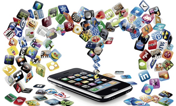
In between that 90-sec video on the homepage introducing your product and a visitor actually signing up for a free trial, there is this glue that is required. The glue that helps visitors map the problems they are looking to solve to the features your product offers. Or the other way round. Back in time when men hunted for food and the web had animated star-shaped red-colored 50% OFF buttons all over, it was a lengthy page usually called Features. Today, when people are busier and the web richer, it has been replaced by what is called the Product Tour.

A product tour is an all-round summary of a product. An all-round summary because it has to bring out all aspects of your product but without going into details like how it allows the color of the error message to be changed from red to pink. It is a very important piece of your product literature, and I am going to talk about the best practices for creating a compelling product tour.

Sell benefits, not features

You have heard this a million times. Make it a million and one. But when it comes to a product tour, the importance of this point cannot be overstated. In fact, it is one the main differences between a deathly-dull-almost-useless feature list and a product tour. A feature list tells the visitor what a product can do, a product tour tells what the product can do for him.

Apple is a master at this, like at most things marketing. For the iPad, rather than listing out all the business features of iOS and the apps it comes along with, Apple just says how business users can be productive right from the start itself.

iPad's product tour

Write these benefits like you write tweets — simple and crisp, conveying just one point at a time.Mint does this really well with its product tour, a very important piece of literature for them given the sensitive nature of the product.

Mint's product tour

Make your benefits easier to understand with use cases. Don’t come up with problem-solution scenarios that everyone can directly relate to — they just don’t exist. Use scenarios 80% of your audience can relate to straightaway and let the others draw a parallel. It is better to hit the exact spot with a majority of your audience than try hit close to the spot for all of them. TheFusionCharts product tour, which I was a part of conceptualizing, uses examples in plenty to drive home benefits that would have taken otherwise taken multiple paragraphs.

FusionCharts' product tour

Group similar benefits

Do not throw all the benefits of your product at once on your visitor’s face. It worked back in the day when the length of the feature list was as important as the features themselves but man has evolved now. Firstly, too much content overwhelms the visitors. These days, they digest it much better in bite-sized chunks. Secondly, for people interested in only a particular angle of the product, a page talking about that angle and around makes it much easier for them.

Freshbooks does this well by grouping benefits under simple action-driven heads.

Freshbook's product tour

Or you could group them in the sequential manner the product is going to be used in. With an email marketing tool like Campaign Monitor, a user will design the campaign first, then send it over and finally track its effectiveness, so that’s a good logical way of grouping the benefits.

Campaign Monitor's product tour

Make it visual

Get your screenshots, diagrams and photos to do a bulk of the talking. Sure, copy is important and be sure to sum up your point really well in words but the visual is what will ultimately drive home the point. Also, visuals are much easier to scan through and remember.

FusionCharts, which is all about data visualization, has an open layout for the product tour and uses visuals in all shapes and sizes.

FusionCharts' product tour

Get the visual to convey as much of the benefit as possible. If you can depict a complete use case with the visual, go ahead and do it. Don’t get Company A to work on Project 123 in the screenshot — use real data and real people, like Basecamp.

Basecamp's product tour

Do a complete roundup

Users don’t just buy a product, they buy a solution. Tell them what kind of documentation your product comes with. Do you also have demos that helps them get started quickly? What about tech support? MailChimp does this well in its tour.

MailChimp's product tour

Do you have an API for developers to create their own apps and add-ons? Is there a community developing them already? JIRA has a dedicated slide about add-ons.

Jira's product tour

And finally, it’s time to establish the credibility of your product.

FusionCharts' product tour

Think your navigation through

Now that we are done talking about the content, let’s talk navigation. Where do visitors come to the tour from and where do they head out? What about the things in between? Since the product tour is a glue between attention and conversion, this is a very important piece of the puzzle.

Typically a visitor comes to the tour from the homepage or a landing page. Could the tour be used as a landing page by itself? After all, it sums up the product pretty well, doesn’t it? Unfortunately, there’s no clear answer for this. It depends on your product, the problem your visitors are looking to solve when they hit your website and the length of the tour itself. Just be sure to add the promise of your product right at the start of the tour if you decide to use it as a landing page, so the visitor has the right context before he takes a deep dive into the product.

FusionCharts Product Tour

What about linking to blog posts and videos for more information on a particular feature? Isn’t that a good addition? The products I have used as examples in the post are evenly divided on this question. MailChimp sprinkles links liberally throughout the content and after it.

MailChimp Product Tour

Basecamp, on the other hand, keeps it all clean.

Basecamp's product tour

For me, internal links are not a good addition. The intent with the product tour is to give the visitor an all-round summary of the product and then send him packing to the free trial. Additional links only divert from the intended navigation flow.

If you have to have the deep dive resources, put them all together at the end of the tour. Interested people can check it out from there, and others can simply ignore it.

And now the final part. For product tours having multiple slides, more simply pages, what should you link to at the end of each slide? Rather what should you link to most prominently — the next slide or free trial signup? Again the thoughts on these are pretty mixed, but here’s what I consider best. The slides should have link to the next slide most prominently. Links to sign up for the free trial or register for the newsletter could be present but in lesser glory.

JIRA Product Tour

The idea is that if the visitor wants to spend more time understanding the product, let him do that before forcing him to sign up. For someone who figures your product will solve his pain point and wants to sign up immediately, he can always find that link from the main navigation or pick from where they are put out in lesser glory.

Over to you

Do you think the product tour as important as I make it out to be? What are other important considerations to keep in mind for a compelling product tour? Got good examples to share? Go for it.

[Helpful read: Behind the scenes of the FusionCharts product tour]

Expect a Microsoft, Google or facebook out of India? Won’t happen unless we THINK BIG!

When VCs from the US flooded into India about 5 to 10 years ago, they were expecting to invest and make happen, a number of Microsofts, Google and facebooks!

They ended up buying shares of existing public companies and became more of Private Equity investors rather than VCs who could put in a 1$ in 100 companies and have 5 block-busters like facebook or Google that returned $100 each! That’s the nature of Venture Capital – taking risks on 20 companies so that one becomes facebook or Google or Microsoft and makes up for all the losses in those 19 other companies.

This is as much an indictment of Indian start-ups not being bold enough as much as VCs turning into Private Equity investors. They did not find enough companies that were bold enough or thinking big enough!

First, some disclaimers! If you are building an Indian version of a successful US company or targeting a unique vertical in India with your SaaS or Cloud solution or trying different Consumer plays, all success to you! You can still be very successful and thrive!

This is not an indictment of the Software Services business! It helped enormous numbers of Indians stabilize and improve their lives and others that depend upon them, building a huge economy around them. But we need to move to the next stage. The thinking needs to be different this time. When the first services companies like Infosys, Tata Burroughs and Tata Consultancy Services started, you needed lots of  money to buy mainframes and minicomputers. Today, it does not take the same amount of resources to get started in the software business. The only thing that will make a difference now are Innovative Ideas!

This article is for people who wonder what it takes to build a global blockbuster like facebook and Google!

That has to do with NOT THINKING BIG ENOUGH! It does not mean just doing products for the Global Market or going for a huge blockbuster IPOs! That may come later. It has everything to do with going after BIG problems. Big What-Ifs! Big Experiments, Big Thinking!

This has to do with our general instinct to jump too quickly into “how do I make money” and risk aversion and the inability to postpone these questions and address some fundamental problems and find innovative solutions for them, not thinking about immediate payoffs!

Opportunities are everywhere if ONLY we stop being followers and start being leaders! In Consumer oriented startup companies, everybody is still dealing with information – work and social in many different platforms – smart phones, laptops, desktops. They are trapped in multiple formats that are incompatible with each other and causing endless frustration. Documents, status updates, photographs, videos, spreadsheets, presentations, databases are all still in many repositories leading us to waste enormous amounts of time just shuffling all of this!

On the enterprise side, Cyber Security is still a large, large problem! Nuclear facilities, Utilities, Government systems of every kind are subject to Cyber Terrorism more than ever before!

Companies are moving rapidly to the cloud; cloud security is even more scary than internal systems that can be cutoff from external access if someone suspects break-ins. Credit card information and online banking have only led to even less secure places to handle money.

Two days ago Amazon Web Services in Virginia ground to a halt because a monitoring system developed a memory leak and brought many, many companies’ servers to a grinding halt for hours!

Backups and Disaster Recovery are still problems that many enterprises have not found good solutions for yet, globally! There are technologies like Cassandra databases that can have three or four copies of the database automatically synched and updated. No need for backups – they are already backed up in real-time in multiple locations. You can almost build indestructible computing if you wanted to, if you choose cloud resources in multiple geographic locations, even across continents. The video streaming service NetFlix already does this with databases synched up across the Atlantic between US and European Data centers of Amazon!

Companies are just getting into collecting lots of Big Data – social media mentions of their companies, products, detailed information about what every visitor to their websites and online presences did when they are there and wondering how to use all of this information with customer and order information they already have in traditional database systems.

All of these are BIG PROBLEMS begging for BIG THINKING!

When Thinking Big, pick any of these above or other problems, they could lead to the next Microsoft, Google and facebook! It requires an obsession with ONE of those problems and a relentless drive to solve that, first.

When you solve big problems, you don’t need to worry about sales, investors and global blockbuster status. They will come as surely as night after day and high tide after low tide.

We have a tendency to equate technical knowledge, prowess and hacking with success. In software services they are important. But not elsewhere in the software business!

They are important tools but not your mission when it comes to building fast growing, large companies. You need to address problems and create innovative solutions that have clearly identifiable benefits. The benefits are the only things users care about. They do not care about Java or Python or Oracle or MySQL. They have a problem; do you have a solution?

The thing that is holding us back is our own thinking! Getting out of that box is the first step towards THINKING BIG! Thinking big takes the same amount of effort as thinking small but the payoffs are disproportional.

Think little goals and expect little achievements. Think big goals and win big success – David Joseph Schwartz.

3 objectives your homepage has to accomplish

As a tech startup, your homepage is the first encounter a visitor will have with your business. The first real encounter. And as a business, what is it that you would like to convey during this encounter? Ideally, you would talk for 30 hours straight but then people have lives to live, promises to keep and food to eat. So what do you do?

Get your homepage to cover you on three simple grounds. Three primary objectives. Here they go.

What’s your promise?

Every company has a promise. The promise answers the question Why should I look at your products? and sets the expectations before the visitor takes a dive into your offerings. Are your products the easiest to use in the market? Most powerful? Reliable?

For companies having a single offering, it is the promise of that single product itself. MailChimp promises easy email newsletters as opposed to Campaign Monitor’s beautiful email newsletters.

MailChimp's Homepage

For companies having multiple offerings, it is the common promise that runs along all the products, more like the promise of the company. 37signals’ promise is making collaboration productive and enjoyable for people every day while Atlassian’s promise is to help innovators everywhere plan, build, and launch great software.

Atlassian's hompage

However, if you have been chosen as the special one and different products of yours have different promises, it is best to stick to the promise of your flagship product.

Talk about your products
This is a drill you know all too well, so I will just focus on how this differs for a multi-product company from a single-product company.

If you are a company with a single offering, just talk about the benefits of your product liberally sprinkled with examples and use cases like FreshBooks does. FreshBooks' Homepage For multi-product companies, it is best to display the most important products from the portfolio with a short description of them and link them to the respective product pages. 37signals Homepage Remember the homepage is not about throwing all the information you have in your visitor’s face, it is about sending them the right way in the right frame of mind.

Build credibility

Would you have dinner at a restaurant where you would be their first guest at 10 pm? Would you go to a concert that starts in 2 hours but has sold only 300 tickets till now? No. If there isn’t anyone else at the restaurant, or there aren’t thousands of people attending the concert already, it just isn’t good. Period.

Human beings are social animals, and for us to be convinced that something is worth our time and money, we need to be told that other people have used the product earlier and found it to be food. We need to be ascertained of the credibility. And as a tech startup, you establish credibility using customer names, testimonials, success stories and press coverage. If you have all of them in aplenty, the world just gave you a standing ovation. If not, a couple of them work fine too.

Campaign Monitor's Homepage

However, building credibility is a bit of a chicken-and-egg problem. A prospect will become a customer only if he can see a customer list, and you can have a customer list only if prospects convert to become customers. In cases like these, get customers to invest emotionally instead — tell them the story of your company, show them the pedigree of your founders and give them a behind-the-scenes peek.

Final words

Of course, you can get creative with the order and medium of the obejctives I mention above. You can have a 90-sec video, an illustration where your mascot does all the talking, screenshots of the product itself or wax eloquent in good old text.

What’s your take? Do you think there’s anything else that a product homepage has to have?

Cross Post – PokeandBite.com

Why aren’t more developers creating serious Mobile App Products?

Mobile Apps

These are the times, when every third person that you meet in Technology world has an idea for an App. It could be every alternate person if you’re hanging out in geeky groups or among heavy Smartphone users.

The Industry trends suggest a phenomenal surge as well. According to Gartner, Mobile Apps Store downloads worldwide for the year 2012 will surpass 45.6 billion. Out of these, nearly 90% are free Apps, while out of the rest of 5 billion downloads majority (90% again) cost less than $3 per download. This trend has a strong growth curve for the next five years. (See Table 1. Mobile App Store Downloads, courtesy: Gartner) 

Another report suggests that 78% of US mobile App Companies are small businesses (based on the Apple and Android App Stores based research). The typical apps that dominate this market are games, education, productivity, and business.

Mobile App Store Downloads - Gartner 2012

This comes as no surprise. There is a huge divide between the Enterprise Mobility (dominated by the Enterprise Architecture, existing platforms and mobility extensions to the platforms that ensure business continuity) and End-User (Consumer) Mobile Apps dominated by the App Stores supported Small and Mid-size App Development Companies. The barriers to entry in the Smart phone Apps Market seem pretty low with the supporting ecosystem from Apple, Amazon, Google, and Telecom carriers.

However, let’s get back to the fact that majority of these Apps “do not” generate direct revenue.

While the entry seems without barriers, there are multiple hurdles on the race track:

1. Developers need to focus on the User Experience. The smartphone apps pick-up is highly skewed toward Apps that offer a good user experience even for minimal functionality. After the initial success, the App makers end up adding functionality for sustained interest, but the User Experience tops. It’s difficult to focus on UX while still trying to do everything right at the underlying architecture level for long term.

2. Marketing is important. Getting the early eyeballs is key for the App developers. Any serious App needs an immediate initial take-off, and among the things that they need to do to make it happen is to market the App beforehand and to get the authoritative reviews in place.

3. Initial Take-off is just the first hurdle. App needs to be able to handle traffic bursts, it needs scale with increased traction, support virality & social connects inherently, and also build an effective User ecosystem. None of these may seem like the core functional features of the App, but are most critical for the broad-based success.

4. The Freemium model is very popular, but it can kill the business if the marginal costs are not sustainable. The paradox of the Free model is that unless the 10% paid users are able to pay for your 100% costs, every additional user takes you closer to the grave. With this come in two questions – how do you keep the infrastructural costs low, and how do you build additional revenue models around the app.

  • IaaS can solve some of the infrastructural headache, but doesn’t provide you with the other functional layers that every App needs. You need to still build them. PaaS providers provide the scalable platform for building Apps, but you still need to build some of the functional features such as Gaming Rooms support, Messaging, User Authentication & authorization models, and so on. Mobile developers are still doing a lot of repetitive work across the smartphone Apps that can be consolidated into a framework.
  • Supporting the additional revenue models require integration with external Ad-services, Payment systems and more importantly the bandwidth to deal with this even more fragmented set of agencies.

5. The End-point device platforms are fragmented and getting even more so. A typical model for App developers is to develop an Android App, iOS App or a Windows App and then support the other platforms as they go along. However, keeping up with these multiple platforms is only getting more and more difficult with the speed with which Apple, Microsoft, and Google keep rolling out the OS. There’s tremendous pressure to release the App within the 1-3 days window of the release of the underlying platform.

Hence, while there are millions of people developing smartphone Apps as we speak, there are only a fraction that get built at serious level, and even smaller fraction that gets built for sustainable business success.

And considering these hurdles, the arrival of the Backend-as-a-Service (BaaS) is a blessing for the App Developers. Forrster’s Michael Facemire refers to them as “The New Lightweight Middleware”. He goes ahead and lists out some of the basic tenets of what makes a Mobile Backend as a Service, but I see this list evolving as the vendors offer more and more functionality to the customers leading to en ecosystem.

And the term “ecosystem” is going to be the key. That’s because a successful mobile App doesn’t stop at the user starting the app, using the app, and leaving the app. A successful App creates an ecosystem for the viral growth, user engagement, social functionality, in-built broad-based connectivity for multi-user interactions, and more importantly the ability for cross-platform usage. In a Gaming scenario, the user interactions and the relevant immediate feedbacks are paramount. Most successful apps build an ecosystem. Instagram, 4Square, Pinterest are the common household examples today.

ShepHertz App42 Cloud API is complete backend as service to help app developers develop, buid and deploy their app on the cloud.While Michael lists out the usual suspects in his post, most of them in the Silicon Valley, there is a very interesting player in Shephertz’s App42 platform, right here in India. The ecosystem approach that they have taken seems pretty much what may be required for serious app developers that need a robust backend provided as a service, so that they can focus on the app functionality, user experience, and more importantly the marketing aspects of the App.

Now why, still, aren’t more and more developers building even more serious mobile App products? Why shouldn’t they be? I think, they will!