From Bootstrapped to Angeled : Is it your idea or product ?

You’ve shaped up your business idea to flag off. You have a pool of talent believing in that idea and lined up with working prototype with feedback. Now, it’s time for funding to take your idea to concept to design to product to a successful business.

Depending on the idea, startup projects can be particularly expensive and often incur new, unforeseen costs. That is particularly true of technological ideas, which are currently in vogue but require exploratory costs (to pay experts to determine if the idea is feasible) and initial product development costs. Even if a team proves the idea is feasible, they often need to build a working model or prototype to prove that to investors, which can sometimes add thousands of dollars to startup expenses.

Bootstrapped to Angeled_To_Raise_Seed_Capital 1

The vital idea behind bootstrapping in commercial means is to borrow as minimal finance as possible. In two words, you only rely on either on your own budget and savings, on some crowdfunded amount or simply on loans from friends and family. This scenario urges you to borrow insignificant amounts of money and thus keep interest costs minimal. But as the market dynamics populates further, the wider entrepreneurial community starts delivering differing views.

Guy Kawasaki has proclaimed that “you should always be a boot-strapper… too much money is worse than too little” but goes onto to suggest “if you do get offered venture capital, take it, but don’t spend it”.

Most people focus all their time and attention on building their idea, and forget that even the coolest product or service is worthless if people don’t use it. Creating a successful product or service requires two things:

  • A solid implementation of the idea.
  • People that use it.

For the best chance of success, you need to identify the smallest core of your idea that has value to your potential users, build only that, and release it.  This “minimum viable product” or MVP serves as the ultimate idea testing ground.  It lets you build a relatively inexpensive version of your idea, test it with real users, and measure adoption.

Investors see a lot of ideas, which is why they won’t sign an NDA (your idea is not original, no matter what you think). But if you have a team that has delivered products in the past, worked through adversity, and has a failure or two to learn from, then the investor can see a group of people who will protect his investment, and has demonstrated the skills to do so.

So No. An idea will not get you funded.

To be investible, a start-up needs to have a good product-market fit and the potential to scale up quickly to a large market. It needs to be defensible with intellectual property or some other competitive advantage. And it needs to have a credible team in place, people who investors will believe can execute. And there needs to be some kind of proof, also called validation, also called traction.

Building an early prototype also helps you attract tech talent, because it gives people something to look at and play with, and it communicates your idea in a more “tangible” form. Then you can shop it around to potential technical co-founders to get them excited about your vision. If you have the means to actually build a working prototype, so much the better!

Most Angel Investors (and VCs) won’t pay much attention these days without some other sign of traction, especially because the financial and technical barriers to entry are getting lower and lower. Bootstrapped to Angeled_To_Raise_Seed_Capital 2

Additionally, the current market size doesn’t matter. The market size in 10 years is what really matters. You want to be in a small but rapidly growing market. You can change everything in your start-up except the market. So spend a lot of time up front to make sure you’ve thought through your market. “Having value” and “being fundable” are two completely different things.

Two of the most valuable things that the investor community seems to have been seeing from close quarters are: customer feedback and data from pilot research, which can enable them ask questions that lead to product breakthroughs. Angel Investors would need to know how your idea has improved to a bit more than a fledged product wireframe, so that their willingness to invest into those ideas via money, and social reach can increase to ensure that the success of your product is further defines by cutting-edge product development process.

Following guidance is thus seems to have gained ground and immovable traction for all the aspiring entrepreneurs who are progressing from a Bootstrapping channels to Angeled funding:

  • Be value-driven rather than fund-driven
  • Be independent of technologies that make you lose control over your idea
  • Make the customer a base for your product than profit
  • Base your ideas on supply and demand and not on the money it can attract

Once again, this isn’t a strict definition, but the seed round is normally used to fund the initial stage of your company where you’re finding product/market fit, and the following rounds are meant to help with scaling. That said, the road from concept to readiness (aka product MVP) is long and winding. Entrepreneurs’ single greatest challenge in this sphere of activity is balancing bursting creativity with structured, method-driven decision making.


PAY-IT-FORWARD PARADOX… The More You Give, The More You Receive

PAY-IT-FORWARD PARADOX… The More You Give, The More You Receive

Ever noticed how the busiest of people are often the ones that find time more easily than others?

It is about making the time versus having the time!

When you make time despite busy schedules and packed days to share your experience and perspectives it helps so many people, definitely more than you could individually imagine. In the process though, you get so much back, more than you could individually imagine. And, I am not just talking about the ego boost you get from your audience, it is the whole process. Deciding what to share allows you to spend time reflecting, perhaps even researching. You learn and remind yourself of what you knew and could have forgotten. The prep certainly helps you articulate and verbalize your thoughts. When you hear your audiences’ perspectives, another learning opportunity. When you get asked a question you couldn’t answer at first, yeah, another learning opportunity. It is the gift that keeps on giving. You very quickly see that making the time to share your thoughts and experiences is a really good way to learn.

At Pensaar, we are crazy biased towards design thinking as a mind set and a process to innovate.

We are practitioners and have used design thinking in our own jobs to innovate and are able to share war stories, trials and tribulations from our experiences. Being less than 6 months old, this August we took on the arduous task of putting together the Design Thinking Summit. The first draft was a vision more than a plan. Here’s what was serendipitous… as we shared our vision, many good people came to support our vision.

NSRCEL-IIM Bangalore, Intuit, iSPIRT and YourStory gave us their support. Many friends and fellow practitioners gave us their time, ideas and mentorship. What was the result? 70+ people went through a 3-day experience of applying design thinking to a real problem and 250+ people spent 1-day in large discussion formats learning about design thinking from each other.

It was truly inspiring and motivating to see so many people pay it forward, we were blessed to have that kind of support. Gave us more passion and energy to realize our vision to spread the awareness and application of design thinking.
Paying-it-forward is wonderful but then you imagine doing that for a bunch of people you have no vested interest in, it is pure humility.

The magnanimity with which they approach knowledge sharing is humbling. There is recognition of the notion that there are millions out there waiting to interact and hear their encouraging and inspirational stories. We asked a few design do-gooders we have had the honour of working with about why they work pro-bono. Here is what they had to say… we are indeed grateful to all the pay-it-forward individuals, makes us want to do more!

“One of the most wonderful experiences in life is to see an idea evolve into a feature or a product and then into business. There are a great many ideas out there that are ready to take this journey. Helping others navigate and experience this journey is what addressing larger audiences is all about” Tridib Roy Chowdhury, GM | Sr Director Products, Adobe

“I do it to pay it forward to peers, practitioners, designers & society at large for better ways to solve problems by design thinking. It is great to be part of something, where it is not driven by the idea of an individual but as a collaborative effort for change.I also get to be part of a platform where I can exchange idea/thoughts/ methodologies and more importantly learn, since there is no single right/wrong way to do design thinking” Harshit Desai, Design Thinker | Digital Transformation Lead | User Experience Strategist, KPMG India

“I see two extremes in the practice of Design Thinking. One pretty serious and offering the best for innovating for better lives. The other is lighter and sometimes belittling the practice. I am a pure play Design thinking practitioner and like to spread the message that for some DT is life changing and for some it betters lives. I have been part of such experiences. It is inspirational! Whether it is pro-bono or not I have been doing this for some years and will continue to do so, to reduce the negativity about design thinking to my best possible ability” Lakshman P Seshadri | Strategy | Innovation & Design, SAP

“Success for individuals or organizations is about what we can do for others as well. I consider it valuable to make the time to share knowledge. Empowering outfits and individuals is just as important. Pensaar’s mission to evangelise and spread design thinking at a nascent stage ties into my belief of sharing is learning” Venkat Kotamaraju | Growth & Strategy Leader, Pensaar

The joy in knowing that that they are changing lives is what makes evangelizing the methodology so important. Also, it triggers a beautiful snowball effect of only inspiring others to do the same.

Guest Post by Deepa Bachu, Pensaar 

Design Thinking- The UnConference way

Gerard Butler and his army of Spartans walking down the stone corridors of the beautiful and mythical surroundings of IIM-B paint a beautiful picture. It’s really not too hard to picture them there, blending in beautifully with the surroundings too.

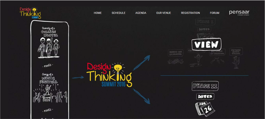
Designthinking‘Preparing for glory’- Like the Spartans, Pensaar too is setting stage for the ultimate revolution. The UnConference, Phase-ll of the Design Thinking Summit is gathering traction and building from a 60+ gathering at Phase-l to now include 300+ participants.
Our existence being rooted in Design Thinking the day of reckoning, 26th August is going to be an action packed day covering various topics. It begins with Pecha Kucha and workshops followed by exciting interaction formats like fishbowl, socratic dialog, market place and world café. Tying it all together will be design thinking experts from diverse backgrounds, wielding their own special weapons and skill sets ( Added bonus- they decide to show up in their greek robes. We have sent them the memo)

Embodying the mission to raise awareness about design thinking and its impact we are thrilled to bring to you just that. Join us and our partners IIM-B and Intuit to take advantage of this unique gathering of people, after all it has been designed keeping you in mind.

Click here for registrations: designthinkingsummit.com and help spread the word #DTSummitBLR

Guest Post by Deepa Bachu, Pensaar

Crafting experiences, which are awesome. by design #DTSummitBLR

These are exciting days for us at Pensaar. The Summit, which we have planning for a while is right around the corner.

Here’s what you can expect from our Summit workshop (Phase1 on 15, 16 and 17 July hosted at Indian Institute of Management, Bangalore). The co-creation session is carefully designed to be a completely immersive and experiential 3 days. You’ll learn how to understand customers, articulate insights that will inspire innovation, ideate till you get disruptive ideas that you rapidly test with customers. The entire conference is focused on learning by doing. And, what’s more you will learn design thinking with a group of 50 people across startups, large companies and academia. We are envisioning creating change makers. You will walk away – empowered and inspired.

We are thrilled to be partnering with Indian Institute of Management, Bangalore (IIM, Bangalore) to bring the Design Thinking Summit. We are humbled by the tremendous response that’s already poured in.

Designthinking

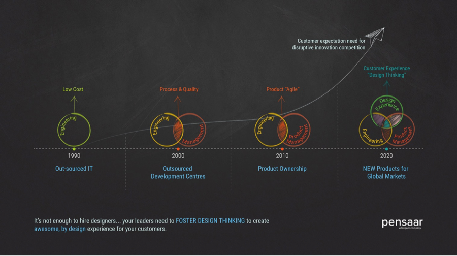
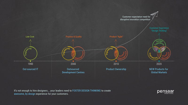
Our mission is to raise the levels of awareness for Design Thinking in India and elsewhere. Particularly in India, where we think we’ve had a strong legacy of an engineering led culture. Sadly though that legacy is a big factor in India being perceived as an outsourced development center. The opportunity though, as we see in every challenge, is to bring about the perfect marriage of engineering & product development with a design thinking mindset – a mindset posited on a user first, design led solutioning

In our experience, many teams and organisations are deploying a tactical workaround – that of hiring designers. Merely hiring designers isn’t enough, its critical for leadership teams to harness the power of design thinking to create experiences for customers, which are awesome.by design

But I get ahead of myself here. Let me back up here a bit.

What comes to mind when you think of Innovation? Ever so often, it means it’s a flashback to one of three ways we experience the pursuit of innovation across organizations:

  1. The Eureka moment
  2. Start thinking out of the box
  3. BOHICA: Bend Over Here It Comes Again

DT2Not surprising that companies (of every shape, size and origin) are struggling with innovation. Good work is happening, the right interventions are being made but these interventions are happening in silos. One is left with the feeling that “some secret sauce is missing”. Is there a secret sauce? And is it missing?

Design thinking is the answer. It’s missing for sure. But it isn’t missing as an ingredient – it’s missing as a mindset within teams and across organizations.

So, what is Design Thinking (DT)? Design thinking or Human Centered Design is a process for solving problems. It’s a perfect blend of divergent and convergent thinking allowing for a wide exploration of possibilities vs. being fixated on a single solution (a uni-dimensional solution)

We approach DT as a “disciplined pursuit of disruption”. Let me explain the 3 key words there:

  1. Disciplined: It’s disciplined, because innovation isn’t about happy accidents and good fortune (serendipitous innovation). We believe in “engineering serendipity” to get to the future we want to create (note: we don’t say get future ready, which is an ever-shifting frame of reference)
  2. Pursuit: it’s a relentless pursuit with rigour. To fully harness the potential of DT, you have to anchor it within the DNA of the team / organisation. For organizations to realize the full potential of their innovation capabilities, they need to look at it holistically, from up skilling talent, empowering them with the right processes, values and decision making, allowing them to push the boundaries of what’s possible
  3. Disruption: This is an oft quoted (largely misquoted) and we make an effort to make that distinction. Disruption is doing new things that makes old / existing things obsolete. Innovation on the other hand is just doing new things.

We are super excited at how uniquely positioned we are. And the DT Summit is our chance to share this unique perspective with the broader audience. We love diversity and we embrace it wholeheartedly.

We fight educated incapacity, because we bring to bear the power of design thinking, which is domain agnostic in its approach and application.

So, what is that Pensaar way of Design Thinking? Our process: Discovery —> Insight —> Dream —> Disrupt is designed around some core principles:

  1. Co-creation: We love co-creating with our client partners (and in turn, encourage our clients to co-create with their users / customers). We love to share the ownership of problems (product or business or social) and solutions we co-create.
  2. Designing for Human behaviour: We love technologies (emerging and disruptive) but only as the means to the end. We believe humans are the best technology and our emphasis has always been on designing solutions for behaviour change – human-to-human interface. (No we don’t think apps are a business model)
  3. Problems & Goals focused: We are obsessed and fall in love with problems. Our approach has been carefully designed to avoid the path of least resistance. To be honest, it does make a lot of our partners edgy, because we spend a disproportionate amount of effort in building customer empathy, generating insights and carefully crafting that problem statement.
  4. Addressing a genuine human need: Most product / business failures come from lack of customers and NOT products. That’s really from NOT understanding customer’s evolving needs and yet trying to design a fancy product. Unless you’ve understood the customers real pain points and his/her hierarchy of problems, any product, no matter how good it looks on paper – its bound to fall short of its potential
  5. Assumptions test: It’s simple really. Any idea or thought you have, is a hypothesis, which needs to be tested. Without, rapid experimentation to test for assumptions and hypothesis you aren’t managing the risks in favour of success.

We can’t wait to meet you and co-create with you at the workshop. We hope to see you, both at the workshop (15 – 17 July) and at the Unconference on 12 Aug.

Please do share this event #DTSummitBLR http://designthinkingsummit.com and help us spread the word on the summit. 

Guest Post by Venkat Kotamaraju – Growth & Strategy Leader, Pensaar


Because designers need to know *about* code

This is a about a long raging debate on the process of designing and developing great products.

In a recent Medium post, Jesse Weaver said something very simple but powerful — we need more designers who know *about* code. And I agree! Not only because I myself like to experiment with code but also because of the following.

“The reason designers should know about code, is the same reason developers should know about design. Not to become designers, but to empathize with them. To be able to speak their language, and to understand design considerations and thought processes. To know just enough to be dangerous, as they say.” – Jesse Weaver

This thought does enough justice to the whole debate around designers and coding. Now how much should designers know about code and how should engineers reciprocate is a different discussion. Given that we have Chrome DevTools and Framer.js today, it should be simpler.

So what does this lead to? This requires designers to go beyond the usual. Talk to engineers and understand their environment — ask stupid questions. By doing this, our usual work, experiments and hacks become easier and more fun. Now isn’t that worth it?

Guest Blog Post by Amal Tiwari, Yawasa

Design thinking Playbook Roundtable by Deepa Bachu

desk-931928_1280

The core idea of a startup is to tap into the previously unexplored markets, identifying unsolved problems and bringing to the market innovation that disrupt the existing eco-system. It’s about understanding complex problems and coming up with innovative, disruptive solutions…a process that requires understanding the consumers’ requirements and behavior patterns to create a well-thought out solution for the customers’ benefit.

While most entrepreneurs spend weeks brainstorming about the idea, they often ignore the key ingredient to innovation : design.

Design /dɪˈzʌɪn/ (noun) – do or plan (something) with a specific purpose in mind.

The Design thinking Playbook Roundtable organized by iSpirit and conducted by Deepa Bachu from Pensaar helped startup founders understand the importance of design thinking and integrate design into their workflow. Here are some key takeaways from the Playbook Roundtable held at the head office of Instamojo in Bangalore:

Design thinking is not just about the graphic elements, UI or tools. It is a creative approach to a problem. It is a problem solving methodology – whether it is blueprints for a building, a beautiful graphic design for a brochure, a sleek UI for a website or a comfortable piece of furniture, design helps to solve any problem, visual or physical.

While it is important to engage a professional, it is crucial that everybody on the team thinks DESIGN. Entrepreneurs should be able to step away from their immediate environment to look around and view their idea from the perception of the consumers, a process that requires creative thinking.

As a good product manager, a startup founder should be able to connect the dots in non-obvious ways to come up with a unique and innovate solution for the consumers. It is crucial for entrepreneurs develop a deep insight of the problem they are seeking to solve and be passionate about it before coming up with a solution. More startups focus more on the solution and forget the initial problem statement. You must never lose sight of your problem, constantly revisiting it while fine-tuning and tweaking the solution.

A product is valuable only as long as the consumer users it. It is thus important for entrepreneurs to understand customer behavior in order to make their product user friendly. Usability studies though interesting, aren’t always reliable. Startup founders thus have to seek out customers and work with them closely to understand what they need, what they think, how they use the product and how they feel about it.

Customer behavior v/s customer intent – it is important to understand the difference between the two. While a user may want to do something in the ideal world (intent), she may not be able to do it in the real world (behavior). As entrepreneurs it is important to differentiate intent from actual behavior. If this is geographically impossible, startup founders should not hesitate to use data analytics to tap into the users’ behavior patterns and modify the product.

Design thinking allows entrepreneurs to look at their idea holistically and come up with the best possible solution for their users. Design after all enables people to create and come up with the unimaginable and unexpected designs.


Design Thinking: When creativity and process come together

Design Thinking as a mindset and process that is starting to get its’ due attention in the US. In India however, it is lesser known and in most cases, an after thought.

What is Design Thinking, you ask? It is a creative process of building products that people simply love to use! Products that not just meet but beat customers’ expectations and bring in the element of unexpected delight!

There are several versions of the design thinking process, having practised design thinking for ~10 years now, here is my interpretation of it.

Design Thinking → insight . dream . disrupt

INSIGHT is all about developing a deep understanding of the customer as well as the environment in which they work. Then, connecting the dots in non-obvious ways to develop clear insights into the customer needs.

DREAM helps you think about many, out of the box solutions before you choose one solution that really solves the customer need you identified. But, you wont stop till you build in unexpected customer delight.

DISRUPT helps you push your thinking beyond what is easily possible and iteratively test your ideas with your customers (no surveys, real experiences tested with fake-o-backends)

Design Thinking in India: Most, if not all individuals creating products in India tend to be engineers by education. I think of this to be a huge advantage. “It’s not just what it looks like and feels like. Design is how it works.” — Steve Jobs. Given the engineering background in India, we naturally focus on how things works. As such we need to use this advantage and focus on converting new and wonderful technologies into products that people simply love. However, we tend to be guilty of not stopping to understand the problem and simply focus the solution right away. Fall in love with the problem, not the solution — one of the many things, I learnt while at Intuit is something I think we should all apply more.

I believe this has to do with our lineage and how we’ve grown into a country that’s going in the path of a technology revolution!

IT progression in India in the ast 30 years

My message to all product and experience creators is just this…it is not enough to have designers think about customers, everyone in the company should foster design thinking.

Be AWESOME, BY DESIGN — start with discovering those deep insights, dream up solutions that push possibilities and finally create disruptive solutions that don’t stop short of delivering unexpected delight.

I’ve shared examples of insight and dream previously. Do share your own design thinking stories and challenge mine.

Does Mobile Only strategy point to lack of Design Thinking?

The runaway success of Indian e-commerce show is driven by the single biggest attraction of hefty discounts available almost on all products! More than any other value proposition of e-commerce such as more choices, convenience, 24×7 availability, payment options and faster deliveries, the Indian customer was lured to e-commerce by the sheer scope for discounts she would not get elsewhere! The intense competition over market share among the e-commerce players ensured that there is always a counter offer for any blockbuster offer from one player. The eternal discount chasing customer is smart enough to sense this opportunity to compare prices of every item on offer with other vendors and settle on the maximum discount offer. While this was the modus operandi of the average online buyer, e-commerce players were sweating out on how to better their offer by attempting to do enormous scales that would only push their quest for profitability farther and farther.

Gme Changer or - Image_1As the dog fight continues to grab market share, e-commerce players are trying to outdo one another by introducing newer business models and innovations; the latest being Mobile Only format. Though there have been many successful experiments that defined the online buying culture in India such as Cash on Delivery, easy hassle free returns and EMIs, the latest experiment’s success is not pronounced yet, while many of the digital enthusiasts are upbeat about it.

Sorry, Mobile Only -Image_2Here comes the Mobile Only strategy!  While all the arguments for Mobile Only strategy evangelize the potential of the native app technology and innumerable values it promises to the marketer, an honest assessment of the anticipated compromises on the side of the customer is yet to come i.e what possibilities it takes away from the customer in order to cut short longer sales cycle.  Ironically, the deterrents for marketers to sell more are also the very value drivers for the consumers to buy more!

What is undisclosed about the real motive behind the Mobile Only strategy? Is it just Customer apathy?

During the years Indian e-commerce players took their baby steps to entice the buyers, this space also spawned innumerable deal aggregators and price comparison sites in empowering the value hunting customer to gleefully snap the best deals in the online space because of customer’s sheer capability to compare and choose across multiple vendors offering products of same specification. While online customers enjoyed this newfound freedom and capability, e-commerce players dreaded this unfettered nature of competition. This had made e-commerce players’ life a nightmare and the only possibility to woo customers was to settle for lowest price and provide faster delivery – both demanded extreme back-end efficiency and truckloads of money to operate at wafer thin margins; if not at loss.  Every e-commerce vendor had been eagerly looking for an effective way to fortify his customer from being weaned away by a better offer from competition. In these circumstances some enthusiasts find the Mobile Only format a perfect antidote for limiting customer’s newfound capability.   Lets look at how the Mobile Only format plays out!

  • In a Mobile Only format, the ease and speed of operation make the customer blind to the loss of the market options- i.e. to compare and weigh the market offers and to arrive at his maximum discounted vendor decision!
  • Deprived of option to compare the customer would be less confused about product choices with other competing products – the bliss every marketer longs for.
  • Customer decision cycle will be relatively short and quick compared to an open market situation like many players offering competing and comparable products as in the case of web.

Thus, effectively marketers are trying to cage customers to the controlled environment of their app and subtly cut off customer from the open market and invisibly condition and constrict his buying behavior for the benefit of the marketer, hoping that customer would fall in place as per their design!

However, what boggles the mind is the unpredictability as to how the customer would react to this stealth move by marketers!

The Mobile Only format yet to sink into the customer mind!

Hostile UX- Image_3
The inevitability of Mobile Only customer experience

Despite all hype around personalized content spiced with data analytics, the user experience remains the single largest bottleneck for going Mobile Only format. A large section of online users, especially those who have access to PC still consider viewing the products on large screens and doing one’s own market study before placing orders. A lot of online buying is driven by such consumer behavior born out of web format capability, but this turns out to be a huge challenge in Mobile Only format as SEOs are still at nascent levels in indexing app pages effectively to provide actionable comparison. Moreover for the user it becomes quite tricky to compare different sites considering the smaller screen of mobile device, while for the marketer app based approach opens up plethora of possibilities. That brings us to the cross roads in deciding how to navigate between marketer opportunities versus customer centricity?

The behavioral profile of online buyer and the Mobile Only format – a case of mismatch?

  • One of the main characteristics of online buyer is his appetite for best deals with maximum discounts available across vendors.
  • He also derives satisfaction that the deal is actually the best by comparing it with other offers. Therefore he is a value hunter and much less brand loyal.
  • Similarly, the app only promotions may not entice the buyer as buyer may feel the buying experience to be incomplete without going through this essential buying process or may remain non impulsive to respond to a targeted notification in the app.
  • The idea of enhancing personalized buying experience and brand building may be misplaced here, as there is a mismatch between vendor offering and customer expectation.
  • Majority of the mobile Internet users have been using online buying just recently and are yet to realize the compromises they have to make while on a Mobile Only format. Eventually they would conclude that the benefits of web may outweigh those of the Mobile format.
  • When the buyer realizes that marketers are effectively limiting the possibilities of the buyer, the disenchantment may lead to a lot of anguish in the minds of customer and eventually she may look beyond Mobile format.

While we have so much pointers to customers’ buying process already on the table, a complete disregard to customer behavior and expectation will have serious implications in winning a pie from the increasingly discretionary customer participation. On the one hand all the leading e-commerce players claim that 70% to 80% of their total orders come through their mobile platform; on the other hand they admit that 25% of these orders are originally discovered in PC platform and the mobile platform was used only at the clinching stage of order execution. Hence ignoring this huge market will be destroying the value they have hopefully awaited over the years.

Thus, only time will unfold whether Mobile Only format is a game changer in delivering value or a big value destroyer? The early reports suggest that Myntra had mixed response to their app only strategy. Interestingly Myntra’s parent Flipkart has put on hold Flipkart’s app only format originally scheduled from 1 September 2015. In the just concluded Big Billion Day sale in October 2015, Flipkart continued the web format and was heavily promoting the app platform by offering app exclusive launches and additional discounts on app based purchases indicating that despite all the best efforts to push consumers to app only format there is considerable volume coming from web format and marketers cannot ignore consumer preferences.

Going by Flipkart’s main competitor Snapdeal’s founder & CEO Kunal Bahl’s admission, Myntra’s app only strategy has greatly helped Snapdeal’s fashion business ever since Myntra shut down the website from May 15, 2015.   Is Myntra’s case a straw in the wind vis-a-vis the Mobile Only strategy? Industry is watching this space very keenly for more signals!

If Mobile Only is overkill, what is the right balance?

Given the growth of Indian Internet users at YoY growth rate of 32%, the 375 million users (as per IAMAI November 2015) augur well for e-commerce players. More than 60% of these 375 million users are mobile Internet users and the share of mobile Internet users are set to grow at faster rate given the continuous reduction in smart phone prices and more and more 3G & 4G network availability. Apparently, this paradigm shift in net access point very much endorses the idea of going Mobile First strategy. However the Mobile Only strategy is self-inflicting to all categories of products especially for high involvement category products. Categories those are low involvement and completely transaction based and used frequently such as taxi hailing services, bill payment services, travel booking sites, event ticket booking and restaurant services may have a case to go Mobile Only at the risk of losing a small portion of their business, as even those category demands multi channel access points simply because of heterogeneous customer behavior.

Mobile Only, does it sound lack of Design Thinking?

According to IDEO’s President and CEO; “Design thinking is a human-centered approach to innovation that draws from the designer’s toolkit to integrate the needs of people, the possibilities of technology, and the requirements for business success.”

Where does Mobile Only falls short in integrating needs of consumer and requirements of business with possibilities of technology?

Understand your customer really well: There are many reasons cited for going Mobile Only such as better maintainability, cost savings, huge data mining capability which in turn can power data analytics driven marketing functions like greater segmentation, contextual targeting, user engagement and rapid personalization at scale. While all these are the possibilities for the marketer to embrace the new format, the same possibilities turns out to negate the possibilities of the consumer that is essential for a sustainable growth of ecommerce category. Mobile Only enthusiasts seems to be missing the plot by ignoring customer decision journeys to understand what motivates people and what puts them off and apparently loses opportunities for creating delightful experiences.

Empathize your customer with customer advocacy: While more and more businesses are waking up to the real world business need of ‘empathy’ mapping by putting the customer at the center of problem solving equation, the Mobile Only format looks highly skewed towards the marketer. Apparently we are still not finding a holistic reason for Mobile Only format apart from the ulterior motive of customer confinement, rather born out of customer apathy or total disregard for customer preferences. Building this wide gap requires rallying customer advocacy and customer centric empathy across all functions of business to deliver value and keep customer experience as the most important metric.

Device Option- Image 4Design to delight: Instead of Mobile only format, to fully capitalize rapidly growing net users the e-commerce players should repurpose all the touch points rather than limiting to only mobile touch points. Marketers should offer all options of net access points including web along with mobile, with all screen options and continuously reexamine the new touch points of value creation.
It is very important to explore all the digital channels for effective customer outreach when we are talking about bringing in all the 375 million net users to meaningful online purchases. A deep understanding of customer experience across all channels is just the starting block of the long process. To assume that customer’s interaction with a brand can be effectively managed only through an app (in an app only ecosystem as envisioned by Mobile Only enthusiasts) seems like an incomprehensive view as customers preference to multiple digital channels such as web & mobile advertising, email, search engines, social media and video are increasingly playing a decisive role in customers decision journey.   To capture the multiple touch points of customer interactions every e-commerce company should aspire to capture a comprehensive view of its customers, by implementing mature systems for collecting and organizing those deep insights. It is all the more important for ecommerce vendors of high involvement categories to provide a feel of the product through multiple and large visual interactions that is closer to actual physical experience to reassure the expectations of the product to user. Such affirmative and inclusive measures would increase the adoption of ecommerce at even faster rate.

The need is to remain attuned to customer decision journeys and understand how to use new capabilities to serve customers better. This is possible when marketers prioritize to understand each step of customer’s purchasing journey and design and deliver best experience across all formats. Every marketer’s goal should be to continuously discover efficient frontiers of value delivery without undermining superior user experience essential for occupying the numero uno position in customers’ mind space.

UX and Design in India

I recently heard of the demise of renowned MP Ranjan. Though I’ve never met him, my friends and colleagues who are in design, speak highly of him. It’s amazing how much design as a field of study and profession has progressed. And I’ve been fortunate to have worked with a lot of smart and talented designers over the past few years. This was not the situation when I started in the tech industry.

While at Zoho (then AdventNet, circa 2002), few of us came together and felt it was important to focus on design (it used to be called Usability then). And many teams had designers who used to be called Usability Engineers. We even went on to setup a usability lab where we had the ability to share the big CRT monitor, have a user try out our product (usually someone from SysAdmin, remember: AdventNet was building enterprise network management products then) and be able to see how a user used specific screens in the product. Most of my friends in other tech companies back then hadn’t heard of or were familiar with usability engineers or what they do. The common question used to be

Are these the people who fix the font colour and bold/italic? Isn’t that graphic design?

When I was interviewing with Yahoo in 2004, the recruiter who forwarded my resume to Yahoo, saw “User Experience” mentioned in the resume, and suggested “Why don’t you write some programming languages like Java in the resume so that they’ll consider this? Why do you want to write things like user experience? How does it help?“. As irony would have it, I ended up getting hired by Yahoo, and joined the same day as @rutasraju who led the UX teams at Yahoo for quite a while 🙂.

By this time, few more companies were beginning to talk of User Experience, Design and even hiring for those positions. And when I moved to InMobi (then mKhoj, circa 2008), we hired UX designers quite early on, and the company continues to build the UX/Design team. It was a much more accepted and serious profession to be included, if you were building products for any kind of human!

In more recent times, design is a mainstay in any company building products. This may be achieved by hiring in-house or by outsourcing/contracting, but the fact remains that it plays at a high level of consciousness for any team starting a company or building a product. At Credibase, when we think of what to do for users, the conversations always start with

What is the proposition for the user, and what is the experience the user will undergo?

I think this is due to a nice and virtuous cycle: See classy products -> Want classy products -> Build classy products. And I think this is great for the ecosystem. From being an afterthought (fix the text and colour on the screens) to being a mainstay, design in India has certainly come a long way, all in 1.5 decades!

Practitioner’s Guide to Product Strategy

Building products that help customers achieve the outcomes that they desire over the long term is hard. Jeff Bezos has a great quote on basing your strategy on things that do not change. This quote captures the essence of strategy and long term planning.

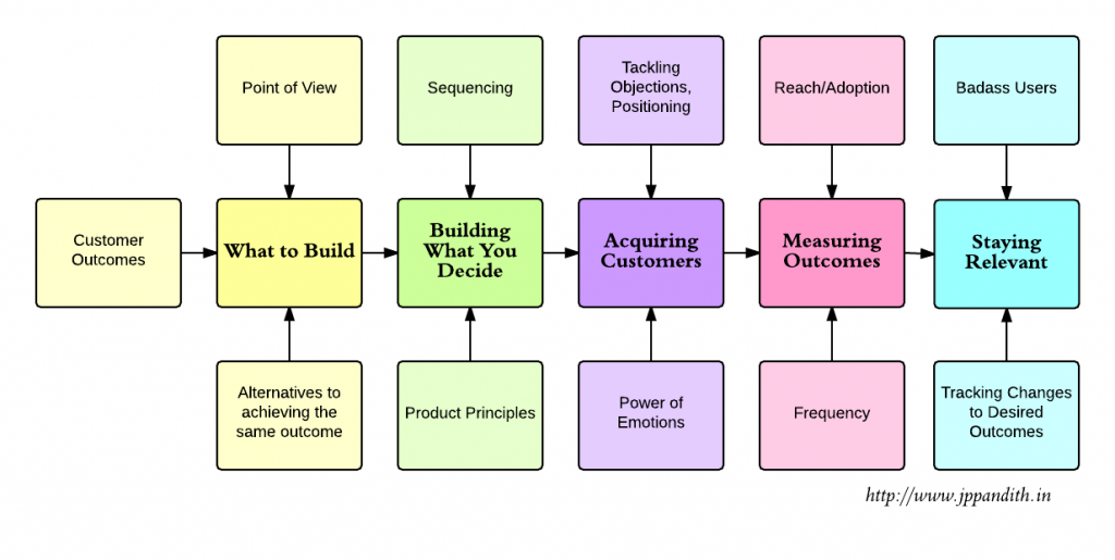
Here are few elements that product teams should consider while building products:

Product_Strategy - Pandith Jantakahalli

What to build? is determined by three critical elements — outcomes that customers want to achieve, other alternatives that help customers achieve the same outcome, and your point of view.

Customer outcomes: It is best to define customer outcomes using a vocabulary that a customer would use. While it is typical to place emphasis on functional outcomes, it is crucial to identify emotional, and social outcomes. Functional outcomes can be defined by understanding the customer’s context, situation and constraints. Emotional and social outcomes can be defined by understanding motivations, where and how much energy the customer is expending to achieve the desired outcomes today, and “skill” level of the customer. Ask what will make the customer successful, before asking what will make your business successful. (Note: It is important to ask the latter question as well)

Alternatives for achieving the same outcome: In order to understand what to focus on while building your product, it helps to understand how the customer is achieving the outcome today. Pay attention to what they are dissatisfied with, and if the dissatisfaction is on an important attribute. You may observe that the customer is using multiple products to achieve the desired outcome, or that the alternative is not in the same “product category”.

Point of view: is crucial to the success of your product as it determines the scope of your product and your approach to helping the customer reach an outcome. For example, you may decide that project management is all about enabling better communication among all stakeholders. Thus focusing your efforts on enabling frequent and timely communication, rather than including support for Gantt charts.

It is useful to define every interaction with your product as “the product”. User guides, support interactions, blog posts, interaction on community forums constitute the product. Prioritizing each of these interactions for focus and attention will immensely impact success of your product.

Building what you decide: is especially hard with a steady stream of distractions that are typical in any business. A really “big” customer will sign-up if we build this feature now, lets build this really small/cool feature — it will take only a few hours. Product principles and sequencing decisions help rein in these distractions.

Product principles: While goals and metrics help communicate what to focus on and measure progress, they are weak in communicating what actions need to be taken at an operational level. This is where product principles are helpful. They help with alignment and cohesion of activities across different stakeholders by providing guidelines for action. Product principles must be anchored around customer outcomes and your point of view. Good principles includes how the user should feel before/while/after using the product. They enable faster decision making while ensuring alignment. Instagram has very clear principles — make every picture beautiful, make it super fast to upload a photo, and make it super easy to share photo across different platforms.

Sequencing: When to build a functionality/feature is as important as what to build, as it critically impacts the pace at which business outcomes are achieved. Good sequencing decisions take into account —limiters/enablers, impact, effort required, and any compounding benefits. Evaluating trade-offs in sequencing decisions is crucial — what is the impact of doing multiple small features vs. one large feature, should we focus on projects that drive more traffic when activation rates are low?

While customer acquisition is usually considered to be part of market strategy, I’m including this to highlight how product strategy informs customer acquisition and how feedback from customer acquisition informs product strategy.

Acquiring customers is greatly dependent on positioning, power of emotion in the customer’s decision making process, and your company’s strategy in tackling objections against using/buying your product.

Positioning: Position based on your point of view, and attributes that are important to customer (but poorly served by alternatives) for maximum impact. Good positioning evokes strong emotions and motivates the customer to take action. Positioning greatly impact pricing of your product. iPad’s positioning and anchoring around netbooks is a great example of effective positioning.

Power of emotion in decision making: A rational approach (based on utility and logic) to selling your product has a limited appeal among prospective customers. People find it extremely difficult to take action in the absence of emotion. Tapping into the motivations and true emotions of the customer are crucial for acquiring new customers.

Tackling objections: Customers do not just buy your product, but they switch to it from an alternative. Hence, it is important to make this switch as easy and painless as possible. For example, if you are building a ticketing system, make it is easy to import tickets from their current system. Leverage existing behaviors instead of asking prospective customers to create new ones. For example, Google Sheets retained formulas on Microsoft Excel and focused on improving the collaboration features. It is also important to focus on eliminating/reducing negative emotions like anxiety. Free 30-day trial, no questions asked returns policy can help reduce such emotions.

Measuring if customer outcomes are being delivered: Feature usage is a key indicator in determining if customer outcomes are being met. Feature usage consists of two important parts — reach (how many users are using a feature) and frequency (how often a feature is being used by a user).

It is important to establish baseline metrics for reach and frequency (for each feature), and run projects to improve these metrics on a continuous basis. If a feature does meet the expected metric or is not being adopted, the 5-whys technique is helpful for understanding the reasons and taking corrective action.

Reach/Adoption: Feature adoption can be improved by measures like building awareness, educating users on how it can help them, and suggesting the feature at an appropriate time. If feature adoption continues to remain low and is not helping customers achieve the outcomes that they desire, it is best to kill the feature. Killing features, simplifies the product and provides a great deal of flexibility in making decisions in the future.

Frequency: Frequency of feature usage can be increased either by resolving issues that prevent usage or by extending/modifying the scope of the feature. Nir Eyal’s hook canvas is a great framework for improving frequency of feature usage.

Staying relevant: A product can stay relevant by helping users become successful at what they are trying to accomplish and tracking any changes to customer outcomes and important attributes over time.

Badass users: Enable users to become experts at what they are trying to accomplish by growing their skills, and providing the necessary motivation. Design your product so that cognitive resources of the user is expended on what they are trying to accomplish, and not in using your product.

Tracking changes to important attributes and customer outcomes: As time passes it becomes increasingly important to track any changes to customer outcomes, and any changes to attributes that are important to the customer (It is possible that entirely new attributes become important to the customer). As building these enhancements are crucial, it is important to say no to items like “short term wins” (or distractions), establishing parity with a competitor’s feature set.

Summary: Product strategy should be guided by the goal of helping users become successful by achieving the outcomes that they desire, and focusing on important attributes that do not change.

Essay has been posted on www.jpppandith.in


Refocus on design for our open source ERP project – ERPNext.

If you have any doubt that design of everyday things is the most important cultural movement of our time, then you need to look up the most valuable company in the world today, which is ofcourse, Apple. We want our tools to work flawlessly and naturally. Open source projects are catching up too.Elementary OS promises to finally make the Linux Desktop accessible for everyone. Many open source web applications like Ghost CMS, Taiga and the upcoming Flarum have designers in their core team. If you want to take a better look, check out BeautifulOpen.

Taste

A couple of months ago, we decided that we need to refocus on design for our open source ERP project, ERPNext. ERPs are known for having the worst user designs and we wanted to change that. Usability in ERPNext was already better compared to many other products, but we knew we were far away from having design as our strength. All of us use Apple products for developing our applications and we use GitHub to manage our team and collaborate with the community, both of which have been very thoughtfully designed. It was only a matter of time before we started comparing our designs and user experience to what we were used to.

Reading about and understanding work of great designers like Dieter Rams also helped us build a strong taste for good software.

The Brief

The next step was to make a brief for the project. Since we already had a fairly mature project, we did not have to start from scratch. Since ERPNext is a data driven application, the two most important screens are the List and the Form. A List is a list of anything, like an Invoice or a To Do, A Form is the actual Invoice that you can create and view. There were a bunch of other screens like the home page, login screen, setup pages, charts but we kept the focus on the two important screens. We took a bunch of screenshots of our current design, highlighting these screens and posted them on a GitHub Issue. We also highlighted the fact that we did not want to go for a radical redesign, keeping our current users in mind. What we really needed was cleanup and polish.

Original Screens

The List and Form Views

The Designer

Now that we had a good idea of what we needed, the next step was to identify a good designer. This seemed to be the most diffficult step. We are not a part of any ecosystem and there is no mentor we could ring up and ask for recommendations. But, we had two leads. Three years ago, we had worked with a wonderful design firm, Studio March which based in Pune (150km from where we are based) for our website. And the other one was ofcourse Dribbble. On Dribbble, we looked up screenshots of designers who had worked on business apps, invoicing apps or project management apps and we had detailed talks over Email and Skype with around three designers. Since we already had a brief, we found that a lot of designers were ready to talk.

Finally we shortlisted two firms, 3Drops from Sweden which we discovered on Dribble and Studio March. Both the companies agreed to work within our budget constraints. Based on the brief and budget, they had estimated around 2 to 3 weeks of work. We selected Studio March since we had already worked with them in the past and we loved their work, we could meet face to face, and also they promised deliver both the screenshots as well as a CSS based style guide, which would be very useful for us to extrapolate the designs to other screens. So we signed a contract went ahead.

The Process

It is always fun to understand the creative process of different people and we really enjoyed our experience with Studio March. First the head of Studio March dropped in had a detailed chat with us. He understood our team, where we came from, where we wanted to go and what our tastes were. Next, they spent a some time playing with the app in its current state to understand all the different ways a user might discover, use and navigate through the app. Then they went on started fleshing out the screens from scratch.

https://cloud.githubusercontent.com/assets/140076/5870740/1d70c0ca-a2f9-11e4-9872-4721bd582e44.jpg

From Wireframes to Detailed Screenshots

In their redesign, they simplified a lot of the visible functionality. They had the courage to throw away things that were not really needed, hide menus that could be hidden, and use the screen space a lot better. Suddenly the app felt a whole lot lighter and natural. With each iteration, they added the remaining functionality and depth into the design. Since this was a never ending process, we realized that time was running out. After two to three interations, we decided to go in and implement some of these designs go get a better understanding of how the designs worked.

In a space of two weeks, we were able to mockup some of the key functionalities in the design. We removed a toolbar, added a sidebar, cleaned out the top menu system and added breadcrumbs. As soon as the design started taking life, we realized the great work done by Studio March team. There was very little we needed to change from their original designs.

They also dropped to our office a couple of times for detailed chats. We had discussions on the layouts and the elements that the design could not cover. Citing engineering effort, we balked on a couple of their suggestions, but they pushed us to work and implement the original designs. Their passion and commitment to the details clearly rubbed off, and the user experience went up a few notches.

Feedback

As soon as we nailed down the important screens, we decided to make a small video to introduce the design. It was initally just a for our monthly Open Day presentation, but we spent a couple of hours polishing it on Keynote and iMovie. For fun, we even added Apple-like adjectives like “beautiful” and “smooth”. We sent out the video to the mailing list and got awesome feedback. It was a great way to notify the community we are working on something new as well as create a buzz. We even got 20+ comments on our blog. Here is the video:

You Tube Link

Conclusion

We learned that executing good design is not impossibly hard or expensive. The entire redesign process was suprisingly smooth. We went from preparing the brief, selecting the designer, working on the designs and releasing them to the community in a span of two months. We were also lucky to work with a great design team.

If you are working on any software project, and don’t have designers in your team, we hope this inspires you to go out and get a makeover.

Here is a working preview of our new design, which is due release mid-Feb.

UxNow ~ Nickel o Wonder : The Design Conference

 “It was a rainy day. Everyone in the family was relaxing and I, in my cuddling days, was sketching scenery with mountains, birds and rivers. I filled my clipart with all the colors I wished for and stroked in every direction with the freedom unrestricted.  Upon finishing my drawing, I jumped and jacked straight to my granny and she, with all the worldly affection, patted my shoulder and gifted me a cent as a token of appreciation. Back then, the twinkle in my eyes was shining bright and it was just the onset of the creativity in me.”

~Anonymous

Is that a walk past the memory lane?  Off course! The semblance of this sweet memory is locked safe in everyone’s account.  Isn’t it? So, what if we invite you to unlock and unhide the very childlike streak in you?  Are the twinkles in the eyes coming back with a smile?

And now that we know you are smiling, here we go!

mailchimpMark your calendar for 28th November 2014 as MakeMyTrip, celebrating the sprit of World Usability Day, brings you UxNow, a conference focused on this year theme of “User Engagement”. World Usability Day is conducted each year in November with an aim to bring professionals, researchers and academicians to work towards simplifying products and services

UxNow aims to provide a multidisciplinary platform for designers, academicians, entrepreneurs & developers to discuss the challenges and potential solutions for effective interaction with and through web and mobile devices, applications, and services.

A one-day conference with exciting talks, chatter, networking lunch and a roundtable panel discussion provides participants plenty of real-world examples along with actionable takeaways.

Checkout the event site & agenda at: http://uxnow.org

To set the ball rolling, we have also started a design challenge where both students and professionals are invited to create products and services that can revolutionize the travel industry. To know more about the challenge please visit the website

UXNOWAs it was once said, “A creative adult is a child who has survived”. So what are you waiting for? See you on 28th Nov ’14 under the umbrella of UXnow. Let us together revisit the creative child in us in our very own NCR and we promise that you would ‘Rediscover’ the shining Nickel for the wonder inside.

Come ready, devices charged. We’ve got a packed day!

Yes!! Your very, Nickel o Wonder!

Guest Post by Dushyant Arora, Head – User Experience & Design at MakeMytrip

Need 9 months to get baby out

One of the pressures and challenges of working on products is to get it out soon – the release. But I often recollect one of the leaders that I have worked with saying “need 9 months to get baby out”.

9monthBaby1

What’s the right time for a product release – Some Considerations?

Build for market, not a customer

9monthbaby2

Remember products are not built for one customer, its built for several of them, for a market. I highlight this as especially in India, we have abundant  services companies and people with great experience driving innovations and solutions for one customer, and often the release time for such delivery can be done in a shorter duration as we are working towards a specific requirement set.  Its different to build it for a market or many customers in mind.

Enough research time to iterate

9monthbaby3

The other key aspect of building a product is to spend good time on researching the market, understanding user problems and figuring out what to build, before start building it. In certain cases it could also be some initial prototypes to get the thinking process going. Often this time is ignored when building products.

9 moms cannot make 9 babies in 1 month

9monthbaby4

By getting more people assigned is not the solution to get the products out faster, actually it could be counter productive as there may not be enough components that can be built parallel and also could result in confusion on co-ordination.

It’s not just about development

Many software products fail primarily because they put all the time and effort only in engineering and developing the product and do not plan for an effective early adoption and go to market (including pricing) launch time planning. They consider this as lesser important task and often consider this as a post product release activity. But the market readiness and go to market should be planned well ahead, and enough time to be allocated to early adoption and launch cycle.  The other aspect that gets ignored many a times is user empathy and design for user interaction and interface.

Focus on quality, differentiators

9monthbabay5

Bugs are fine in software, can be fixed is the typical attitude in software industry. But depending on the mission critical nature of the products, quality is going to be key criteria. Thorough testing and quality is an important part and while dates can be compromised, quality should not be compromised as the word spreads if its buggy. Get it out with good quality.

9monthbaby6

Many products compromise on features and differentiators, to deliver a product in time. This again can be dangerous in the current extremely competitive world.

So usually the right time of the release should have key focus on quality and differentiators.

Alpha, Beta….

We come across examples of products that get released to market without alpha, beta cycles – without being taken to first few customers or users to try out. This can be dangerous, inspite of the time pressures or the brutal confidence that you may have about your products and self testing, there should be time allocated for alpha and beta trials.

Rapid release cycles

9monthbaby7

The other side consideration here is that while products have to be planned, it can’t take too long as well. Many of the established players get into this syndrome where they spend too much time planning and laying it out but by the time the product comes out, the market is lost or captured by some one else. This is where agile methodology comes in handy. Products should be planned in such a way that there is minimum viable scope covered coming in from the research and there is agility built into cover a rapid release cycle post the first launch, where more enhancements can be planned, based on customer adoption.

So if you started reading the blog hoping to get the answer on the right time for a product release, sorry for disappointing you. But from my experience where I have been involved with enterprise software products that were built in 3 months, 6 months, 1.5 years, 3 years etc. , some of the above points were the learnings for the success or failure of the product. Plan time for the ideation/research, design, development, thorough testing, beta and GTM launch planning before getting your baby out…

Share your experience or other considerations that I may have missed here…

Personalized UI: Shape Shifting

Whenever we think of Personalization the first thing that comes to mind is Amazon displaying products we are likely to be interested in. The next thing that come to mind is like advertising on the internet. A little more pondering, and Google’s search results and Facebook’s news feed would strike us as being personalized too.

Notice how personalization is invariably assumed to apply to information — whether products to buy or ads to click or statuses to like. The structure around which information is placed often goes ignored — and underestimated — when it comes to suiting the individual.

20140812-shapeshiftingui-man-bike-phone

On the mobile, the ubiquity results in apps rarely getting more than a few fleeting glances. Darwinian economics of App Stores thus have necessitated apps evolve into the leanest units of functionality possible. Any unnecessary clicks, pauses or confusion that could trigger distraction are an evolutionary disadvantage.

Darwinian economics of App Stores have necessitated apps evolve into the leanest units of functionality possible.

A fluid UI that shifts shape depending on the user and their context can streamline the user experience.

There are many simple ways for interfaces to adapt to the user’s context without the need for sophisticated personalization algorithms.

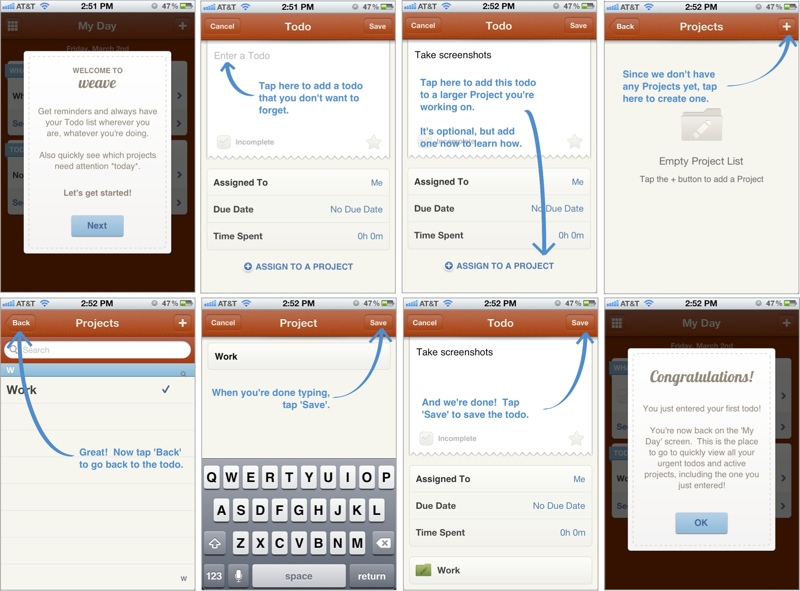
Mobile Games were probably the first to innovate in this area. Starting with a dedicated First-Time User Experience (FTUE or ‘fatooey’) that would run only for new users to introduce them to basic game elements and get them started. In freemium games, it is not uncommon to see different views when trying to buy game currency packs: for players who have never bought before, these packs will be sorted with the lowest priced option on top. But for regular buyers, they are sorted with the highest priced option on top.

(Image Source: kryshiggins.com)

Other apps have started to take a leaf out of this book: the image above is a walkthrough of the FTUE of Weave, a popular ToDo app. Secret and Slack have recently received accolades for their FTUE too. Smashing Magazine has a really interesting guide to FTUEs on mobile:

Adapting UI to context is prevalent in more ways than just the FTUE in mobile apps

1. Screens on GPS devices switch to a darker color scheme at night, for low glare.

2. Language localization is perhaps one of the oldest forms of adapting the interface for the user.

3. Responsive web pages are a great example of the UI adapting automatically, with the context being your screen size.

4. The Uber app changes its default view after you have requested a car, to directly show you where it is and when it will arrive, and put the relevant information immediately in front of you.

5. The new Foursquare app, that notifies you of interesting place around, only triggers the notification when it senses that your location has changed.

(original source: It’s A Read/Write Web by Luke Wroblewski)

6. Knowing that most users use a single thumb of their dominant hand, it might be a good idea for apps to structure their navigation accordingly, AND laterally invert key elements for left-handed users. (If you know of any apps that already do this do let us know in the comments.)

In contrast, desktop user interfaces have static, making all options available at once, and expecting the user to “pull” what they want.

3 key ingredients to consider while designing personalized UI are Identity, Context and Behavior.

Identity

There are two parts to Identity: the first part is knowing every user, being able to recognize them when they come back to your app even if on different devices. Knowing every user more is part of this – various traits that let you tailor the app experience: whether the user is left-handed or right, their internet bandwidth, language preferences, social graph, etc.

The other part of identity is created by the user: their identity in your app. How they use your app, and the persona they create in your app is a large part of this. For example, users portray themselves very differently on Facebook vs. Instagram vs. LinkedIn. Sometimes users use Instagram to post pictures of what they sell to their audience, while other times users use Instagram to share personal photos with their friends.

Context

Context is about the here and now. Knowing if a user is at home or walking on the street can play a big role in shaping the UI of a restaurant recommendation app. Or a payment app — whether a history of transactions on the main screen is more important, or a pay here button. What screen the app is being used on – a TV or a car – will govern what actions are front and center. The user’s local time, whether the user is currently on a subway train or running down the jogging track, whether they came to the app from a specific notification are all piece of context that can be used to personalize the experience.

Behavior

Interpreting users’ collective previous actions to anticipate what they might do, and shaping the UI accordingly is where personalization gets complex but also magical. All content recommendations – products, music, search results, news – do this. With UI, it overlaps with the second part of Identity mentioned above: is the user using a calendaring for their business or for personal scheduling? Can the payment app know if it is being used to pay for purchases or to send money to friends? Can a news app learn about your sharing habits to decide the prominence of the sharing button?

BUT there is a slippery slope to ultimate confusion

The best UIs are the ones that are familiar – the user instinctively knows where to click and how to reach their goal. Too fluid a UI can create confusion. Getting the personalization wrong can be even worse. It is always the right thing to make changes in small steps, and A/B test to learn from how users react.

My final comments on a Twitter discussion about Design & India focused startups

Here’s the starting point of the discussion on Twitter:


Just to summarize my thought: the original referenced article talked about design being a key pillar of a startup. My contention is that that is a developed market centric view which should be applied carefully to India focused startups. It is first more important to understand the consumer’s concerns & see how design fits in there. Saying that the design sense of the Indian consumer is “not evolved” is saying that consumers haven’t yet caught up – that’s wrong. It is not the consumer’s job to “catch up”, it is the job of a company to understand what are the drivers of earning the consumer’s business. Design has become such an important differentiator in developed markets because consumer does not have issues of systemic trust.

None of this is suggesting that design is not important. But as entrepreneurs we need to allocate capital and resources correctly and figuring which problems are the biggest drivers is critical to that exercise. Design, IMHO, comes after trust has been earned, after operations are smooth … it is not a 1st order concern.

Sense of aesthetics is also fundamentally affected by surroundings: garbage on the roads, construction everywhere; the average consumer’s desire in India is just to have things work and be clean. Aesthetics is not yet a mass concern. Think of the online banking site of any Indian bank – from global standards of UI/UX they are horrible. In fact the one I use (large well known bank) is downright buggy and randomly logs me out. This has not been fixed in over 6 years; 6-long-years! You’d think this would be the death knell for the bank. But they have retail locations everywhere, they advertise heavily and for an average consumer that solves the first order problem: this bank will not run away with my money or go down tomorrow.

Take a look at these two great posts that came up in the Twitter discussion:

In short: when doing business in Rome, study Rome.